Software
Houzz Logo Print
poolroomcomesfirst

Exterior review

10 years ago
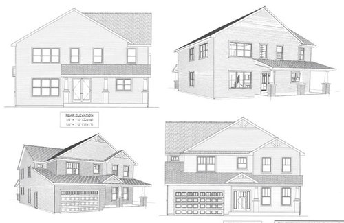
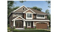
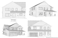
In the Best and Worst exterior thread there were quite a few comments that made me rethink some of the features on our plans. I'd like some feedback. It's hard to tell from the pic, but it's brick on the first floor front, and on the second floor center. Antique Chicago style brick. Pebble grey sidding on the rest. We'll also have brick down the sides and back up to the first floor windows.

Comments (29)

  • PRO
    10 years ago
    last modified: 10 years ago

    The more brick is used in a traditional manner the better it will look. Only covering one elevation with brick and not the others Is not traditional, it is pretentious. Brick is also a very heavy material and should not be applied were it appears to float or there is no obvious means of support.

  • 10 years ago

    The brick should be used around the whole house or only at the pillars. I also don't like the gable above the porch as it seems stuck on and has no real reason for being there.

    What is the look you were going for?

  • 10 years ago

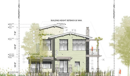
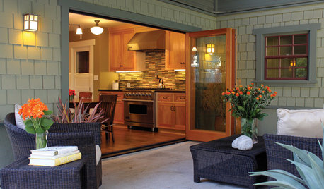
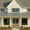
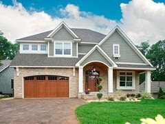
    We started out with these 2 photos as inspiration

    Then function sort of dictated form. The gable above the porch is aesthetics only because it was in our inspiration photos. I do see where in those houses there is a functional need... But we like it.

  • 10 years ago
    last modified: 10 years ago

    I personally like the top photo better than the bottom one. Cleaner lines. I figure that front gable over the porch gives you more room to stay dry when the weather is rainly and blustery, so that's a function.

  • 10 years ago
    last modified: 10 years ago

    The biggest problem is the massive oversized gable. That thing is HUGE! Using the garage door for scale it looks like it's approaching 40' wide!

    Regarding the gable above the porch.....as you noted, there's a reason for the gable your "inspiration photos" in that the porch roof extends out over the steps. On your house it's an applied "doo dad" (sorry for the use of a highly technical design term) and there's a BIG difference between the two. And then of course the small size of your "doo dad" gable in relation to the massive size of the house gable only makes each look worse.

    And, as Mark noted about the brick, that has a "doo dad" feel too. But whatever you do however, don't change materials (like brick to siding) on an outside corner. Always do it on an inside corner and therefore avoiding as much as possible the "hollywood house" look.

  • 10 years ago

    I do see where in those houses there is a functional need... But we like it.

    So are you actually saying that you posted so we'd validate how wonderful your elevations are?

    In case you are serious about feedback, I took your elevations and removed the gable over the porch to show you how it would look without it. I didn't remove the brick, but honestly your back and side elevations read cleaner. If you wanted to mix, I'd consider adding shakes on top and the rest all siding instead of the brick. Or add a "belly band" around the top of all elevations of the first floor and put the brick only on the first floor but all the way around the house.

  • 10 years ago

    Are you required to have a certain amount of masonry on the front of the house?

  • 10 years ago

    We want the whole first floor brick. We're waiting on the builder to come back with costing. Their initial estimate was 40k upcharge for first floor brick. Ok we like the redone version without the gable over the porch.


    Would the the belly band just be white trim? Or would the brick to siding transition be enough?

  • 10 years ago

    No masonry requirements at all.

  • 10 years ago

    Ok we like the redone version without the gable over the porch.

    Since your thread is labeled "Exterior Review" you still have to fix that massive overscaled gable. That's what's visually driving the house into the ground.

  • PRO
    10 years ago

    "Doo dad", I somehow don't think I will be using that one.

  • 10 years ago

    The siding isn't the problem. You have a very boxy, heavy design, almost like a four square or Prairie Style. The second inspiration addresses that heaviness, and makes a feature of it, by using thick, heavy, bold trim. Your drawing shows thin, wimpy, cheap trim. Your unconscious intuition has already perceived the problem, so you are trying to fix it with brick, in the hopes it will look more interesting and expensive. It won't work.

    Go back to the inspiration shots, thicken up that trim, add corner boards, rakes, a datum line, fatter columns, chunkier windows, etc. Clean up the fenestration and make everything meaningful, not confused. No pointless gable in gable. Strengthen the roof pitch, deeper eaves.

    Google Frank Lloyd Wright in Oak Park. That's the general feeling you are trying to achieve.

  • 10 years ago

    Yeah Mark, you're right.

    I probably should have said "You need to properly articulate the buildings vocabulary" with "vocabulary" in air quotes in lieu of saying "applied doo dads".

  • 10 years ago
    last modified: 10 years ago

    The biggest issue with the home is that it's trying to be about as wide as it is deep, forcing you into badly competing central masses that aren't working. With a giant bulbous roof. Something has to be dominant and something has to be subordinate. Your inspiration pictures all have clear central massing with a clear hierarchy of subordinate elements. Yours has two major axis pushing and shoving each other like siblings on a car ride struggling over the back seat.

    I prefer thingamabob to doodads. That gable is certainly a thingamabob.

  • 10 years ago

    So should we look to do a hip roof instead of all the gables? What does "strengthen the roof pitch" mean? I like the comments about beefing up the trim. How can we keep our second story floor plan without that big gable? It does serve a purpose...


    The house has to be deeper than wide because it can only be 45' wide, but we could go deeper than we need.

  • 10 years ago

  • 10 years ago

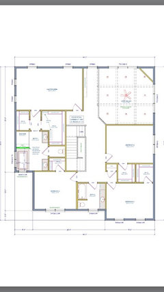
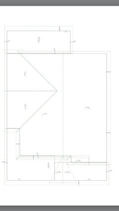
    btw your toilet door should open the other way so that when you come into the bathroom you don't have to walk around the door to get into the toilet area. And it's hard for the architects here to see if you can do a different roof if you don't also show your first floor plan.

  • 10 years ago

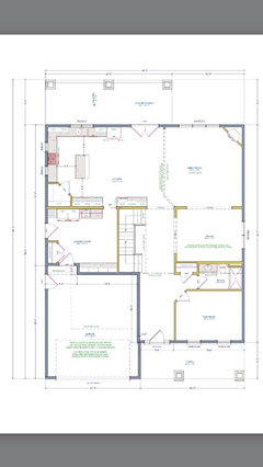
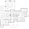
    Here's the first floor and roof.


  • 10 years ago
    last modified: 10 years ago

    The best houses are designed in plan, section and elevation all simultaneously. One is not complete without the other elements completed AT THE SAME TIME. Therefore all elements are working together. In your house it appears the process was completed sequentially. You know..... "Ok we have the plan. We have to keep the rain out so now let's slap a roof on it!!!".

    Great thread here on what makes for good design: http://ths.gardenweb.com/discussions/3285825/what-makes-a-house-have-good-design?n=39

    And interestingly, good design costs the same to build as poor design. But in your case maybe even $40K less because brick alone will not create a silk purse here.

    Edit: JDS and I posted more or less simultaneously and, while the hipped roof suggestion goes a long way towards mitigating the heavy looking roof, you need to find a way to break up that 40' wide form into smaller more human scaled elements much like your "inspiration" photos have which means looking at your plan.

  • 10 years ago
    last modified: 10 years ago

    "Strengthen the roof pitch" means give it some rational relationship to the other elements in the design. The basic issues are proportion and scale, the mathematical ratios of all the parts working in harmony.

    Think of the human body. In the average adult human, there is a natural proportion between the size of the head, the overall height, length of arms and legs. These relationships continue right down to the smallest scale-- the joints of the hand, the features in a face. When these mathematical relations are "off" in some way, one notices it immediately. If you saw a person with a head just slightly larger than average, you'd likely think something was very wrong. But at the same time, not all variations are necessarily bad, because slightly off proportions can have great individuality and character. However, in a building, it takes a really good eye to pull this off.

    In the case of this house, you strengthen the pitch by making it steeper, but also by making the eaves deeper and the trim thicker, possibly add brackets and other millwork, so the roof "reads" as a strong, imposing element. Alternatively, you can pull the roof down so that the windows break through the roof line. The total composition should then look really powerful, like Bogart in a good fedora.

    Personally, I would go even further. Change the proportions of the house so it looks deeper, slimmer, and taller. Right now it looks short and squat. You can get the same square footage by putting dormers in the roof. You have the space for a full stair up to an enormous attic, and that can become anything you want it to be.

  • 10 years ago

    "Like Bogart in a good fedora" Well said.....I'll have to remember that!

  • PRO
    10 years ago

    While looking for improvements on the exterior, there may be some improvements on the interior that could be made that would in turn effect the exterior in a positive way. (That's a subtle way to say there's room for improvement on the interior layout) Right now the exterior doesn't even look as good as Gilligan in a bucket hat.

  • 10 years ago

    I wish we would have gone to an architect first, instead of trying to modify stock plans with a builder. We did a great job with the interior, but to the points above the exterior is lacking. Thankfully it's not too late to still do it right. A little bit of sunk cost in design fees, but a lot of learning, and our house will be better for it. Thanks for the advice everyone.

  • 10 years ago

    I can't read your measurements inside but a few things I noticed.

    1. I would highly recommend you put your kitchen on the kitchen forum for advice from the kitchen gurus. I think with their help you could get a kitchen layout that's even better than what you're showing.

    2. What are the dimensions for your mudroom/laundry area? Right now it looks huge with lots of wasted space in the middle. In fact your mudroom/laundry is larger than your dining room!

    3. Your dining room seems to be quite a distance from your kitchen. Imagine carrying large platters of food into the dining room. Question. Do you even need a formal dining room?

    4. You do realize that your open to below area means you'll be hearing all the sounds from downstairs upstairs? Also that it will be harder to heat, and harder to do things like change light bulbs?

    5. How are you planning on arranging your furniture with a corner fireplace? Corner fireplaces are harder to arrange furniture around.

  • 10 years ago

    Mudroom is 15'4" x 13'11".

    Yes, the kitchen was posted in the kitchen forum, and this was the result of their feedback.

    I know about the dining room being too far from the kitchen, but the view from the great room is better on that side, and we wanted the Mudroom to transition into the kitchen over the great room. Yes we need a formal dining room because of a family table that we want to keep.

    Yes, the open to below will mean higher heating bills and occasional inconvenience with light bulbs thank god for LED... This was one of my wife's must haves. I get the poolroom I've always wanted and she gets the great room

    furnature will be L facing right wall entertainment center There's no window on that wall to house the TV


  • 10 years ago
    last modified: 10 years ago

    I read your comments about the two story great room and your wife's desire for one (and believe me I know the truth to "Happy wife, happy life") but I'd look to get rid of it. If you bothered to go to the thread I noted above you'll see in my list there I noted among other things that most two story spaces have all the warmth and intimacy of the lobby of a Hyatt hotel. Yours will likely not be any different.

    With that said here's what I'd recommend. If in fact you are getting a creative person to sit down with you for a review of your house, ask him/her if they have any ideas for the family room. After all right now it's just lines on paper. A good designer will say "Looks ok but have you thought of this???" and start drawing lines. I do that all the time and it usually ends up with "We never thought of that!". At the very least it will show your wife some alternatives before a healthy six figure chunk of your hard earned money is spent forever. For that to work however it will take a degree of trust on your part and to be open to any new ideas you may not have thought of. In lieu of doing a bunch of typing read my two posts here written for another homeowner. The first post relates to preconceived ideas and the second one relates to client trust. http://ths.gardenweb.com/discussions/3567694/floor-plan-input-before-architect-meeting?n=19

    Fortunately you're in a position where it's not too late and the best of luck with your project. Exciting times for sure!

    poolroomcomesfirst thanked Architectrunnerguy
  • 10 years ago
    In our last home we did away with the 2 story great room and created another tv/media room above it. It was a nice place for the children and actually benefited our resale value. I actually used it quite a bit myself, as get away from football games. Lol. Our home sold in a week to a family that loved that space. You are getting some great advice from people in the know, so take advantage of it.
    poolroomcomesfirst thanked marrymaid
  • 10 years ago

    Forgetting about the heating bills and the lighting, the other reason as I stated before is that the noise travels upwards. Meaning if you have kids and are watching tv in the great room or entertaining friends, your kids will hear the sounds upstairs. Not fun if they are younger and you're trying to get them to sleep.

    poolroomcomesfirst thanked cpartist