Software
Houzz Logo Print
pschr

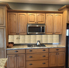
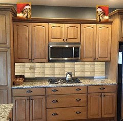
Please help me choose top of kitchen cabinet decor...

10 years ago
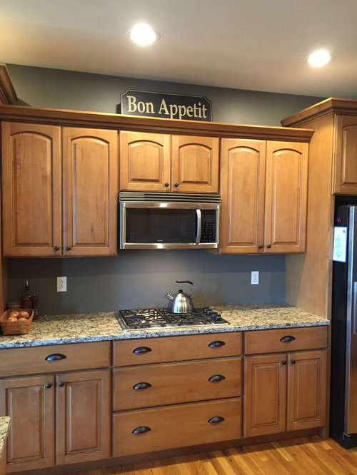
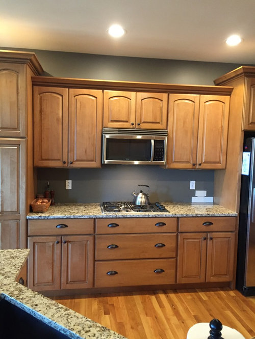
choice A

pschr's ideas · More Info

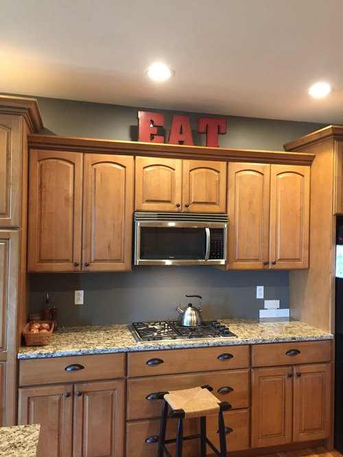
Choice B

pschr's ideas · More Info

Choice C

pschr's ideas · More Info

Comments (48)

  • 10 years ago
    last modified: 10 years ago

    #2 with either the "EAT" or the "Bon Appetite" sign actually on the wall under the microwave, behind the cooktop.

  • 10 years ago

    #2.

    pschr thanked nutsaboutplants
  • 10 years ago

    I like the color choice of the red, not necessarily the sign itself, as long as you have red in your decor.

    pschr thanked User
  • 10 years ago

    B.

    pschr thanked ceezeecz
  • 10 years ago

    kswl2 you sound like my sons and husband! They absolutely hate the EAT sign. We will be tiling the backsplash as soon as the tile arrives so we won't be hanging anything under the microwave that is why I was thinking to put something up on top of the cabinet. It is the only spot where I would add anything for decor. I have thought about a platter or a few crocks too. Any other ideas are welcome.

  • 10 years ago

    B. I am not a fan of things above the cabinets. (Says littlebug who currently has 5 baskets on top her cabinets . . . . mental note to self: take them down!)

  • 10 years ago

    B... no fan here of having words posted all over the house. I have enough people/things/responsibilities telling me what I have to do...don't need my decor to do the same.

  • 10 years ago

    Bon Appetit. The size and colors are good, and the cabinets step down so it's not pushed too close to the ceiling.

    I don't have a problem with anyone wishing me a good appetite. Not that I need their encouragement.


    pschr thanked User
  • 10 years ago
    last modified: 10 years ago

    After you have a tiled backsplash in place I think anything in top of the cabinets is overkill. It's such a clean, pretty expanse as it is!

    pschr thanked User
  • 10 years ago

    I'd hate to take away from the backsplash with a sign on top of the cabinets. Where do you want your eye to go?

    pschr thanked ceezeecz
  • 10 years ago

    Bon Appetit brings Julia Child to mind, and it fits subtly with with colors in the room. So that's my vote. That is a gorgeous color on the wall, can you share the name/brand? (Petty kitchen!)

    pschr thanked bpath
  • 10 years ago

    B. Pretty kitchen!

    pschr thanked theclose
  • 10 years ago

    I like pottery up on the top of cabinets like yours!

    pschr thanked K Sissy
  • 10 years ago

    Why not wait until you come across something thatreally speaks to you? Pun unintended but acknowledged :) Without that personal touch, signs can look more like a staged house than a home.

    We store a Portmerion-style oversize covered casserole and a tureen above our cabinets - of necessity, but they look nice, too. It's an attractive and functional place for oversize platters, etc.

    p.s. My husband and I are currently debating whether to put up a sign in our
    house too - I think it goes on the kids rec room door and he wants it on
    the door to my office. The sign reads: Insane Asylum Entrance.

    pschr thanked Pj G
  • 10 years ago

    I don't like signs in the house as decor either.

  • 10 years ago

    Nothing on top.

    pschr thanked User
  • 10 years ago

    B. Paint goes great with those cabinets.

    pschr thanked User
  • 10 years ago

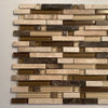
    bpathome, the color of our kitchen is SW Anonymous. Thanks to everyone for your input and compliment on our kitchen. Our tile will be Walker Zanger Cafe in latte with the grout matching very close to the tile, so the backsplash will not be the focus of the kitchen. I think I will live for a while with and without the Bon Appetit sign.

    pschr's ideas · More Info

  • 10 years ago
    last modified: 10 years ago

    I vote for nothing up there, too!

    also, kswl, I am rather liking the idea of a sign in the bathroom...ha.

    pschr thanked cyn427 (z. 7, N. VA)
  • 10 years ago
    last modified: 10 years ago

    What a pretty kitchen! I like it better with nothing (not a sign fan), but do like the idea of pottery.

    Bathroom sign:

    Live, Laugh, Poop.

    Keep Calm and [never mind] :D

    pschr thanked User
  • 10 years ago

    Nothing. You have the open shelf, with nice styling & it gives the eyes a chance to rest.

    pschr thanked Peppapoodle
  • 10 years ago

    I am also not a fan of "wall words" or any other type as home decor..but I am also not going to vote for NOTHING. I say keep looking. Something fits--you just haven't found it yet!!

    pschr thanked arcy_gw
  • 10 years ago

    I vote for nothing as well (B).

    pschr thanked monicakm_gw
  • 10 years ago

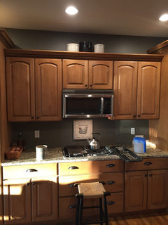
    I found these crocks in the basement.

    Choice D?

    pschr's ideas · More Info

  • 10 years ago
    last modified: 10 years ago

    Here is what it may look like with the BS. I don't think there is a need for anything up there. Your island has texture and the granite has something going on, too.

    A place for your Christmas Gargoyles maybe?


    pschr thanked User
  • 10 years ago

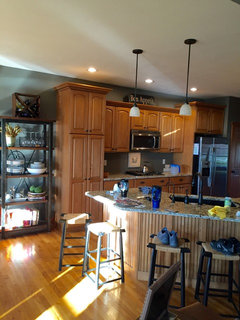
    I really like your rack and how you have it arranged with plates, bowls, glasses etc. What about taking the elements of the rack (the wrought iron and the metal) and finding something (wrought iron bowl, or something metal) for the top. It's a pretty shelving units and might be nice to bring the construction elements of it more into the kitchen - which is very pretty by the way.

    pschr thanked blfenton
  • 10 years ago

    Kswl2, now I want to go out and get a neon sign for my bathroom that alternately lights up "poop" and "pee." Because, really, people might not know.

    Count me among those that don't like wall words. But, I like the red color of the eat sign with the wall color.

  • 10 years ago

    Thank you nightowl for the picture with the tile back splash! I do not know how to that. You are convincing me that nothing will be the best....that wasn't my first choice. Thanks everyone!

  • 10 years ago
    last modified: 10 years ago

    I have to add that I didn't know there were so many word sign haters out there.....the farmhouse style and Pinterest is full of word signs, which makes me believe other people do like them. I happen to like them, if they aren't over done. I think they can add a bit of eclectic mix to one's decor. So many decor options and opinions out there.

  • 10 years ago

    I think a backsplash with larger tiles would look really good...on the diagonal.

    pschr thanked K Sissy
  • 10 years ago

    K Sissy we have chosen a 3 X 12 subway tile but we haven"t considered a diagonal.

  • 10 years ago

    I don't like anything on top of the cabinets! I thought I was in a minority until I read the comments! And I especially don't like silk greenery on top which seems to be what most folks do here in my town! (Think coated in greasy dirt!)

    pschr thanked User
  • 10 years ago

    I like the crocks. Could you spray the middle one red? And the smaller ones black? or leave the smaller ones white. I like the red, but not crazy about the Eat sign itself. The Bon appetite looks good too.

    pschr thanked Lily Spider
  • 10 years ago

    pschr, I like the bon appetit sign, but do what you love and don't worry about what others like or don't like. It's your home.

    pschr thanked User
  • 10 years ago
    last modified: 10 years ago

    #2!

    I was always one to fill every available space with something and I feel I am finally appreciating the value of negative space; it's every bit as as important as filled space, and sometimes more so.

    pschr thanked gramarows
  • 10 years ago

    I prefer it with nothing. My second choice is the Bon Appetite sign. I like the color and scale. I think the crocks would be ok since the color and scale appear similar to the BA sign. I think the Eat sign is too tall and while I'm a fan of the color red, eyes are drawn right to it. I would want your very nice side display to be noticed!

    pschr thanked User
  • 10 years ago

    That nice bakers rack is all the display you need---and it is functional.

    pschr thanked User
  • 10 years ago

    I bet you could shop that bakers rack for a few things for on top. Might help the very busy(full) rack blend with the calmer new space next to it

    pschr thanked Kippy
  • 10 years ago
    last modified: 10 years ago

    I really like the bon appetit sign. Lovely kitchen. When you finish it is going to be very cozy. The backsplash will add a lot. Please come back and show pictures once completed

    pschr thanked decormyhomepls
  • 10 years ago

    I would live with it to see what you like & what inspires you. I do not like anything on the wall behind the cooktop beside a backsplash unless you don't cook. My DH & I cook daily and I wipe the surface behind my cooktop every day, sometimes many times a day.

  • 10 years ago

    I do like the Bon Appetit sign, but it bothers me when attention is directed in places such as the top of the kitchen cabinet, it just doesn't seem like a good place to direct the eye. Your kitchen is beautiful, which it was mine!

  • 10 years ago

    B is my vote ... there is already plenty to look at in your pretty kitchen!

    pschr thanked pamghatten
  • 10 years ago

    I like the Bon Appetite sign a lot.

    pschr thanked indygo
  • 10 years ago
    last modified: 10 years ago

    I vote B - nothing. I am not a fan of words in the house telling me what to do. I see words all day at work, on the highway, on the menus, on bathroom doors, on my computer, in the newspaper, etc. It's nice to have some freedom of thought in the home. Nice looking kitchen!

    pschr thanked rockybird
  • 10 years ago
    last modified: 10 years ago

    i'm not a sign person either, but i think the bon appetit sign looks nice!! i prefer it over the crocks and much, much prefer it to 'EAT' (which i don't care for at all!)

    it looks fine empty, but i do understand how that space can look odd when empty- i don't like a lot of clutter on top of cabinets, but it can look almost sterile empty esp when the cabinets are several of a similar ht/width...with your center cabinets lower than the ends, it almost seems to be begging for something!

    pschr thanked busybee3
  • 10 years ago

    Maybe you could move the EAT letters over to the beverage center and rearrange the letters.

    pschr thanked User
  • 10 years ago

    My preference is usually stuff on top .. but when shown the photo of the cabinets you don't really have a lot of space to fill. I do like the little punch of red with the sign. I say, put what you like up there, or not. I do not believe less is more, to me less is just boring. When living in California I was amazed at all the beige, bland, boring decor. Not a bit of personality in any of the homes I visited. Anyone could have lived in any of them and you never would have known who lived where. I love a home that is infused with the personality of the people who live there.

    pschr thanked User
Sponsored
Custom Home Works
Average rating: 4.6 out of 5 stars10 Reviews
Franklin County's Award-Winning Design, Build and Remodeling Expert