Software
Houzz Logo Print
jennifer_heiting

Exterior design help

10 years ago
last modified: 10 years ago
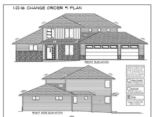
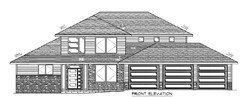
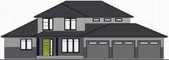
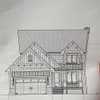
So they are starting are new build next week. And while I am super excited and very pleased with our layout, I wish the exterior lookeda little more contemporary. I like the elevation, I was just hoping there might be a few tweaks or ideas out there to give it a little more contemporary edge.

So here it is. We are a little limited, like the majority of the roof must be at least 6/12 and windows can't change much do to layout, but I figure there must be something we haven't thought of to give it a contemporary boost.

So creative minds any suggestions?

Thanks!

Comments (27)

  • 10 years ago

    We all have different tastes and ideas. For my taste, that front elevation is a jumbled mess. Too many materials and mismatched windows. Is that a window grouping on the second floor, above the front door? It looks like the old metal single pane louvered windows you see in 1960's homes in FL. Windows seem to be too small and too few of them. Garage doors are 1/3 of your facade, which is fine, but you then need to assign more of the budget to them, so you have attractive garage doors that complement the front facade. You are trying to put too much "makeup" on that elevation and the house is looking like a "clown".


    Have you made a mood board with actual samples of the materials shown in the elevations? Have you looked on Houzz for inspiration photos? Don't be afraid to go simple and classic ... most of the time less is more.

  • PRO
    10 years ago

    It appears to be a prime example of coming up with a layout without any consideration for the exterior's appearance or massing. For anybody's taste, and I think you see it too, the exterior of the structure is a jumbled mess. The problems are in the massing, window placement, window design, material selection, material placement, and roof pitch. I am afraid to properly fix it would involve changes to the floor plans and time from a more talented designer.

  • 10 years ago

    1. Eliminate the brick and the vertical boards on the second story-- it's too "country cottage," too busy.

    2. Enlarge the windows, and simplify them. The one above the door makes no sense. Modern architecture is often all about natural light.

    3, More glass in the front door. Simpson Door has some good contemporary designs.

    4. All glass modern garage doors. Split them into three separate doors, the two plus one shouts "suburban retail tract house."

    5. Either make the "porch" overhang bigger, and wrap it around the side, or eliminate it altogether. Right now it looks wimpy and indecisive.

    One good resource for this sort of look is Sunset Magazine. They show a lot of "soft contemporary" houses, with an emphasis on integrating the house into the landscape. Take a look at their website for ideas on making this design more custom.

  • 10 years ago
    last modified: 10 years ago

    How come you have so few windows in the house and why are they so small? When I think contemporary I think of large windows grouped together letting lots of light into a house.

    Also as others have said you have lots of materials and different kinds of windows all going in different directions which create disharmony in the look of the house.

    Scone just posted some good suggestions to help it

  • 10 years ago

    Ok took some of what scone said and played around in photoshop.

    Didn't do much with the windows yet but here are the results of other changes.

    Widows are a bit trickier due to inside layout but I am going to play around with those next.

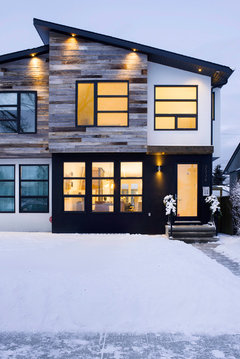
    For reference the window above the door was inspired by houzz pictures like this one

    b65 (Richmond,2013) · More Info

    and this one
    infill project killarney · More Info

    Maybe it would look better if we change the other windows to match more closely?

    Thanks for the suggestions so far!

  • 10 years ago

    Stone doesn't suggest contemporary to me (or at least not the type you have pictured). Have you played around with a different material there?

    The window and the door look strange to me because one has 3 bars and the other has 4. I would think both with the same number, or keep the 3 bar window and go with something different for the door. Also the scale is off, with the door having a narrow sidelight and the window having a wider vertical window. I think if you wanted to keep both, having window width match the door + sidelight might make more sense visually.

  • 10 years ago

    cpartist is gaining on it. Your inspiration photos "work" because of the simplicity and repeatability of the element and the simplicity of materials with just accents of the wood / busier pattern.

    Windows should be cohesive with each other - thus her simplicity statement. In the above - she's added some nice strong horizontal elements in the garages, as well as the upstairs windows. She also removed the visual clutter of the materials and added a nice large bold door (image the fun you could have with that - those oversized pivoting doors are so cool!). This series of small changes did a better job even visually "grounding" the house!

    Contemporary / modern means "less is more" and strong repeated visual elements make the eye happy.

  • 10 years ago

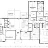
    Makes sense, and I can see how the simplicity works. Unfortunately we do have some restrictive convents that require 2/3 of the front of the home to be covered by masonry. Would the effect still be the same with stone/brick in the center portion? Also I would love to have the windows above the garage bigger, but would need to make some interior changes then. The widows above the garage are all bathroom windows. I will try to post the floor plan later (my kids are making it impossible right now)

  • 10 years ago

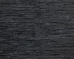
    I had a feeling you would say something like that. I think it could work if you stuck to a stone that had very little variation in colour, like the one below.

    Realstone Systems Thin Midnighty Sky Shadowstone · More Info

    Jennifer Heiting thanked paraveina
  • PRO
    10 years ago

    The covenant requirement for 2/3 of front elevation to be masonry, combined with the complex roof, wall and windows shapes makes it very hard to simplify your exterior design. It also raises the potential for any masonry on the front elevation (and not on the sides and rear) to create the dreaded "pasted-on" look which is common to many tract homes. Considering the 2/3 masonry requirement, you might consider the elevation by cpartist, substituting appropriately scaled masonry where she shows an area of 2-story horizontal siding, with the rest of the house unified with a simple painted lap siding or perhaps colored stucco harmonious with the masonry color. I'm struggling for a creative solution which provides a good alternative to the elevation in your first photo at the beginning of this posting. Hopefully, there may be some good alternatives to that. Good luck with your project.

    Jennifer Heiting thanked Virgil Carter Fine Art
  • 10 years ago

    As Virgil suggested if you're required to have masonry on the front, I'd do a light stone color masonry and the do the rest in stucco picking up the color from the masonry. I'd then change the other elevations to stucco too. Here's with masonry instead of the lap siding.

    Jennifer Heiting thanked cpartist
  • 10 years ago

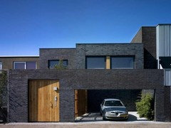
    You can also come up with funkier "brick" - darker may be better. Or something in a larger format, etc. Found this picture that also shows some cool wood accents. But - this might be very forced on your design and incongruous with other houses in your neighborhood, or, may not pass architectural review if most of the houses have the overall look / feel of your initial rendering.

    Jennifer Heiting thanked just_janni
  • 10 years ago

    I wouldn't object to brick either, it doesn't have to be stone. I may be asking for a bit much trying to fit a contemporary home in our location, with our restrictions. I don't have to have a strong contemporary exterior, at the very least I'd like to have the exterior look a little less traditional. But thanks again for all the suggestions and ideas so far. It has definitely given me some possible ideas on how to adjust the look a little bit.

  • 10 years ago

    Even if you stick with a more "traditional" look for the house, you need to simplify it. It's way too busy right now. Good luck. :)

  • 10 years ago

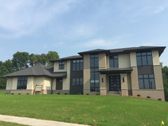
    Thanks everyone for your thoughts, ideas and suggestions. I also looked up some Parade homes that we went to this summer for some extra inspiration.

    http://valleyparadeofhomes.com/homes/view/603


    Contemporary Splendor · More Info

    http://valleyparadeofhomes.com/homes/view/599

    http://valleyparadeofhomes.com/homes/view/597

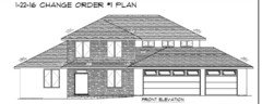
    I played around a bit with my home designing software and a little bit of Photoshop (can't add garage windows in the home design software) and I am feeling a bit more pleased with the results. It's not strongly contemporary (which I realize is not possible with our constraints) but I think its not overly traditional now either.

    Here are two of my favorite options so far. We still need to figure out what materials to go with (need to factor for extra cost and weather conditions around here) and I'm sure it could use a few more tweaks, but I feel like we closer to the end product. Which is good seeing as we start next week!

    Thanks again houzzers :)

  • 10 years ago

    Both are better but still not 100% there.

    Personally I'm still not a fan of the odd window above the door. It's the only one and it sticks out like a sore thumb. The one area you want to stick out is your front door so that it says "welcome" and you don't want other parts of the house to compete with the front door and the welcome it gives. When you have too many different elements instead of it all blending into a harmonious whole, they fight one another for attention.

    On your inspiration house, notice how all the windows are the same? (However even your inspiration house I personally feel could be simplified a bit and still maintain it's prairie influences.)

    The other problem with what you designed is that if you are putting the brick/stone only on the front elevation it's going to look strange on the side elevations. In good design the brick would follow around the sides of the house onto the back of the house too.

    That's why I didn't add it on the elevation I did for you because I wasn't sure you'd want the expense of bringing the stone/brick all the way around the other sides of the house.

    One more thing. You made the bottom window next to the door a triple. It looks odd with the window above on the second floor only a double. They should match up with the type of design you're trying to achieve.

    Jennifer Heiting thanked cpartist
  • 10 years ago

    My husband really likes the odd window which is why I left it, but I will play around some more tomorrow and replace it with the other style to match and see what he thinks.

    Around here it is pretty standard to just put brick/stone on the front and not the sides. I don't disagree that it would look better, but like I said it's rare around here to do it that way. Maybe because there isn't much space between the houses here? Also, I was more focused on playing with the window as it is much easier to do in my program, walls are more work but I plan on trying out more options when I get a chance.

    The triple vs double window was my husbands idea (he really has absolutely no design sense lol) I will play around with that too tomorrow.

    Thanks for the feedback :)

  • 10 years ago

    I like the top better, except for the door. I was wrong there, matching the three's doesn't work. I don't mind the triple pane on the ground floor - it feels more traditional to me to match all those windows. I am not an expert, but my vote between the two options presented is top with bottom's door.

  • 10 years ago
    last modified: 10 years ago

    You are trying to design all aspects of the house at the same time without any way to visualize the result and IMO that approach will be apparent in the final work.

    Recommendations:

    1. don't choose the masonry or siding until you have the basic composition of the house solved

    2. don't stop masonry part way up a wall - for a clean modern design avoid traditional brick

    3. leave a space between the windows and the roof overhang - if the roof is built with trusses use a raised heel truss - if the roof is conventionally framed put the rafters on the attic floor.

    4. try putting a horizontal band under all the overhangs including the porch roof to provide a much needed horizontal accent

    5. find a way to wrap materials around corners without traditional corner boards

    6. don't design the windows or doors until you have a massing model that works

    7. unless you are willing to be disappointed when the house is built, you must design in 3D - if your designer doesn't have that skill, get a free copy of SketchUp and draw a simple massing model or find a designer with that ability

    8. draw the floor line on the elevations and make sure the interior stool heights are appropriate for the spaces (they seem random)

    9. if you are going to have gutters, show taller roof facias and the gutters - if not, try a shorter facia

    10. when you design the windows leave the operation type and mullions until last

  • 10 years ago
    last modified: 10 years ago

    The current upper and lower hip roofs create a strong horizontal emphasis and you should not attempt to fight it. As an alternative to the horizontal banding of materials shown below, you might use one material on both floors of the center element and a different material on the elements to the left and right of it.

    Glass panes should feel generous rather than cluttered with odd mullions designs. Choose the materials after you have drawn a 3D model and verified that the entire house is compatible with the design concept of the front facade.

    To pay for more and larger windows use oversized double-hungs instead of paired casements. Historically, casements are much older than double-hungs. The front door should be the last thing you design. Let the front porch extend beyond the corner and wrap around it.

  • PRO
    10 years ago

    That garage roof detail where it is a freestanding hip roof with essentially a huge cricket behind (area underneath the little windows) is is not a good idea if you live where it snows. It is a guaranteed ice jam.

    I seem to always notice bad roof deigns here.

    Casey

  • 10 years ago
    last modified: 10 years ago

    I suspect a 3D model would reveal other awkward aspects of the roof design. The valley where the porch and garage roofs meet will taper as it rises and be tough to properly waterproof with asphalt shingles. I predict the need for some expensive copper or stainless steel flashing. To avoid such surprises I model the roof as early as possible in the design process.

  • PRO
    10 years ago

    I could be wrong, but the roof configuration looks like somewhere down the road it is going to leak.

  • 10 years ago
    last modified: 10 years ago

    I couldn't help myself.

    Casey said: "I seem to always notice bad roof deigns here"

    deign

    dān/

    verb

    1. do something that one considers to be beneath one's dignity.
  • 10 years ago

    Yeah, I agree with Casey. These atrocious roofs that keep being vomited upon atrocious houses are beneath anyone's dignity.

  • 10 years ago

    I am no expert, but I like what JDS did with your windows. I really dislike the strange window you drew over the door (it looks like a mini version of the door and sticks out). You need to convince you DH that it has to go.

    Carol