Software
Houzz Logo Print
anniefrannie

Combined living room and dining room - still stuck! Any ideas please?

13 years ago
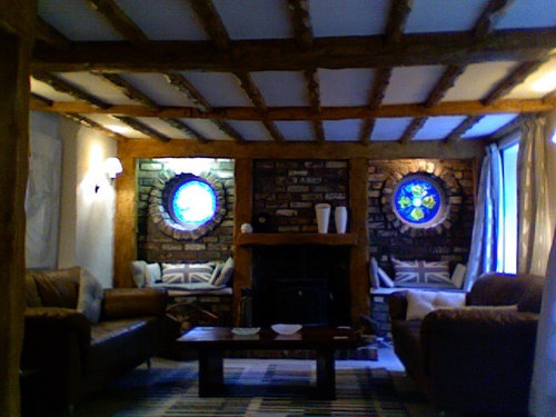
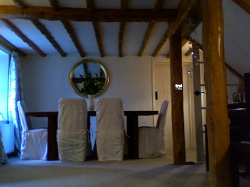
Hello I posted yesterday but today with photos (and have ironed the chair covers since the photos were taken). Would really appreciate some inputs.

Thank you

Best of

Annie Frannie

Comments (35)

  • 13 years ago
    Without knowing your likes, color faves, and what you don't like about the space? Hard to give you input dear. Needs light and brighter colors is as much as I'm willing to say without knowing who designed it as it is. Tact is everything.
  • PRO
    13 years ago
    Are those stained glass portals beside the can't-tell-what-it-is in the first photo?
  • 13 years ago
    So pretty......
  • 13 years ago
    I am guessing that you...want to make a separation between the two?

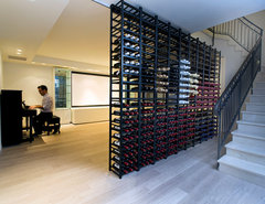
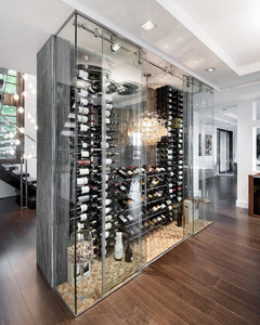
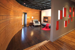
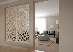
    One option would be to make a partial wall or partition between the two. Maybe a glass split wall or a floor to ceiling wine rack. A wine rack can be visually stimulating while still allowing light to pass through.

    ETHAN CARMEL ARCHITECTS · More Info

    Contemporary Wine Cellar · More Info

    A Passion for Wine · More Info

    Sitting Room Pittsburgh · More Info

    Living Room · More Info
  • 13 years ago
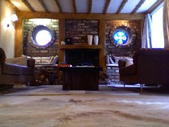
    Yes they are - I realise my photos really help to make the place look miserable, have attached slightly better photo of the north facing side of the room which has the stained glass windows, a wood burner and two nooks. I am going to have the dreadful brick work plastered over pretty soon and will at least start out with an off white to try to create some more light.
    The problem (and I realise there's more than one) is that I have a long, low, combined dining and sitting room. It's 30 feet long by 14 feet wide, plenty of space for two functions but leaves me with a weird "dead area" in the middle. Just to make life even more difficult this is a cottage so the windows aren't huge, the beams are there for a reason...
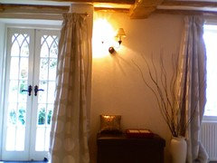
    I have two double windows and french doors on the west facing side of the room they overlook the terrace and garden.
    The entrance to the room is on the east facing side.
    Who designed the room? The removals team.


    Annie Frannie (currently a mixture of despair and shame)
  • 13 years ago
    Your clever wording made me laugh! Could u turn your table the other way to "use up" more space? Also, do you have any sideboard, buffet, etc?
  • PRO
    13 years ago
    Since I am an avid proponent of not painting brick. I would cut a piece of drywall and fill in the square above the mantle, around the portal windows and below the window seats. This will lighten up that wall without being permanent. I would the hang a bright colored painting in the space above the fire place.
  • 13 years ago
    That's an idea - at present it does look like everything is hugging the nearest available wall...
  • 13 years ago
    Interiors international - the brickwork is officially dire, it looks like something I could have done on a really bad day.
    I am thinking of saving up for a mirror frame tv to go above the fireplace (my daughter has offered to donate to that from her college fund...).
  • 13 years ago
    Jayme - I forgot to mention that there is a slight downward slope between the dining table side and the sitting room side - just realised when I began man-handling the table...
  • 13 years ago
    Nikrangel - thanks for the screen ideas - I like the trinity 33 idea - wonder if it's possible to get screens with concealed but v effective lighting?
  • PRO
    13 years ago
    AF -- I hope you realize how special your home is! You are getting great advice already, so I will only add that I would agree to painting or colorwashing the brick if it's younger than 60 years old, look to spread that vibrant cobalt blue a bit, and that I hope to see what you do.
  • PRO
    13 years ago
    I agree with all the posters above - (particularly about your brick walls) you have a good basis and very simple elegance means less can mean more. If you are worried about your dead zone space, fill it with a lovely rug that is arrestingly beautiful. Wall art on the floor. A cottage with a low roof requires that you keep the eyes drawn low and this will certainly fit that bill!
  • 13 years ago
    last modified: 13 years ago
    Is there any space to do a little seating/furniture arrangement like the one in the left of this pic? An area like this with it's own area rug can fill in a space well. (Ie: along one side of the room).
  • 13 years ago
    Thank you Barnhart, ASV and all previous posters - so the brick walls will be plastered soon, I have a very temporary fix for the middle no-man's- land (although still guilty of some wall hugging) and will do some antiquing over the weekend.
  • 13 years ago
    A big pic there would look great!
  • 13 years ago
    Hey Jayme - there is plenty of space - for now I have moved a leather ottoman and a blonde cowhide rug down from my bedroom - it's not perfect but it's better than it was 20 minutes ago...As you'll guess from the shot one of my light bulbs has just conked out (nobody said it was going to be easy)...
    thanks again for engaging in my saga....
    AF
  • 13 years ago
    I just love your home..so rustic and interesting! Please keep updating so we can see your progress! The cowhide probably adds some interest!
  • 13 years ago
    I just have to ask. Why no overhead lighting? There are many options available that don't require hard wiring into the ceiling and can be run to an outlet instead. I was so afraid I'd offend you! The first thought that came to me when I saw the space was "man cave". Lodge looks can be awesome but effective lighting is a dire need to brighten this room. Love the exposed beams! The French doors are a wonderful pattern. I so hope I have not offended you. It was not my intention if I did.
  • 13 years ago
    Mictros - you gave me the kick in the pants I needed to see the room properly.

    I agree on overhead lighting - not sure who/ how to fit it but will ask around - sadly no chance of a chandelier as the ceiling height is a maximum of 6ft 8 inches.

    Glad you said man cave - given that this is a loo-seat-down household (just my daughter and myself) it goes a long way to explain why we don't like what we have in the main room without knowing quite why (although we don't do curly girly gingham and florals either).


    AF
  • 13 years ago
    Whoa! Sounds like overhead wiring for flush mounts in your future. I have the same problem in a low ceiling hall. Solved it with a flush mount fixture but I had ONE direct lighting access. So I got a traditional 3 light that has adjustable lights like track light but with glass sconces?
  • 13 years ago
    last modified: 13 years ago
    Is there an area in your home you like? A vignette? Hard to suggest anything without knowing a bit about the feeling you want. For myself,I am in love with your space & would turn it toward the gleaming & fey. Gilt mirrors & Cy Twombly (not ren faire & twee wee folke) & definitely the blonde cowhide. I would also remove the slipcovers from two of the chairs. Depending on what I'd find,I'd paint (maybe) re-cover (likely...silk velvet or metallic linen print... I only need a bit ;).
    In short,what is your vision?
  • 13 years ago
    last modified: 13 years ago
    Is there a possibility of placing one of the sofas facing the fireplace ?
    The sittingroom area doesn't really need overhead lighting. You can create a fantastic atmosphere with table and floorstanding lamps.
    It is however a bit of a problem in the dining area, where you could always hang a chandelier with real candles, provided you don't hang it too close to the ceiling.
  • 13 years ago
    It looks like the vertical timber beams have been varnished with a high gloss finish, while the ceiling beams are rustic. If so, please sand the finish off any shiny timber. It gives a Disneyland look. You say you hate the brick, but is it so bad you don't want to at least preserve the trim around the windows? It's such a distinctive feature, and the quality may be tolerable to you if you can edit out some of the other elements that detract from a cooler simplicity I think you're after - like the stained glass in the windows? What's behind them anyway?
  • 13 years ago
    Not sure what a mirror framed tv is, but it does not sound compatible with a rustic/brick and timber setting...
  • 13 years ago
    Kitasei it's a TV with a mirror finish on the screen when it's switched off and can be framed so that it looks properly and completely like a mirror. The brick is definitely going to be plastered over and painted so that's one thing less to worry about.

    AF
  • 13 years ago
    Kitasei - thank you for taking the time out to respond twice - behind the stained glass windows is a little patch of garden with a trellis (good roses in the summer). I agree about the timbers - will see how I can get them toned down (sadly can't get rid of them - this is a seventeenth century cottage so the bedroom and bathrooms upstairs depend on them)...cooler simplicity would be excellent.

    Best of

    AF
  • 13 years ago
    A 17th Century cottage..Wow..so awesome...I love the timbers and rustic appearance of the home...please post more as you go along.
  • 13 years ago
    You have lovely divided light white doors elsewhere in the house. If the stained glass windows were replaced with something similar, I think they'd give you a lovely view of the rose garden and more light. I like all of the timber elements very much, and am sure that they will blend well with the feminine lines and white walls you are bringing in. Reminds me of Kathryn Ireland's style..
  • 13 years ago
    Hey again thank you - am in the process of making my list

    Stop me if this sounds crazy... I've just remembered something from my garden design days:
    Long, thin gardens tend to look better if they are broken into sections and circular/organic shapes are used to distract the eye from the oblong.

    So I'm thinking:
    go for round/oval tables;
    maybe look at a glass-top table in the middle section(in imitation of the water feature effect);
    screening;
    play around with height - which includes interesting art on the wall, overhead lights;
    end the crazy wall hugging - it makes the place look like a doctor's waiting room
    the brown sofas look like empty flowerbeds - am stuck with them for the moment so will need to liven them up
    don't buy any more "man-cave" brown leather items.

    I promise to have the brick wall plastered and painted asap, and will investigate matching the round windows to the french doors (although the windows could be a phase two job).

    AF
  • 13 years ago
    There you go ! Make visual areas. I asked before if you could place one of the sofas facing the fireplace, shaping a corner with the other sofa ? That will already give you some definition of 2 visually seperate areas.
    Also If you pull it back somewhat into your middle section (but not too much) you don't have too fill up that space with more furniture. Plus you will have one less item hugging the walls. ;)
  • 13 years ago
    Hi Patricia - I will take a look at moving the sofas around - although I do have my eye on a padded bench which has x legs (not sure what these are really called) which would help to complete the sitting area.
    I'll be covering it in a plain, pale, ivory velvet to keep it soft in colour but sharpen the contrast with the wood.
    best of

    AF
  • 13 years ago
    Hello all

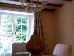
    I am slowly getting there - the brick wall has been plastered and is slowly drying out. I found a pretty urn to break up the dining table and a very temporary light to sit above the dining area. Will post a photo in a moment.

    Wish me luck - I'm off to the local auction rooms on Friday!
    AF
  • 13 years ago
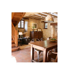
    Dining table with urn and temporary lighting