Software
Houzz Logo Print
pippiep

How do you narrow down the greiges?

10 years ago

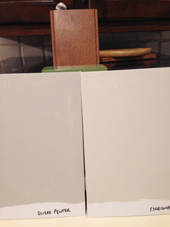
I've narrowed it down to 13 greige colors for the kitchen. THIRTEEN! I can't buy $8 samples for all of them. They are all Benjamin Moore. I did buy Edgecomb Gray and Revere Pewter, because I was fairly certain one of those would work, and if not in the kitchen, maybe in another room. I painted both of those on foam board and like them both.

They will be painting the walls before installing the cabinets, so I have to decide on paint with my cabinet/tile/counter samples. I had to return the tile board that we're 99.9% sure we're going with (Horus Art Broadway tile in Pistaccio), but I was able to order my own samples.

Here's my list:

  • Edgecomb Gray
  • Revere Pewter
  • Jute
  • Ashwood
  • Halo
  • Hazy Skies
  • Camouflage
  • Lancaster Whitewash
  • Dove Wing
  • Winds Breath
  • Old Prairie
  • November Rain
  • Overcast

Phew!! How to choose?? Anyone have input on any of these colors?


Comments (29)

  • 10 years ago

    Tough one. I ordered the large paper samples from the BM web site that I carried around in a room.

    I don't think Lancaster Whitewash is a greige.

    Also, I sampled BM Edgecomb but ended up with SW Agreeable Gray; it seemed a little less greenish. Sorry, now I'm opening another can of worms :)

    Another option would be to go to HD and have them match the BM colors. Their samples are like 2.99. Just make sure that the match matches exactly your paint chip.

  • 10 years ago

    Thanks for the tip about matching for samples! I hadn't thought of that. I did buy (returnable) a couple of big sheets, but the local store only has the Affinity line in those sheets.

    A few of my color choices aren't exactly greige, because I'm thinking about more of greenish presence (Camouflage).

  • 10 years ago
    last modified: 10 years ago

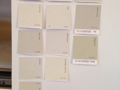
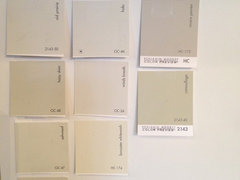
    Here's everything but Overcast:

  • 10 years ago

    Look for the undertones. First determine what undertones you have with the rest of the kitchen especially those color items against the wall.

    It looks like you have red undertones. Look at a color wheel. Any color the opposite of red will intensify that undertone.

    Get rid of ones with the wrong undertone.

    Next, put the remaining samples together and be picky. Be bitchy about why you don't like. That will clear out a few more.

  • 10 years ago
    last modified: 10 years ago

    We did the same at boyfriends Love all those colors but - EdgeComb Gray (to dark in his place), Revere Pewter (to dark and very drab at his place with greenish undertones), Winds Breath pretty but a bit more beige undertones than gray at his place. We ended up with BM Balboa Mist, so pretty and nice greige at his place. My place is going to be painted WindsBreath - just sampled both here. I was hoping the Balboa Mist would work but it was much more gray at my place. Just get rid of the ones you know won't work. When we narrowed it down we painted a bigger area on the walls in different rooms and looked at it for a few days.

  • 10 years ago

    Thanks! I haven't figured out how to easily piece photos together on my Mac. I just signed up for an account on BM so that I could order large color sheets... but I really need to wait until I have the tile in my hands again!

  • 10 years ago

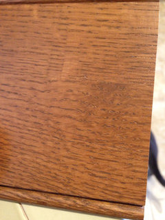
    Is that sample of your cabinet? You really can't rely on what a color looks like to me, because my monitor may not be showing it true to life, but I would rule out Wind's Breath, Halo, and Revere Pewter based on what I see. I just don't think their tone is quite right for the wood.

    I found that taking my samples and chips outside into indirect sunlight helped me to see the true undertone, and to sort into yes/no piles.

  • 10 years ago

    Yes, that's what we're going with for cabinets, but the color isn't completely accurate on my monitor. I've asked the GC/KD to order a full sample door, so we can make a better decision in a few weeks.

  • 10 years ago

    Here's the sample with foam board samples I painted this morning -- they match the small chips perfectly (that is not the tile we'll be using, but I wanted to put something green in there since our tile will likely be green):

  • 10 years ago
    last modified: 10 years ago

    We remodeled our kitchen in 2011 and used Revere Pewter and loved it so much we painted the living room and laundry room with it too. Now we are in a new house and before we moved in, we painted the WHOLE house with it. I love it! Goes with everything. My sister in law recently used it to paint her kitchen cabinets too. It's such a versatile color. I do have to say we did try to color match with Dunn Edwards because that's what our paint guy uses and it was NOT the same. We ended up spending $600 to buy it from BM instead for him to use.

  • 10 years ago

    I'd pick halo....some greige shades straddle cool and warm surrounding elements.....that one looks versatile that way.

  • 10 years ago
    last modified: 10 years ago

    I have Camouflage in my bedroom. I would not call it a greige. It's more of a soft sage green that has always reminded me of eucalyptus in the fog with a bit of sun shining through. Chameleon-like, it shows bits of blue, tan, yellow. If there's gray in there, it doesn't read gray, or I wouldn't have it on my wall. It's really a neat color, the only color--other than creamy white--that I have in my house.

    ETA: pippiep, I think your swatches accurately represent Camouflage. I'm afraid of color on walls, but this makes me happy. I have an east-facing slider and this color never looks dark.

  • 10 years ago

    Yeah, that one is not a greige... it's my wildcard because I like the sample!

  • 10 years ago

    I went to HD had had them match the BM colors as it was much cheaper than the BM samples, which are 5.99. I have found that the sample boards do not provide a true view of the colors. I noticed that they looked very different on different sides of the room, actually. I had a total of 19! samples before I decided on all of the colors for my whole house remodel. BM Revere Pewter. Behr Ashen tan and Swiss coffee trim for both. The other colors were used upstairs and we choose Behr Old map.

    They really do look different depending on if they were in the the sunlight or on the dark side of the room, so samples were necessary.

  • 10 years ago

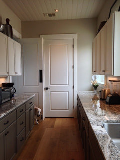
    I found a greige that I loved from SW called Accessible Greige. I am sure it looks different in many settings and lighting. Here it is in our butler's pantry.

    gw · More Info

  • 10 years ago

    We used Edgecomb in our bedroom ...it is so cool, we are thinking about repainting our lake house great room which is now done in SW Agreeable ...

  • 10 years ago

    I have Edgecomb Gray in my kitchen and love it. I painted two guest rooms in Revere Pewter and it looks different in each room because of the light - love both! I sampled Halo and November Rain - I wouldn't call either of those greige. I also used Fog Mist and Collingswood - both are light greige

  • 10 years ago

    I was set on Overcast but with our abundance of overcast skies in our area, I couldn't get past the name (I know, stupid reasoning). A second trip to the store led me to Tapestry Beige, a greige that's very similar to Overcast.

  • 10 years ago

    I got our sample tiles today, and I definitely had some colors to cross off the list. But, we might be changing our plan... the tiles are more a bit more yellow and less green than the sample board we had borrowed. It could be because I have them laying flat instead of standing up, so I'll get some velcro so I can make my own sample board and play with configurations.

    We might go with a white or nearly white tile and do the wall in a more saturated color, like Camouflage. There is only one spot where the tile will meet the wall; otherwise, it goes up against the cabinets. So mostly, the cabinets need to coordinate with the paint.

    I finally got a good photo of the cabinet sample that is more true to color than others I've posted. (The white balance setting on my phone's camera app was non-intuitive!)

  • 10 years ago
    last modified: 10 years ago

    I must have 20 or 30 greige and white paint samples in my garage from trying to pick a wall and trim color for our bedroom/bathroom remodel. We ended up with Edgecomb Gray in the bathroom.

    At first I was afraid I saw a pink undertone during certain times of the day but that went away as soon as we put a darker gray color (Squirrel Tail) in the adjoining bedroom. Now it looks perfect.

  • 10 years ago

    I narrowed my gray down by looking at the undertones,as beachem had said, then I selected 2 and bought those samples. It went pretty quickly. When you lay them all out together its easier to see the undertones. If you are having trouble look further down the same card to the darker colors, you might be able to catch it. Good luck!

  • 10 years ago

    If you are deciding between Edgecomb and Camouflage, then you might want to look at BM Grant Beige.

  • 10 years ago

    Is grant beige more of a tan? Any undertones?

  • 10 years ago

    I guess its not helpful to expand your list. But have you looked at BM Florentine Plaster? I find it goes with a lot in our home. We have nice sage green curtains on a dining room window that it works well with. I never see pinkish cast but do get green undertones in some light. BM Florentine Plaster

  • PRO
    10 years ago

    I have misgivings about greige with your cabinet choice. I'd choose a cooler color such as a slightly sagey green (something like Farrow & Ball's Lichen". If you want greige walls, think about white cabinets instead.

  • 10 years ago

    Oh! We already switched direction and are going with Butter Cookie, which is a green-based yellow. My husband hated ALL the greiges!

  • 10 years ago

    Ooh, I like that color. Especially with your cabinets. I wonder if this is considered more on the warm side. Good choice.

  • 10 years ago

    Our cabinets are arriving on Thursday, so I'll hold up the sample boards to make sure.

    The runner-up colors were Bronzed Beige and Gloucester Green.

    Though if it were solely up to me, I'd probably choose Camouflage. I love that one! It will have to go somewhere else in my house.