Software
Houzz Logo Print
monicamc123

Is gray passe?

10 years ago
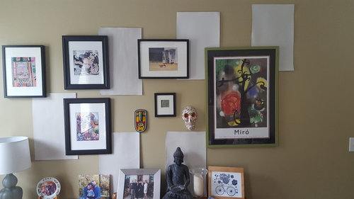
I have posted here recently about finding a great greige color for my home. I've received some great suggestions, but not sure I've found "the one". I hung my top contender paint boards (homemade) today and they all look the same! Ugh! Anyway, I'm considering going darker, but is the gray trend waning? I know the colors of the year from BM and SW were both off-whites, not grays. I don't really want to go too beige, but I think a too light color will look dingy (and I have a 3 yr old and 18 month old who would tear up white walls something awful!). Thinking about picking up a sample of Revere Pewter or Smokey Taupe from BM, but I don't want to come in at the tail end of a trend, so to speak.

In the photo, clockwise from far left:

SW Modern Gray

Behr Wheat Bread

BM Pale Oak

SW Gossamer Veil

BM Edgecomb Grey

SW Accessible Beige

Thanks for any input! I really appreciate any help since this is my first home and want to get it right

Comments (46)

  • 10 years ago
    last modified: 10 years ago

    I like Edgecomb Gray and Accessible Beige. Neither of these colors read really gray to me - more of a warm greige.

  • 10 years ago

    I have Accessible Beige and love it! Not grey, but not beige. It's a cool taupe that I think is timeless and looks great with white trim. Good luck with your decision!

  • 10 years ago

    I know!! I swear they are poster board with two coats of each color, which is why I think I need to go darker...

  • 10 years ago

    I think you need to go darker, unless you want greyish white walls. I don't think Grey is going away anytime soon. It is everywhere, and is a neutral. I suppose, why should beige rule that scene.


  • 10 years ago

    Are you planning on having every room the same color? If yes, it seems a pity when your house can have so much more personality at very little extra cost if you choose a few different colors.

  • 10 years ago

    I think it could be on the wane. but since I personally would never use gray in home decorating, it doesn't matter to me. Unlike Ingrid, I like the uniformity of the same wall color from room to room. Color brought in thru upholstery fabrics, accessories, window treatments, etc. I find to be more exciting than color on the walls. To each his own.

  • 10 years ago

    patty, I've done it both ways. My previous house in MA had different colors in different rooms and my furniture was more neutral. Current house in CA has all walls painted in the same color (BM Grant Beige) and the upholstered pieces are much brighter. I've also collected more art over the years and that makes a statement instead of different colored walls.

    I wouldn't use gray either. Don't think I have anything gray in the house!

  • 10 years ago

    I am also not a gray lover, so take my opinion with that in mind. I actually think the current color of the wall is very nice. If I had to pick from the ones you have, not sure following the listing but the one on the right bottom is the one I would choose. I recognize some of the names and I know that I have liked them but in the photo they don't look too captivating. (sorry- I know how frustrating paint can be. chances are if you picked any of them it would look great anyway)

  • 10 years ago

    Gray is always cold to me, so if you want to go gray, go deeper and warmer with a touch of green perhaps, or yellow.

  • 10 years ago

    I plan to use the same color for most of the house. The bedrooms and bathrooms are different and I'm using the formal living off the foyer as a study that that I'd like to do in dark blue (or something fun like that). Its an open floor plan house with a two story foyer and open staircase in the back of the house. Foyer, family room, kitchen and stairs are all connected, so I want to use one color for the area. But its a big area, so I dont want to have to repaint any time soon!

    The current color looks okay sometimes (like in the pic), but a lot of other times it glows deep gold and makes everything in the house yellow. At night it looks army green-not my favorite :/ I feel like it is a very visually heavy color and I want to freshen things up without going too cool...

  • 10 years ago

    i think it's becoming a little less popular/trendy, but certainly not passe...

    just based on the one pic, i think i would choose the upper left one- the one at 10 ... i would go a little darker too... your current wall color is making it harder for you to decide (and certainly us!!) ...

    narrow it down to fewer colors(2 or 3) and paint larger swatches ... which gray or greige you go with depends on the rest of the stuff in your house, imo... the hard thing with grays/greige is being able to identify the undertones before painting and seeing which undertones 'come out' in certain lights... i avoid grays/greiges in my house that would lean towards pink, purple or blue since i don't care for 'hints' of those colors so much with my furnishings... i tend to choose neutrals with more of a green or gold undertone...

  • 10 years ago

    They all look like drab white paper to me. I would not have gray walls in my house. I think your existing wall color is 100% better than any of your samples.

  • 10 years ago
    last modified: 10 years ago

    Accessible Beige covers every one of my walls, and I couldn't imagine a more perfect color. It's a delicious blend of beige and gray tones in our home. Of course, it all comes down to the light in your own space and the look you're after. I don't think that any color is necessarily "passé". Just because you've seen it done often doesn't mean it's not a good choice now.

  • 10 years ago

    I certainly wouldn't paint every room a different color but have rust red in the dining room, a soft green in what we call the front room and two walls of greenish grey in the living room, the rest is cream. It's a sort of happy compromise between all one color and living inside a crayon box. You already have pretty well the same idea.

  • PRO
    10 years ago

    I really do not understand your concern with whether something is on trend or not - are planning on selling? If not, then just go with what you like and forget about trends. Personally, I prefer gray over beige, but I can work with either. I do not like off-white as a wall color - only for trim.

    Judging by the colors in your art (which I really like), I think gray is a better choice for wall color than beige - I do not like your current wall color at all - it does not show off the art and it particularly clashed with the green frame.

  • 10 years ago

    Thanks Lars! I'm mostly just afraid of grey looking too trendy and it looking dated in a couple of years. We may sell down the road, but mostly I'm trying to avoid repainting anytime soon. I think I'm just trigger shy since its such a large area and I want it to look good :) I'm curious if you have any favorite warm greys...

  • 10 years ago

    As a drapery fabricator, we're still seeing lots of neutral (at least in the southeast) - which includes grey/"greige"/blue-grey, etc. This includes fabrics as well as paint colors. So, no, I don't think it's going anywhere. Have you checked out anything on Pinterest. Find some rooms that you like, go look at the chips and have some samples made up. You're doing well with the sample boards, though I usually use a larger piece. Colors can look completely different room-to-room, even wall-to-wall. Do your upholstered pieces lean more toward beige/cream/warm or cooler colors? Some of the BM colors I've seen....Moonshine, Gray Sky, Silver Gray, Wickham Gray, Stonington Gray, Gray Lake & Gray Cashmere. Sherwin Williams - Ice Cube, Mountain Air, North Star.

  • 10 years ago

    Personally, I think the lighter greys are prettier, especially with white trim.


  • 10 years ago

    I don't think we'll see gray leave any time soon. I too thought that gray might be boring/cold at one point. Then I recently got to see my friends' house in another city where most of the walls were painted gray. Stunning, peaceful, serene, airy, and very comfortable are the ways I would describe their home. They had black framed art with chunky white matting, and it made the artwork display beautifully. Most of their furniture was neutral (black leather couches), but the curtains and pillows were in colorful, lively prints. It really looked fantastic and it felt good to be in their spaces. It made me totally rethink my "gray outlook." : )

    Try putting some larger sheets of white paper behind your gray swatches. You aren't going to get an accurate read of the colors with the competing gold color wrapping around them.

    Also, look up Kylie M Interiors for some gray recommendations. Her web posts and videos where she explains the color nuances can be helpful.

    I wish you well finding your gray!

  • 10 years ago

    I love SW Accessible Beige and Agreeable Grey (very similar to BM Edgecombe). They are not drab or depressive and wonderful neutrals.

    Look at SW color collections --- SW Accessible beige --- is represented in several, and pick some coordinating brighter colors (for the kids' room or bedroom, or powder room).

  • 10 years ago
    last modified: 10 years ago

    I love warm greiges. Modernize the beige a bit without being too cold. (in my house anyways, I can appreciate cool greys in other's houses!)

    ETA: I've had Revere Pewter for over a year and am not sick of it at all. Warmed up some spaces with Ashley Grey (which does have a bit of a purplish tinge)

  • 10 years ago

    Our house used to be all a greige--maybe ten years or so ago--and I remember holding a board painted Powell Buff up and thinking that WOW my house could look all warm like that. So I painted things Decatur Buff, very similar to the color you have now. I'm going to paint in a few weeks, probably with one of the colors you're looking at. And I know it will feel light and airy and WOW for six or seven years, maybe longer, and then I'll probably want warm colors again. It's all cyclical, but it's only paint! I think the colors you're testing look great with your pictures.

  • 10 years ago

    I have SW Amazing Gray in the dining room and Worldly gray in the kitchen and like them both. Worldly gray is step lighter on the same card as Amazing Gray. They both read gray but are definitely on the warmer side.

  • 10 years ago
    last modified: 10 years ago

    Most of our walls are BM elmira white. Love it.

  • 10 years ago

    I also have SW Worldy Gray in the "public rooms" and it isn't cold at all. It has enough beige in it, though not a true griege, it is warm and goes with everything. A wonderful change from total beige I had for so many years along with almost everybody else. Bedrooms are BM Quiet Moments, a light blue-green. Decor is various shades of blue-green, some brown, off-white and a little black. Everyone who comes in mentions how warm and welcoming the house is and they love the walls. Never have regretted the gray in Worldly Gray for a second.

  • 10 years ago

    Louislinus and Peaches--Does your Worldly Gray ever read pink? I love the chip, but was scared off when I saw a couple of pinkish pics online. Peaches, I have Valspar Smoke Infusion (close to Quiet Moments I think) in my bedroom and Sea Salt in the bathrooms, so I think our tastes may be similar :)

  • 10 years ago

    Mine doesn't read pink. FWIW I like the little bit darker Amazing Gray.

  • 10 years ago

    NO PINK! Wouldn't have it still on the walls if it did.

  • 10 years ago

    Hmmmm, I'll have to pick up a sample. I'm tempted to post a pic of all my sample pots because it is truly insane how many I have!! :)

  • 10 years ago
    last modified: 10 years ago

    I try to analyze the formula, it gives clues as to what colors to expect under changing light conditions. I'm not a fan of golds, so if I choose a color that has gold tint, I find a different way of achieving the color without the gold. I have a bathroom painted in what looks like SW Dogwood Pink or something like that but I reworked the formula to get the gold out of the mix. It's so gorgeous and fresh, never feels heavy or like a baby-pink color, a pure soft slightly peach pale pink. But that's in my girls bathroom..... I have Accessible Beige in my living room and front hall, and in my home with the light conditions in these south-facing rooms, it looks like wet concrete. I regret it. Too greenish or gray, it just doesn't work with our furniture and flooring. Oh well. I didn't have time to study the formula because we rushed to get the room finished for a family wedding. I'll repaint it in ten years!

  • 10 years ago

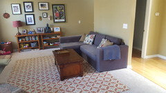
    I'm super analytical too. I feel like this is some sort of code that I can crack. Maybe that's why I'm going a little crazy, lol! Here's a pic of my family room (I've changed out the red lamp):

    It's bright, but North facing-so avoid bluish tints? The carpet has a pinkish undertone-so are yellowish grays out? What about the yellowish maple floor? I have a lot of orangey furniture, so avoid anything with a green base? I kept going lighter to avoid problems, but that's how I ended up with all the white samples in the original pic. Ugh, I know I'm being overly analytical! I just feel with soooo many options, one gray/griege is the best choice. But which one.....that is the million dollar question!

  • 10 years ago

    I love gray. I just painted my entire home SW Unusual Gray with the exception of the sunroom, which is yellow. I would rather have white walls or gray walls, and I have never really liked beige or off white.

  • 10 years ago

    I don't think gray is passe (nor would I worry about what's considered passe if I like it), but I strongly agree with laughablemoment's comment-you have to look at your samples with the white background, because otherwise you won't never be able to read the colors correctly..just by being surrounded by warmer color, all of the grays will seem more cold..and they will seem lighter too, since the background is darker right now.

    (By the way I like your current color too))

    Put each sample on a bigger white piece of paper, move each one around the room..see whether it goes with the floor, with the furnishings..how it behaves next to a window, how does it feel to look at it in artificial light...etc, etc.

  • 10 years ago

    Definiely look at the samples against white. If you find a color you like but it seems too light, you can ask about tinting the paint at 150-200% of the color (when you start with a light color, 150% of that pigment still gives a farily light paint color). Sometimes there is something on the strip or another paint color pretty close, but often they have a bit more or less of one color and it can read dofferently.

    All the colors you are looking at in those samples are going to be a lot lighter on the wall than what you have now. Is making the room lighter one of your goals for the room? The samples at 10 and 5:30-6:00 on you wall in the first photo seem like the best tones, but I might like a bit more of the color -- hard to say without seeing it against a clean white.

  • 10 years ago

    I would also recommend Kylie M. Interiors. She has been helping me also with a north facing room. From what I'm learning, generally greens and grays are not best for north facing rooms and I have found that personally to be true. So I am looking at some warm colors. Now warm grays may work in a north facing room but I wouldn't think cooler grays would work.

  • 10 years ago
    last modified: 10 years ago

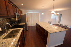
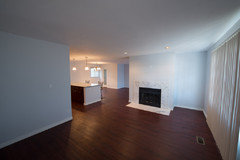
    I just finished painting an entire house BM Touch of Grey. Buuuuuuuuuut.....as you can see the granite in the kitchen is grey, the Carrara Bianco marble around the fireplace is grey....and so on....it ties in.

  • 10 years ago

    Grey is very popular here. If you look at home listings, new construction, etc., you will see a lot of grey.

  • 10 years ago

    Not a huge fan of grey... It reminds me of institutions and industrial buildings. That being said I did have a bedroom in our beach house painted gray recently, however it was more of a warmer grey. I used SW Agreeable Grey.

  • 10 years ago

    Love gray, always have, always will. Choose the gray that works for your surroundings, NOT what is on trend.

  • 10 years ago
    last modified: 10 years ago

    First -- what Maddie and others have said -- paint for what you enjoy and what goes with your home and furnishings. Trends are what designers and vendors show to keep something new to buy always out there, but you should live with what you love.

    Keep in mind that color names and groupings are as much about marketing as anything. I have Agreeable Grey on my walls and I find it funny that it is called a grey. It is as much beige (softned or muted) as grey. It's kind of in the natural linen family. In years past it would have been called a stone color or maybe a sand - something that suggested a more natural and warmer neutral.

  • 10 years ago

    I agree SO much about the names-they can be quite deceptive. I did not want to go with white, but after many samples that didn't feel quite right turned to the whites family-and there it was where I found my main neutral. It's not really white:) As for grays they all felt cold in my place, even the warmer ones..they looked amazing everywhere but my walls lol..in the end I mixed a perfect greige color of my own..

  • 10 years ago

    Thanks for the tip about the white background. It really does make a difference!

    The names are funny. Edgecomb Grey looks more beige and Accessible Beige looks more gray-go figure!


  • 10 years ago

    Color names have their way with us. Who would go for Disagreeable Gray or Inaccessible Beige?

    Kidding aside, based on lots of discussions on good grays in general, it seems that Sherwin Williams gets mentioned a lot. Do they have a wider range of grays than, say, BM?

    While I don't care for gray interior walls, at least not in my house, my house's exterior is gray and white and I adore it. It's about time to repaint and I will keep it gray, but am thinking a shade deeper. No mauve or blue undertones. Slight green or beige is okay.

  • 10 years ago
    last modified: 10 years ago

    When I moved into my current house in 1991, the living, dining central hallway and kitchen areas were white. All bedrooms and the bath and the half-bath were grey.

    If you like grey, it is NOT passé. If you dislike grey, it isn't passé either, it is just something you (and DEFINITELY ME) prefer not to live with. Paint what you like. Don't worry about terms such as "passé" or "dated". Seriously!

    (My house exterior is grey cedar shakes. There, the color doesn't bother me! I had the house re-painted on the exterior about 7 or 8 years ago, and I stayed with the same color so that the process would need just one coat.)

  • 10 years ago

    At least 1/3 of my wardrobe is gray. If a sweater comes in several colors, including gray, I will get the gray for sure! I'm constantly in search for gray undergarments as well as shoes, or at least something in a pewter shade, but not silver. I dont like, or have ever owned a silver or gray car, never. Light fixtures, bath/ kitchen faucets, door/cabinet hardware, no silver. The only silver or gray I have in my life which I have no control over, is the 'new' hair color growing on my head.