Software
Houzz Logo Print
leah_pickard0

Ugliest house on the block needs curb appeal ideas

10 years ago
last modified: 10 years ago
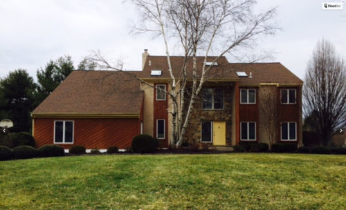

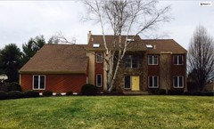
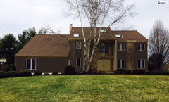
My husband and I just bought an 80s contemporary and are dying a bit on the inside at the architecture and curb appeal. We joke that we have the ugliest house on the block--but in all seriousness it is. We're looking for ideas on how to minimize the "contemporary" look or at least update it somehow. We are open on anything from changing paint colors, to more significant improvements like switching out materials (adding siding, different windows, new roof lines, etc). Help us!!

Comments (27)

  • 10 years ago

    photo hasnt arrived... but we've seen some pretty ugly ones here so we're ready....

  • PRO
    10 years ago
    The red stain on the siding plus the yellow door are really ... Interesting ... With the stone and stucco. Depending on budget paint is cheap, go for a more monochrome look so the materials are the star. Lose the terrible meatball bushes for softer landscaping. Don't add anything from an earlier era like shutters or divided light windows...
  • 10 years ago

    if i was going to spend some money i'd change the section of diagonal siding. odds are you're having leaks from it as it was frequently installed improperly and rain follows the boards down to the sill.

  • PRO
    10 years ago

    New roof in black.

    add a front porch

    get rid of the window next to the front door and replace it and the door with a beautiful double door.

    Paint entire house in light soft gray.

    add hefty trim around all Windows and paint out white.

    add another window on the long Span on the left side of the house.


    Leah Pickard thanked Home Interiors with Ease
  • PRO
    10 years ago

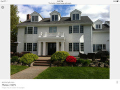
    Love this home And porch seems like you have the space out front to add something like this.

  • PRO
    10 years ago

    Hello Leah,
    I think you may be surprised to find that with some of the modifications and some careful visualization/design work you will find a way to make your home very attractive. It has some good bones, and not to single an architectural style out, but at least it's not a raised ranch. All joking aside, your home has good proportions. I agree that a covered entry may be a good idea, though keep it modern and clean. Not sure changing the direction of the siding is necessary, definitely a study in different color palette options is needed first. I would do a landscape rehab but I wouldn't jump on removing anything yet. The theme of this post is hire a pro to do the design homework it could save you a tremendous amount of money.

    - Charles

  • 10 years ago

    When you say it is the ugliest on the block are you saying it is the only contemporary? What do the other houses look like? Are you trying or hoping to "fit in" better?

    I think I need to know what exactly you are trying to achieve in order to give you direction.

    TY

  • 10 years ago
    last modified: 10 years ago

    @visualizemaven The other houses in the neighborhood are 80s traditional colonials. Siding, shutters. Very symmetrical. I'm not sure we will achieve that, but I'd like to downplay all of the textures (maybe just the wood?) on the house. The stone in the covered entry way is beautiful but I think is overshadowed by the dark wood.

  • 10 years ago
    I don't think your house is ugly; you should embrace its individual style. It does need updating though. I am not to crazy about the white window trim, that I would paint out in a darker color. Your roof looks a bit tired, are you planning on redoing it? I also am not fond of the diagonal boards on the front. That looks very dated. Is that white birch as close to the house as it appears? It might be nice to rework the front door/ side window area and enlarge the front deck. New landscaping would really look wonderful. If this were painted a more neutral color ( all one color) it would look less choppy and enhance the stone which is very pretty.
  • 10 years ago
    Sigh, we need Grover!
  • 10 years ago

    True... but to comment on slightly related thing and that's the tree which doesn't seem ideally placed, at its height anyway.... ?

  • 10 years ago

    I am bothered by the confining wall to the left of the door so I scribbled it out as well as the plants hiding the landing. The wall could be replaced with a column if needed.

  • PRO
    10 years ago
    Home Interiors has hit it...that vertical siding SCREAMS the 80's. I'm bothered by how oppressive the left side is compared to rest of the 2/3's. The roofline on that part seems awfully heavy. This is quite the project monetarily.
  • 10 years ago
    Unfortunately the roof is only two years old so we won't be replacing it anytime soon. So we are stuck in a more tan/brown color scheme, right? The tree is very close to the house and we are thinking about removing it. It's pretty but probably going to start causing issues.
  • 10 years ago
    "Mushroom bushes" ...... Haha, I like that description!
  • 10 years ago
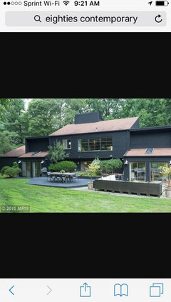
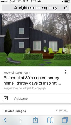
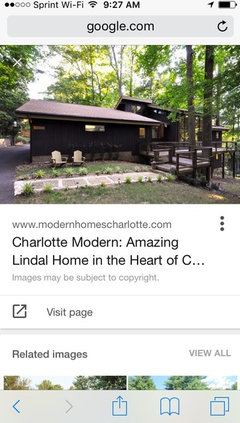
    I googled eighties cont. and lots of interesting stuff came up. I do think if you simplify your paint scheme it will help a lot. Some inspiration
  • 10 years ago

    Keep the contemporary style but update it like lynartist has suggested. It's best to play up the unique features of the house. I think a nice blue or red door would make a difference as well as having the rest of the house as monochromatic as possible.

  • 10 years ago
    Do not remove the wing wall and replace with a column! The house does not lend itself to that type of style. Embrace what you have. Paint the stucco one of the mid range colors of your stone. Paint your front door your favorite color. Then redo your landscaping. The house has good bones.
  • 10 years ago
    I agree with Theresa. Some of the ugliest houses are the ones where someone tried to change the bones of a house and failed. Embrace what you have and make it the best 80's Contemporary out there. All of the ones I have seen that still look good today used weathered, natural colors to blend with the stones and surroundings. Ditch the garish colors and have fun!
  • PRO
    10 years ago

    Leah we don't think your home is ugly! We think it's got a lot of character! We recommend doing away with the yellow door. A door finished with a Log & Siding stain in Mahogany would look great! For the siding, we recommend that you clean the home first, then pick a solid stain color that would go nicely with the door, such as a cedar color. If the wood is in good enough condition, you can use a semi-transparent rather than a solid stain. We think the white trim looks great!

  • 10 years ago

    Looks like that house has good bones - despite having too many types of surfaces. Is that brick - in addition to stone? Then vertical siding and angled siding?

    While I personally pause at painting brick - in this case it seems required. Because I'm avoiding drudge things on my to-do list - played with colors. Not changing the roof, changing the entry door to a double door (this gives a huge improvement, high-five to Home Interiors With Ease). My colors aren't right but that scary red is gone. (And yes, that birch in front isn't really helping much - I'd hide the brick, not the stone.)


  • 10 years ago
    So it's wood siding, stucco, and stone. No brick. Sorry the picture is dark. But I love the visual of minimizing the various surfaces. And the double door is a great addition for sure! We plan on taking out the tree too. Thanks for helping me see some potential!
  • last year

    And the tree remains! The miracle of paint in an appropriate color works again. Thanks for the update and good work.

    Leah Pickard thanked gurukaram
  • last year

    Yes, the tree ended up getting an "all clear" from an arborist so we will keep it for now. I do wonder if it's getting too big, but its very pretty to sit on the porch under it.

  • last year

    Very nice improvement!

    Leah Pickard thanked doods
  • last year

    What a difference! Most people don’t return with updates and here you are nine years later.