Software
Houzz Logo Print
maddielee49

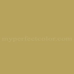
World's Ugliest color

10 years ago

Yup!


Pantone 448c


Link

Comments (61)

  • 10 years ago

    The dark colour is not one I would likely choose, but I don't find it offensive. That nail colour TR posted, however, ick!

  • 10 years ago

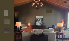
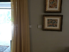
    Artillary, your wall looks great in your room. It may be a little more olive?

  • 10 years ago
    last modified: 10 years ago

    Pretty ugly, but I think that Jen's "Bashful Bile" is definitely the ugliest color I've seen. And on nails yet!

  • 10 years ago

    My son recently painted his LR and guest bath what sure looks like the exact color, Mississippi Mud. It's either Behr or SW. He loves it! Me? Not so sure, but he'll never know!

  • 10 years ago

    I'm rather surprised that it was voted the ugliest color. I don't think it would fit my decor but I could live with it more easily than "Bashful Bile" to which I have an almost visceral reaction. As a house color that purple-mauve is atrocious but if it were the color of a flower it would be pretty. The green on that house is pretty darn awful and I think there are a hundred better greens. Nevertheless, my vote goes to "Bashful Bile" as the most horrid color of the year.

  • 10 years ago

    Maddie, what do you think is the world's prettiest color?

  • 10 years ago

    Not maddie, but I think Tiffany Blue might win a few votes. I watched an old movie with my son several months ago, I think it was It's a Woman's World, or something similar. One of the houses and the hotel rooms were painted a subdued TB, and it struck me as beautiful.

  • 10 years ago

    It's hard for me to pick an ugliest or prettiest color as so much depends on context. I really don't like spring green...except in the spring time, when the birch trees just start to leave, it's a wonderful exciting color. I don't like chrome yellow but Van Gogh used it to incredible effect. I'm not a fan of shocking pink, but I've seen some really cute girls' outfits in that color. So I guess I'd say, it depends.

  • 10 years ago

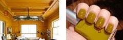
    However, the bile fingernail color appears as a shadow color of Chijim's "narrow room" post. The room is yellower and less green, but the shadows get more bilious.

    This is one of the problems with evaluating a color with no context: There are bits of each photo cut and paste into the other.

  • 10 years ago
    last modified: 10 years ago

    whereas the exchanges between the Pantone color and Aktillery's room are not nearly so close: the undertones are completely different.

  • 10 years ago

    I was going to say the same thing pal did about bashful bile and the sitting room.,

    its a very Provence sort of color.

    i once had an ugly swing coat that I swear was school bus yellow. I don't know why I bought it.

    And I have a Chanel tote bag that DH calls Baby Potty Yellow. I wanted something that looked good w black, grey and navy. But not red.

    I like the new color.

  • 10 years ago

    The top color is one of my favorite colors.


  • 10 years ago

    I like both the original poster's and TR's. If I wasn't so afraid of making a mistake...

  • 10 years ago

    I would rather paint a room

    in the "worst" color or the bike over vossy's green house photo. (Sorry it that is your actual house-that is just a green I don't like)

  • 10 years ago

    The first thing that came to my mind was "Army green".

    I have seen this green look nice with browns on craftsman homes in Pasadena, CA. I don't care for purple, magenta or pink on exterior surfaces because of the contrast with the greens of the landscape. I did see one pale purple and grey home in a desert environment that was pretty. It might have looked wonderful at sunset. The sky seems to stretch out in that area of the desert and plays more of a role because of the scarcity of trees and mountains. Sunsets can put beautiful colors on walls there. A beautiful sunset might have made those walls glow.

    One of my least favorite colors on a wall is what I call Pepto Bismol pink.

    I like pink.

    Just not that pink.

  • 10 years ago
    last modified: 10 years ago

    Yep, military vibe

  • 10 years ago

    Fun thread! Would love to see more "ugly" colors. Actually, IMHO theres no such thing as ugly colors - only ugly color combinations. Color is all about how its relating to other colors surrounding and reflecting off of it.

    And as filtered thru our cultural biases too,

  • 10 years ago

    That's very similar to the color in my front entry hall.

  • 10 years ago

    I'd have to see it painted on something to know if I liked it or not.

  • 10 years ago

    Palimpsest, nice to see you back.

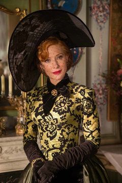
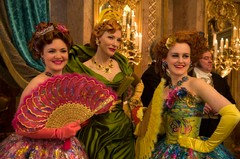
    The Bashful Bile reminded me of Cate Blanchett's wardrobe in Cinderella (and the evil stepsisters). Of course, the costumers were trying to make her look evil (or maybe poisonous).

    Source: http://www.comingsoon.net/movies/news/387685-cinderellas-newest-poster-introduces-cate-blanchetts-wicked-stepmother#/slide/37

    I agree about context. I had a color called pumpkin bread in an office and loved it (pretty much like it sounds, on the border between orange and tan). I used the same color in a bathroom and hated it, because the context (using the toilet, pardon me for being blunt) changed the way I interpreted the color.

  • 10 years ago

    The so-called "Bashful Bile" is not a far cry from BM's Wasabi. I like Wasabi (and considered it for my previous home), but in the end I have to say that it is a color that might put me ever-so-slightly on edge.

    Color is so subjective, contextual, and personal.

  • 10 years ago
    last modified: 10 years ago

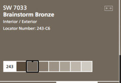
    What is really unusual is that here is the sample on line of my color on my walls.

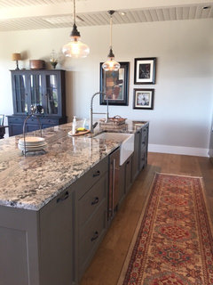
    Another photo of it in my space. Used in on the island.

    gw · More Info

    gw · More Info

    Above photo under construction. The sample reads milky brown and in my house it reads deeper olive gray green.

  • 10 years ago

    Yeah, pepto bismol pink is a rough one! It's an interesting color as they were using it in holding cells because pink seems to initially have a calming effect on people. However they found that the effect was short-lived and that they ended up becoming more aggravated. Is it any wonder?

  • 10 years ago

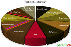
    Speaking about the color of baby poo...I came across this. Never knew you could chart it!

    Could it have been inspiration for the colors in this room???


    Funky and Fun Living Room · More Info

  • 10 years ago

    I agree it depends on a context; no ugly colors for me, just bad combinations/wrong surface/wrong amount of it. And personal connotations that are so different for everyone..

    I for example can't take yellow and black together even though it's pretty; I think I was scared once in a yellow and black tiled room(don't remember what exactly was it..some public space), when I was a little girl..

  • 10 years ago
    last modified: 10 years ago

    Ida's nail polish example is repulsive to me, context or no. And I agree, a color can be ugly to us in the way it is used, or in combination with something else. I think the Pantone color is ok. It's similar (I think) to colors we're considering for re-painting our shutters, but maybe a bit more olive.

    I meant to add that, back in around 1967-68 iirc, I had a pair of patent shoes that were approximately the Wasabi color. They matched a plaid mini-dress. I felt so 'Mary Quant' in that outfit! Wish I had a photo of that!

  • 10 years ago

    I have tackled almost all the rooms in moms house. Kitchen just needs a coat of paint til I can afford to replace some cabinets


    the other room...the bathroom that I had picked a soft pallet of warm mellow yellows but dad heard that holding cell story and you guessed it...pepto pink. Ack!!!!

  • 10 years ago

    Part of the problem with "bashful bile"is the name. If it were 30 years ago and you called it "Tuscan stucco" it would've been more popular. I don't know what I'd call it today… Maybe something meaningless like "farm to table". That always seems to work. For a long time my favorite nail polish was called "shanghai express"… What color is that?

  • 10 years ago
    last modified: 10 years ago

    I can't imagine being in prison in a pepto pink room. I'd go nuts.

  • 10 years ago

    I wanted to be sure that bile truly is that color, so I Googled it. You can thank me for not posting the photo of the actual plastic bag full of the putrid-colored liquid, but I swear - it was the exact, same color as those fingernails. ;-)

  • 10 years ago

    One of the walls in my apartment is painted the first color. i don't love it, but it isn't hard to live with.

  • 10 years ago
    last modified: 10 years ago

    I don't really think there is a ugly color. It depends on what it's mixed with. Bashful bile would be pretty with some blues and lavenders but not blood red. There was a big McMansion in my old neighborhood painted Bashful Bile with blood red trim around everything. It looked like a putrid bleeding ulcer and I felt sick every time I looked at it.

  • 10 years ago

    There are no ugly colors.

  • 10 years ago

    But if there were "Bashful Bile" would be in my top five.

  • 10 years ago
    last modified: 10 years ago

    IdaClaire, I really like that yellow .I've been thinking of adding one decorative pillow to my navy and white bedding that is that color with perhaps a tinge more brown to it? Closer to baby poo. Lol .

    I also have to say I don't mind that first color and that I also HATE Peptol Bismol pink. And I'm not sure what color it is, but that green/blue that was used back in the 50's on appliances . Now perhaps I don't really mind the color, but just don't like it used in that way. I think I'd like it on a summer shirt. I think I'm thinking of a more mint color .

  • 10 years ago

    This is one of my most favorite colors! It's so earthy, deep & rich. My favorite house by Ken Pursley in GA (lake house always showcased by Southern Living) is done in similar pallet of colors.

  • 10 years ago
    last modified: 10 years ago

    Well, I must admit having seen that color brings back a not so fond memory of my DD's diaper. :-(

    I love Aktillery's bronze color, and had no such reaction, so obviously it's not reading the same on my iPad anyways. :-)

  • 10 years ago

    I would like the color matched with a saturated shade of raspberry.

  • 10 years ago
    last modified: 10 years ago

    Well, I'm biased, but I like the bashful bile a lot. It is a super-flattering color on me to wear. I'm not sure I liked chartreuse, lime, or olive greens before I noticed what they did for me, but now that I know how flattering they are, I generally am excited to see them on clothing in a store. I guess it's spilling over to general enthusiasm for the color.

    My eye color is yellow green, somewhat like this (below), so if Bashful Bile were a dress color, it'd match my eyes. Plus colors with strong yellow undertones (yellow, orange-red, lime green, olive, turquoise) tone down some unflattering ruddiness in my complexion:

    I totally agree with the poster above who said there are no ugly colors, just ugly combinations. Probably everything's got a good context and a seriously unfortunate context.

    P.S. "Being worn by Cate Blanchett" seems to be a GREAT context for all colors.

  • 10 years ago
    last modified: 10 years ago

    I agree with everything said about context. But speaking of liking or not liking colors, I'm in the camp of liking the new ugly color.

    One I had a visceral reaction to was a recent Pantone color of the year. It had violet in the name..Just looking at it I could smell cheap floral air freshener.

    ETA It wasn't violet, it was Radiant Orchid

  • 10 years ago

    "Well, I'm biased, but I like the bashful bile a lot. It is a super-flattering color on me to wear. I'm not sure I liked chartreuse, lime, or olive greens before I noticed what they did for me, but now that I know how flattering they are, I generally am excited to see them on clothing in a store. I guess it's spilling over to general enthusiasm for the color."

    Well, no wonder you like it... the real color name of the bashful bile is Aged Chartreuse.

    I also like it..... would look fabulous with charcoal, black, navy, turquoise, burnt orange, platinum, deep plums, eggplant, summer plum....and with the right combination of other colors, even aqua. Teal!! Blue/Green Teal.... but can even see green/blue teal.

    I have a beautiful lumbar pillow in one of my rooms and it is very, very close to that Aged Chartreuse shade. It is called Lemon Curry....and it is in a room with burnt orange, charcoal, blacks, lighter grays and amethyst and eggplant.... along with mixed metallics....it is open to a room that is Retro Avocado with accents of Ocean Abyss... a gorgeous blue Teal...which is open and visible from both these rooms to the third room which is the Retro Avocado with charcoal, Ocean abyss/teal and hot pink accents... all of these colors look fabulous together.

    If you ever want to find a fabulous color between a chartreuse and an olive.... Behr Retro Avocado is gagaga G.O.R.G.E.O.U.S.

  • 10 years ago

    The very first color shown at the top of this thread - my neighbor down the street just painted his house this color. With bright white trim. I LOVE it. It looks wonderful.

  • 10 years ago

    I don't dislike the 'ugliest color' in the first post, it's a nice dark neutral that goes with lots of other colors. The only color I've ever had a very anti feeling towards was acid green, that it became popular during my HGTV (and the like) watching days was quite dismaying, it was so hard to avoid as something in any room makeover included that color, it almost made me ill seeing it (and so frequently).

    I never really disliked pepto pink in small doses until I decided to paint my home office Coral Flower, on the chip card and swatch I painted it was so pretty... but on the walls it was the closest thing I've ever seen to pepto, so overwhelming in a small room. It only lasted until I could decide on another color (a very pale green), what a relief.

  • 10 years ago

    Well, I must have been way ahead of the trend when I picked the new trim color for the house we lived in from 2003-05.

  • 10 years ago

    That fleshy bandaid color is truly ugly, and I've seen houses painted in it.

  • 10 years ago

    Just so sick of everything grey, grey, grey!

  • 10 years ago
    last modified: 10 years ago

    My mom bought a house once that was freshly painted sort of a peach/terracotta stucco (yes kinda bandaid color mayflowers) with a reddish/burgundy trim. I had seen it paired before, so it didn't completely surprise me. Granted it would NOT be something I'd pick. But seriously, everyone we polled thought it was the most hideous combination that they had ever seen. FWIW....:-)

  • 10 years ago

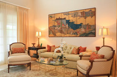
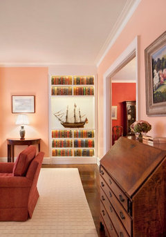
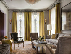
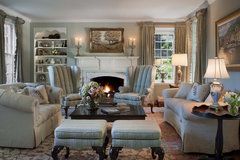
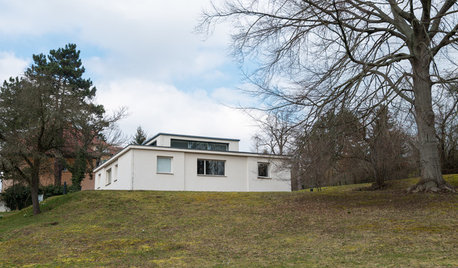
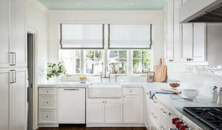
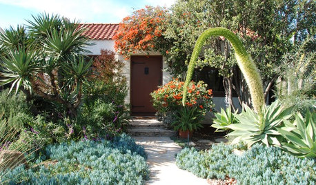
    Context is important


    Classic Traditional · More Info

    Bookcase Built into Living Room Alcove · More Info


    Jackson Street 1 · More Info


    Addition to Traditional Okie Style House, Bryn Mawr, Pennsylvania · More Info


  • 10 years ago

    Yep. I have bile in my home lol. It's everywhere.

  • PRO
    10 years ago

    Fuchsia and magenta are my unfavorites.

    In the old gardening books they would warn against using apricot-colored flowers because according to the tastes of the Edwardian era, "nothing harmonizes with them".

    The original color is an extremely dark shade of neutral bronze, it would work well with anything IMO.

    Casey