

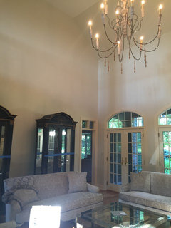
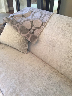
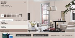
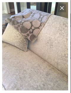
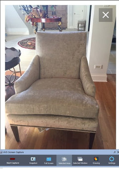
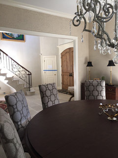
What's with a western exposure....my walls are green!
10 years ago
Featured Answer
Sort by:Oldest
Comments (20)
 PRO10 years ago
- 10 years ago
Related Professionals
Ocala Interior Designers & Decorators · Vicksburg Interior Designers & Decorators · Rocky Mount Interior Designers & Decorators · Athens Interior Designers & Decorators · La Grande Interior Designers & Decorators · Evanston Interior Designers & Decorators · Gaithersburg Architects & Building Designers · Omaha Architects & Building Designers · Santa Rosa Architects & Building Designers · Saint George Architects & Building Designers · Magog Architects & Building Designers · Roanoke Kitchen & Bathroom Designers · Champaign Kitchen & Bathroom Designers · Hobbs Kitchen & Bathroom Designers · Pocatello Kitchen & Bathroom Designers 10 years ago
 PRO10 years agolast modified: 10 years ago
- 10 years ago
 PRO10 years ago
- 10 years ago
- 10 years ago
 10 years agolast modified: 10 years ago
- 10 years ago
- 10 years ago
- 10 years ago
- 10 years ago
- 10 years ago
- 10 years ago
 10 years ago
- 10 years ago
- PRO10 years agolast modified: 10 years ago
- 10 years ago

Related Stories
MODERN HOMESMy Houzz: Modern Exposure and Energy Efficiency in Toronto
A Canadian architect transforms an outdated bungalow into a thoroughly modern family home
Full Story
GARDENING GUIDES6 Plants for Colorful Fall Foliage in the Water-Wise Western Garden
Try these colorful, drought-tolerant additions to your garden for a fall season filled with color
Full Story
GARDENING GUIDESGreat Design Plant: Western Sword Fern Adds Prehistoric Drama
For distinctive looks and easy care in a shade garden, go for North American native Polystichum munitum
Full Story
HOUZZ TOURSMy Houzz: New York Farmhouse With a Western Feel
Fourteen acres, 30 animals and 2 owners who love country style make for one happily traditional farmhouse
Full Story
CONTRACTOR TIPSBuilding Permits: What to Know About Green Building and Energy Codes
In Part 4 of our series examining the residential permit process, we review typical green building and energy code requirements
Full Story
GARDENING GUIDESGrow Your Own Privacy: How to Screen With Plants and Trees
Use living walls to lower your home and garden's exposure while boosting natural beauty in your landscape
Full Story
COLORThe Best White and Pastel Colors for Every Kind of Natural Light
Understand how sunlight affects your rooms and get tips on choosing paint colors for each type of exposure
Full Story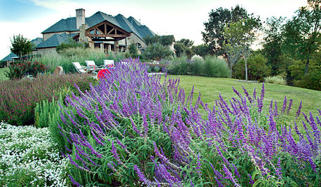
GARDENING GUIDESGreat Design Plant: Salvia Leucantha
Soft, velvety purple spikes gracefully arch over the gray-green foliage of Mexican bush sage in spring through fall in western U.S. gardens
Full Story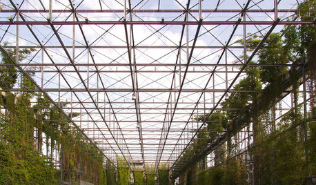
URBAN GARDENSA Vertical Park in Zurich Greens Up the Grid
This breathtaking mix of steel and vines in Switzerland shows promise for greener, healthier cities around the world
Full Story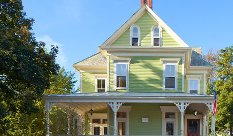
COLORColor of the Week: Spring Green
Spring has finally sprung for many of you — and here's how to bring some of that green inside
Full Story


BeverlyFLADeziner