Software
Houzz Logo Print
anniedeighnaugh

Do you like this room?

10 years ago

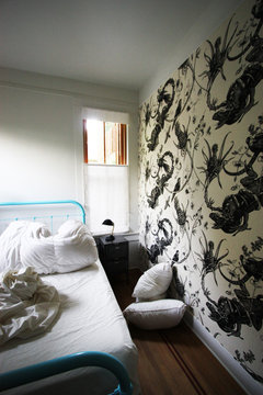
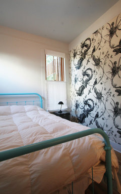
There's so much I could say about this room, but I don't want to sway you. Tell me what you think...


Transitional Bedroom · More Info

Comments (60)

  • 10 years ago

    Just. Not. The. Thorns. Otherwise, the floor is nice. I'd donate the bed to Salvation Army.

  • 10 years ago

    I have mixed feelings. I like the colors, bed, wallpaper and floor. On the other hand, I don't like the light fixture and the furniture seems shoved to the end of what appears to be a larger room.

  • 10 years ago

    I don't like it at all.

  • 10 years ago

    I've seen worse.

    It's a tough shape for a bedroom.

    The greens clash for me. My grandma had beds like that...but painted white. It's decked out like a hospital bed from the Great War.

    Is that the best wall for the bed? We don't know. But maybe the bed can go on the white wall?


  • 10 years ago

    I think the floors and moldings are nice, the ceiling fixture looks strange flush-mounted, the wallpaper is interesting graphically but perhaps is not restful, the color of the bedframe is appealing, but the bedding needs to be different to pull the room together. It takes a deft hand to mix white and off-white and to make an eclectic room look cohesive and I think this room could benefit from that deft hand.

  • 10 years ago

    It's trying much too hard too look like they didn't try at all, it's disingenuous.

  • 10 years ago

    I only like the floor.

  • 10 years ago

    I like the room, floor, wallpaper, the bed. But not the high mattress on that sweet antique bed, nor the bedding/color of the throw. The light fixture seems meh, don't really like it in the room, but wouldn't hate it in a different room. Interesting how beautiful some of the other rooms that design co has done; this just doesn't seem to fit the portfolio.

  • 10 years ago

    It makes me feel sad and depressed. The walls are bare, the bed to me is ugly, there is no art to look at, nothing beautiful to hold your eye or capture your imagination. The colors are not warm and cozy, which is what I would want in a bedroom.

  • 10 years ago

    Can't say there's really anything I like about it...


  • 10 years ago

    I have to say it never even occurred to me that a pro would have done that; it reminds me of some of the cheap B&Bs I used to stay in when I was a student in London in the 70s, although they would have had different wall paper on each of the other walls, not plain.

  • 10 years ago

    Ink blot psych test?

  • PRO
    10 years ago

    Like the odd shape of the room, but not the decor.

  • 10 years ago

    I like the room itself, the floor, window, mouldings and different whites with the unusual angles of it look wonderful. I don't like anything that has been added to it though. None of it seems to work together or work in that room at all.

  • 10 years ago

    I don't care for any of it.

  • 10 years ago

    Minus the light fixture I like each item but not together. Also, it is very sparse and bare.

  • 10 years ago

    Where is the picture taken from? Is that the ENTIRE room? Seems we are getting only a corner of it. I agree the floor is a keeper.

  • 10 years ago

    like just the floor.

  • 10 years ago

    Wow, have we ever been so consistent on our take on a room? I don't think so

    There's very little I like about it. The floor is lovely, the shape doesn't bother me, the trim molding is nice, but from there, it goes downhill fast. I want something soft to put my tootsies on in the a.m. so at a minimum I want a rug on the floor. The wall paper is anything but relaxing...are those artichoke blossoms? The whites don't work well together at all...they look like an accident. The color scheme isn't really one as nothing relates to anything else. In fact it would seem to ensure that nothing relates to anything else. That ceiling fixture is just weird...maybe in a good way in a contemporary space, but I doubt it. The side table is just way too small, the light fixtures by the bed are all but invisible. The placement of the bed could be improved by sliding it down the wall. The window treatment would seem to ensure no one could sleep past sunrise. I've seen people do that "casual toss" of an afghan or whatever for a picture, but to leave the bed skirt crumpled?

    No thank you.

  • 10 years ago

    Apparently the designer really liked the look though as they did it again in another bedroom with iguana wall paper.

    Iguana wallpaper! · More Info


  • 10 years ago

    How funny Annie! I was going to post the same thing. Also they seem to like the same bed and color!

    Eclectic modern whole house remodel and addition · More Info

  • 10 years ago
    last modified: 10 years ago

    What can I say, AKT? Great minds....

    ETA: At least in your shot, they made the bed!

  • 10 years ago

    Institutional Chic.


  • 10 years ago

    I do now kind of like the turquoise paint on the bed now. But iguana toile wallpaper, that is a new one!

  • 10 years ago

    Nope. I like the bed just not in that room.

  • 10 years ago

    I don't mind the wallpaper but the white white walls, the bedding, frame and light are NMS.

  • 10 years ago

    I know that iguana wallpaper(that exists also in fabrics) etc..it's one of my favorite patterns ever. I think it's by Timorous Beasties, but don't want to check right now..might be mistaken. They come in all different colorways..black n'white is a little harsh. I also love thistles.

    I like the room itself..they show us the corner only, but it's hard not to like all the details-the floor, the baseboards, the window frame..

    Otherwise, I think it's a fail. It's a miscalculated "devil may care" try for simplicity..

    Because it's obviously not "devil may care", it's trying too hard-and missing.

    If I didn't know anything about the price of that wallpaper-I'd be fooled into thinking that whoever lives there just arrived, and is saving money, or just is not into design at all, not everyone is..

    But I do happen to know:)

  • 10 years ago

    I think I'd have bad dreams if I had to sleep there. Makes me think of Flowers In The Attic - or just the thought of being trapped in a tiny little attic room.

  • 10 years ago

    Yeah, that's expensive...the wallpaper translates into about $60 per yard!

  • 10 years ago
    last modified: 10 years ago

    That's what I was getting at. The wallpaper is expensive. The one bedroom has Tolomeo sconces at about $350 a pop. The little black lamp could be a $600 Kaiser Dell task lamp. The ceiling fixture is $450 or so. I am assuming the locker side tables are also an expensive version of something that could be found inexpensively. It's trying to look left over and thrifted but it's actually a pricey room. Even the beds are probably new and custom powder coated.

    I actually like the individual elements.


  • 10 years ago

    My first thought: monastic. Many years ago, our administrative team from work went on a strategic planning retreat. We stayed at a nearby monastery, which was ideal for this purpose. The sleeping rooms were stark, bare, clean, devoid of distractions and ornamentation except, of course, for the obligatory cross on the wall. Their worship areas were beautiful, though.

    That's what this room reminds me of.


  • 10 years ago

    I actually do like the overall room. The color combination and the simpleness of it. With a few refinements (i.e. the light fixture) I think it would be a nice room. Throw in a simple rug and maybe a black and white picture and it would be nice in an appropriate older house.

  • 10 years ago
    last modified: 10 years ago

    Apart from floors and molding, I do like the white walls and light blue ceiling. Like the turquoise bed frame but would put the bed against the window wall, perhaps white flouncy sheers or velvet curtain wall. Definitely my white lambskin rug, and absolutely get rid of the wallpaper and green blanket.

    Oh, and looks like I'm the only one who likes the light fixture.

  • 10 years ago

    Expensive doesn't necessarily mean tasteful. Like the bed and color of it. Otherwise, just does not work.

  • 10 years ago
    last modified: 10 years ago

    Yeah, reading the post about how expensive each element of the room is reminded me of an old commercial something about some woman that had money but no taste. Just because it's expensive doesn't mean it looks put together. To me it looks as if someone just moved into a home that others had decorated(the wallpaper) and in the mean time, they had to have their old furniture in a room that it didn't match at all. They posted that photo in a thread asking for help putting this new room together. HAHA! "Where do I start?" That is what the room looks like to me. And if a professional decorator DID THIS, they need to find a new profession because it looks horrible! That light fixture is the ugliest fixture I think I've ever seen! The boob light looks better than that! HA!

  • 10 years ago

    I think plain white bedding would look better with the blue painted bed. I would remove the wall paper and maybe pick something that picks up the colour of the inset on the floor. Don't think the light fixture does anything for the room. A lovely potted plant near the window would liven this up a bit too.

  • 10 years ago

    As a horticulturalist who spends her days pulling out thistles from beds at an arboretum, that bedroom is my worst nightmare come true! The light looks like a giant marshmallow. No.

  • 10 years ago

    "To me it looks as if someone just moved into a home that others had decorated(the wallpaper) and in the mean time, they had to have their old furniture in a room that it didn't match at all."

    I think that this was their exact intention.

    And in that regard they succeeded, so it's not that the decorator did a bad job, because they did what they set out to do, successfully. However, I think the same thing could have been done for a lot less money than this room cost, and that's what bugs me about it. It's like Marie Antoinette's Limoges milk pails for when she played at milkmaid.

  • 10 years ago

    It's like Marie Antoinette's Limoges milk pails for when she played at milkmaid.

    Only they were probably beautiful.

  • 10 years ago

    The floor is nice. The rest I don't care for.

  • 10 years ago

    The light fixture looks like a makeup sponge.

  • 10 years ago

    I hate the bed. The frame reminds me of institutional beds, and painting it that color doesn't help. Th iguana paper is better than the triffid paper, but neither work here. The only good thing is the floor.

  • 10 years ago

    So - why are the walls all askew? I think that's the right word, askew. The angles don't make any kind of sense, I cant picture it in relation to any type of house style unless it was an octogon shaped house or something. Or perhaps the walls are really at right angles, but house was built over a portal to another dimension so the time/space continuum is a little wonky there and distorting things. Yeah that must be it.

  • 10 years ago
    last modified: 10 years ago

    You'd think that the blue and green would work together, but they don't! That is the only problem with the bed, for me it is not the quite right shade of blue and the green is a mismatch. Otherwise I like an iron bed in the right context -- the overwhelming wallpaper is not the right context for it. I love pale blue (or most any pastel) ceilings; it's too bad about that light fixture and the wallpaper (Scary!).

    I don't care for the liner stripe on the floor, either. It draws attention to the awkwardness of the space and actually visually shrinks the room.

    I have often seen oddly shaped and awkward small upper story rooms in old houses, so I am assuming that the woodwork is original and reflects the age of the house.

  • 10 years ago

    It's horrible. And I'm generally a fan of the offbeat (and I like iguanas), but both of those wallpapers are hideous IMO.

  • 10 years ago

    Like others, I like the floor. I like the idea of the large graphic wallpaper for one wall, but not the choice. And I would never use a bed frame with a footer in a small / difficult room; not just because I'm tall and don't like footers, but because in a small room I don't want anything to look walled off or closed off. A bed with just a headboard would look more open and make the space more continuous; KWIM? Plus I'd forever be banging into when making the bed, it but that's just me.

  • 10 years ago

    The wall paper is way to large for a room that small. the bed is too big also. The green and blue don't match because they're about a shade off of being the same degree of saturation of color. The floor is great, in spite of the odd shape of the room. I'd put in a single bed, no foot. If the wall paper has to stay, do black and white bedding. No rugs are needed. The light fixtures are all sort of odd. The ceiling light is too large, industrial looking for a room like this. Takes your eye right to it's odd shape, maybe a small straight down light? Or white globe? I would turn this into an office, put desk in front of window. Add side chairs, in black. What did you think of doing?

  • 10 years ago

    It's hard to say as I can't see the shape and size of the entire room, but since the bed is most important, I'd think about angling it into the corner so it parallels the angled wall. It would make access to both sides of the bed easier.

  • 10 years ago
    last modified: 10 years ago

    I love the floors, but I'm sorry to say, nothing else.

  • 9 years ago

    I'm a bit late adding my two-cents worth.... But this really is an ugly room. However, it has a lot of potential. The floor is beautiful and the trim is quite nice. I think it needs some period treatment.... Perhaps a nice Victorian floral wallpaper... A plush rug... A tasteful window treatment... Maybe a nice brass light fixture. I don't really mind the style of the bed, it's the color. I think it would be nice if it were brass... Or even painted white. It also needs a different nightstand... Maybe something Eastlake... With a nice antique lamp on it. Tiffany style, maybe. I actually like the shape of the room. I've always been intrigued by old house with oddly shaped rooms. I have to wonder... Is there another bedroom on the other side of that wall? It looks almost as if it was once a large room that was divided into two smaller rooms. I've never been a fan of taking old homes and giving them a contemporary makeover. If contemporary is what you want, buy new... Or build to suit.