Software
Houzz Logo Print
akl_vdb

Wasn't feeling the love with the backsplash...

10 years ago
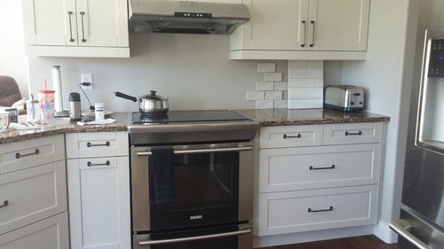
So I picked up a couple more samples. As in the previous post in 1 side it looked ok, and the other side it was too white. Even DH agreed.

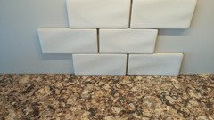
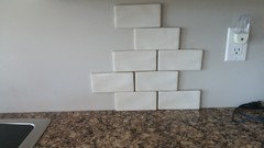
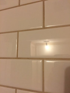
So I'm going to look at this for a while. It has that handmade look. The colour might be better with the cabs. (first post was tile on right...new tile is tile on left)

What do you think?

Comments (39)

  • 10 years ago
    last modified: 10 years ago

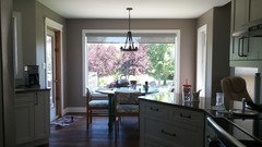
    Per my monitor...new tile is better BUT....I see two different shades when comparing the upper cabs to the lower cabs? Lower cabs look much whiter than the upper cabs on my monitor. Can we have a close shot to see counter and a small section of cabinet with just the new tile?

    akl_vdb thanked rantontoo
  • 10 years ago

    Can we see a shot with the countertop? How does the tile look with the counter pattern?

    akl_vdb thanked Lavender Lass
  • 10 years ago

    I know rantontoo! They do look different. I think it's just a trick of the light!

    Next to counter with ucl on

    Ucl off

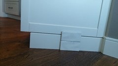
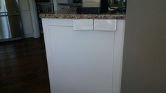
    Next to cab

  • 10 years ago
    last modified: 10 years ago

    I have them taped just under the counter (as if you couldn't tell :) )

    And lavendar_lass, I think they look great with the counter. They aren't cool at all, so seem nicely coordinated with our warm counters.

  • 10 years ago

    I like those better.

    akl_vdb thanked User
  • 10 years ago
    last modified: 10 years ago

    So mayflowers (z8), now I have to go with them! You are like the backsplash guru. And they are available at my local Home Depot. $9.99/sq. ft.

  • 10 years ago

    I like them too. A much better color with both your countertops & your cabinets. Who makes them?

    akl_vdb thanked romy718
  • 10 years ago

    http://www.tilesdirect.net/antique-white-3x6-handcrafted-tile/

    highland park Premier Decor by msi is what the box says. So I googled.

  • 10 years ago
    last modified: 10 years ago

    I think MSI is a big granite company in the LA area and they've rapidly expanded into quartz and tile. Maybe other home remodeling products too.

    I took my zone off, akl. I only use it when I need to ask garden questions and I'm done for this season.

    akl_vdb thanked User
  • 10 years ago
    last modified: 10 years ago

    Much better! I like the look of the "hand made". I also see the cabinets as drastically different colors. In person do they look the same color? Light can change things so much.Oh on your tile link I love those Dove Gray ones! I'm wondering if they would go with my kitchen. I have fantasy brown quartzite countertops and dark espresso cabinets. Thanks for the link lol

    akl_vdb thanked ravencajun Zone 8b TX
  • 10 years ago
    last modified: 10 years ago

    They are the same colour, but the lowers do look brighter. Maybe because they don't get as much sunlight?? I don't know!

    I can already tell these are better because I'm getting more responses. :) Thank you!

    This is the window with all the light we get. So at night they do look more the same.

    Lol ravencajun! Anything I can do to enable:)

  • 10 years ago

    The new photos help; I like the new tile. I have seen these in my local Home Depot. They are on my list for future consideration. I think you have a winner.

    akl_vdb thanked rantontoo
  • 10 years ago

    Just be sure if you buy at HD get the same lot numbers (on the box ends) it really matters. I think the HD look great!

    akl_vdb thanked suzyqtexas
  • 10 years ago

    Thanks suzyqtexas, I wouldn't have thought of that!

  • 10 years ago

    I think your search is over akl_vdb, these look just right.

    akl_vdb thanked ghostlyvision
  • 10 years ago

    I bought all the tile, and left a message with the tile guy that we have it. We're not booked until September but sometimes if he has delays he can potentially fit in other jobs.

    So DH is like, "So you can tape them all up on the wall so we can see how it all looks?"

    uh, no.


  • 10 years ago

    I'd like to see too. Can you ask HIM to tape them all up? :P


    akl_vdb thanked User
  • 10 years ago

    Lol mayflowers! I seem to end up being in charge of everything! But I have to cut him some slack, he puts up with my crazy ;)

    I do wish he'd look at a sample for longer than 8 seconds though! He looks then starts making coffee. I'm like, "Buddy!" which is why we still don't have a roof colour picked!

  • 10 years ago
    last modified: 10 years ago

    This has been going on for years though....

    So I appreciate it!

  • 10 years ago

    I like the tile on the left.

    akl_vdb thanked blfenton
  • 10 years ago

    Excellent blfenton, that's the one I bought.

  • 10 years ago

    Mayflowers, if you see this...

    I'm crazy, I get that. Anyways, I'm starting to rethink the size of the tile. I think I want a more contemporary look. 4 x 12? 3 x 8 or 9? They don't have it in my colour that I have but I have a couple tile shops to look at. What do you think?

  • 10 years ago

    I like the tile you selected. Even though your home has many contemporary elements, the kitchen is somewhat traditional. I guess you'd call the tile transitional.

    Is it just the size that's making you think twice?

    akl_vdb thanked User
  • 10 years ago

    The size and maybe the handmade look...maybe not as 'crisp' as I was thinking?

    And how do you remember my house? ☺lol

  • 10 years ago

    This has been going on for years though....

    Um, maybe this?


    akl_vdb thanked User
  • 10 years ago

    You went a little cottagey with the dining area so I see this tile fitting in nicely. But if the sides are uneven, you'll want to space them a little more. It would show more of the grout than what you wanted, but maybe you'd want to embrace that look. Have you seen photos of white tile with a darker grout?

    It seems to me that you have made traditional choices in most of the new additions to your home, like your molding. Now I'm remembering your powder room with the cute little vanity, so that's cottagey too. Doesn't it have a basket?

    akl_vdb thanked User
  • 10 years ago
    last modified: 10 years ago

    There is a basket. How in the world?

    I'm not sure I want to embrace that look. I'm finally starting to realize that I have to stick with the house's bones...contemporary. But there are some more traditional leanings in the house as well.

    I'm going to take another drive out to the tile store to return my other sample, I have my eye on a tile...I'll see if they have it. Regardless, I do have 30 sq. Ft of this tile in my house so I have backup!

    Thank you!

  • 10 years ago

    Fireclay recommends 3/16" for their ceramic tiles. This is what 3/16" looks like:


    akl_vdb thanked User
  • 10 years ago

    See, I can envision that and I don't think that's quite the look I'm going for. I'm sure it would look fine though. More crisp and clean looking I think I want.

    And I do regret my cottagey/rusticy period...The bathroom sink isn't too cottagey:)

    The lights I bought were pretty though. Not sure if they totally 'go', but they're cute!

  • 10 years ago

    Ok. To update...I think we are going to keep the 3x6 handmade Highland park as shown. They have a 4x12 but apparently doesn't have the same amount of undulation as the 3x6 and I cannot view it in person.

    DH and I went to a tile store today, looked at 1 million brands of ivory type tile. We came in the house and DH looked at the 3x6 Highland Park in Antique white still taped up and he says, "Ah, that's better."

    It just goes. The colour is perfect with the counter and the cabs.

    So that being said. Is there any way to just modernize it up a tiny bit? I understand it will not change it's bones and I don't want it to look silly. Any ideas? What grout colour would you recommend?

    Thanks!

  • 10 years ago
    last modified: 10 years ago

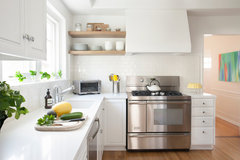
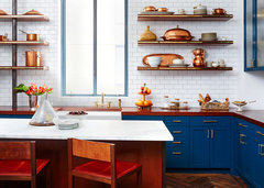
    I'd probably recommend whatever mayflowers recommends, (hi mayflowers!) but my first thought was a grout that matches the tile. These are both labeled transitional kitchens but, to me, having a visible grout line, even pale grey, is going to create a more traditional look with your cupboards. BTW, I wonder how a stacked pattern would look, if that would look more modern to you, rather than offset? Maybe have your DH tape some up in that pattern!

    (I followed GW's advice to make a grout sample board before using it on the BS.)

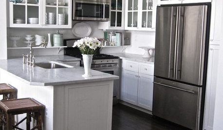
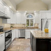
    Linda Rosen Interiors- Los Angeles Kitchen · More Info

    Chelsea, NYC - Gentleman's Loft · More Info

    akl_vdb thanked barncatz
  • 10 years ago

    Lol, have my DH tape some up!

    Mayflowers? Help?

    I have a stacked pattern taped up right now, but can you do this with a 3x6??

    The colour is seriously perfect. Sigh. So I cannot go with anything else.

  • 10 years ago
    last modified: 10 years ago

    I think barncatz is right that a matching grout would be the most modern and work best with the waviness of the tile. I thought about a vertical or stacked layout but I don't know about the uneven edges with those patterns.

    akl_vdb thanked User
  • 10 years ago

    oh my! ...do I ever need your help! Would you ladies look at the question I posted about my tile? I'm in desperate need of advice and turned to this forum last night for the first time. akl_vdb - I'm sorry to intrude, but you all have it all together with this tile thing, and me not so much! Your tile looks awesome!! Thank you!

    akl_vdb thanked cbolding
  • 10 years ago

    Thanks mayflowers! Then we will do it. Maybe just have the grout slightly visible. I'll be posting in a month when I have a night to decide on grout after it's placed!

  • 10 years ago

    I'd message eam44 and see what she'd recommend for spacing.

    akl_vdb thanked User
  • 10 years ago

    Love your help mayflowers! Let's try this message thing. I'm not holding out any hope though! I may just start another thread!

  • 10 years ago

    vb 7