Software
Houzz Logo Print
theresa6

Trying to make dining room pretty

10 years ago
last modified: 10 years ago
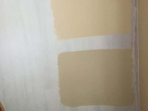
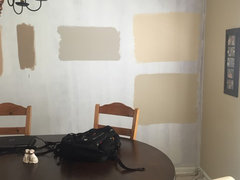
My husband is pressuring me to pick a color and paint the dining room today because he hates looking at the primed white wall.

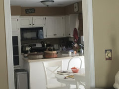
I'm having a hard time picking a color. I'm trying to match the main living space but have the color be a little bit darker, little more intense, without being overwhelming because there's only one window in the room and it doesn't get tons and tons of light.

The brown chairs are going to be replaced eventually with these

And I am also trying to match the bronze in my buffet and the Dark Wood on the table. I will be replacing the rug and the light fixture eventually as well.

Comments (25)

  • 10 years ago

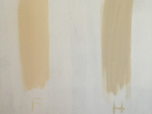
    Are you choosing between these two samples? Are they your finalists, or are you going to look some more?

    Between these two-the grayed version, the one that has "H" under it, will work better. It will be more darker and intense because you'll have it in bigger expanse, and in two layers.

    Your living room seems more gray to me than the samples are, even though it's warmer gray; but the colors are very hard to translate through the pics. You're there, so you know whether I'm correct or not.

    It matters only because you're saying you try to find a darker, intense version of the living room color.

    Otherwise, I find this a pretty combo.

    PS I like your light fixture. Not that it's an important piece of information..))

  • 10 years ago

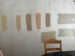
    I have tried probably about 12 different samples in this room! Another one that I liked was this greige color but I wasn't sure if it matched with the room. My kitchen has brown in it and I am not sure yet if I will be getting a brown couch or a gray couch so I'm not sure great it's the right color but I like it.

  • 10 years ago

    I would frankly stay away from the beige tones. They're so tired and overused and would choose something like the lighter gray tone in the center of your last picture.

  • 10 years ago

    I kind of feel the same about beige. Can I do that gray color with a brown kitchen?

  • 10 years ago

    Of course you can.

    Brown is extremely versatile. It will work (not in every version but mostly) with almost everything.

    I like this greige you've posted. A lot.

    PS Ah, the kitchen is not brown, just the walls are. I thought the cabinets are stained.

    Well. I think you still can.

  • 10 years ago

    Eventually I will repaint the kitchen to incorporate some of the other colors I've used throughout the house but it will be a little while. The backsplash is mostly brown which is why I said the kitchen was brown :-)

  • 10 years ago

    These were my other choices though I really don't think I want to do brown.

  • 10 years ago

    I like the top right in the first picture. It's light and fresh, pretty, and looks good with the furnishings.

  • 10 years ago

    Greige. Still vote for it. Will be easier to tie everything together. Forgiving. And just fab.

  • 10 years ago

    I love beige, always have, always will. That said, there can be a place for gray, but I'm not feeling it in your space.

    What is the color of the main living space? If the lighting is different and if you like the main color, I can almost bet that it will appear different in that space. You might just be able to use the same color.


  • 10 years ago

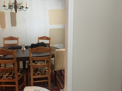
    What color does your eye go to first (with a smile) as you look from that door way from that other room? In your pic of the 2 larger samples and you can see 1 of the smaller samples my eye went to the bottom larger sample and the smaller darker sample. I agree to stay away from the yellow-y tan color.

  • 10 years ago

    I'd steer away from the gray because there's no other gray going on in your main area,. Also, the chairs you've chosen appear to be more cream/beige and I don't think that gray walls will play well with them.

  • 10 years ago

    I think you're heading into a grayed down overload and it will get rather gloomy overall. If you love the grays, maybe something light and airy to mix it up.

  • 10 years ago

    I vote for the large bottom sample. I assume it's the same colour as the other picture with the H under it? Maybe you have painted already haha would love to see what you chose if you have.

  • 10 years ago

    Would you consider pulling one of the colors from your rug? I think the blue would look nice with both your current living room and kitchen colors and provide a nice backdrop for your buffet. Something like BM Montpelier?

  • 10 years ago

    "Pretty" is what you are going for your title says. Beige/gray not screaming PRETTY. I like the idea of finding a color to pull from the rug...I suppose the red is too bold and fad is to get away from BOLD..but the blue or yellow..yellow would blend with your kitchen.

  • 10 years ago
    last modified: 10 years ago
    That's why I picked the top right. It's a fresh 'pretty' color. It doesn't look beige or gray on my monitor. It looks more like a cheerful, very mellow yellow.

  • 10 years ago

    I'd go with the more saturated brown, esp. if that room doesn't get a lot of light. Light colors will look blah in there with no natural light to reflect off of them.

    Also, dining rooms do well in cozy colors, esp. with that rug you've got. I'll be warm and elegant.

  • 10 years ago

    a) The rug doesn't stay, as indicated in the initial posting

    b) It highly depends..every color can scream "pretty". "Beige" and "gray" can scream pretty at the top of their lungs imho))))

  • 10 years ago

    I'm trying to match the main living space but have the color be a little bit darker, little more intense, without being overwhelming because there's only one window in the room and it doesn't get tons and tons of light.

    Can you do exactly that? Pick a color you have and like, and then go see the strip it comes from and pick something a few versions darker?

  • 10 years ago

    Obviously, we're going to be all over the map as to what constitutes "pretty." Personally, I dislike a yellow beige. Something about it reminds me too much of a Band-Aid, but that's just my own opinion and I understand that others like shades in that range.

    What do you like best? Which color really makes your heart sing? Start there.

  • 10 years ago
    last modified: 10 years ago
    There's nothing wrong with each of us having our own ideas of what 'pretty' means. To me, it has a lightness about it. not heavy. Grayed colors feel moody, dismal, even gloomy, imo. Dark colors heavy.

    Mincing words really serves no purpose and doesn't change anyone's color preference or word selection.

    However and whatever the OP perceives to be pretty is, of course, all that will matter to her in the end. People ask in order to sift through other people's perceptions, so they can clarify their own.

  • 10 years ago

    Your dining room might be the perfect place for wallpaper!

  • 10 years ago

    I agree with IdaClaire..in this context, whatever theresa6 considers pretty, is the most important opinion))