Software
Houzz Logo Print
monicakm1

Soft Dusky Purple That Will Go w/ This Picture

10 years ago
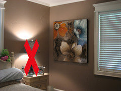
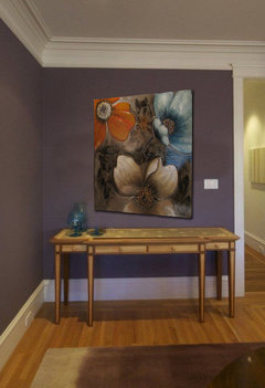
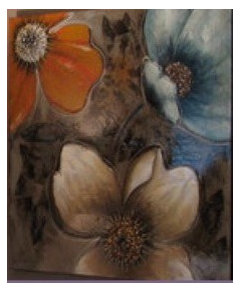
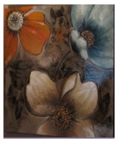
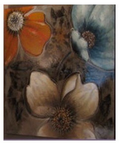
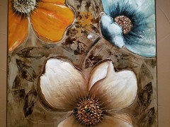
I'm contemplating a soft dusky purple wall with off white/creamy carpet for the master bedroom. BUT THIS PICTURE STAYS so it might be a deal breaker. Can you suggest one that would work or is it a big fat NO?

Comments (42)

  • 10 years ago

    Might work if I remember to attach it :o

  • 10 years ago

    I like your present color! However, I think tibbrix's vintage charm looks good too.

    or tropical dusk both by BM

  • 10 years ago

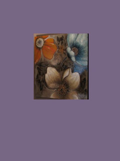
    I am useless at attaching photographs- much-the less photoshop- but I think anglophilia suggested a Farroe and Ball color called Pelt that may be nice- it's a darker, more saturated color- a little less purple.

    monicakm_gw thanked Abby Krug
  • 10 years ago

    Omg! I need to use Pelt in my home! Yummy!

  • 10 years ago

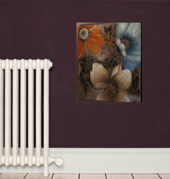
    Thank you roarah! You are so kind to mock everything up for us all here.

    monicakm_gw thanked Abby Krug
  • 10 years ago

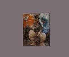
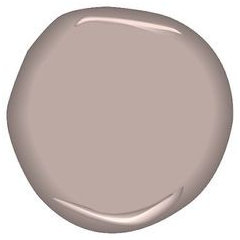
    Tropical Dusk is the color I had in mind (from sueb20's recent photo). It's too bright from the BM sample so I used Sueb20's picture. I think it looks good but paint and I have never been friends :( So if the general consensus is that the painting looks good with a dusky purple, what about a dusky purple with a creamy off white carpet? If those are thumbs up, then I'll present the ensuite color palette.

    Thanks roarah for the mockups. DH is the one that chose the brown in the bedroom. I wanted brown but couldn't make a decision so he made it for me. I've always loved purple and really want to incorporate into the master bedroom that I'm wanting to lighten up. The rest of the house is deep richer colors but I like to keep the bedroom lighter. You'd think with the brown walls it would be dark but it's not. If purple would work, I'll have the color I want, the light carpet but still a cozy feeling at night. Vintage purple is too blah for me and Pelt, altho dreamy gorgeous, not what I'm looking for in a bedroom. A dining room maybe :)

  • 10 years ago

    BM Sleepy Hollow

    BM Kalamata

    BM Amazon Soil

    monicakm_gw thanked User
  • 10 years ago

    Yes, there is some gold in the painting. Thanks for the suggestions of the other colors but they're too light for me. I'd like to keep the walls a saturated color and lighten the carpet to more closely match the ensuite flooring...a light ivory travertine look porcelain tile.

  • 10 years ago

    thanks tibbrix but those a little too warm. Do you think the Tropical Dusk is not right with the picture?

  • 10 years ago

    Monica, I have tropical dusk in my house and the mock sample is certainly not how it reads here, more like sueb's image!


    monicakm_gw thanked roarah
  • 10 years ago

    Commenting just so I can save this thread, some great color options here!

  • PRO
    10 years ago

    F & B's "Pelt" is a FABULOUS color! It makes everything pop. I used it in my guest room and I adore it. It's rich, warm and velvety and the color changes as the light does during the day. Sometimes, it looks brown, sometimes, purple but mostly a sort of Cordovan color. Art looks amazing on it.

  • 10 years ago

    Some beautiful colors have been shown, but for what it's worth I feel that the picture actually looks best with the color you already have in your bedroom. Somehow with the purple tones the picture seems to "bleed" into the background and lose some of its impact.

  • 10 years ago

    I really like your current color and like it with the picture. I think a dusky purple can still work with it. I like the mock up with Sueb's pic. I think whatever you go with should be a more earthy purple and have some brown it in it help tie the picture in.

  • 10 years ago

    There's a color called Lavender Wash in the BM Color Stories group. It picks up the tones around the Blue/violet flower in the upper right hand corner, and should be very easy to live with.

    monicakm_gw thanked scone911
  • 10 years ago

    There are so many ways you could go.

    monicakm_gw thanked just_terrilynn
  • 10 years ago

    Thanks for your comments everyone. I agree that the current wall color looks good with the picture. Looks like they were made for each other :) I don't dislike the current wall color, I have just always loved purple but never was brave enough to incorporate it into my decorating. I will look into some purples with more brown but I don't want a color that reads more brown than purple. If that's the case, I'd just keep the current wall color <g> I understand that a purple might not be AS perfect as the current color and that's ok as long as it works well with the picture.

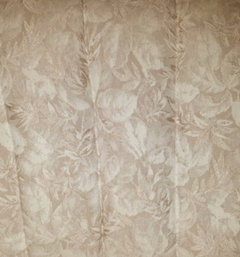
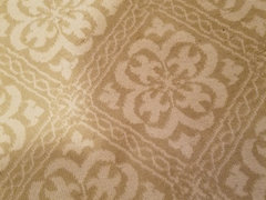
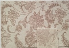
    I already ran my plan by DH and he agreed to do it for me...install the carpet, not paint. I'll have to hire a painter. Here is a picture of the fabric on the Dutailier glider rocker that I rocked my grandbabies on :) It's 10 years old. This is *kinda* what I'm looking for in a carpet. A tone on tone light ivory. Either a print or embossed. DH likes my idea but felt he had to informed me that "no one does florals anymore, it's geometrics" and that it will be harder to find what I'm looking for. I had to remind DH that I don't follow trends ;)

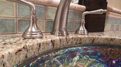
    The ensuite is light ivory travertine look porcelain on floor. The wall, 3ft up, is the same porcelain, ivory travertine and "sea tones" glass tiles (atlantic blue, aqua blue and seafoam). Granite is Light Giallo Ornamentale. Vanity and wall cab is a deep chocolate stain, "rain" glass door and white trim and closet doors. Ceiling paint is SW Rain. Walls are a very neutral tan. I think I can add some dusky or heather purple towels to tie into the purple bedroom wall. I have shirts with purple and blue in them and actually have a pair of Sketchers that are purple and blue :D so I know the color combo can work.

    thank you for the color options justerrilynn but I'm looking for a shade of purple and darker than those choices.

    The windows are north and east facing.

    This fabric is actually a little darker than what I want in my carpet choice.

    Here you can see all the colors of the bathroom. The floor is the color of the travertine pencil rail on top of the glass tile.

  • 10 years ago

    scone911, I think lavendar is very pretty but it's not what I'm looking for in this instance. I'm looking for a deepish dusky purple. Not sure I could find light walls easy to live with :) LOVE LOVE the look of rooms with white and light colored walls. I've seen some drop dead gorgeous light and bright rooms but it's like a place you'd "love to visit but wouldn't want to live there".

  • 10 years ago

    ingrid, would you please explain what you mean by "bleed" into the background? I really really wanted purple walls :( but I wonder if just changing the carpet to the light ivory would be enough. I've never been thrilled with the color DH picked out but it's perfect with the painting.

  • 10 years ago


  • 10 years ago

    I like this purple/plum


  • 10 years ago

    Monica, try Sherwin Williams River Rouge. The undertones are almost cocoa-ish. It is saturated and rich.

    Whatever color you try, I would definitely get sample pots. I went with River Rouge for my small master bath after trying a couple of purples that I loved until I got them on the wall.

  • 10 years ago

    That's very pretty tishtoshnm! Would you mind posting a picture of it on your bathroom wall? Yes, I'll definitely buy samples to put on the wall.

  • 10 years ago

    ^ The name is misleading. It's not that light IRL; the color stories group builds up darker. Also, a "duskier" purple will fade to black at night, even if you have good lighting.

  • 10 years ago

    Is there Dunn Edwards, where you at?

    One of the colors I used is called "Twilight Taupe"..the name is very misleading though, except for the "twilight" part. It's actually deep rich color, that is definitely more purple than brown, but has a lot of brown it it. It transforms through the day, and in different lights, just enough to keep you constantly intrigued with it.

    Of course you need to see it first in your light..I was going for moody yet enveloping feeling, as the rooms I used it in were not that bright from the very beginning.


  • 10 years ago

    Benjamin Moore Bonne Nuit is my favorite purple...enough gray to keep it from being too in-your-face, but still definitely purple. :)

  • 10 years ago

    Monica, I meant that with the taupe background the painting, to me, stands out more, whereas with the purple it has more of a blend-in effect. On the other hand, if purple is your heart's desire I say go for it regardless of what anyone else says, and I'm only seeing a picture and not the actual room. I've found from the comments some have made about my decorating choices that this can sometimes make quite a difference. Hope you find the color you love!

  • 10 years ago

    Thank you jbald! Bonne Nuit looks very nice :) I think the first two colors in which I will invest in samples is it and Tropical Dusk. Do you (or anyone) know if BM Affinity is a full spectrum paint? I'm also thinking about doing this whole thing backwards by installing the new carpet first and living with it and the current wall color for awhile to see if I still want to paint the walls.

    I can't leave the house for at least 6 weeks and I've already been housebound for a month (seems like 6). Rescue dog (that I've mentioned on this forum) has heartworms :( Protocol is extremely long (expensive) and confining for the dog. Too hot here for him to go thru this outside so he's a house dog now...and a very well behaved one :) But, the poor baby has developed a fierce case of separation anxiety and frets himself into anxious mess if I leave the house. He HAS to remain quiet and the goal is low heart rate, breathing rate and blood pressure or he can die from the treatment. Doggie Xanax doesn't work (probably due to the steroids he's taking). My husband being here doesn't help. The next thing we'll try is Benedryl (sigh) or increase the Xanax if the Dr says it's ok. Sooooo, I'm going to have to do this with help from DH. Good thing he's a carpet contractor. A couple of the design stores we contract with are sending carpet samples home with him and he can stop by BM and pick up paint samples.

  • 10 years ago

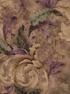
    ingrid, thank you and yes, purple IS my heart's desire...or so I think. I know it's said, "it's only paint" but I still don't want to waste the time, energy and expense to paint and find that as much as I love the color, I don't love it on my walls! MY instincts are almost always right for ME and I rarely question them but I have a hate-hate relationship with paint :o Here is a wallpaper sample that is 14 years old. Way back then I wanted a tan/green/purple color palette thru out the house. I have the tan, green and a tiny bit of plum but mostly golds, back, pumpkin, cream/wheat. I have tan/brown walls, green, and burnish pumpkin-y walls. I feel like plum will tie in well with those colors. It's just a matter of getting the *grown-up* purple shade just right :o

    And yes, I agree completely about looking at a picture and not the actual/entire room. I'm sure I've even made similar comments ;)

  • 10 years ago

    Has anyone seen BM Temptest IRL? In some photos it looks more gray and in others, more *plum* (my mother ask that I not tell the world I'm painting my room PURPLE <LOL> Tropical Dusk and Bonne Nuit are still on my short list of plums to consider. My husband brought home the first round of carpet samples. None were quite as light as I wanted. Nothing took my breath away. But he DID come home last night with enough of this carpet redo the bedroom and it's free. It's Kane. He hates Kane carpet. Calls it crap carpet now. Used to be really good, but like so many other things, has gone to crap (coming from an installer that installs high end carpet and REPLACES a lot of high end Kane carpet due to flaws). It's muy expensive and I hate not to take advantage of it. At first I said I'd take it and just go with a totally different look (and forego the plum paint). He said he didn't want me to settle. We have another bedroom that could use a carpet refresh and nothing else would have to be done. The med sage painted walls, ivory trim, green, tan and gold bedding and accessories. Two floors join this bedroom. One has dark petrified hickory porcelain wood plank (bathroom) and the other is light ivory travertine (entry). It's perfect for THAT room.


  • 10 years ago

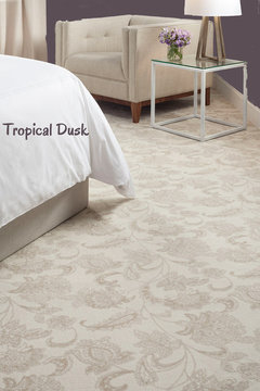
    I've found the carpet I want (looking on line). But, I'm pretty sure DH is going to tell me that pattern size is too large for our room :( The repeat is 40.5x42.4

    I think it's beautiful with Tropical Dusk (on the computer monitor). My furniture is the color of the fabric on the chair in this picture. It's Lexington purchased in the mid 90s but still looks great. No dark wood in the room at all. This pattern comes in some beautiful colors! I know... florals are out but they're not out for me :)

  • 10 years ago

    Why are florals out? They are so not out, and never will be. I saw just yesterday a new book in a store..something about decorating with botanical, or along these lines. I didn't buy it only because I'm so disciplined...)) (well, and because I had to buy other stuff) So beautiful.

  • 10 years ago

    On my monitor tropical dusk does look the best. I would get a sample and paint some boards and try them in the room and see how they look in the room.

  • 10 years ago

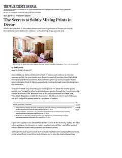
    Florals are most assuredly not out of fashion. Here is a piece from this weekend's WSJ on a bedroom designer Mark Sikes did up in Santa Barbara. I hope this link works- sometimes WSJ articles show up locked- sometimes they don't. Really pretty bedroom for people who like pink and beige. http://www.wsj.com/articles/the-secrets-to-subtly-mixing-prints-in-decor-1472152220 

  • 10 years ago

    Page unavailable :( Can you do a screen shot and save it? I don't think he meant that floral are all together out (too bad if they are, I'm not ever doing geometrical and gray). But the vast majority of patterned carpet that he installs is squares, circles, diamonds, etc. And after spending two days looking at pattern carpet on line, there is much more of that than what I'm looking for.

  • 10 years ago

    Here you go, Monica. I hope this works better.

  • 10 years ago

  • 10 years ago

    Here is a link to Mark Sikes's Instagram account. There are two pictures of the bedroom from the WSJ piece there - https://www.instagram.com/markdsikes/?hl=en.

    monicakm_gw thanked Abby Krug
  • 10 years ago
    last modified: 10 years ago

    SW Expressive plum seemed worth mentioning. It flashed past on my FB.

  • 10 years ago

    Now I'm even more confused. Milliken sent me samples of the stately beige color. Meanwhile one of the carpet stores my husband contracts for oordered a sample board. Believe it or not both the large sample on the board and the smaller sample are labeled the same color, stately beige. That's way more than slight shading difference that carpet companies say is normal. I was not look for something with so much contrast. I like the smaller sample much better. Hoping a Milliken rep can advise which shade is more accurate.