Software
Houzz Logo Print
lookingonthebrightside

Dining Room Progress/Update

10 years ago
last modified: 10 years ago

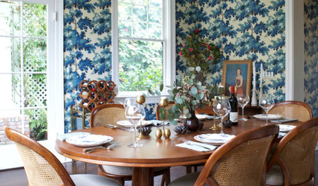
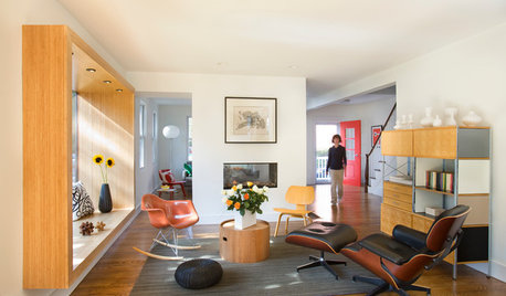
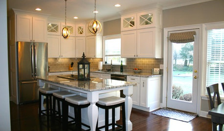
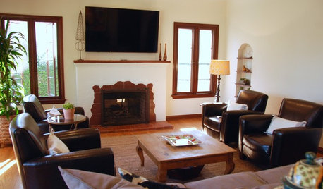
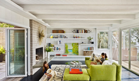
I wanted to check in since so many of you have been so helpful to me at the beginning of my DR update. I was laid low part of the week by a virus, so am behind on my progress. However, I did put a second coat of primer on, ordered a bunch of fabric and some blind samples, and picked up a few more paint samples. As of now, I have decided to go rugless, but might add a light colored one later. Here are inspiration pics:

I picked up samples of BM Windham Cream and SW Jersey Cream today. I was a little dismayed that they couldn't make up samples of any of the more yellow creams in samples, but whatever. I just KNEW one of these would be perfect, but they just look kind of blah beige in the room. It faces south, and there's a lot of oak floor plus the cherry furniture. Anyway, I'll keep moving the samples around today to see what I think.

I am thinking now that I may need to go with a blue or green paint tone, but I know that will accentuate the cherry. I will go pick up some more paint samples in the next few days. Ugh.

In the meantime, I brought this painting into the DR from our MBR, thinking I could use it in the DR and it might give me some inspiration. I do like it, and it would be nice to put it where other people besides DH and I will see it.

Here it is with Windham Cream (left) and Jersey Cream (rt).

I have also made progress on the contents of the china cabinet-polished the silver, washed the crystal, and have gotten rid of some stuff.

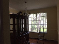
Before

Primed and Ready for Paint

Thanks for reading, I will be back next week with more paint samples, and am open to suggestions. PS This room seemed small to me until I started priming it. Ha ha!

Comments (38)

  • 10 years ago

    it is so hard to find just the right cream. I swear I tried 20. I ended up with BM windswept. it is PERFECT in my house. some others that looks like the perfect cream in other peoples pics looked, grey, green, orange, etc in mine!

  • 10 years ago
    last modified: 10 years ago

    Glad ou are feeling better. Have you figured out if you can lower the chandelier?

  • 10 years ago

    Maybe Philadelphia Cream is what you looking for in the dining room. I like the painting.

  • 10 years ago

    I'm prefering the Jersey Cream since it seems to have a bit more *life* to it. The Windahm Cream..........yaaaawn. Not much better than a white. I absolutely love your yellow/blue inspiration pix.

  • 10 years ago
    last modified: 10 years ago

    lascatx- Thank you. I think the chandelier can be lowered, but I'm not going to keep it. Of course, the ones I really love are over $1k, and that's not happening!

    happy-I will check out Philadelphia Cream. Thanks.

    Patty-I like the Jersey Cream better than the Windham too. It looks great in there tonight.

  • 10 years ago

    It is coming along!! You have a great plan. Looking at your inspiration pics...they really read as very light lemony yellows, NOT creams. I think that is why your samples might seem a little "blah" and beige-y compared to the pics. I don't have any good yellow recs, but I'd check out the yellow chips if I were you. It's going to be lovely!

  • 10 years ago

    I second BM Philadelphia Cream. Used it in my front hallway. Used BM Dunmore Cream in my dining room, with an accent wall in red. Very nice creamy yellows.

    (don't mind the smudge...it is from my camera)

  • 10 years ago

    The worst cream-color paint I ever had was SW Heavy Cream. It turned sickly green on my walls. The best cream color I ever had was Farrell-Calhoun Soft Gold. It stayed a pretty, soft cream. I doubt that you can find F-C. It is a regional paint company, I think. My point is to look at some paints that are called gold, instead of just looking at paints that have cream in the name. btw, the lovely Soft Gold was picked for me by the guy at the paint store after I described what I wanted.

  • 10 years ago

    I agree with bbstx. There may be a few creams that appear to be in the 'yellow family', but your best bet is to look thru the yellow/gold for a truer color. Here's SW yellow pallette:


    http://www.sherwin-williams.com/homeowners/color/find-and-explore-colors/paint-colors-by-family/family/yellow/

  • 10 years ago

    How many coats of primer is that? You got amazing coverage!!

  • 10 years ago

    Seeing your room with lighter walls is a revelation; I think that alone will make a huge difference in the feel of the room. I'm not so much a fan of your walls being yellow, but that's for you to determine.

  • 10 years ago

    Look at all that light! The Jersey Cream looks beautiful. Love it with that painting.

  • 10 years ago

    Agree with others to look in the yellow lines. And congratulations on a fine priming job! Wow!

  • 10 years ago

    You are a woman on a mission! Great progress!

  • 10 years ago

    OMGosh! What a difference. It almost looks like different room, so much larger.

  • 10 years ago

    Wow, you are doing amazing!


    I absolutely love your painting.


    Yellow gets more intense in large doses so you may want to try a large swatch on the wall before commiting.

  • 10 years ago

    Look at SW pineapple cream and venetian yellow, on same strip. Both are very creamy. You will never be able to tell simply by paint chips I had to paint big sections on the walls and look at various times of the day.

  • 10 years ago

    You have made great progress. Love the Jersey Cream (between the 2 colors) you show.

  • 10 years ago

    Echoing robo and ravencajun about testing. The paint-store guy told me to be sure to paint samples up against the trim instead of just painting in the middle of the wall. He said it would be even better if I had a section where I could paint the sample between two pieces of trim (between 2 windows, between a door and a window, etc.).

    And then there is my sister's method for painting samples. She had a large scrap of Sheetrock (4x3 ish) that a builder gave her. She would paint the entire sheet whatever color she was sampling and move it around the room at different times of the day. The plus was she could see how each time of day would affect the color. The minus was she only did one color at a time, so it was a slow process.

  • 10 years ago

    I love your inspiration pics! I can't wait to see your progress. I love white, yellow and blue.

  • 10 years ago

    That is 2 coats of 1-2-3 primer. After painting about 20 boards and moving them around the room at different times, I have narrowed down my favorite paint colors. We had about 5 minutes of sun today, despite a very rainy week, so I got to see the colors in the sun, too. I am loving the Lemon Sorbet!

    Jersey Cream, Lemon Sorbet

    Liveable Green, Rainwashed, Celery

    I think I might end up using one of these greens or Rainwashed in the LR across from the DR.

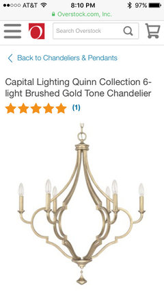
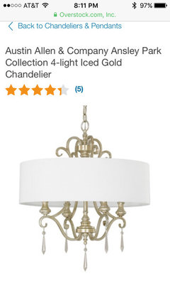
    Here are chandeliers I like, in the order I like them best. Need to stay around $400 or less.

    Thinking I will go with the cordless bamboo shade plus off white drapes, then something fun on chair seats. These are my favorite fabrics so far, but not making that decision just yet. The embroidered one doesn't show up well, but it is TDF and has multiple shades of blue in it.

    Thanks for your thoughts!

  • 10 years ago
    last modified: 10 years ago

    :::clapping:::

    Love the Lemon Sorbet in your room.

    I like the first chandy. I like the softness of shades. The second is too cold, the third look I think has peaked (the drum over chandelier thing) . I also like the last chandy a lot

    OOh OOh I love bamboo with off white

  • 10 years ago

    I agree with what Mtn just said! So exciting!

  • 10 years ago

    I agree with Mtn too! I need to see a bigger swatch of the fabric, I can't get a feel for the pattern.

  • 10 years ago

    I was just looking at Pottery Barn Drapery panels, they have some in blue and white that remind me of the last inspiration picture that you posted.

  • 10 years ago

    Oooooh! I like the lemon sorbet. Yummy. Your current chandy looks like your first inspiration photo. Maybe finish the room and then decide?

  • 10 years ago

    Thanks for posting. It's fun following your progress. I may be doing the same to my dining room soon, so you are inspiring!

  • 10 years ago

    Adding I would keep looking for chandies... None of these seem quite right although I am on a "you can't go too big" kick so like the scale of the last one (pictured in the bedroom setting).

    Love the lemon sorbet! Still in awe of your priming job over the previous color...

  • 10 years ago

    N-thing the 1 and 4 chandelier choices. Looking amazing!! Love the fabric choices for the chairs. This is going to be such a different room, well, it already is!


  • 10 years ago
    last modified: 10 years ago

    Finished painting-2 coats of primer, 2 coats of wall paint and 2 coats of trim paint. It's certainly yellow, but it's growing on me. Not loving the matching chair rail, but it definitely makes it recede. I think I'm just used to it being white. New chandy arrived yesterday and Roman shade and drapes are ordered.

  • 10 years ago

    You are fast! which Chandy did you pick? What a nice view from your window.

    The paint job looks super. It will feel less yellow when the room fills in.

  • 10 years ago

    Looking great!!!!!

  • 10 years ago

    Looks really good!

  • 10 years ago

    Looks great!

  • 10 years ago

    Nice work! Can not wait to see your finished room!

  • 10 years ago

    It looks so pretty! Can't wait to see the rest of it come together.

  • 10 years ago
    last modified: 10 years ago

    Yummy. I think that once the roman shades, chandy, and drapes are in, you will not notice the chair rail. Anxious to see the finale.