Software
Houzz Logo Print
kristina_oconnell

How high should tile backsplash go in my kitchen?

10 years ago
last modified: 10 years ago
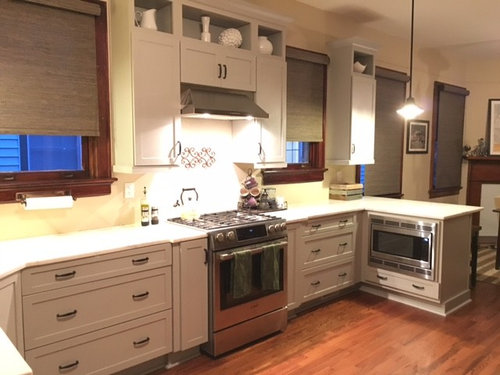
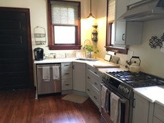
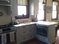
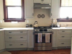
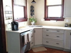
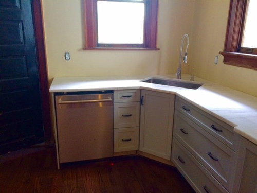
Hello! I'm finally ready to pick a backsplash but I'm having trouble figuring out how high the tile should go. I definitely want it to go all the way up to range hood, and all that way up under the wall cabinets. The weird part is over the sink and dishwasher. It's a big empty wall and it might look funny if the backsplash is at the wrong height. Any ideas? Thanks so much!

Bonus points for this question: The house is 90 years old and everything is crooked! What backsplash pattern/material will hide the fact that the countertop is perfectly level, but the window sills are not! There's about a 1/4 inch difference from one side to the other and I'm trying not to accentuate it :)

Comments (20)

  • PRO
    10 years ago

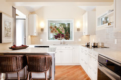
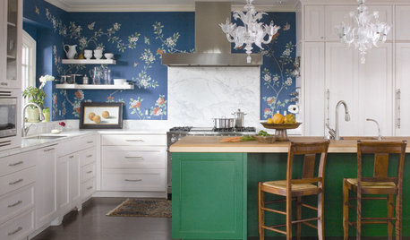
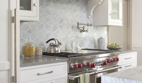
    Here's a nice example of how you can use the backsplash tile around your windows. Under your hood you could take it up to the bottom of the hood.

    Glen Echo Heights · More Info

  • 10 years ago

    Thanks! So having it at a different height from over the range wouldn't look weird?

  • PRO
    10 years ago

    I would take the backsplash up to the height of the bottom of the cabinets. The exception would be the under the hood, where I'd take it up to the bottom of the hood.

    The best backsplash to use with an uneven situation is a solid. Here are some alternatives to tile. If you are going to use a tile, use a larger one.

    https://www.houzz.com/magazine/5-stunning-alternatives-to-the-tile-backsplash-stsetivw-vs~164842

    The fruit basket should be moved up. I would remove the plant from behind the sink, as it look cluttery in your new, streamlined kitchen.

  • PRO
    10 years ago

    Hi, Kristina!

    I think since the backsplash is going to the bottom of the cabinets you should keep that constant over the dishwasher and sink.

    Also, the backsplash should be just busy enough to keep the eyes away from the uneven window sills.

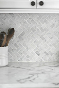
    Here is an example:

    - Hedgeapple

  • 10 years ago

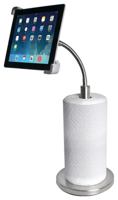
    I don't see that the window sills are uneven. Just the one pic had the apron removed, but they look even to me. I'd prefer a standing paper towel holder. That attached one is pulling the eye right toward it. If you cook with online recipes this one is great for holding your i-pad! Otherwise, use a traditional one.


    CTA Tablet Paper Towel Holder With Gooseneck · More Info

  • 10 years ago

    The apron has since been fixed! The space was two different rooms before the walls got knocked out so not everything across the space matches now. It's an old Charleston craftsman home from 1926. Each window sill drops about 1/4 of an inch from right to left. Hard to notice with the plain walls but adding a geometric backsplash is worrisome.

  • PRO
    10 years ago

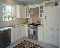
    That is exactly why I recommended a solid or vertical backsplash. I think an idea like this would work well in your kitchen.

    2002 Showcase · More Info

  • 10 years ago

    I would either (a) only tile the stovetop area the same as your countertop, or (b) tile the entire wall areas to the height of the top of range hood/vent to give eye a continuous line. I would again use a stone similar or same as your countertop for a continuous look (I do like the previous posting w/the herringbone pattern, highlighting the charm of your windows. I would add a simple flat valance or woven roman shades above all windows to finish it off. Enjoy, great remodel!

  • 10 years ago
    Is that paint color staying? Id go with something cooler like Classic Grey by BM. That will give u much more options for backsplash. It looks pale yellow at least on my screen.
  • 10 years ago

    Except for behind your stove, bring it to the bottom of your upper cabinets and keep that height all along the kitchen wall. The smaller your tile, the less noticeable your crooked walls will be.

  • 10 years ago
    last modified: 10 years ago
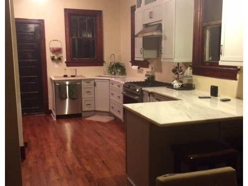
    I love your wall color. I'm going to throw a dissenting opinion out there. Go up to the rangehood, sure. But do a low profile trim around the rest of the counter, not to the bottom of the cabinets. Keep to a lighter color unless you have a really stylin' tile you want to use that people will oo and ah over. I think anything more than that will draw more attention than the room, which I think looks great without a lot of backsplash.

    Tile up the wall anywhere but under the rangehood and cabinets makes no sense, imho. But then, I don't know what tile your considering.

    I have a 1925 bungalow. I wish it was only 1/4" out of square! Like krysmays says, small tile [eta: or solid as suggested earlier] and I think lighter tile, too, will help hide the off kilter. Unless you are like me and embrace soulful imperfections, as opposed to soulless perfection! Vive la difference!

    Joe

  • 10 years ago
    last modified: 10 years ago
    Carolyn. What I think that picture has (which is quite lovely) that the OP does not are two major things—1) A natural border on the ends (or at least to the left end, can't see the other end), and 2) only two slivers of wall that the tile stops vertically. The OP has no such natural borders and has considerably more plain wall. The visual effect will not be the same. (Interestingly, they did not stop at the bottom of the cabinets.)

    IMO. I could be wrong, but, I don't think so.

    Joe

    PS, Oh, and white trim around the windows.

  • 10 years ago

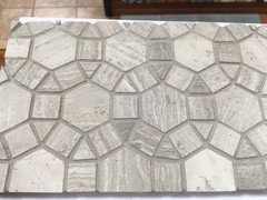
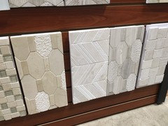
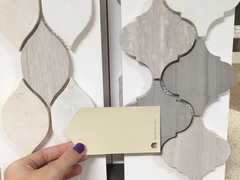
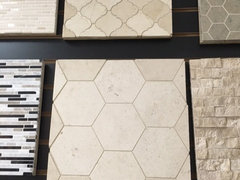
    Thanks so much everyone! I took a few pictures during the daytime. The paint is more of a beige than a yellow. There are some tile samples in a couple of shots if anyone can weigh in on those too!

  • PRO
    10 years ago

    I would end the splash where the countertop ends and carry it up to a height at least to the bottom of the upper cabinets and possibly a couple of inches above. Where the hood is located the tile would go up to the bottom of the hood. If you want comments on your splash selections, it would help to see closeup photos of the choices, possibly labeled A,B,C, etc.

  • 10 years ago

  • 10 years ago
    last modified: 10 years ago
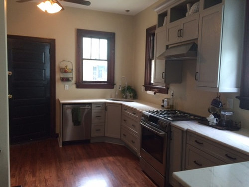
    Ah! And your cabinets are more gray than white. Really is a nice color combination. I still like your color choices and hate the idea of covering too much of that up with tile, especially with the dark wood trim around the windows. But that's just me. You have to live with it, not me.

    If you really have to tile up the wall, I say simple, simple, simple. I don't usually jump out with subway tile, ever, but here I think that will be your friend.

    I Like CDR's picture of one tile for the range and a simpler tile every where else.

    Joe

  • PRO
    10 years ago

    All of those tiles are quite busy and will accentuate the change in height on the windows. Do you want to keep the arts and crafts feel of the home?

  • PRO
    10 years ago

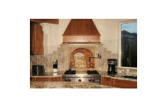
    In the corner sink area you could create a pyramid tile design that staggers down to meet the level of the upper cabinets. Not need to be straight across the top.

    Here is an example of a staggered tile design

    Linda Paul

    www.lindapaul.com

  • PRO
    10 years ago

    you can do the above staggered tile layout (for your sink area )with subway tiles too.

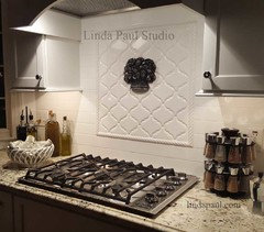
    Here is an idea for above your range that transitions from a central focal point , of arabesque tiles and fruit basket ceterpiece, to nice white subway tiles

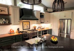
    here is a transitional country style kitchen that used the beveled white subway tiles (which I like a lot)

    Linda Paul