Software
Houzz Logo Print
dchomedesign

Kitchen Backsplash! Please help me choose!

13 years ago
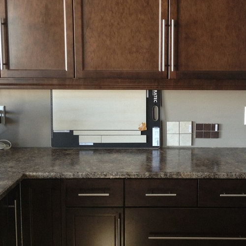
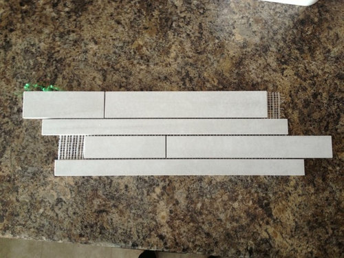
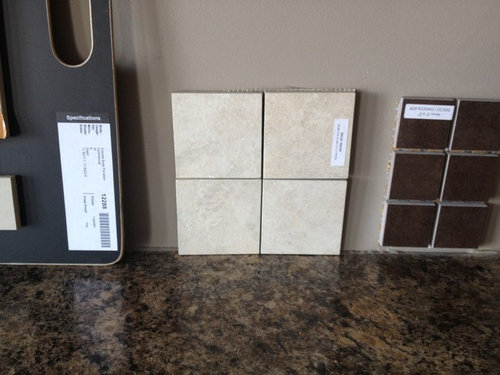
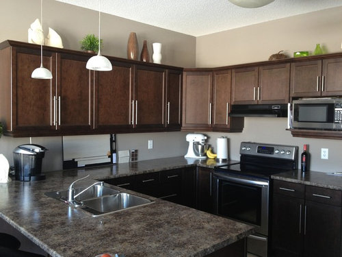
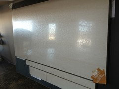
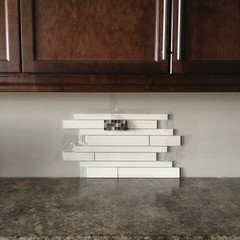
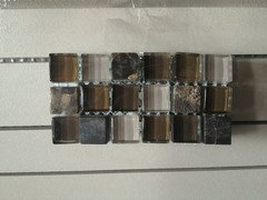
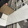
I'm stuck between 3 styles of backsplash. Left to right. The left is a strip style( the bottom half of the sample board) middle is a 3x3 mosaic. And right is 2x2 mosaic. I'm wondering if the strip style will be too much for the space cause they are quite long. The middle has the same pattern as the counters. Not sure if that's too much matchy matchy. And the right we're debating cause we were told if you have lots of natural light which we do, you can do the darker tiles. Please help me choose!! I've also attached a sample if the strip style mosaic so you can see. (Although its in white and we were want it in the beige.)

Comments (50)

  • 13 years ago
    I vote for the strip style. Don't like the 3x3 mosaic ones, bit dull. I do like the dark brown mosaic, but you'll lose all contrast and I'm afraid you'll create sort of a 'black hole', so not too sure about them.

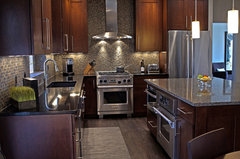
    Tudor Kitchen · More Info

    Classy Kitchen! · More Info
  • 13 years ago
    last modified: 13 years ago
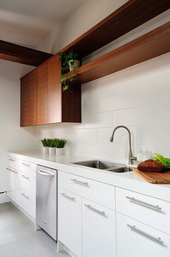
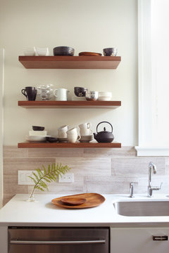
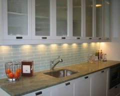
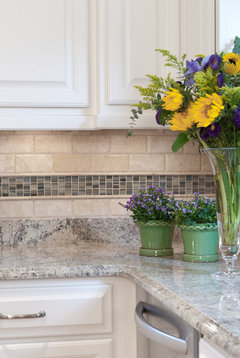
    Dayna, I actually like the biggest horizontal tile in your first photo -- the 24x12 (?) -- as the backsplash. For a very simple and clean look, and for ease of cleaning. :) But that's just me.
    Kitchen · More Info

    Lucy McLintic · More Info
  • 13 years ago
    I like the strip style and the horizontal lines. Do you have any counter material left? If so, you can have them shaved to the same depth and use it as your accent in the design to bring cohesive look.
  • 13 years ago
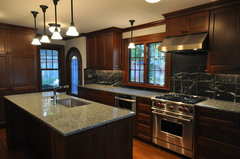
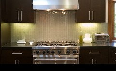
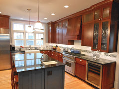
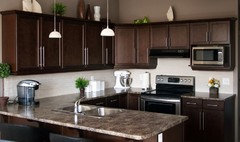
    I added those two pictures to my comment to illustrate how dark cabinets, dark counter and dark tiles look. But it's really difficult to find pictures of that combination. So... I guess there must be a reason for that ;-)
  • 13 years ago
    I like the strip one best out of the 3 choices..I like your kitchen too!
  • 13 years ago
    I like the darker one better, I think it will go more with the counter top, not sure about the colour white as the upper part of your wall above cabinet is a different colour. I like the strip ones too but not the colour.
  • PRO
    13 years ago
    I like the first tile...do the long linear horizontal skinny tiles....
  • 13 years ago
    The paint just looks that way cause of the sunrise coming through. So its a little more golden in the picture. And more like the color under the cabinets. The paint is BM Ashley grey so not a true grey but it is a tad taupe. When doing a dark tile would you also do a matching grout or a lighter grout?
  • PRO
    13 years ago
    I think the lighter strip style ones go best. The middle ones are dull, like the mosaics you would put on a shower floor, and the dark is too dark for your cabinets. I think you need the contrast to brighten it up. Good luck.
  • 13 years ago
    If you like the darkest tiles, you can play them up with undercounter lighting...I like your wall color and think a tile in the grey family would look better than the beige choices.
  • 13 years ago
    daynacote-so true about the light it changing the look of paint-same with my room when I took a picture of it. I would have a good contractor show you some combinations of tile-grout samples, or use an online tile-grout tool to check. Some people have gone for neutral colour rather than too dark or too light.. such as grey.
  • 13 years ago
    I would hands down go with the strip tile in the first picture. It has a nice color contrast and a more contemporary feel to it. The middle tile is not bad if you want something a little more on the safe/comfortable side. The far right tile is way to similar in tone to both the cabinets and the countertop. It would just give you a wash of brown.
  • 13 years ago
    I like the striped
  • 13 years ago
    Definitely the strip
  • 13 years ago
    Use glass strips. Not tile.
  • 13 years ago
    I wouldn't do the dark brown tiles. Given that your cabinets are brown, you wouldn't want to have brown on top of brown on top of brown. It would just be too much in my opinion.
  • 13 years ago
    Or something shiny. Everything is too dull or matte looking IMO.
  • 13 years ago
    Won't glass look so 2012-2013 in a few years? It seems a fad, not lasting ? IMO
  • 13 years ago
    Yah we've decided against glass all together. Not really our style that we're going for.
  • 13 years ago
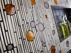
    For me, glass is more the future and stone is more the past. My stone tiles really date my bathrooms to the year 2003. There are some incredible glass tiles, modern twists on classics, or entire sheets of glass. When there is already stone and dark cabinets, glass adds something light and reflective. I thought I'd post a couple of edgy ideas just in case I can convert you. Tee, hee. Have fun! It's just one California mama's opinion. But it's a strong one in this case for glass. PS I don't sell glass tiles. Lol!
  • 13 years ago
    Strip style...
  • 13 years ago
    I vote for the strip.
  • 13 years ago
    I like the strip style best.
  • 13 years ago
    So as the sun came into my house this morning. I saw this texture through out the tile I'm not so sure I'm fond of. Reminds me of snake skin or frost spots.
  • 13 years ago
    strip is still best. You have thousands of choices - you can get strip in other texture and dark if you want it.
  • 13 years ago
    I think all three tiles. Try the skinny in the middle of the other two. Switch it around, see what you like
  • 13 years ago
    I like your Kitchen,
  • PRO
    13 years ago
    I would certainly go with strip style tiles in light colour. Why strip: becuse it has a 'dynamic' look which best corresponds to your kitchen (the mosaic ones look too static). Why light colour: because a lighter backsplash will be nicely framed with darker colour cabinets and darker walls, this will give you a right contrast.
  • PRO
    13 years ago
    We like the strip tile the best out of your samples... As others have suggested, There are many options to choose from so take another look in order to find a tile that you really like. Happy Renovating!
  • 13 years ago
    Strip
  • 13 years ago
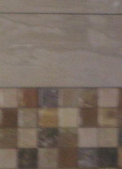
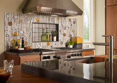
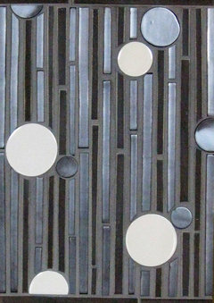
    I was able to get a larger sample of the the tile and I found this mosaic I like. Do you think it's too much to add a 2 or 3 width strip throughout the backsplash to give it a little more character? Or is doing that kind of dated and out if style?
  • 13 years ago
    I like that white one very much. I also like the glass mosaic, goes beautifully with the colours of your kitchen. But I would just go for the white one without the mosaic.
  • 13 years ago
    Reversing that balance might be easier to accomplish?
  • 13 years ago
    I think that would send us waaaaay over budget. The mosaics $25 a sheet where the strip is $12 and we need 33 sqft
  • 13 years ago
    Think I misunderstood; thought you were planning more of the mosaic....carry on!
  • 13 years ago
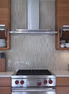
    You could consider turning the strip tiles vertically:
    Contemporary Kitchen · More Info

    Urban Arlington · More Info
  • 13 years ago
    I rather like the mosaic (the colors are great with your kitchen) but not so much with the strip. I might play around with a stripe of the mosaic within a basic subway tile.

    [houzz=
    Haight Ashbury · More Info
    ]
    [houzz=
    Kitchen Renovation, River Forest, IL · More Info
    ]
    [houzz=
    Clayton Kitchen Remodel · More Info
    ]
  • 13 years ago
    I like the strip one but a bit darker.
  • 13 years ago
    Yep love it!
  • 13 years ago
    And it is gorgeous! Well chosen. Simple, but not boring because of the different sizes strips. I love it too :-)
  • 13 years ago
    Hooray! Love it. You have a beautiful kitchen. I was before too.
  • 13 years ago
    "It". IT!!!
  • 13 years ago
    Well done!!
  • 13 years ago
    Congratulations :) Glad you finally have it all done. Have yet to see final results my own new kitchen yet. Having a milky white kitchen this time with these tiles below:
  • 13 years ago
    It does look great - simple and classic!
  • 13 years ago
    Looks fab! So glad you went with the lights colours, it really brightens your space. Great job:)
  • 13 years ago
    Thank you! Definitely brightens it up and looks super sharp with the under cabinet lighting
  • PRO
    12 years ago
    Here is an idea for a long space use the plain field tile or add pops color by adding the circles
  • 12 years ago
    I was just going to suggest you go with the strip one and then i saw you did! It turned out nicely, great job!