Software
Houzz Logo Print
sapphire0905

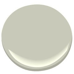
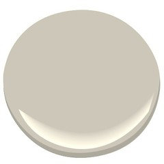
WORLDY GRAY (sw) - REPOSE GRAY (sw) OR GRAY OWL (bm) PAINT & FLOORING

9 years ago
last modified: 9 years ago
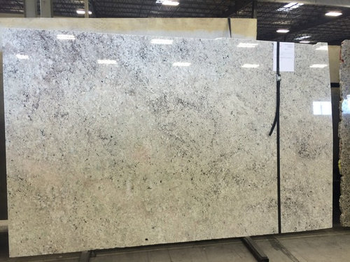
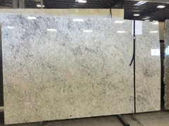
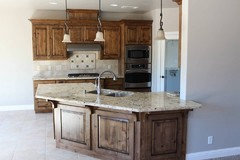
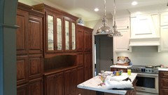
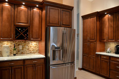
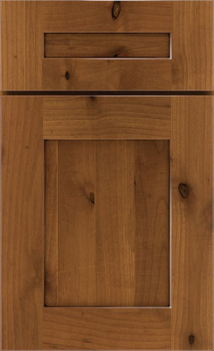
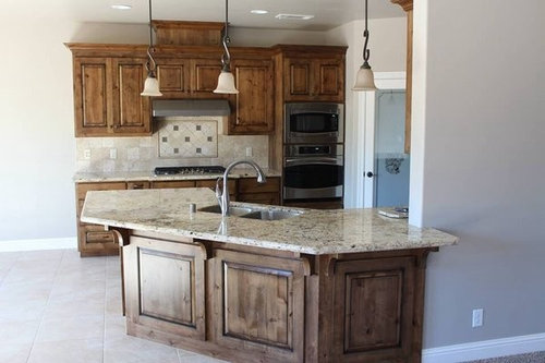
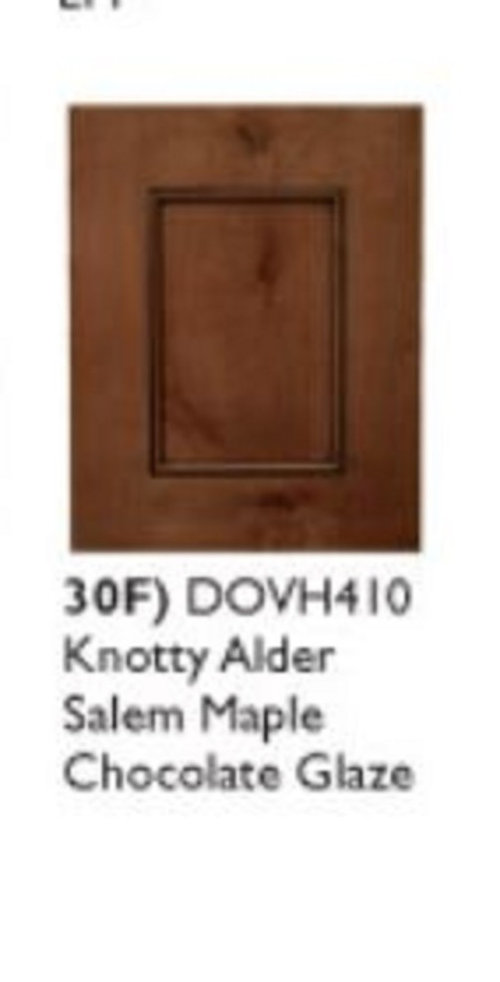
I THINK I HAVE PAINT NARROWED DOWN TO WORLDLY GRAY-REPOSE GRAY- OR GRAY OWL.. I'VE ATTACHED GRANITE AND CABINETS (SALEM MAPLE WITH BLACK DISTRESSED GLAZE OR SALEM MAPLE WITH CHOC GLAZE) THAT I'D LIKE TO USE. MY APPLIANCES WILL BE SLATE, TRIM WHITE AND SHUTTERS WHITE. please ADVISE WHAT COLOR OF PAINT AND FLOORING. THANK YOU!!!!!!!!


Comments (56)

  • PRO
    9 years ago
    With your new photos, I can't tell what your direction is. Are you replacing the cabinets and granite in the kitchen shown? Or just paining the walls? If just painting the grays don't work well. I would be tempted to go lighter. Have you considered doing SW Shoji White in flat for the walls and same color in semi gloss for trim? That would give you a brighter look with all your woods and flooring and yet have a subtle tone on tone look. I would try that.
  • PRO
    9 years ago
    I see the new photos are from a commentor not the original poster. Ok, now I think my thoughts are even more true. I would check out a shade in the tone of your white trim. You didn't mention what "white" you are going with. Try trim in semi-gloss and walls flat finish. It will provide a tone on tone look. Test this out. I am afraid the other ones will look dark with dark wood and floors. And off due to gray tones.
  • PRO
    9 years ago
    last modified: 9 years ago
    Enough of the grays. Choose something else to compliment your kitchen. I see green in the granite. How about B.M vale mist?

  • 9 years ago
    last modified: 9 years ago
    judy, is vale mist comparable to gray owl? I have a sample of gray owl that I'm going to put on my wall tonight. what do you think of repose gray (sw) ?

  • 9 years ago

    flo,, would I do cool or warm colors with the granite. do you like the color choice of cabinets ? (salem maple stain with black distressed glaze )? what flooring would you consider ?

  • 9 years ago


    catching fireflys

  • 9 years ago

    judy, flo , the paint color is going in the whole house.

  • PRO
    9 years ago
    Looking at what you posted and the few pictures on your idea book, it seems to me you are drawn to off whites, light colors and pale stone grays. I just think your cabinet wood and stain don't seem in concert with those things at all. I would probably check your true vision. Do you have photos of proposed house? Floor plans. Existing furnishing you want to use? We are operating in a vacuum and need more information to give you any useful info. A kitchen especially needs to be planned out as much as possible. Lots of details as you are probably finding out. Is this a new home build? Do you have children or pets? Do you have lots of natural light or just some? All the answers to these questions will help us lead you in a good direction.
  • 9 years ago

    Pretty granite...what is it?

  • 9 years ago

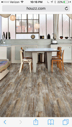
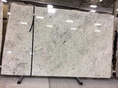
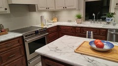
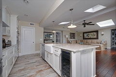
    the picture (I posted first) above with the granite and cabinets is the look I'm going for. (the first slab is my picture and my granite), (the second pic with the granite and cabinets is someone else's kitchen using colonial white granite). I think the pair looks great together. Are you saying the cabinets and granite don't go together ? I'm in search of paint to go with this look. I've narrowed it down to repose gray, worldly gray or gray owl. I'd like input on the paint color as well as flooring (to accommodate the 2nd photo).. i'll post it here.

  • 9 years ago

    I have two kids, no pets. the house has 3 windows in living and kitchen.

  • 9 years ago

    this is my slab.. it's colonial white.

  • 9 years ago

    Between Wordly Gray and Repose Gray...I think I like Worldly better


  • 9 years ago

    kjoy. thank you!!!!!!

  • PRO
    9 years ago
    The granite in your inspiration photo is something like Icy brown. Your granite is gray with black and flecks of white. A cabinet with a grey washed look or white would look better with your granite and than your wood. If you are locked in on your cabinets, I would test out SW Aesthetic white with white trim. This white has slight warm tones but light enough it could be bridge over granite and wood. If you do something like that, I would do a wood floor about two shades lighter than your wood cabinets. Test that out, because the grays you are talking about might go lavender on you with your light and woods.
    Sapphire0905 thanked Flo Mangan
  • 9 years ago

    i'm locked in with the knotty alder (stain isn't locked in though)... i like the idea of asthetic white.. what's your opinion on natural cream from Benjamin moore ? paint color would go in the whole house... (not just kitchen).

  • 9 years ago

    I like Natural Cream, Sapphire0905. Very nice color!! Picking paint is so crazy hard. Went through this four years ago, and I swore I wouldn't redo things again soon. Famous last words....:)

  • PRO
    9 years ago

    OK, knotty alder is wonderful for cabinets as far as wood species is concerned. I used it recently and we went with a gray/brown stain that is great. I will try to get some photos for you of that. Here are some photos of your granite (or close, since every slab is different) to give you an idea of what you can do.

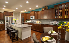
    Campbell Homes/The Marketing Group · More Info
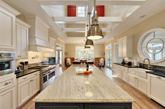
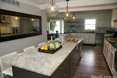
    Here is one with your type granite and medium stained wood cabinets, but notice the island is white or off white. Flooring a couple shades lighter than the cabinets. they have pumped up with some turquoise color on the walls to bring some color into the look. Also added accents of bright yellow. Turns out the grays are very institutional so people need to find ways to brighten up. Here is another approach.
    Kitchen · More Info
    This is your granite with a dark island color and white peripheral cabinets with black countertops. So you can mix the two if you wish as well. That might be a way to bring in a combination with the granite you have chosen.
    kitchens · More Info
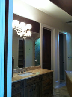
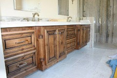
    This is the knotty alder in a bathroom with the grey brown stain. A bit hard to see, because this is still under construction, but it is really nice. That could be your answer. Now this is a marble on the countertop, so your counter top is different. Hope this view helps you see your "cabinets" a bit better.

  • PRO
    9 years ago

    Can you see the gray tones in this versus the red undertones of the sample you posted. This would go with your granite and the gray tone walls you desire. I am not a gray fan, but if I picked one, it would probably be the BM Revere Pewter.

  • PRO
    9 years ago

    So, in summary, keeping the granite, go for a gray/brown stain for your cabinets, and then depending on flooring there are some really pretty engineered wood flooring that has the gray/browns too. And the BM Revere Pewter HC-172. It has warmer undertones but is still gray look in most lights. CAUTION: You have to do sample boards so you can put in the light of your space to determine if any of these paint colors work. What I like about the Revere Pewter is in some lights it is gray and in others it is warmer gray beige. That means it can go with a lot of different colors and as time passes, you can change up without painting everything. Hope that helps.

  • PRO
    9 years ago

    BTW, my client was nervous as a kitten about the gray/brown, but once it was done in total, they love it. It really looks gorgeous. I hoped they warned you a bit on the wood species. It has a lot of knots, more than the "sample" showed, but it still is wonderful. Just a heads up.

  • 9 years ago

    thank you!! look at this knotty alder and stain.. this is a little bit better pic than the kitchen photo I attached earlier (salem maple with distressed black glaze) .. if my home looks like this I will be very pleased!... still trying to decide on paint.. ugggg... who knew paint color would be this dang hard to choose.

  • PRO
    9 years ago
    The black glaze is what makes this look. What style are your doors? They need the profile like this with lots of grooves and details for the glaze to cling into. Is the panel you posted the type you will have?
  • PRO
    9 years ago
    Paint is very hard. Don't loose faith. It just takes time. It will all work out. Will there be an island in your kitchen? Or peninsula? Just curious.
  • 9 years ago

    flo.. the cabinet door is just 1 panel. there will be no island or peninsula.. one more question for you.. I attached some flooring a few posts back.. what's your thoughts on it ? or do I stick with just one solid color ?

  • 9 years ago

    also,, if I went with aesthetic white for the whole house (interior walls and ceiling then the trim and shutters are white.. would that look ok?

  • PRO
    9 years ago

    What do you mean the door is one panel? Is it like a shaker style? Do you have a picture? If you don't have some profile indents, the glaze won't be worth the upcharge. If that is the case, I would just pick a color stain you want and don't do the glaze because it won't show up, if you know what I mean? So the kitchen is a galley type layout? On the flooring, "catching fireflys"? That has too much variation and will fight with other elements in my view. It is kind of "cottagey" and your cabinets are pretty formal with the woods and stain. Is your house under construction? Could we get some pics, because it is hard to make recommendations when we don't have a full perspective? Hate to steer you wrong.

  • 9 years ago

    I'll I'll get back to you when I can get some photos. I appreciate your comments ... this is very helpful !

  • 9 years ago
    My kitchen is worldly gray. not a lot of wall space to show but perhaps you can see it against the cabinets. they are dark stained oak and the cabinets and trim are sw white duck. the ceiling is sw Shoji white.
    Sapphire0905 thanked bradley_amber
  • 9 years ago
    Another view. Installing backsplash so this part won't show but it might show the color better.
    Sapphire0905 thanked bradley_amber
  • PRO
    9 years ago
    I posted several photos and concepts earlier today but I don't see them here. If they don't come up shortly I will repost. I have to do that from my desk top and I am not in my office until later today. Hopefully, you will have more pics posted by then.
  • PRO
    9 years ago

    Well, I am going to try again. I am trying to give you input to your dilemma on what cabinet stain, flooring choice, granite and paint colors that all work together. Bottom line: I believe you have two main choices. One, if you keep the flooring "Congoleum Catching Fireflies" and get the cabinet stain much more on the gray/brown side and then some off white to gray wall paint. Since the paint is going all over the entire house it is important to keep kitchen in mind, but also the affect for the rest of the house. The flooring is very casual and the cabinet look you want is quite formal. So, a disconnect. The second choice: Change the flooring to a more brown/wood stain look. If you "search" the photos on Houzz you will see that there are only a few pictures of this flooring product. I can't find any "customer reviews" on the product. I do have a client who has dogs who likes the vinyl plank tiles, but that is the only one. Most people opt for engineered wood, or tile right now. Here are some photos I found for you.

  • PRO
    9 years ago


    Coastal Kitchen · More Info
    I believe this is the vinyl flooring you are considering. Notice the cabinetry is white. this is a "coastal" home.

  • PRO
    9 years ago


    Kitchen Remodel - Cooper City, FL · More Info
    Here is a kitchen with an approximate cabinet look, and lighter countertop. Not sure exactly what it is. Notice the walls and flooring are light.

    Sapphire0905 thanked Flo Mangan
  • 9 years ago

    just a heads up...Gray Owl can really pull out a baby blue on your walls, (if the lighting is right for it): so careful of your lighting.

    Sapphire0905 thanked User
  • PRO
    9 years ago

    So, if you want grays, I would recommend going with either gray or white painted cabinets (less cost) and the weathered wood vinyl (prefer engineered woods with similar looks-slightly more cost). If you stay with the wood stained cabinets, I would go with a pretty light paint color, hitting the line between gray and beige (SW Accessible Beige 7036; SW Agreeable Gray 7029) I might even cut these with 50% white for a lighter look. All depends on your light in the room, and which flooring you go for. Your main challenge is with the wood stained cabinets, you are on the warm side of the color palette and with the gray toned flooring (Catching Fireflies) you are on the cool side and these don't "dance" well together. Also, stained wood cabinets are more "formal" and painted are more "casual". So, hope this helps. Paint color is affected in the final analysis by many factors. Natural light, artificial light, the "low-E glass in windows", the woods, the flooring to name a few. It is one of the hardest decisions, especially because it generally is done throughout the house. The thing about the two Sherwin Williams colors I suggested, they can sit next to each other two if you want as long as they are separated somewhat. I just did a home that their entry was gray-ish travertine, so they put the SW Agreeable Gray in the entry (two story) double stair-big. Their kitchen was done in painted cabinets with light off white and a chocolate brown glaze, so they went with the SW Accessible Beige in there. Most people can't tell there are two different paint colors! Lighting changes the way these colors look from morning, day and night! So hope this helps as you move forward.

  • 9 years ago

    Here is Gray Owl with Colonial White...

    Rockford Renovation · More Info

    Sapphire0905 thanked kjoy1
  • 9 years ago

    i really like that! kjoy.. do you ?

  • 9 years ago
    My choice would also be BM Revere
    Sapphire0905 thanked Harley
  • 9 years ago

    I do like it...it looks gray/blue to me but coordinates really well with the brown cabinets and flooring.

  • 9 years ago

    Worldly Gray SW and Revere Pewter BM are very similar. Almost identical color in conversion charts.

  • 9 years ago

    Kjoy what's your opinion on repose gray ?

  • 9 years ago

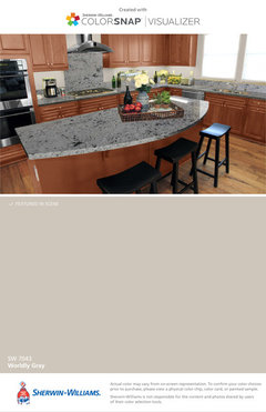
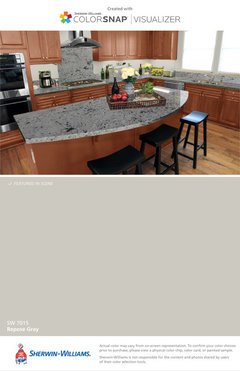
    They are both pretty. Between Repose Gray and Worldly Gray...I like Wordly Gray better because it looks like a warmer color...which I think would coordinate better with a warm wood. Of course I am just looking at these colors through a computer screen. Do you have any samples painted on the wall yet?

    Repose Gray


    Worldly Gray


  • 9 years ago
    I painted my living room worldly gray and it looked purpleish at times and muddy at others. But I have a north facing room. I switched to BM classic gray which is very pale, almost an off white but definitely grayish. I like it much better. It's bright and fresh looking and I think it'd look great in your room of you're open to the idea of lighter neutrals.
  • 9 years ago

    I used Repose gray in several rooms in my house because its a warm gray. I also have Mindful Gray, which is just a little darker, in the great room. It's a little bit from the green family compared to some other grays, but on my walls, depending on how the light hits it, it can read light blue sometimes. It is a really nice color. I also had it in the kitchen above a cooler white cabinets, and it looked dirty. So we switched that to Gray Screen, and it looks just about like the repose gray in the rest of the house.

    I would suggest painting a few big poster boards with the colors you are considering, and move them around the house to see what you like. Also, I would probably have to have all the other things in before I could pick the right color, but that's just me.

  • 9 years ago
    last modified: 9 years ago

    Good morning friends on Houzz.... ! I need to pick paint today .. I'm not going with any paint color I listed originally .. I have the paint choice narrowed down to natural cream (bm) or balboa mist (bm). What color would you pick ?

  • 9 years ago

    They are very similar...I vote natural cream:)

  • PRO
    9 years ago

    Have you tried these in your home and that light? The Balboa Mist has more gray understones than the Natural Cream. The natural cream definitely goes beige. Balboa Mist is a bit "lighter" LRV of 66 and Natural Cream LRV of 65, so they reflect about the same amount of light. I think the Balboa Mist MIGHT be a better choice of the two. But, truly, you have to see sample boards in your light. That is the absolute must to get close to what you envision. Maybe you have already decided since I just saw your post and it was 17 minutes ago.

  • 7 years ago
    @lynnma96 what is that 4th color from the left in the swatch picture you posted?