Software
Houzz Logo Print
hzdeleted_14066723

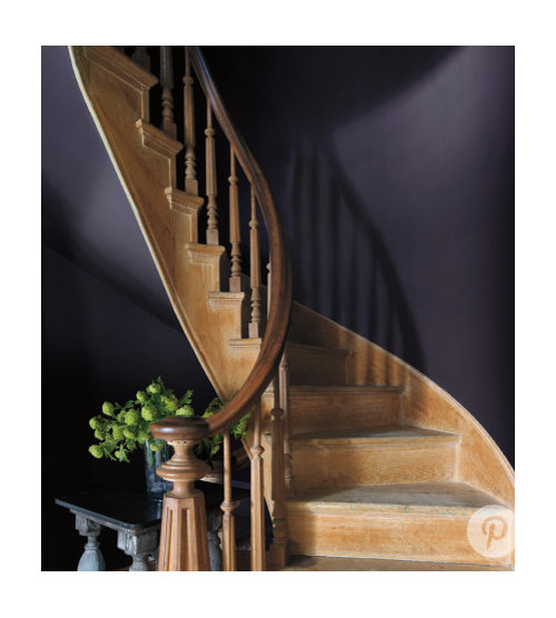
Benjamin Moore 2017 Paint Color of the Year

9 years ago

Just announced! Shadow! Exciting. Purple is getting its due (shout out to Annie Deighnaugh). Hooray! Wonderful choice, IMO.

Comments (54)

  • 9 years ago

    Ugh. No. I don't mind, say, a dark little jewel box of a powder room, but not that color. Many years ago when I worked as a wedding musician, the owner of a very upscale bridal salon gave me an extremely expensive formal gown that shade because they couldn't even get anyone to try it on.

  • 9 years ago

    Didn't Beekeeperswife paint her dining room purple?


  • 9 years ago
  • 9 years ago
  • 9 years ago

    I love the gray-purple-lavender hues but not sure about that degree. Coincidentally I'm helping someone choose colors for her house and we are looking at purple/lavender for the dining room and I'm really excited to see it happen. I think I'd like purple in the dining room or master in my next house.

  • 9 years ago

    I love that color for sweaters, etc. But it's too dark for me for walls. I am sure it can be stunning in the right room though.

  • 9 years ago

    Sueb, look at BM Vintage Charm.

  • 9 years ago

    It strikes me as being perfect for the Addams Family home.

  • 9 years ago

    Well now, I'm finally "in". LOL

  • 9 years ago

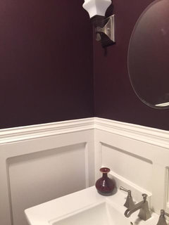
    Very pretty color that would look terrific offset with bright white moldings.

  • 9 years ago

    Love it. Then again, I accent with a lot of purple, and even think purple and orange is a beautiful combination.

  • PRO
    9 years ago

    The problem with colors such as this is that most people have no idea how to use such a bold color and end up using it poorly. Some colors are "idiot-proof"; this is not one.

  • 9 years ago

    I can look at the rooms shown and admire them, but not for me. No rooms that deep, dark either (although there have been many shared here I think beautiful). I crave light and bright (meaning soft colors and lots of natural light).

  • 9 years ago

    Well let's see where this "in" color goes. I am not a fan, but in the right house it could be stunning.

  • 9 years ago

    Humm, I like dark and I like purple but I'm not sure I'm a fan of this one. I'm sure it can look good in the right space with the right accessories and trim.

  • 9 years ago

    These color-of-the-years are so haphazard and cyclical. BM would do much better by categorizing its color trends into ones that are trendy, ones that are classic, ones that are practical for those who don't re-paint every few years, ones that require the homeowner to have the funds to change room furniture and accessories to accommodate.

    I think it takes courage not to fall for these color trends.

  • 9 years ago

    Angolphilia, I'd be interested to hear which colors you think of as idiot proof. (Because I might want to use them!)

  • 9 years ago

    These color-of-the-years are so haphazard

    Agree. I didn't notice a big outbreak of orchid colored rooms a couple of years ago when that was it, or of kelly green the year that was the color. Ditto for the pantone colors. How many blue and pink rooms did you see in mags last year?

  • 9 years ago
    last modified: 9 years ago

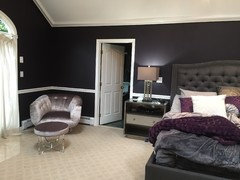
    Anglophilia, I can tell you a color that is NOT idiot proof...purple! Why oh why do I have to love such a complicated color? A color with multiple personalities. A schizophrenic color, but an oh so beautiful and captivating color :) DH didn't realize, till we painted the bedroom purple, just how much purple I wear lol

    Monica (who's still contemplating which color purple to REpaint the bedroom OR are we actually starting to like it?) :o

  • 9 years ago

    I love red-based purples more, but I like this one a lot too. It's inspiring..like the emerald was.

    (I also feel like "finally in", lol. But I'm not sure it's that great. Don't understand this "color of the year" thing...I perceive it more like an annual game, or something. Let them play if they like it))

    And yes..agree with Anglophilia as well..not an easy color to pull off. Very easy to let it fall too..flat. While purple should have depth.,stay true to its nature.

    I read in one of the decor books I love that unlike other colors, purple is not advised to be used in its various graduations and shades in a room..the author-whom I like a lot-says basically to stay with one purple shade and stick to it.

    It made me sad because I wanted to bring in more purples.

    But then I thought..have you been to a garden in May, full of lilac trees? Are they all the same purple? No, they are blue purple,and red purple, and darker purple, and lighter purple...and they do look amazing just as they are.

    So I sighed and decided to go against her advice.

    And I'll have even more purple and its shades in our new place. Why not if I find it beautiful...

    And I'll have plenty other colors too. I carry colors throughout the rooms-even if just a bit-there are very few colors that can't play with purple accents very nicely. Granted, the mood will be different..can be very solemn, or very sophisticated, or mysterious..or can be very joyful too. Knowing myself-I'll go mostly for joyful. All my solemn is inside, and I think that's where it should stay, for everybody's sake..:)

    Of course it's important not to overdo it, like Marie from "Breaking Bad"..so she's like my compass in that regard. Am I in Marie's territory? No? Then great.

  • 9 years ago
    last modified: 9 years ago

    I think the color-of-the-year thing is fun, nothing more. I also suspect it's a form of advertising since it's reported in the news every year, so it's probably just a whimsical thing plus clever advertising.

  • 9 years ago

    "Gentleman's Grey" and "Dark Burgundy" (aka navy blue and burgundy) are the colors in my couch and loveseat. The couch that is still in excellent shape even though it is in the den and used all the time. The newer one that was in the living room died a long time ago. My bright brass that I love is coming back in style. Now the colors are also. This is why I only buy what I like and don't go for "in style"!

  • 9 years ago

    Exactly, sherry...although let's do hope that avocado appliances and bathroom fixtures never make a comeback!

  • 9 years ago

    I just used a similar color in my laundry room along with Revere Pewter. I still need to hang the sign that I made.

  • 9 years ago

    I wish Annie Deighnau would see this thread and put the pic of her library up here with the purple section. It's really gorgeous.

  • 9 years ago

    tibbrix, Why not avocado? (Sarcasm). LOL. Hey, avocado green, harvest gold, and chocolate brown. They were the IN colors (until everyone got sick of seeing them EVERYWHERE). Actually, I am a little tired of the couch. It is a tapestry and I would like to change the colors with the season. Of course, I have no idea where I would store all those extra pillows! Besides the fact of getting them on the couch before that season was over.

  • 9 years ago

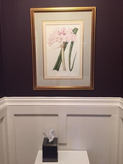
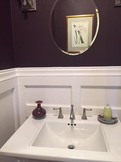
    I don't think I would like it in most public spaces I live in or see every day (like a foyer, kitchen, den, but I could see it in a powder room, den, or that cute laundry niche Mark-Rachel posted. And with the right furniture (I remember BKW's dining room and accents - perfection) and accessories (the powder room Tibb posted above with the beautiful millwork).

  • 9 years ago

    I am a massive color lover, so I personally find this delightful. While I enjoy painting full rooms in bold colors, I think one way to use such dominant wall paint is in smaller spaces like powder rooms, half baths and even full baths.

    Another way to ease into it are CLOSETS! Closets are overlooked!

    The first thing I personally painted when we closed on our home, were the closets. I had painters working on the rooms themselves, while I did this. Primarily because the woman who lived here before us lived here for 50 years, and the closets were drab tan and kind of dirty. The plaster was in need of repair. The floors were also painted brown. We had one month to paint the interior before we moved in, and I thought painting closets right away made sense so they could dry and I could start moving our clothes in.

    My two girls picked sky blue for the walls and HOT PINK for the floors. It looks really fun and cheerful! So I did my closet, the only walk in, the same. Then others are pink with yellow floors and yellow with red floors. I just think its a nice surprise to open a closet and get COLOR IN YOUR FACE!

    I would take pics but that means I would need to hang up the dresses I threw into mine this weekend, and that isnt happening today!

  • 9 years ago

    Never thought of closets! What a great idea!

  • 9 years ago

    I love it! Deep, intense, rich color! Yummy!

  • 9 years ago

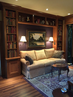
    Thanks for the shout out, Tibb! I'm here. That is actually a stunning shade of purple...not so in your face, but deep and rich and welcoming.

    My library is a little less gray than that.

    I've been in my purple phase for a few years, and now they're finding it...I'm always a few years ahead of my time. Go figure.

  • 9 years ago

    Love.

  • 9 years ago

    Me too!

    Amanda DRo, I think like you..my new closet is purple..)) but very different purple. red based..and very velvety...

    (Actually it was a color that we chose for my daughter's room..but I fell in love..and decided to borrow some more of it

    first put it in the master bath too..but with the LED lights in the evening-it didn't work, light changed it so much in the evenings..so we repainted there

  • 9 years ago

    I love it too :) Annie, it was your picture that made me take a leap of faith and paint my bedroom my heart's desire...purple. Unfortunately MY purple didn't turn out as nice as yours. Bummer, but I wasn't (too) surprised knowing my track record for picking out paint. But to my defense, the color was mixed differently than the sample I chose from. Too much magenta. Does your color change dramatically thru out the day? DH said we can have it repainted :) Ohhh, you NEED this lamp. I do too but would need to sell a kidney to afford it :o

  • 9 years ago

    Speaking of closets, I painted our pantry purple back in 2004. I wasn't brave enough use it anywhere else so this was the best place for it :)

  • 9 years ago

    Monica, I think you really do need that lamp.

  • 9 years ago
    last modified: 9 years ago

    My pantry is almost the same color (Behr Blackberry Wine has just a touch more red).

  • 9 years ago

    Annie, would you mind sharing the paint color that you used in your library?

  • 9 years ago

    I know I need that lamp. It's just finding a way to pay for it. It's times like this I wish I was a pack rat lol. If something lays around here for 6 months or so without being use, out it goes :/ My carpet and that lamp were meant to be together!

  • 9 years ago

    Pretty lamp!

    My wall was a Martha Stewart Living color...HD still kept the formulas to mix it though they stopped carrying her paint line. It was called "purple elderberry".

  • 9 years ago

    I love that color and your library color also Annie . I have long been a purple lover . Since I was a child I would always say my favorite color was purple . I would definitely try it in the guest bathroom or a guest bedroom , too bad they are all done painting . Monica that lamp is gorgeous .

  • 9 years ago

    Beautiful color!!! Not really a color I want in my current home, but my luggage is this color.

  • 9 years ago

    There def seems to be a bit of a blue undertone to it.

  • 9 years ago

    I think a lot of black. these colors, IMO, are best used as accent colors or on walls with very little wall area, which is where they REALLY work.

  • PRO
    9 years ago

    Its really a nice colour.

  • 9 years ago

    Nice, but something to get tired of .

  • 9 years ago

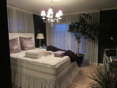
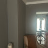
    My wife and I liked Shadow a lot in that stairway pic, but after painting the sample on the wall it seemed too light (they used pretty moody lighting in the image). Our room is naturally really bright (day or night) so we went one shade darker on the sample. It's a color called "Galaxy" and love it (but its dark, sometimes it looks black). Sorry if I overload with

    these pics, have posted before under different topics :) -- Also, it doesn't have the full effect yet, we aren't done (new rug, curtains, bedding, artwork, etc)


  • 8 years ago

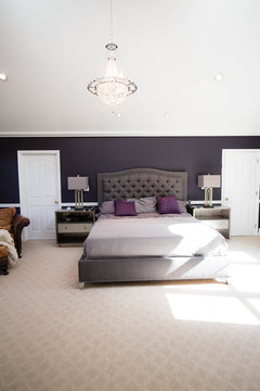
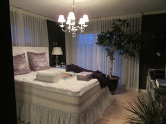
    I painted it with bright white ceiling, mirrored dressers, white linen floor to ceiling draperies

    .

  • 8 years ago
    last modified: 8 years ago

    Every person that has seen the color shadow wants to paint their room this color.