Software
Houzz Logo Print
sunshineandpinot

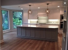
I don't think I'm happy with my backsplash :/

9 years ago
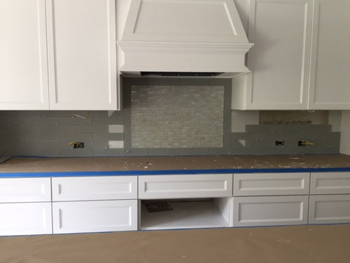
Counters (covered right now) are White Macaubas.

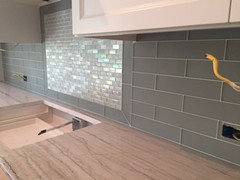
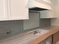
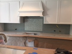
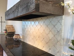
I picked a matte glass tile by MIR Mosaics called Sugar Cookie. I asked my contractor if the line had a fun mosaic that we could do behind the cooktop in the same color but different texture. The line doesn't have one but he found a great match and I was thrilled. Fast forward to installation yesterday. The color just didn't seem right to me; it just seemed "off." I checked the box and the box did not say Sugar Cookie- it said "White Mirage" which is a different color. And the mosaic is certainly a different color.

I expressed my concern to the contractor. He said the colors are right (????) and I need to see it with under cab lighting and the counters. But if I decide I cannot live with it, he'll tear out and redo.

Sooooo...... do we proceed and do I try and live with it? Or tear out and redo?

Comments (72)

  • 9 years ago

    The mosaic tile is very pretty, but IMO the shiny, iridescent small-scale doesn't go with your matte tile and makes it look fussy. I'd say to ditch it and go with the matte tile you have. I like that it is greyer than the sample.

    However, I am wondering whether you might have a totally different tile (not MIR Sugar Cookie). Is there anything on the tiles that might help identify them? Edges the same? Who bought the tiles?

  • 9 years ago

    I like the mosaic a lot. The field tile, not so much. I don't think they marry together at all.

  • 9 years ago

    When I was deciding on a bs, I was really surprised at how different the colour of some of the shiny tile sample boards looked compared to the matte ones once I had them propped up against the wall. Could this be part of what you are seeing?

  • 9 years ago

    I am not at all a fan of the backsplash inset look. I don't think it ever looks right, so that alone could explain what seems wrong here! I'd scrap the inset and just continue the other tile, which i quite like.

  • 9 years ago

    He could remove the mosaic. As it's nicely framed, he could fill the space with your field tile oriented vertically. What color grout did you choose?

  • 9 years ago

    What about same main tile but herringbone pattern on the inset

  • 9 years ago

    Smm if you plan ahead of time for a herringbone insert you can ensure that you won't have tiny pieces - you adjust the dimensions to work with the tile. Retrofitting a herringbone pattern into an existing frame can be tricky, and given this installer couldn't get the color right, my guess is it's a lot to expect.

  • 9 years ago

    That's what I was thinking too eam. Unfortunate.

  • 9 years ago
    last modified: 9 years ago

    I don't have a suggestion/fix for you but I just wanted to say that I empathize with your situation and I feel terrible for you. About 3 weeks ago I had a similar situation where I had to decide if I could live with a backsplash that turned out to look different than what I had pictured - I had the queasy gut wrenching feeling in my stomach when I looked at it. In my case changing it was going to cost quite a bit of extra money, cause a lot of stress in my relationship with the tilers which was already on thin ice and cause disaster with regard to scheduling - so much so that I really tried to talk myself into thinking it would look right eventually... others thought it would be good... theoretically it made sense to me that it should look right... maybe after more things were completed around it it would fall into place....

    To make things worse it wasn't like I knew that it just needed to be changed to "xyz" and it would make it all better. That made it even more frustrating.

    I'm coming to the end of my home renovation that let's just say hasn't gone swimmingly after 3+ years of construction with 2+ years in the planning phases before that and I have to say that I was pretty worn down.

    In the end, after two days of driving myself crazy, I listened to my gut and I had them change it. I chose what I thought would be better even though I wasn't sure that it would actually make me happy (and I think for me that was the hardest thing to justify).

    I write this novella on the off chance that you are the kind of person I am (a perfectinost) and you look for things to make your heart sing not just "be nice" and it might encourage you to go with your gut. If so, trust that it will be worth it and you deserve to go the extra mile to make this detail correct. Give yourself permission to try something different and experience the stress and drama that trying to figure something different out at the 11th hour will inevitably cause.

    Hopefully that wasn't too dramatic but I had to write it when I read the phrase in your post "I don't think I can live with this." It's what I told my husband about our backsplash.

    Good luck finding something that makes your heart sing :)

  • 9 years ago

    I love the iridescent glass tile. What stands out to me is that the mosaic insert is not framed. Possibly that could have tied together the field tile & the insert? I think I'd ask him to grout a small section of the subway field tile & then uncover your countertops. Seeing the countertops with the grouted tile might help you make a decision.

  • 9 years ago

    Thank you for your responses and thoughts. I really wanted a simple backsplash with a little glitz behind the cook top but this is NOT the look I was going for. I emailed my contractor and told him I think I'd just prefer all glass tile, with a contrasting grout (lighter????? darker????) versus trying to "force" a mosaic.

    I love the mosaic and I love the matte glass tile. Just not together.

  • 9 years ago

    I think you're making the right decision to just cut bait and start again. I really think either tile would work, just not together.

    Let us know what you decide on!

  • 9 years ago

    Make sure you uncover the counter when you make your decision.

  • 9 years ago

    Alright, I've been "talked" into by contractor and my husband to let them finish it and grout it, and of course see it with under cab lights and the counters. Hubby says if I'm not totally pleased we'll re do :/

    How much does it cost to redo a back splash?

    Hubs also REALLY likes the mosaic and/or the idea of a mosaic and doesn't want to totally scrap it in favor of just glass tile.

    Ahhhhhhhh!

  • 9 years ago

    I think you're right to live with it for a little while. I know I'm in the minority here but I really, really like it! I see what people are saying about the two tiles not really going together but that wouldn't have occurred to me unless it was pointed out. I'm usually a pretty match-matchy plain jane person and I don't find this combination to be off, at least not in the photos. Wait until everything is done, cleaned up and accessorized. If your husband and team are saying that re-doing later it is ok if need be, then indulge in giving it a try. All your attention is on this now so you are especially aware of how it is not what you expected. You'll be more certain of your decision once everything else has fallen into place.

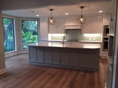
    Your cabinetry is stunning, btw! You've created a beautiful space!

  • 9 years ago

    I agree with your husband too. I also wouldn't make a decision without seeing it with the counters uncovered. for me that is throwing the whole thing off. and what finish hardware are you using? I think finishing it up could be just the thing that is needed for it to work.. good luck, can't wait to see it done.

  • 9 years ago

    I would do lighter grout, lighter than the tile I mean. I would want to see those individual tiles set off rather than blending and then it just looks like a solid wall color.

  • 9 years ago

    The grout is very light- Snow White is the name.

    Cabinet hardware is a brushed or satin brass.

  • 9 years ago

    I wouldn't make a decision with the counters covered either.

  • 9 years ago

    I think it might be the combination of iridescent finish with the matte finish that is throwing you. Looking at them with the grout and countertops may change your view of them though, so hard to say at this point.

    What is throwing me in the photos is that the top cabinets look cream and the bottom are bright white. Is that just something happening in the pictures? With the grays and whites in the rest of the color scheme, that cream shade on top is what throws off the harmony to my eye...

  • 9 years ago

    Trey- I think its just the shadows. The island is gray but back cabinets are all white; SW Incredible White.

    Thanks for all the support. I am still very nervous I'm not going to love it :/

  • 9 years ago

    They finished it this weekend. It looks a lot better with grout but it is still not the look I was going for :(


  • 9 years ago
    last modified: 9 years ago

    Ask them to rip out the mini brick and replace it with your field tile laid vertically.

  • 9 years ago

    it all looks really nice.

  • 9 years ago

    I hope that you were intending to add under cabinet lighting because I think the real issue is it's just too dark looking.

  • 9 years ago

    Although I am a big fan of grey. this is not right. Your initial choice of a light golden color was a better choice. Rip it off fast...like a band-aid!

  • 9 years ago

    I think your contractor should eat the cost because he installed the wrong tile

  • 9 years ago
    last modified: 9 years ago

    I hope you get what you really want and don't settle. DH and contractor would have been vetoed by me as soon as I realized I didn't like it. It would not have been a question or suggestion in my house ;-)

    Frankly, I sort of wondered if your contractor was hoping you wouldn't have the nerve to ask him to redo it once he finished the work. Maybe that's what he was counting on. Anyone doing their job well should want the customer to be over the moon, not merely satisfied or willing to live with it.

  • 9 years ago

    It just looks wrong to me. I would take the contractor up on his offer to re-do it.

  • 9 years ago

    I kind of like the pearl with the matte. Some nice contrast, but I'm not a huge fan of how this was laid into the matte tiles. I think it needs a border or some sort of separation to frame it. It is just too flat for me and not delineated enough. But that is what I think. What matters is how you feel about it.

  • 9 years ago

    Actually, I do like it. The grey is perhaps a bit too dark and it does give the kitchen a more masculine look. If you decide to keep the back splash, I would make sure the counter top is not too dark.

  • 9 years ago

    I would of used the metallic mosaic all around, but indeed lovely kitchen :)

  • 9 years ago
    last modified: 9 years ago

    Yoo-hoo! Lauren! Original poster! What did you decide to do?

  • 9 years ago

    I don't love it :( :( :(


    It's not terrible but it's just not want I wanted at all...... any idea how much it would cost to redo that space? And I'd also LOVE backsplash suggestions if I decide to go that route. (I'll probably start a new thread if we decide to go that route.)

    Major issue- my husband really likes the backsplash. Hardware goes on next week..... maybe that will help? The matte glass tiles just suck the light. :( I'm sad.

  • 9 years ago

    It's hard to say just from a picture, but it looks good.

    This is why I would have put my foot down the moment my gut said, NO!

    ;-)

    That said, if you're not happy, then it needs to be changed. Period.

    You need to find a backsplash that you BOTH love.

    That's the way it works in mama's (MY) house anyway!

  • 9 years ago

    ps... it's a gorgeous kitchen and space. I envy those windows!

    Life is short. Don't compromise.

  • 9 years ago

    I know it doesn't help but I think it looks so nice! Since your husband really likes it why don't you finish up the details and decorate around it, give it through the holidays and come January if it hasn't grown on you a little, see about redoing it.

  • 9 years ago

    beautiful serene kitchen-get your seating in...large plants around the window-and/or small table there.....just use the space-it's wonderful.The SUMM of everything much exceeds the individual elements in this almost finished project. It's really great-nice scale and color tones...everything works !!

  • 9 years ago

    Lovely kitchen, but I think the backsplash detracts from it at present. Quick photoshop to demonstrate. I'm also in if you'd like to try out a few different tile options:)

  • 9 years ago

    I don't love it :( :( :( ... It's not terrible but it's just not want I wanted at all

    I agree. I think the problem is that it's all too plain -- no focal point, no pattern. Imagine this space with a lovely artisan tile -- I love Tabarka.


    The island, the only item that really has some pattern, looks great.
    But the plain-simple cabinets with the plain-simple backsplash and the
    plain-simple ceiling ... comes out kind of blah.

    Since tile is an expensive fix, I'd focus on the adjacent breakfast room ... and allow it to become the focal point. I'd add some colorful curtains ... and then use that same color for some counter top accessories in the kitchen. No beige, no pale blue -- get some color!

  • 9 years ago
    last modified: 9 years ago

    It could be my monitor, but when I look at the pictures with the counter, it looks to me like two different color directions: beige/brownish for the counter vs blueish/gray for the main BS tile.

    What is it that bothers you? Right now it sounds like the backsplash is too dark for your taste.

    Personally, I'd go with a light plain backsplash, like oldbat photoshoppped, perhaps the color of your focal point tiles. Your kitchen doesn't need any additional focal points in my opinion although it could look really cool to add some rustic wood or contrasting molding to the bottom of your hood.

  • 9 years ago

    I love everything else you picked out in the kitchen but am not a fan of the backsplash at all. I think the color is too dark and since you didn't get what you asked for your contractor should replace at no cost to you. Have you found any inspiration photos that could help you find what you will love? Don't settle!

  • 9 years ago
    last modified: 9 years ago

    Its going to be expensive, in the sense that you're re-doing everything, and messy, but replacing a bs you don't like with one you love is absolutely worth the effort here, I think. Of course, I'm not paying, and my husband doesn't love the tile I'm pulling out. Whether it's worth it or not is up to you.

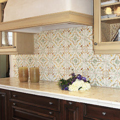
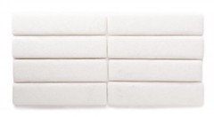
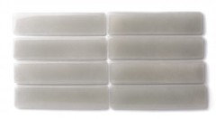
    If you want to stay with glass tile, but are hoping for something with better color and more soul, presence, consider the glass tile from Fireclay Tile. Below are Queen Anne's Lace and Bluegrass, both available in 2" x 8" tiles (matte and glassy) as well as subways and decorative shapes, etc... and either one a much better color choice for you. Good luck!

  • 9 years ago

    We have Fireclay and just love it. The product is superior.

  • 9 years ago

    Sorry to hijack..Mimi is there a picture of your bs somewhere? We're leaning toward Fireclay as well. Thanks!

  • 9 years ago


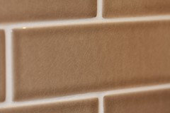
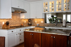
    This is "mushroom". Enlarge the first photo to see the crackle. I loved the variance in the colors, which gave the simple random subway tile some visual interest and texture.

  • 9 years ago

    Have to agree with the above - it looks on my monitor that all of the backsplash tiles read green/blue and the countertop reads grey/brown and none of them seem to work together. The fireclay tiles posted by eam44 would look to be a much better match. I disagree above that you need some kind of focal point. I think it's a smallish kitchen and has lovely pendants, and windows and island and a bold backsplash is just competing with that. Keep it simple! In fact, i was the above writer who earlier said they pretty much always dislike the inset backsplash and i think your current BS is a perfect example of how those insets rarely look good. Even when the underlying colors are similar, as yours are, there's just something "off" about them. I think the only exception is when they are using almost the same tile (like, carerra subway tile BS with a carerra herringbone pattern inset). I still think this is busier than i like, but isn't an eyesore as so many other insets are. I think this inset mistake is actually a good opportunity to replace the whole thing!

  • 9 years ago

    Lauren, I was wondering what you decided to do.

  • 8 years ago

    Bumping - this is a beautiful kitchen and I'm wondering as well whether what you did (or didn't) do.