Software
Houzz Logo Print
tjmoon

Is this a Decorating Fail?

13 years ago
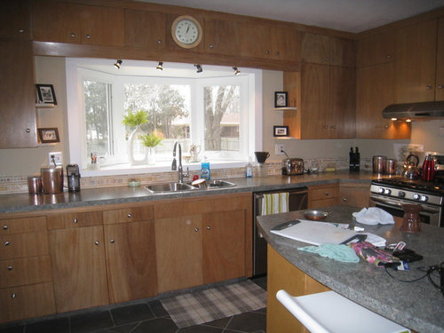
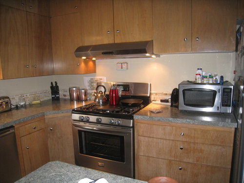
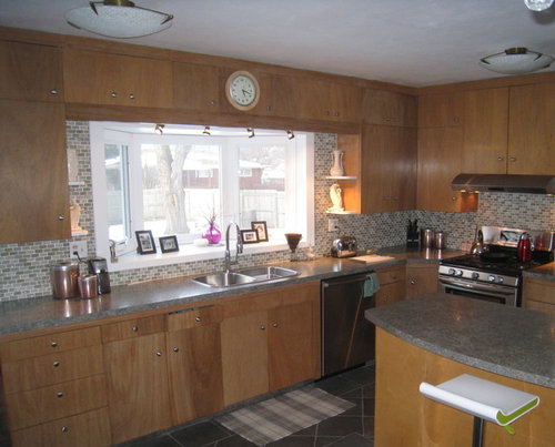
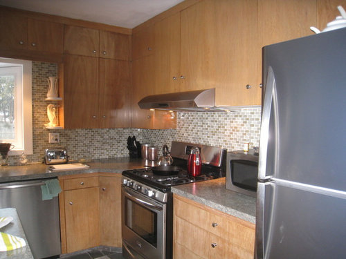
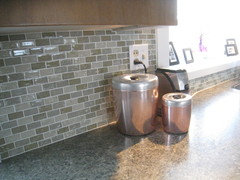
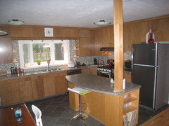
I just finished installing this glass tile backsplash in my kitchen, The old backsplash was partially honey onyx with paint above it. That was removed and replaced with a shattered glass tile that blended well with my countertops. I wanted something with bling, but not too much contrast because I it didn't want it to stick out too much. Now I think it looks too bland, and too grey. I almost wish I would have put honey onyx all over instead. Of course, there is nothing I can do about it now, or is there? I don't want to paint the cabinets. They are original to the house and in wonderful shape. Any suggestions? Did I make a decorating fail?

Comments (58)

  • 13 years ago
    I agree the rug and the clock take away from the room. That window is a wasted opportunity, it would be an awesome place to grow herbs or put some plants in nice pots. If you are worried about color perhaps you could change out the decor on the shelves to something brighter? I love your back-splash and your cabinets, flooring all really nice!
  • 13 years ago
    I didn't even notice that cool white and green stool when I first looked. I would try to add a couple of other pops of apple green and that mirror the contemporary look of the stool. To that end, I do agree with an above poster that the shelving in the corners by the window is not contributing to that look.
    Here are a couple of ideas
    https://www.houzz.com/magazine/crisp-fresh-go-for-green-apples-stsetivw-vs~243705
    http://www.crateandbarrel.com/kurt-green-2x6-runner/s458341
  • 13 years ago
    Yes, I also didn't notice the stool. I'd also put away most accessories and have fun adding that terrific green color in a few spots.
  • 13 years ago
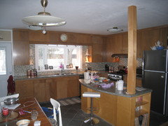
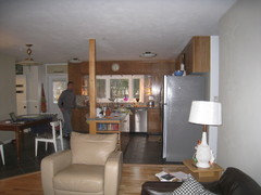
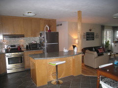
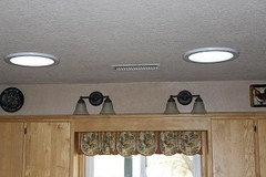
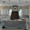
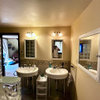
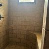
    Thanks for the encouragement, and ideas. There is actually a hole behind the clock. There used to be an electric clock back there. The window is on the north side of the house and I haven't had much luck with herbs, but I just bought a mint that does well in shade, and am also thinking of some ivy. I was thinking that I could do some more stuff with lighting. Under cabinet is a challenge because there is no overhang on the cabinets to sort of tuck them away under. You would see the fixtures. I really don't like the ceiling fixtures. I wish I had recessed lighting or something more modern. The ceiling has some issues due to a leaky roof, and I was thinking that maybe when I had that fixed, I would put recessed fixtures in the ceiling. Also, have thought of adding a skylight over the island. Here are some more photos. sorry so messy.
  • 13 years ago
    Add undercabinet lighting, preferably LED in strips or puck style.
  • 13 years ago
    What if I painted the island and pole white?
  • 13 years ago
    Recessed lighting would be nice. If that is far off, lampsplus.com has a large selection of contemporary flushmount and semiflushmount lights to further the vibe you are going for
    http://www.lampsplus.com/products/close-to-ceiling-lights/style_contemporary/
  • 13 years ago
    I totally agree with replacing your hardware on the cabinets. Cathy S's comment said that.
  • 13 years ago
    Since you have the hole in that cabinet, what about taking the doors off a couple of cabinets and having some open shelving above the window - fill it up with modern white bowls, etc.
    kitchen · More Info
  • PRO
    13 years ago
    last modified: 13 years ago
    Since you are most likely stuck with that post, what if you widened it by a few inches and made tiny book niches? It's a custom cabinetry job, but once you stripped it back to the actual support piece, you might reclaim an inch, depending on how thick the plywood is that covers it.

    Also, ask a builder if it could be changed to steel to reduce it's size even more. then if you add four or five inches, overall you may only gain a few. Just enough space for 4-5 cookbooks per level. Tiny ones, or tchotchkes of course.

    They could be in stop and start sections - like a mid century feel. And chrome the pole in the open areas.
  • 13 years ago
    To me cabinet hardware looks off,otherwise with few minor adjustments it will look great,I like what you did.
  • 13 years ago
    You did a great job with your tile.....I think it is very hard to get it right!!!.......I see a more modern vibe when I look at your kitchen........so I would change accessories to stainless steel look, canisters, etc......and some solid white to pull in the counter stools, maybe putting a small pot of ivy in a white or stainless container in the window....keeping it clean and neat....I would do one grouping under the cabinet on the door side of countetops and one grouping either under the cabinets on the other side or in the corner,..try changing the clock to one with stainless steel surround to pull up the stainless steel look.....loose the rug and NO for me on painting the island and pole.....I would keep the lime green to a minimum, maybe in kitchen towels and table chair seats, etc..things easily changed....just saw your white tea pot collection on top of fridge....they would look great in the window!..keeping everything white in the window, change your picture frames to white keep them in a cluster of assorted heights and not stringing them out, but nothing over a 5x7..keeping top of fridge clean.....it's a nice room......enjoy
  • 13 years ago
    last modified: 13 years ago
    No to painting the island white and I like the cabinet hardware-plays into the simplicity of the cabinet design-though larger would work fine. Your appliances provide enough "shiney" imo. I would replace the clock with a very simple, modern piece in a smaller size. I would replace the open shelves by the window with something more linear and modern in stainless, which would bring your collectibles in line with the style of the room.
  • PRO
    13 years ago
    I think it looks really nice! Love the bar stool and love the bright green as your accent. You mentioned that you did not want to see your under cabinet lighting - you can use a small, simple light rail to finish your cabinets an conceal your under cabinet lighting.
  • 13 years ago
    Tile looks great. It goes so well with the countertop and cabinets. Great improvement.
  • 13 years ago
    Leave the cabinet knobs. Small and simple. Not a problem. Now that I see the picture of the whole room... Talk to a cabinet man and have him match your existing wood. He can make you a new panel or door to replace the one where the clock is. And he can make a side panel to run down the the side of your refrigerator... Thus encompassing the kitchen. No need to change wood on your island and do keep the post as is. As for the dining light I love those adjustable pendants but due to the close proximity of your new ceiling lights you may need to replace the dining light with something from kichler in brushed nickle.
  • 13 years ago
    It is good to get some feedback on this. I just need to quit second guessing myself and go with it. Thank you.
  • 13 years ago
    You have a lovely space-time to enjoy it!
  • PRO
    13 years ago
    Nice job on tiles! ... Choose accent colour ... Lime green or orange, and add white. If the budget allows, off-white countertops (ceasar stone or similar) would lighten up the whole space and make the kitchen shine! And I agree, choose different hardware ... More contemporary and simple - longer sleek handles in brush stainless steel would look nice ... You are going the right direction.
  • 13 years ago
    I think your new tile job looks really gorgeous & you chose a wonderful muted color combo. What I would do is paint just the inside trim of your window a semi-gloss black or dark charcoal that would give the window itself some definition. It all seems to just fade away into itself. The black or charcoal around the edge of your bay window would be picked up by your appliances that also have black in them making your whole color scheme more grounded. I agree with other posters that plants, and perhaps some glass colored vases, would brighten up your window. Same with the small shelves on either side of the windows. Maybe the same black or charcoal paint color on the little shelves as well? I agree lose the rug, and don't paint the island. Really pretty cabinets. Updated hardware would help a lot, perhaps oil-rubbed bronze to be friends with the black or charcoal trim and applicances. Those long sleek handles in stainless or oil-rubbed bronze would look wonderful. That's what I put in my new kitchen, and I love them!
  • PRO
    13 years ago
    I think you did a nice job, it looks like you did a good job on the installation. Your home should suit you (and your family) :-)
  • 13 years ago
    You've done a lovely job with the backsplash, and your original cabinets are wonderful. Don't tinker too much--it's looking great as it is.
  • 13 years ago
    last modified: 13 years ago
    I have been pondering your clock/hole dilemma, not sure of your size area there, but what if you went with a square minimalistic wooden clock in similar wood tone as the cabinets something that didn't have numbers just hands in may be a stainless color?
  • PRO
    13 years ago
    Think about modern slimline track lighting -- the bendable kind so that you could configure it to drop a pendant or two over the island, as well as giving you task lighting where you need it. There are lots of options with either art-style track-heads, or smaller led or halogen lights that look modern, don't detract from the clean, modern look and provide great, directed light where you really need it. If you have to do ceiling repair anyway at some point, you could just eliminate the wiring for one or more of the mounted fixtures. Also, puck lights as under-cab lighting can be really effective -- the pucks themselves are small and less than an inch thick -- not objectionable or distracting to the overall look. I would also add some color on the countertop -- how about a big bowl of colorful apples or pears -- either great-looking artificial ones or real? Or persimmons? Or lemons and limes? Have fun!
  • 13 years ago
    I would change the color of the window or the cabinets. Instead of pics on window, I would put a great heavy clock and some nice green plants! I would like warmer looking things in the counter. The rug is gone, so you can replace it with one that has some color from your tile. Since you like steel, make a light chandelier with kitchen bool (?). Otherwise, spray paint all steel from counter and light with green from your tile. :)
  • 13 years ago
    Go modern. Sleek flat cabinets, glass backsplash . . . Clock: Go with a more modern one like someone earlier suggested. Cabinets: Embrace them. Coordinate their pulls with your new modern clock that accents the stainless in the fridge. Your opinion that it's too bland: Bring in warm, rich colors in accents. Little change: Paint out the bay window. Bigger job: Embrace the pole and make it bigger with a purpose other than support (someone else suggested a column of nooks). Lighting: I wonder if the light was a more modern one with even some color in it if it would make the cabinets look modern instead of retro.
  • 13 years ago
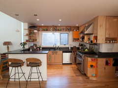
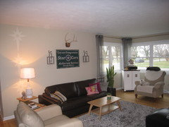
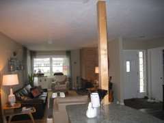
    The wine rack is really cool! I have been tweeking some of the accessories, but I can't afford to change much right now, so I used what I already have for these pictures. Some pictures show how the kitchen opens up to the living room. The sign "Star Cars" is from my dad's shop and he died last year, and I really want to keep in a prominent place in my home. I think what I am aiming at is not just contemporary. I think I want a little mix of industrial chic, modern, and some vintage mid century. The white clock is from another room, I don't like it, but it is more modern. Plants, I think I need more. Quite a mix I know. Am I getting there?
  • 13 years ago
    SolarTubes make a great addition to lighting--without the leak problem of typical skylights. I put two in my kitchen, so I don't have to turn on lights in the daytime.
  • 13 years ago
    Yes, I was thinking about doing these instead of a skylight. I would like to put two of them over the island. I have to wait until we replace the roof in a couple of years though.
  • 13 years ago
    Not a fail at all! I think the tile looks great
  • 13 years ago
    Love the square replacement clock. Good choice. And the idea of solar tubes is fantastic! Maybe not now, but when you're having your roof repaired, you can do them at the same time. Also, I'm a strong believer in your home must fit YOU!! Not a designer or a neighbor. I can see there is a lot of love and care in your home just by your accessories and furniture selections. It's easy for people to judge after seeing professionally designed, staged, decorated, photographed, and sometimes model homes. But to look at someones home and see that it fits them like a glove is what matters most. Congratulations on the backsplash! It was a great addition. :) And if you're like me, you'll always find another project. Thats what keeps it current, fresh and inspiring to us.
  • PRO
    13 years ago
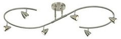
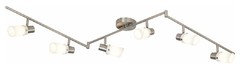
    Perhaps you could move the light so it is over the table... and use tracklighting instead of the fixture in the middle of the kitchen(where it probably doesn't do much good); they come in curves, L shaped and more, these I have posted come from lampsplus.com
  • PRO
    13 years ago
    It's the countertop color that's making this grey...pull out a color in the backsplash and countertop and repaint the walls, think the wall color is too peachy, pick a grey taupe
  • 13 years ago
    VERY VERY NICE. I WOULD GET MORE BOLD HARDWARE N REPLACE THE CLOCK WITH A NICKEL MORE BOLD CLOCK .
  • 13 years ago
    N REMOVE THE RUG IT DOES NOTHING FOR THAT SPACE. IT'S KIND OF OUTDATED N COMPARISON TO UR KITCHEN.
  • PRO
    13 years ago
    Repaint the walls with an opposing color hopefully found in your backsplash...needs to be darker and contrasting to take the "bland" feeling away. Like a darker grey that blends with your countertop and flooring.
  • 13 years ago
    It is a very lovely kichen. Well done. The first thing I noticed was the pretty colour and the grain in the wood. I would not concern myself with the hardware as anything else may distract from the wood. The style of the cabintry reminds me of the.1950s'. You have mixed the two earas', nicely. I would keep the corner shelfs as they are a great place to add colour & change it out for the season. I agree on the changing of the clock. I would look into an art deco clock.....perhaps a star clock. Have fun!
  • 13 years ago
    Can I buy your living room lamp :) :) :) Seriously, I just think your space needs a bit more color (one or maybe two colors that would bring the living room and kitchen together) and other that that, it's a pretty space with a lot of potential !
  • 13 years ago
    Love the backsplash, love the cabinets (and would hate to see you paint them even though I love white). The new clock is good for now as well as the hardware. Would love to see some color. Do you have a Home Goods? They have great glass pieces that are very reasonably priced. A big bright bowl with the above suggested fruit would be great. You could also tie those colors into the living room with some bright throw pillows. You are very lucky to have your Dad's sign, it's so personal and what a home is all about. Be careful not to hang things too high (maybe it's just the angle in the pictures that makes it look a little high). One more thing, I love that your pets look so content.
  • PRO
    13 years ago
    The back splash goes well with the counter and cabinets. I would replace the lights with something more modern. Track lights, perhaps.
  • 13 years ago
    Love the kitchen; I love the sign, too. :) I'd absolutely get a new front door...something midcentury perhaps? That current one is jarring me when I look at e pictures...
  • 13 years ago
    White clock looks much better. Do not paint pole white nor the island. Get rid of canisters on the counters. Put them behind cabinet doors or some place out of sight; I think they are distracting from your look. Keep counter accessories to a minimum. Your tiles look great. Your dad's picture is so special, as art should be. Just please lower it several inches. The bottom of the picture should be around 6 inches over the sofa.
  • 13 years ago
    I can't tell what you put on the shelves beside your kitchen window, but it looks so much better than it I'd with the picture frames:) It looks very put together now.
  • 13 years ago
    than it DID with the frames, not I'd.
  • 12 years ago
    New up to date modern hardware would really make this room pop
  • 12 years ago
    Like the choice of backsplash very much. A little color in the accessories is all I would add. I still think the clock has to go. It stands out too much, there shouldn't be anything there. A hole can be fixed pretty easily, with a little bit of work and where it's located it shouldn't be easy to see once fixed. Love the barstool and love the idea of making the pole larger and serving some function. Either small shelves or wine rack. Looking good!
  • 12 years ago
    one year old post
  • PRO
    12 years ago
    no, it looks good; better than what was there.
  • 10 years ago
    Can I have your kitchen? I love the backsplash & cabinets.