

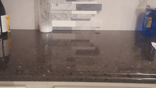
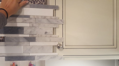
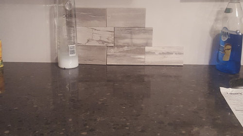
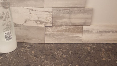
BACKSPLASH HELL
9 years ago
Featured Answer
Sort by:Oldest
Comments (14)
Related Professionals
Cambridge Interior Designers & Decorators · Leominster Interior Designers & Decorators · Kearney Interior Designers & Decorators · Flagstaff Interior Designers & Decorators · North Platte Interior Designers & Decorators · Casper Interior Designers & Decorators · Dover Architects & Building Designers · Madison Architects & Building Designers · Augusta Architects & Building Designers · Magog Architects & Building Designers · Waycross Kitchen & Bathroom Designers · Vicksburg Kitchen & Bathroom Designers · Parkersburg Kitchen & Bathroom Designers · Stamford Kitchen & Bathroom Designers · Cheyenne Kitchen & Bathroom Designers- 9 years ago
 PRO9 years agolast modified: 9 years agosfball06 thanked Home Interiors with Ease
- 9 years ago






Related Stories
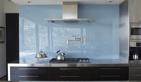
KITCHEN DESIGNThe Future of Backsplashes
Grout is out. Continuous sheets of glass, stone, metal and porcelain are saving cleaning time and offering more looks than ever
Full Story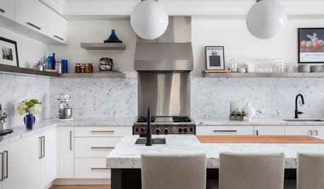
KITCHEN BACKSPLASHESWhy You Should Embrace a Solid Slab Backsplash
The effect is stunning, and yet the cost can be minimal. Here’s what to know about using full slabs of stone in your kitchen
Full Story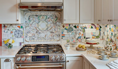
MOST POPULARKitchen of the Week: Broken China Makes a Splash in This Kitchen
When life handed this homeowner a smashed plate, her designer delivered a one-of-a-kind wall covering to fit the cheerful new room
Full Story
CONTEMPORARY HOMESHouzz Tour: An Architect’s Art-Worthy Abode
White gallery walls, midcentury furniture and a collection of eye-catching art make this New York City apartment a showpiece in the sky
Full Story
HOUZZ TOURSHouzz Tour: Life in a 19th-Century Creamery
Starting with an empty storage barn, this family transformed a historic Minnesota creamery into a modern home that honors its roots
Full Story
KITCHEN COUNTERTOPSCast Concrete Countertops With a Personal Twist
From frame making to pouring to inlays, learn how concrete counters are cast — and how an artisan embellishes them
Full Story
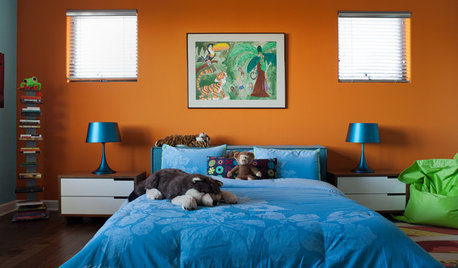
COLOR10 Color Combos You Never Thought Would Work
Orange and blue? Purple and green? Yes and yes. Unlikely pairings can look great if you do them right
Full Story
APARTMENTSHouzz Tour: Personalizing a Miami Bachelor Pad
Meaningful artwork and other taste-specific touches make for a masculine home that happily fits the owner
Full Story
KITCHEN DESIGNKitchen of the Week: Preserving Period Charm in Atlanta
Additions and updates to this kitchen respect the past while meeting the owner's needs in the present
Full Story




JAN MOYER