Software
Houzz Logo Print
emmie2

fantasy brown granite w/ Sunset cherry cabs : backsplash assistance

9 years ago

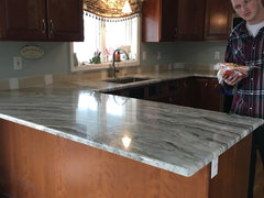
ok so earlier you were kind enough to help me decide where to end my backsplash.(thank you). Now I"m requesting assistance in choosing it's color. This is a mini-remodel keeping 19yr old Kraftmaid Sunset stain, cherry wood cabinets in their original footprint, updating stainless steel appliances, and replacing the old faux green marble laminate countertops with Fantasy Brown Granite. So far, so good.

i've seen some beautiful tilework on these forums but most are linked with painted white or very dark cabinets. it's very hard to get an idea of what will work via one tile samples and also because i am finding it tough to find pictures in the same family as what I have put together.

i find myself repeatedly drawn to (1)elongated subway tiles and have learned from your advice to stay away from busy tilework as my granite is busy enough, "She" truly is the star of this kitchen. and (2) tiles with variation in the color. So these are some of the things i've come up with:

the Encore crackle tile-silver, bali, sky and I really like Ice but can't find a picture of it in use. i don't have a sample of Ice to look at but do have the others.

the fireclay series- really love their glass tile but am hesitant to commit. i have french linen, tusk , gardenia and 2 others. the two that are decent are FL and Tusk, but i don't love them and their colors seem " too saturated" if you know what I mean?

(3) home depot white (not the polar ice but a subdued white)subway tile with gray grout

i'm technically challenged and therefore can't cut and paste. If anyone is able would you be able to help a girl out? any thoughts or advice, both on color or direction would be greatly appreciated.

also as an fyi i'm considering putting a panel of SS behind my slide in JennAire Induction range up into the Kitchenmaid OTR SS microwave/hood. (not a fan of or but ductwork out of the question). i will try to upload some pictures Thak you

Comments (13)

  • 9 years ago

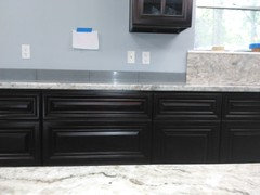
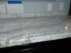
    pics


  • 9 years ago
    last modified: 9 years ago

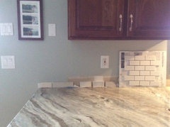
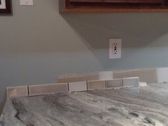
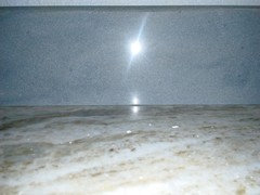
    the top picture (with my son) is daytime and the upper cabinets actually look darker than IRL (lower cabs are closer to color). the next two are at night. The wall color is BM Gray Wisp chosen instead of RH Silver Sage. it can be pale green or pale blue depending on the light. the house faces south/southwest and has a covered porch (which darkens our poorly lit kitchen). the granite has more taupe/brown than gray in it though the pictures don't really seem to show that. the bottom picture has from left to right encore silver (first two tiles), Sky, smoke, storm and Bali. the samples of Sky and Bali behave the same way my paint does


  • 9 years ago

    First, allow me to swoon over your counters. Fantasy Brown is one of my all time favorites... *swoons*


    Now that I've got that out of the way... I'm continually drawn to Bali. I think it brings out all the lovely green/blue-gray hints in the counters. Sky and Storm probably tie for second place. I think Bali and Sky will give you a brighter/lighter/more airy feel and Storm will create more of a "comfy and warm" feeling.

    emmie2 thanked BobbinsNLye
  • 9 years ago

    Thanks BobbinsNLye, swoon awayI still can't believe she's mine! I've always been partial to stones with movement and this granite delivers. Which definitely makes it harder to pick out tile. I wish there was a color between Sky and Bali. Although from what I've read, this particular tile has plenty of variation in it, so perhaps the Bali sample is one of the " bluer" tiles out of the group of five and my Sky sample is the one with the least amount of color?

    The HD and Lowes in my area has very little tile to actually see IRL. I just saw a nice photo of a white JC subway tile in another thread that may work as well. I like it better than the white tiles in photo #2

  • 9 years ago

    All of your samples look pretty:)

    When I could not decide on which color tile for my wood cabinets, I color matched the tile to paint, got a sample jar and tested the different colors - which actually weren't colors at all - I was deciding between white and cream - not an earthshaking decision:) I had though I would do white, but then thought it might be too stark - thus the indecision. Anyway, the white paint was too stark, the cream much better, so I went with "Alabaster". This also worked well with my wall paint color. I do not know how it would work with your walls though:

    H-Line "Alabaster"

    https://www.houzz.com/photos/my-pics-work-in-progress-phvw-vp~57088087

    emmie2 thanked jhmarie
  • 9 years ago


    I am of course prejudiced since I have fantasy brown too. I like the second long tile and the last blue one. I was considering a somewhat similar blue for mine I think I have a picture. I decided to go with matching instead but I really liked the blue.

    This is what I went with.


    emmie2 thanked ravencajun Zone 8b TX
  • 9 years ago

    Jhmarie, that's a clever idea and the color marries perfectly with your beautiful granite. I was thinking if I go white subway ( and who knew there were so many shades of white) that I would use a grout color that I could match to some of the veining in the stone. Either a medium gray or a deep taupey brown.

    Ravencajun, I've been stalking your pictures ;) with great interest. You've done a lovely job with all your choices. Isn't it hard to choose? I have to go back to see where you found the matching tile

  • 9 years ago

    Ravencajun - that is so pretty:)

    emmie - Because of the amount of grain in my cabinets, I had to be careful of adding too much movement to the backsplash. When your tiles are installed but not grouted, it will give the illusion of a contrasting grout. In my case I could see that contrast would not be the best, though I did use white grout since there is white as well as cream in the countertop - sort of a subtle contrast. You can decide on the grout after the tiles are up and you get more of a visual idea of how it is all going to come together.

    emmie2 thanked jhmarie
  • 9 years ago

    Thanks for that tip.

  • 9 years ago

    also, you have such a great space there now to "try out" which color you like the best! for a few bucks at the paint store, you could get a paint sample close to the tile you're considering, throw it up there and see how it looks!

    emmie2 thanked User
  • 9 years ago

    You'll you will laugh but I actually am trying to find a tile a little lighter than " Sheetrock". That gray actually doesn't look too bad ;)

  • 9 years ago

    Watch out for trying to mix cool grays with warm oak. Small amounts work OK. A gray backsplash would have gone with my countertops - but would have been drab with my warm wood. Warm wood tones and cool grays do not bring out the best in each other which is why the gray is usually paired with white.

    Gray is a bit overused right now which means it risks being labeled "dated" in the next 10 years though it will always be an important neutral - like cream and beige. Go ahead and try it in wall color that can be easily changed but be careful of using too much in more permanent surfaces.

    The grays in your countertop read warm which is why it is working with your cabinets. Consider your wall color last as it is the least permanent surface and easy to change.

    emmie2 thanked jhmarie