

Gallery Wall
9 years ago
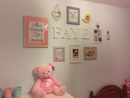
Featured Answer
Sort by:Oldest
Comments (13)
- 9 years ago
 9 years ago
Related Professionals
Concord Interior Designers & Decorators · Cookeville Interior Designers & Decorators · Danville Interior Designers & Decorators · Albuquerque Interior Designers & Decorators · Greensboro Architects & Building Designers · McAllen Architects & Building Designers · Fort Collins Architects & Building Designers · Fort Smith Kitchen & Bathroom Designers · Cookeville Kitchen & Bathroom Designers · College Station Kitchen & Bathroom Designers · Gloucester Kitchen & Bathroom Designers · Lawrence Kitchen & Bathroom Designers · Lincoln Kitchen & Bathroom Designers · Salt Lake City Kitchen & Bathroom Designers · Spanish Fork Kitchen & Bathroom Designers- 9 years ago
 9 years ago
 PRO9 years ago
 PRO9 years ago
- 9 years ago
 PRO9 years ago
 9 years ago
 PRO9 years ago
- 9 years ago
- 9 years agolast modified: 9 years ago



Related Stories
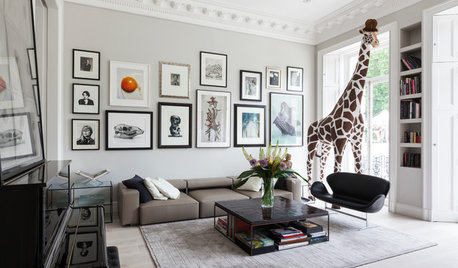
ARTAn Insider’s Guide to Creating the Perfect Gallery Wall
Bring your room to life with these expert tips for grouping artwork and photographs
Full Story
BUDGET DECORATINGBudget Decorator: A Most Affordable Gallery Wall
Need to fill a wall on the cheap? See how to make use of something pretty cool you may already have
Full Story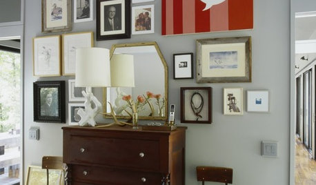
ARTA Gallery Wall for Every Personality
Eclectic, ambitious, inspired, dreamer? Which art-wall type are you?
Full Story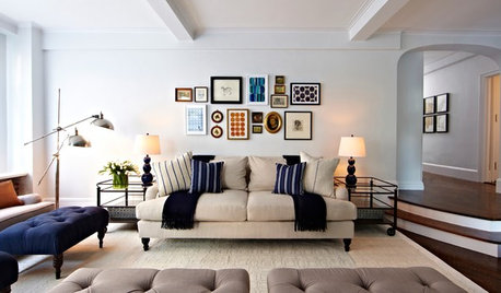
SHOP HOUZZShop Houzz: Products to Help You Create a Gallery Wall
Curate a stunning collection for a gallery wall that makes an artful statement
Full Story
SHOP HOUZZShop Houzz: Create a Gallery Wall at up to 75% Off
Bring style to your walls with art, frames, mirrors and other decor
Full Story
DECORATING GUIDESHandmade Home: How to Design a Gallery Wall
Learn how to transform a blank wall into an eye-catching display — with or without art
Full Story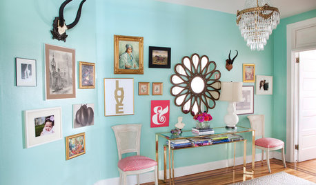
SHOP HOUZZShop Houzz: A Picture-Perfect Gallery Wall
Capture life’s moments and the things that inspire you on a most intriguing wall
Full Story0

SHOP HOUZZShop Houzz: Up to 65% Off Gallery Wall Art
Dress your walls for less with contemporary, traditional, coastal and vintage-inspired artwork
Full Story0
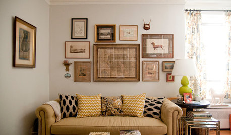
SHOP HOUZZShop Houzz: Create a Salon-Worthy Gallery Wall
Make a statement and tell a story with an eclectic collage of artworks
Full Story0

COLOR9 Great Colors for Your Gallery Wall
Boost the power of your art collection with paint that brings out its color and detail
Full Story


Warren DowneyOriginal Author