Software
Houzz Logo Print
designhome1989

need help picking out wallpaper

9 years ago
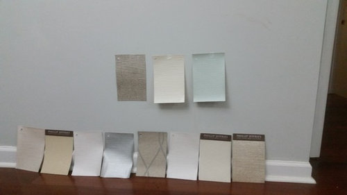
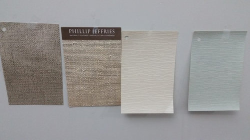
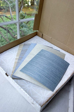
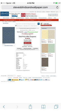
i habe recieved some of the wallpaper samples.. some grasscloth and some not.

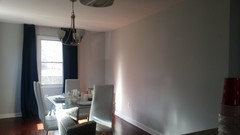
i am conflicted what color to use. the walls of the dining room are light light gray so mostly i decided to not use a gray or any beige, even though some of the samples are those colors


i think blue or greens are more the color im going for but im still not entirely sure. so, im wondering what you all think... which ones so far look ok???

im open to other styles and colors

the only blue shade i have so far is the one to the far right... i plan on getting more green and blue sjades but again open to any suggestions, or if any of the pictured ones look ok

Comments (39)

  • 9 years ago

    What furniture do you have in the dining room and adjoining areas?

    Hard to say what works best without knowing what else is in your home.

  • 9 years ago
    You discuss the color of the wall paint and are discussing wallpaper. Is the wallpaper for an accent wall or adjoining room. Sorry. Not getting this.
  • 9 years ago
    the curtains are navy blue.

    ?
  • 9 years ago
    hi, its for the accent wall. the long empty wall to the right.
  • 9 years ago
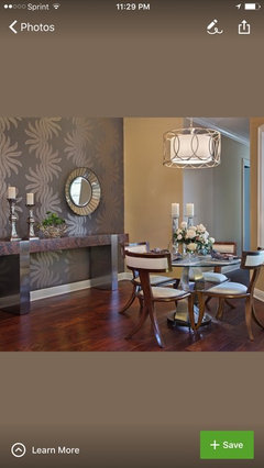
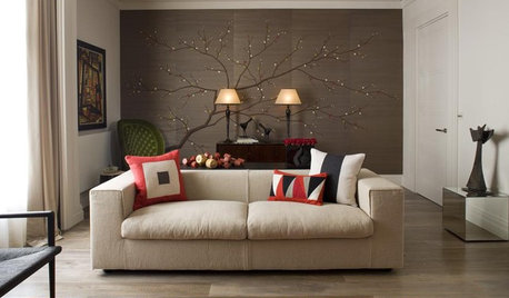
    Hmm, I'm thinking non of them. All to boring! Now these are wallpapered accent walls...
  • 9 years ago

    Try to be a bit bold for an accent-my favorite of your choices was the large patterned one! Do you know what furniture you will be using?

  • 9 years ago
    yes! i do know

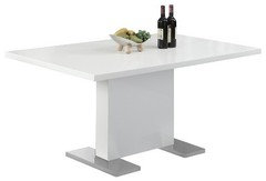
    this table by monarch , because im keeping the chairs.

    curtains are a dark navy blue. i dont mind darker shades, but i dont want to darken the room and make it look too heavy either.

    btw i hate the too-many too silly looking wallpapers with too much designs and patterns
  • 9 years ago
    not a designed but just to weigh in, as I want thru this too.

    If house is mostly gray and white paint stick with cooler tones but go for a cool pattern that speaks to you. something that stands out.
  • 9 years ago
    does that mean only greens, blues and purples/grays will go well with the light gray walls?

    i want some beige or yellow, but the curtains are staying so whatever color i pick needs to look ok with rich navy blue...

    i am looking at blue/green grasscloth now but none look good with the curtains.


    i also have a somewhat champaigne colored credenza another designer suggested to me but i dont know how well all these colors will work...

    they are all bold colors of blue, stark white and a soft gray wall... ugh
  • 9 years ago
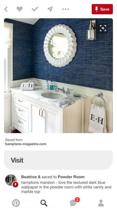
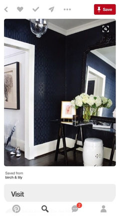
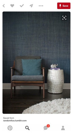
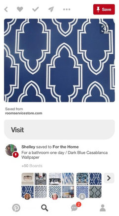
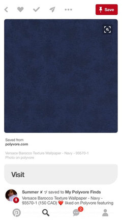
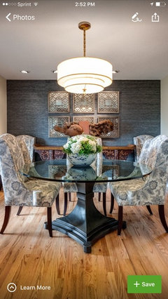
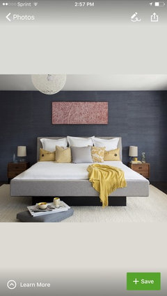
    If you are keeping the curtains then you may want to consider going to a darker toned blue paper to tie those in. This will make your furniture pop to and look wonderful with your gray and add some warmth to the space. You can add yellow in your accessories. Your light fixture is too high off the table BTW. Here are some examples of paper. Mixing gray and beige tones is a sophisticated look but best left to a professional. You may want to hire one if that is your wish.
  • 9 years ago
    Couple more
  • 9 years ago
    yes i think im set on the color.

    a blue tone. i dont want it too dramatic and same color as curtains. but a shade or two or three or four lighter is nice. the examples above are nice. ireally like these grasscloth ones....


    my only question is would yellow, tan or gold features like decor, buffet etc go well...and if so , how...

    im thinking of ordering one of these....the two blue shades
  • 9 years ago
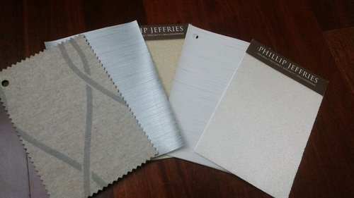
    Designhome, it's hard to see in the box! Take the two darkest blues and put them on the wall as close to the drapes as possible so we can get a visual.
  • 9 years ago

    the gold/yellow and tan will go because they are complimentary to blue. the first blue one in the box is a nice shade.

  • 9 years ago
    oh the pizza box swatches arent mine. i found them online. but they are the closest to what i envisioned.
  • PRO
    9 years ago
    Don't do wallpaper. Do a great painting. Easier and less risky for you. Then the painting can pick up the navy blue. Those lighter blues will just wash everything out. I will find some art for you.
  • 9 years ago
    is tan not a warm color? i really love gold, tan, beige colors. the house, moreso this dining area doesnt have any other colors than blues, whites and grays .

    i am now deciding either blues (no greens or lavenders because the curtains are blue) or tans/yellows.

    my only issue with tans are the wallpapers i found are verylight and next to the gray wall, they get swallowed? if ykwim
  • 9 years ago

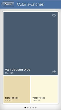
    Flo, Van Deusen!! send her to read Christines post! lol

  • 9 years ago
    ughhh you may be right. i heard wallpaper is hard to take off and not ruin paint. i have been hesitant about it for that reason. otherwise if there are easy to take off ones, i might look now for tan or light blue wallpaper

    im not as crafty as most people here so if i mess up, umm....thats it. LOL ruined walls.
  • 9 years ago
    who is van deusen, beth?
  • 9 years ago
    last modified: 9 years ago

    lol. VanDeusen is a blue paint color from BM. we were helping another poster w/her dining room. took us days to get her to go for the darker blue paint color for her walls. she was afraid of darker tones. She finally went for it and it came out beautiful. (she had white wainscot). I chuckled when I read Flo's answer to you because it's sound like the other one.

    If you'd like to read it, (and it's long) here it is

    https://www.houzz.com/discussions/dining-lacks-something-what-would-you-change-dsvw-vd~4379834

  • 9 years ago
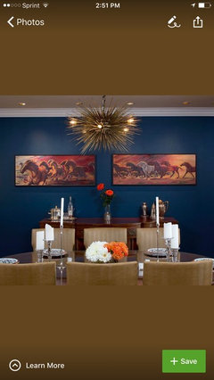
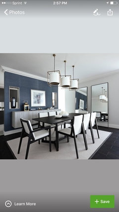
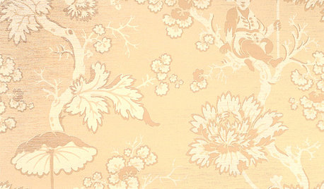
    Here are some examples of blue grass cloth in rooms. It is a very versatile look. When you say gold and yellow or tan you are not being specific about the use. Of course gold always looks lovely with blue; are you thinking of changing your light fixture or perhaps having gold on the sideboard as pictured on the one I posted earlier? Are you planning on having a lot of yellow in your artwork? That would look very nice. Yellow looks great with blue, white and gray. I would caution you about the tan however. Tan does look nice with blue but may be harder to incorporate with the gray in the rest of your house. Try not to have to many design elements in one space!
  • 9 years ago
    LOL!! i thought that was a person., A hahaha.
    im going to google van deusen paint. i agree that light colors wash out. look at the picture i posted. everything looks bland.
  • 9 years ago
    ah those dining rooms are nice
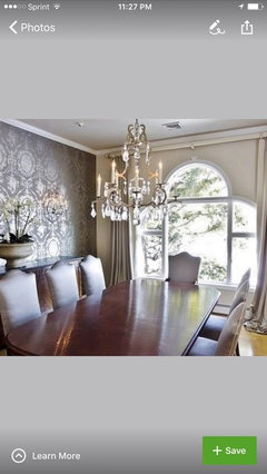
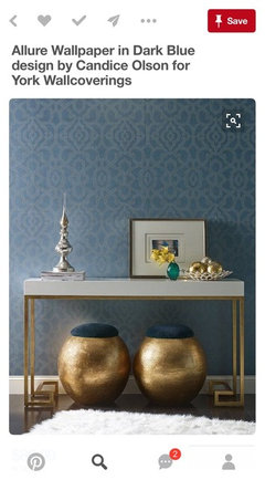
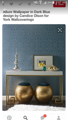
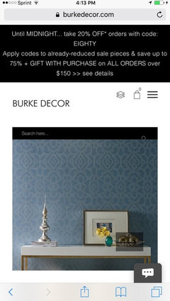
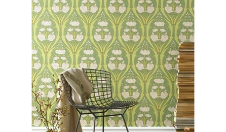
    the first wallpaper you showed , with the soft pattern and the gold and white table...ah thats gorgeous. i was looking for that one. if i can find it i wouldnt mind buying it and trying it. thanks for posting it :D

    although now that flo mentions, it IS messy and risky, but idk, maybe if i get a swatch and it looks nice, i will take the risk!
  • 9 years ago
    Oh geez! I thought these were your samples! Yikes! Just paint then....
  • 9 years ago
    beth, that post is so0 long but perhaps worth a read with coffee later tonight. i get some good ideas from other dilemmas and i think others do too vice versa.

    oh and the paint color is gorgeous. i dont think its bold at all. its very soothing. it would look stunning with some gold and champagne stuff i got. i cant paint though, so i think the pic above is pretty close to the shade.
  • 9 years ago
    no the samples i originally posted and every picture posted thus far are mine. the only samples that arent mine are the ones in the pizza box.
  • 9 years ago
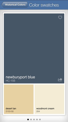
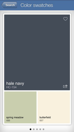
    Here are some paint colors. It's just paint;)
  • 9 years ago
    Designhome, that paper is listed right on top of the photo. It is Allure by Candace Olsen by York wallpaper! Should be very easy to find!
  • 9 years ago
    I think it is lovely; have a pro hang it!
  • 9 years ago
    Just google it!
  • 9 years ago
    i am definitely considering it
    i have some idea for how to include the wallpaper in a rich blue with the white table chairs and gray walls.

    so top pick right now is the allure wallpaper, i would like some texture such as grasscloth and im not too keen on patterns but this wallpaper seems to be an exception. i really like it.

    of course if there are other similar ones id love to get them to test too. i am ordering a swatch of this to test out.
  • 9 years ago
    the options linartist mentioned are awesome looking. since you are afraid of bold styles, I say go for a pattern in one of those dark blues where the pattern isn't much different in color

    but some gold accents around the room, artwork and such would look great. I wouldn't do the whole wall gold or tan though.
  • 9 years ago
    i think i will stick to blue, since the furniture will be beige and white


    my only problem is that i have a big ocean painting that is mostly shades of blue. iguess i cant put that up. it might get lost in the wallpaper blues..
  • 9 years ago

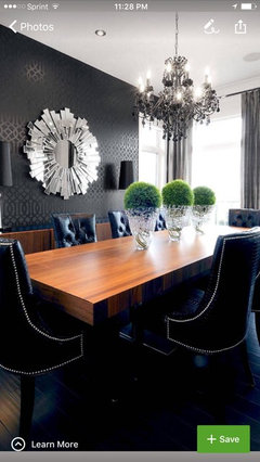
    I feel strongly that accent walls need to make a bold statement. And I agree with Flo. Wallpaper is a pain. However-- this dining room posted by Design home is gorgeous! I love starburst mirrors. That one really rocks on that black accent wall. This is making black and white work at its best --with tons of WOW factor! Love it!

  • 9 years ago
    i might just end up painting if its cheaper. i only wanted wallpaper for its patterns (see: allure wallpaper candice olson) and texture (grasscloth). they are expensive. and for now, i am still trying to get samples before i make the purchase. havent found a place to get a sample of the allure WP though.

    yes, it would be a simple accent wall. it would have to be blue because curtains are blue and wall iis gray.
    i couldnt do black. wayyy too bold for me.
  • 9 years ago

    I think a deep rich blue would look great. And remember-- it's YOUR house. I would love to do a black accent wall, but i'm a crazy artist lol!

  • 9 years ago
    i will probably get a designer to pick one out for me