Software
Houzz Logo Print
lablover61

Walls too PLAIN

13 years ago
last modified: 13 years ago
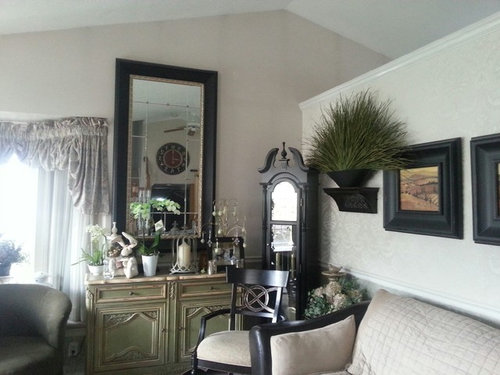
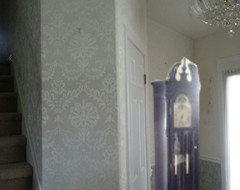
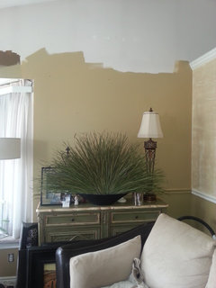
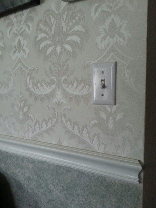
I need to do something to a large wall ie. paint, or Ideas? I can't figure out what to put on the wall next to mirror. The eye goes up and down as you scan the room. It just doesn't look right. It's so cluttered. It has a front corner window seat and chair rail around the room. The top half of chair rail I wall papered a long time ago and don't like anymore. Any Ideas on what To do to this room? I have no idea on a color to paint. The carpet it Taupe. I've attached a picture of the off white wall paper too.

Comments (162)

  • 13 years ago
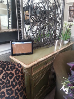
    Kathryn Peltier Design - yes the console is cream/green. The chair is just green.
  • 13 years ago
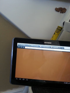
    Kathryn Peltier Design - I do like that Toasted Marshmellow! Very warm. I brought up the color on my Notebook to give u a peek.
  • PRO
    13 years ago
    I'm not sure - it might be too yellow still. gregswife had suggested a green. You might try matching the chair with a very muted gray-green, too. I'll look again later - gotta run!
  • 13 years ago
    Lablover..just to clarify...are you leaving all of the wallpaper or just the stair wall wallpaper? Did you decide just to paint where you have paint now? Yes, black wainscotting isn't for everyone. I like to throw different ideas out to give posters more options.
  • 13 years ago
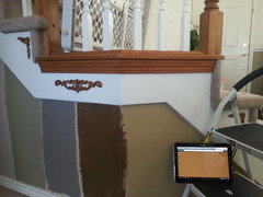
    On the stairs picture, from left to right, it goes providence olive, grey, fossil butte, correct? What is the color over the window?
  • 13 years ago
    It's all 3 of the 4 colors I put on the stair wall except the grey. I took a picture of the paint chip and posted above (its Golden Age).
  • 13 years ago
    Darzy - yes I am going to take down the paper. I was working on a paint color first. Then going to start the big project. Didn't make it back to Home Depot today but will again in a.m. and I hope you know I really do appreciate your ideas. Thanks :)
  • 13 years ago
    جميل
  • 13 years ago
    I like the color under the black chip above the is no name on it. Is that one of the samples on the stair wall ? I really like the color you already have under the stair wall the best. Or a shade or 2 darker.
  • 13 years ago
    Kevin Retired Decorator - I know the picture shows up smaller of the paint chip than it actually is. If u click on it or use ur pointer finger on it, it enlarges. The name is Golden Age. It is on the stair wall on the very right. Also, it is onthe wall in the picture right next to the black/golden age paint chip.
  • 13 years ago
    (@ Tina Thanks for the info.) I like the color if it goes with the carpet and flooring. And of course with everything else. I love golds they feel so rich looking. I haven't had enough time to read everything the past few days.s
  • 13 years ago
    Tina, I am feeling so sad after reading about your room. When I saw the first "before" photograph that you had posted, I immediately loved so many things that you had done. You have a wonderful style that is very dramatic. I agreed with Brenda when she wrote, "It's a fun room. It reminds me of one of those great little overstuffed boutique shops that you stumble into on vacation. Tone on tone, with strong black accents and a bit of green ... there is a lot to like about the room." And 5 other people agreed, too! Your natural style is sumptuous, rather French, full of texture and drama. You even use contrast well, bringing in bold, dark lines and deep blue accents. Sure, it's all right to switch a few things around or update your window treatments if that is what you would like to do ... but please don't change too much. Your own style is lovely and dramatic!
  • PRO
    13 years ago
    You know, I saw that color Kev is talking about and didn't realize you'd painted another color there (from the previous photo). I like that color too. I think it brings a certain richness and warmth to the walls - what I thought might work with the Toasted Marshmallow, but doesn't. I am concerned, though, about it working with the wallpaper.
  • 13 years ago
    @irishgirldesing... I couldn't agree more! Some tweaking and editing is in order for sure but irishgirl's point is why I mentioned that a LITTLE "clutter" is okay sometimes. I too actually like the oversized mirror above the chest (centered). Breaking the rules (in a good way) looks much more interesting and fits the style and personality of you Tina! You aren't designing to "sell"! Yes, great designer advice has been given but trust yourself too and don't lose the personality of your space. Having said that, I'm very glad you removed those swag curtains. :)
  • 13 years ago
    I don't mind the gold walls with the wall paper because the oak railings tie that color in to the hall stairs. Also the gold color sort of updates the oak color by making it more neutral.
  • 13 years ago
    last modified: 13 years ago
    ; ) I still like the grey green of providence olive! Your room and furnishings are really good and i agree about the french/boutique look of the room. You can't go wrong!

    I thought your screen name was lablover, not Tina! Lol
  • PRO
    13 years ago
    I think you could use some new wall decor. Check us out we have the best prices around.
    http://www.bargainbacker.com/Wall-Decor_c_13.html
  • 13 years ago
    @ Bargain Backer have you even looked at the pics.??? This client has beautiful things. I don't blame you for trying to make a living but at least see if there is a need 1st. Don't assume. I wouldn't buy from you due to your pushy, uncaring ways. Please !!! This isn't a place to push your sales if you don't want to invest in the needs or wants of a nice client. Lisa has most likely has nicer things than you do. @ Lisa Sorry I went off, but non caring sales people here should at least find a need 1st. You have beautiful wall decor. I do everything here for free because I like helping people and enjoy & love my passion for decor. And nice people like you whom want their home to be their beautiful refuge from the world.
  • 13 years ago
    Hear, hear, Kevin!
  • 13 years ago
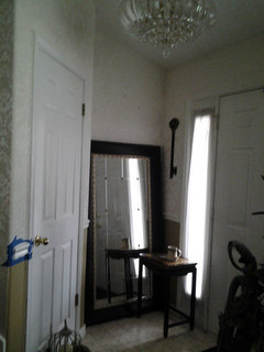
    I just noticed you had posted a photo of your fron entry, so I photoshopped your clock over in that corner. Keep in mind, the scaling is off on the clock--I'm sure it isn't that big on the wall, but it's an approximation.
  • 13 years ago
    Kevin Retired Decorator - hahaahhahaa! That's so funny! It's quite ok Kevin.! I've been told I have too much in my room already :). I was wandering why I was getting these kinda odd posts (suggesting me to buy their items).
  • 13 years ago
    Nancy Walton - Oh my Goodness! Ur so funny too! I knew I hadn't moved that there! I once had it there and got tired of it , and put that table w mirror in that corner.
  • 13 years ago
    LOL!!!
  • 13 years ago
    Gregjswife - I think i am leaning towards the gold. I love the olive Providence but I think it's because I did my daughters room in a light green last year with a slightly darker accent wall. So still undecided. P.s. yes it's still lablover :)
  • 13 years ago
    Darzy - I was reading one of your earlier posts - what did you mean when you said for the window treatment hanging tassels on the window sides?
  • 13 years ago
    Kevin lol! U said what we all want to say in these conversations!
  • 13 years ago
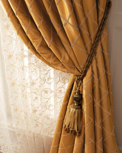
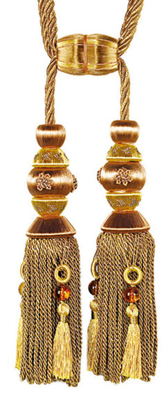
    Hi Lablover...I meant something like this for the curtains on each side of the window. It nods to your elegant style preference and give a little "swag" without the dated valance. I've seen tassels with lion heads, etc if you want a bit of exotic.
    Tasseled Tieback · More Info

    Gold Double Tassel Tiebacks · More Info
  • 13 years ago
    BTW...I had posted earlier "I like Golden Age". It somehow got deleted. Maybe it sounded "nuts" but I was referring to the paint chip color that you couldn't see until it was enlarged.
  • 13 years ago
    Darzy - I really, really like that look! And regarding the paint color (Golden Age), Maybe I deleted it by accident? I had updated my profile on here and was having trouble. I still haven't gotten down this whole site yet and how to get around with adding things. (sorry) who knows what else I lost? Thanks for your comment :). I know my large mirror issue is still up in the air, as far as where it's permanent home will be. Originally, I put it there cause I thought it was ok with it centered on that wall as much as i could because the window in the way. And also, being to actually use it from across the space too. I will have to try all senarios when it's down for painting the room.I think too, it might be too skinny or slim to have it positioned that way. It's a very slow process for me as my husband just had shouler surgery too. But, keep checking back :)
  • 13 years ago
    Lablover..sorry about your husband's shoulder surgery. That will slow you down for sure. We'll check back!
  • 13 years ago
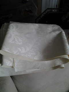
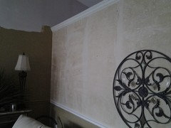
    Good morning! Well got some of the wallpaper down. Here's a photo of the short wall. It was so easy to remove. I guess because it's a vinyl paper. My husband went for Chinese food and I had it down before he got back. Just have to figure out how to get the glue off now. :) I've never taken down wallpaper before and I'm amazed at how easy this was. It came down in sheets.
  • 13 years ago
    Photo of sheets of wallpaper.
  • 13 years ago
    Wanted to see how the large mirror looked in niche by front door.
  • 13 years ago
    last modified: 13 years ago
    Lucky you with the wallpaper coming off so easy! Sometimes it's a real pain! I like the big mirror better over the chest (even tho it's a bit too big there). BTW...what paint color is that? It looks pretty dark. Since you like traditional elegance I think the chair rail two tone works. How about doing the dark below the chairs rail, then paint the upper part two (or three) shades lighter on the paint chip? Are you tired of the chair rail idea tho?
  • 13 years ago
    Yes. But, the husband wants to keep the chair rail. So, I'm out of luck with taking it down.So, I tried painting it the wall color to camouflage it and that didn't work. Do you think the wall color is too dark? It's the paint chip I posted (golden Age)
  • 13 years ago
    last modified: 13 years ago
    I've got to run but a quick thought.... I think the chair rail is fine. So, if you're keeping the chair how about just using the golden age below the chair rail (leaving the chair rail the white of the trim) and painting above the chair rail a lighter version of the Golden Age? I think that would look very nice. We have company coming over but I'm sure others will comment with more (and maybe better) ideas.
  • 13 years ago
    Trying again to post pic here.
  • 13 years ago
    I think the color is M-a-h-v-a-l-o-u-s! as Billy Crystal would say. It warms it up tremendously, don't you think?
  • 13 years ago
    I love love love the first pic you posted, minus the window treatments. The 2nd pic (the 'left' side of the room, with the crosses and blue pillowcases) looks dated and almost as though someone would invite me into that room to "save" my heathen soul. Just too… old lady christian-style. The after pics you've posted are nice and modern, but just look like anything else out there - kinda staged, not lived in, not personalized. I have to say, if you could edit out some of the stuff in the first pic, and a lot of stuff in the other half of the room, what you originally had going on was pretty nice.
  • 13 years ago
    (Oh, and yes the mirror was a little large for that placement)
  • PRO
    13 years ago
    The color looks great! It does really warm up the room and it looks very nice with your console. Can't wait to see more :-)
  • PRO
    13 years ago
    I actually like the chair rail painted in. It gives a bit of detail but doesn't compete with your furnishings!
  • 13 years ago
    I like the color!
  • 13 years ago
    It seems like the new color is the one ! great job !
  • 13 years ago
    Oh yes! The second picture you posted doesn't look as dark as the first one.Very nice color on my monitor. How does it look in person? Do you like it?
  • 13 years ago
    Just a idea that grass planter looks good on the buffet how about the smaller mirror behind it and nothing else I feel would look good. I would center the buffet on the wall. It makes a statement but isn't so busy.
  • 13 years ago
    Less is more bigger is better look !
  • 13 years ago
    The new paint color is wonderful. Just read thru all of the comments -- the chair rail needs to be painted in a semi-gloss paint, even when it's the same color as the walls. Maybe that's why you don't like it painted the same color???
  • PRO
    13 years ago
    You can make your home more Artistic.I hope this can help you to make your home more beautiful. Weclome to my site: Outletarts .com
  • 13 years ago
    Tina, how's the room coming? Please post the After pictures.
Sponsored
Wannemacher Interiors
Average rating: 5 out of 5 stars26 Reviews
Customized Award-Winning Interior Design Solutions in Franklin Cnty OH