Software
Houzz Logo Print
melis918

Need direction/color advice for MB!

9 years ago

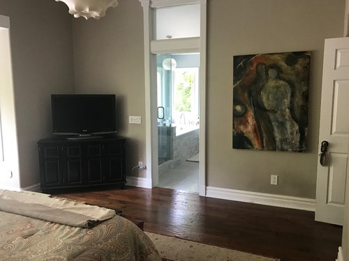
I've largely ignored our MB over the years as the rest of the house has been remodeled and updated. I think it's always been at the bottom of my list because we are the only ones who see it and it's just never been a priority. It's the ugliest room in our house and feels cluttered.

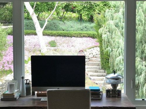
Ive decided to get rid of the desk/computer in our room since no one ever uses it and it somewhat blocks the view. My cabinetmaker will be putting in a window seat under the long window, painted white to match the trim. It will have storage drawers to hold photo boxes and miscellaneous junk. I'm having the room painted next week before the window seat is put in and I literally have zero vision for this room at all. The only input DH has given me is not to pick a boring wall color, whatever that means.

Here is what has to stay: bed with stainless headboard, overhead light fixture, all paintings, the rug and the tv.

Here is what will go away: desk and chair, bedding, red bench& the too small bedside lamps. I can also replace nightstands and the tv cabinet if necessary. I normally steer away from earthy colors, but I think the colors in the paintings are throwing me off.

Comments (22)

  • 9 years ago

    I would choose a lovely soft muted greenish blue tone to blend with your gorgeous view. I love is Glass Slipper. Both SW and BM make it.

  • 9 years ago

    Hi Melis --

    Wow, amazing view!

    I'd start with the paint as that's happening next week and sync your vision to the result. With all those gorgeous windows you will be getting greenish light into the room, so I'd really see how that affects your TBD-soon paint samples.

    The "not boring" input from your husband really narrows things down, eh?

    How do you want to feel in the room -- wrapped in a dramatic shade that energizes...or cocoons? soothed? like you're part of the landscape (which could mean deeper or lighter shades)?

    Because *I* love an indoor/outdoor blend I'd answer the questions then look to the hardscape and plantings and see if anything resonated. But that's me!

    [And you have so many options out there -- greys, greens, browns, bricks -- plus sky shades!]

    I know your paintings are large and dramatic but they also look to be full of complex shades so I wouldn't worry about clashes at this point.

    [And hey, major museums do deeply colored, non-neutral walls so I figure the rest of us can!]


  • 9 years ago
    last modified: 9 years ago

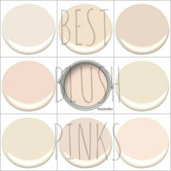
    Okay...this is a long shot but one of these would be sooo pretty.

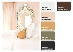
    If you find A pink with a bit of peach men like it. Just don't call it "pink".

    Or, deeper or more vibrant?

  • 9 years ago

    Do you want a light and airy feeling? Or dark and moody? Do you spend much time during the day in this room?

    You have some interesting architecture and moldings so you could pull off a bolder or darker look, depending on your style.

    I'd tend to go dark in the tones of your two big paintings.

    Here a few pics:

    Farrow and Ball Hague blue bedroom

    Dark blue bedroom

    Can you tell I like blue?

    Dark green bedroom

    A dark colour would really make the view outside the windows pop too.

    But it all boils down to how you want the bedroom to feel/function.

  • 9 years ago

    I'm not sure if this makes sense, but I think I primarily want the room to feel crisp and clean more than anything. Not cluttered or fussy, with the focus on the artwork and the view outside. I lean towards contemporary in design, but have to keep things a bit more transitional because of the style of our house. Most of the house is painted in soft grays and blues, with the exception of the teal Dining room. My kitchen is white and gray and black and the family room is painted Stonington gray. I think what DH means by not boring is no gray! The adjoining master bath is all Carrara marble and white cabinets. I guess I'm more of a serene person if that means anything. I love the blush colors but would t want it to read too pink. I wouldn't mind green, but not sure what shade. This is very hard for me!!

  • 9 years ago
    last modified: 9 years ago

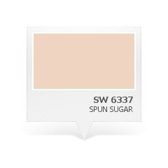
    Melis hopefully you will get some green suggestions. When you go for your paint samples pick up a Sherwin Williams Spun Sugar 6337. It's very delicious! I had a color very close to this in my last house master and its so relaxing. It also meshes with other colors well. This is a non-pink blush.


  • 9 years ago

    I am currently at the paint store getting 10 samples in various blushes, muted greens and blues!. Spun Sugar is included among them!

  • 9 years ago

    I've been looking at blushes but then gave up because it either read band-aid, flesh, or pink girlie. While I love blue, I can't see if it's in your rug. Personally, I like the current color. Does it qualify as "boring"?

    If yes, I'm assuming that something like a greige or grey is out (BM Balboa Mist or SW Agreeable Gray). Or perhaps even something like a very creamy white.

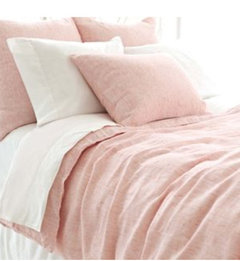
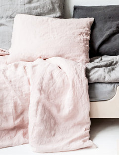
    Another suggestion is to get linen duvet covers, maybe in blush. Just got one and love it.


  • 9 years ago

    Nosoccermom- I'm not too sure about the blue either but I figured I'd give it a try as long as I'm at the paint store. I do think DH may have been referring to the current color as boring. lol Im keeping my fingers crossed that one of the blush ones will work!

  • 9 years ago

    I keep thinking a moody purple would be fabulous.

    Behr Blackberry Wine

  • 9 years ago

    Just perusing here but wondering if/how the blues are working?

  • 9 years ago

    The painters are here as I type this! I ended up choosing a deep blue, though not nearly as dark as navy. DH absolutely hated all the blush/coral swatches and discouraged the greens and purples. He wanted a navy that read almost black, but it was too dark for me. I am just on my way out to look for white bedding, then I need to order new nightstands and lamps. The window seat will go in next week and then I'll start thinking about fabric for the seat pad.

    A quick question: my headboard is stainless and all my bathroom fixtures are satin nickel. Can I introduce gold/brass drawers pulls and/or lamps without it looking weird? I know it's ok to mix metals, but I'm never quite sure how/when it works or not!

  • 9 years ago
    last modified: 9 years ago

    Deep blue will be so nice with your headboard! I have mixed metals throughout my house. Don't know what the rules are. To me it just matters that they are equally dispersed. So, your headboard is stainless with a brass lamp in a contemporary style and a little silver or stainless decorative box or small picture frame is next to that and a little brass or gold knob on the stand they are all sitting on. That's how I roll.

  • 9 years ago

    The deep blue will bring the drama for sure -- "not boring" directive met!

    Looking forward to your after shot.

    JTLynn's ideas for mixing metals are great.

  • 9 years ago

    Love dark blues. Just painted my powder room BM Newburyport Blue.

  • 9 years ago

    Very nice! It's dramatic but unfussy and really highlights the art.

    What colors did you use?

  • 9 years ago

    Very beautiful!!! Love your ceiling light.

  • 9 years ago

    Nice! Highlights the art and the window view!

  • 9 years ago

    Dramatic change. You really changed the mood. Can't wait to see the window bench.

  • 9 years ago

    What color is it? And, color of ceiling paint? Beautiful

  • 9 years ago

    Thanks for all the advice and compliments. The wall paint is SW Riverway and the ceiling is the same color at 15% strength. The bathroom is SW Interesting Aqua and the ceiling is also the same color at 15%. Everything is ordered and I am anxious to see it all come together!