Software
Houzz Logo Print
christy_drybread

Please help with paint color for home office

9 years ago
last modified: 9 years ago
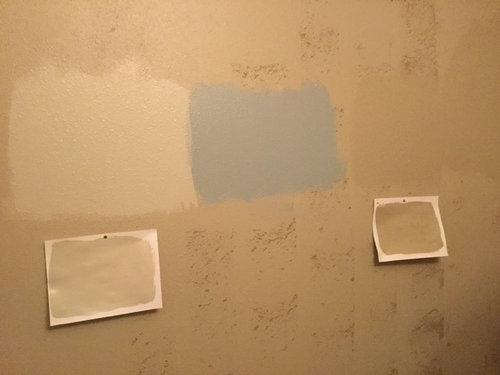


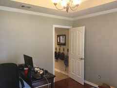
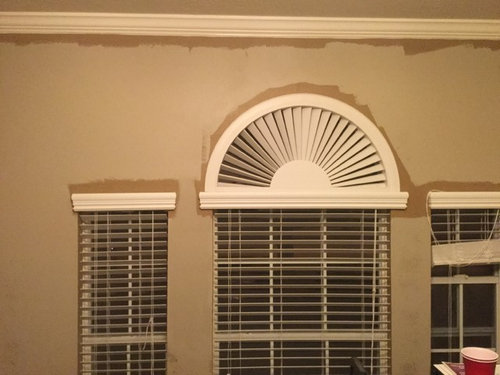
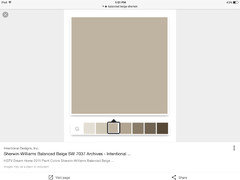
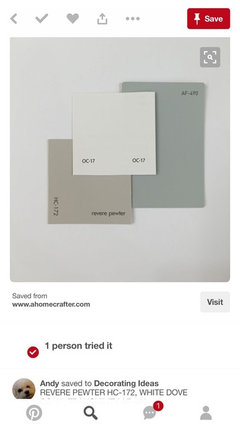
We are converting our dining room to a home office and as usually I can't commit to a paint color. I started painting the room SW balanced beige and I just didn't care for it. I tried a blue/grey, SW svette sage, Behr dessert khaki, and Revere pewter and none of them really jumped out at me. As for furniture we ordered a walnut executive desk and filing cabinet. Any suggestions?

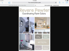
The top picture from left to right: BM revere pewter, BM solitude and behr desert khaki. The bottom pic is balanced beige. Too me it looks dull.

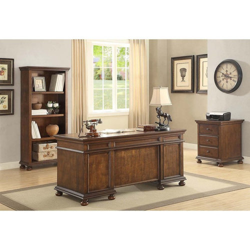
This is the desk we ordered.

Comments (62)

  • 9 years ago
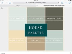
    Found this great house color palette with SW Latte....instead of the Tranquility you could do the suggested Oyster Bay color...very nice combination.
    Christy A thanked zzmom40
  • 9 years ago

    Thank you! Oyster bay is very pretty! Not sure my husband would like a green color but I do really like it.

  • PRO
    9 years ago

    This would be a nice light to complement your walnut desk...and add a more of a transitional element with your traditional desk and window trim.

  • 9 years ago


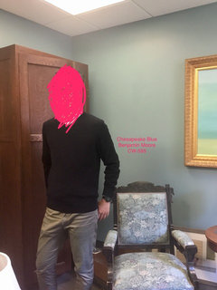
    My office is painted this color, and it's always gorgeous and soothing. Chesapeake Blue from Benjamin Moore.

  • PRO
    9 years ago

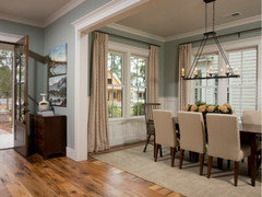
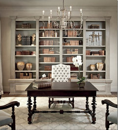
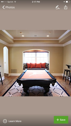
    I would say Oyster Bay kinda sits in the middle it's a blue/gray/green....looks great with dark stained wood...like in this dining room image


    Christy A thanked Home Interiors with Ease
  • PRO
    9 years ago

    Who will be the main user of this office space? You or your hubby? You definitely need group paint color therapy! Latte?! Oh my goodness. Nice color but might be time to slowly let go of that paint can! lol. Blues would lend themselves nicely and are a bit more masculine in nature so if hubby main user, I would lean toward more masculine look. Desk looks pretty massive feeling as well, so the lighter green/blues might not hold up real well for a guy? Just need some input from whomever is main user?

    Christy A thanked Flo Mangan
  • 9 years ago
    But Flo Latte saved me from the hunter greens and navy blues of the 90's oh and that horrid drab grey of the late 90's. Lol I know it's time to move on:) The room will be shared. I do work from home but I move around a lot. My husband works from home 1 day a week and needs a quiet place for conference calls.
  • 9 years ago

    I really do like the blues as a pop of color but would like to stay more neutral.

  • PRO
    9 years ago

    Medium blue gray would probably work for both then. You could go lighter in an off-white direction as well. What direction do the windows face? What light comes into that room?

    Hilltop Residence · More Info
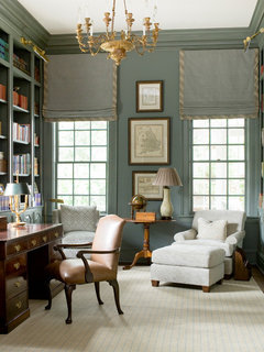
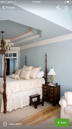
    this is great color, although it is custom, but we could get close I'm sure. Notice the traditional desk and chair, but the light carpet and other elements make this a really nice space. It would work well with the Latte in your entry as well.

  • PRO
    9 years ago

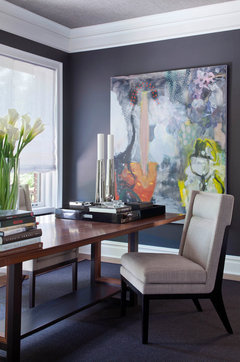
    I like Flo’s suggestion of a darker gray..lately I am into purple/gray...

    Inspiration:

    Any saturated color will highlight your windows.


    Denver Designer Showhome 2013 - The Study · More Info

  • PRO
    9 years ago


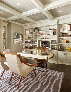
    Traditional Home Office · More Info
    More neutral combination of off-whites, and taupe colors. This is different style but just looking for the color palette you like best.

  • PRO
    9 years ago


    Custom Cabinetry · More Info
    Pretty neutrals.

  • PRO
    9 years ago

    See what you might be most attracted to, and we can help further.

  • 9 years ago
    The room is south facing. I like the simplicity of the last 2 pics. Just something clean, simple, and elegant.
  • 9 years ago
    I really do love the blue but I'm having flashbacks to my navy blue leather couch and matching accent wall. Lol
  • PRO
    9 years ago

    You might try two paint colors SW Agreeable Gray and SW Accessible Beige. Both are lighter colors and in a South (bright light) facing room, might work out beautifully for you. Nice white for the ceiling, possible darker color for the center top ceiling. Keep us posted on your progress.

  • 9 years ago
    Great! Thank you I have a sample of accessible beige from the last room I did. It looks almost identical the revere in the room.
  • 9 years ago
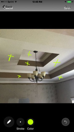
    Can you throw a quick coat of paint over the remaining old color? It may be easier to think without the dark edges and ceiling.
  • 9 years ago
    Good idea! I agree it's very distracting!
  • 9 years ago
    Flo what color are you thinking for the top ceiling? I like that idea. Would I paint the ceiling walls the same as the walls or white? We never knew how to paint that ceiling.
  • PRO
    9 years ago
    The paint for the ceiling will depend on your wall color decision. You can help your assessment by painting your walls with a good primer. Then do sample boards on primed boards with 1" white borders on 3 sides and paint to edge on forth side. This gives you a comparison edge. Everything will look the same the way you are doing samples now. It takes time and an investment in proper boards and different sample paints. It will save money in the long run.
  • 9 years ago
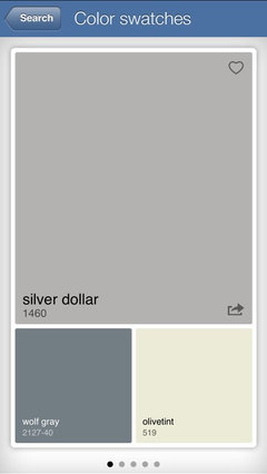
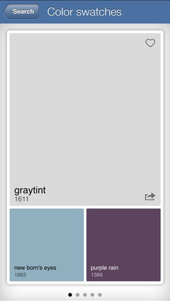
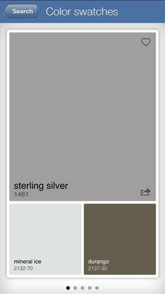
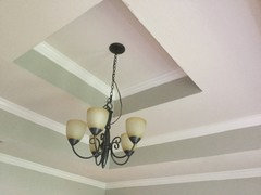
    I like JudyG idea of a gray/ purple and Flo's of going darker. Perhaps something like BM Silver dollar. You could paint the ceiling in a light shade to highlight your mounding such as BM graytint. But please paint all the tray surface up there! It will look so much nicer than racing stripes;)
  • 9 years ago
    I meant to post BM sterling Silver. Just a shade darker!
  • 9 years ago
    Lynartist, love the racing stripes comment! I always hated how we painted the ceiling but couldn't put a description to how bad it looked. Lol We took the plunge and painted the room revere pewter. I left the ceiling open to ideas but the room honestly looks so much better just erasing the dark hopsack paint. I'll post pics tomorrow.
  • PRO
    9 years ago

    Hey, we didn't approve that Christy! lol Looking forward to pics. Yes, I was getting to that "racing" stripes part which I hate too.

  • 9 years ago
    Looking forward to seeing it Christy!:)
  • PRO
    9 years ago
    last modified: 9 years ago
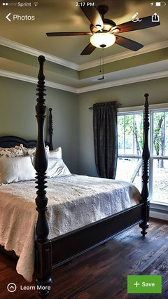
    I am sure it looks so much better...I really don't think you can go wrong with a light grey/silver..........here is a few coordinating colors...I went a dark grey in my master bedroom tray ceiling and just love it....maybe do the Chelsea grey for ceiling or BM Greystone...

    still really like this light for your office...more transitional...

    My ceiling in Greystone BM

  • 9 years ago

    Your ceiling looks great! Are the walls and the ceiling the same color with only the very top painted Greystone?
  • 9 years ago
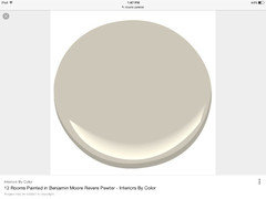
    Hard to get a good pic but it looks so much better
  • PRO
    9 years ago
    Looks great! Are you amazed at how much lighter it looks with all the walls done?! I would paint the "racing stripe" the color of your trim and the very top of ceiling a darker grey as we discussed earlier.

  • 9 years ago

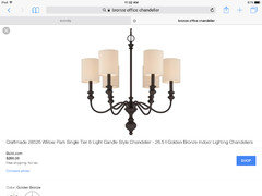
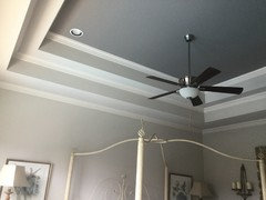
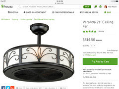
    My husband really wants to put a ceiling fan in. What do you think about this compromise?

  • PRO
    9 years ago
    Walls and ceiling trays are SW Worldly Gray...trim SW Shoji White and ceiling accent is BM Greystone.

    it looks great..I like the Revere Pewter!

  • 9 years ago

    Yes Flo it looks so much lighter and cleaner! We did try to paint the racing stripe the same white as the trim but didn't care for it. Maybe with the dark top ceiling it would look better.

  • PRO
    9 years ago

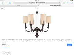
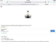
    Not to crazy about the details on the sides..kinda "old fashion" lack of a better word........and it is only 21" will look super small up in that ceiling area....

    I really like Fandeliers but the size you need will be much more expensive....Here is one in my clients family room...it looks great!

  • 9 years ago

    That is very nice!


  • PRO
    9 years ago

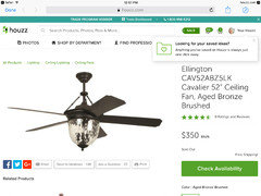
    I totally understand wanting a fan...my husband can't live without them!:) so we have some ceiling fans...of course would love to have chandeliers everywhere...especially being in the design business! But being practical and comfortable come first:)) here is a very pretty traditional fan I thought you might like...

  • PRO
    9 years ago

    I am not sure how effective that fan would be, you might be better off doing a chandelier (fixture) and getting a floor fan instead. The true value of a fan is air movement on skin. They do nothing to cool and in fact really push hot air around and cool a persons skin. That's it. I have 5 similar ones to the one posted above and the glass globes are a nightmare to clean. Get frosted if any. I plan on replacing ours as soon as soon as I get any time for our house! lol

  • 9 years ago
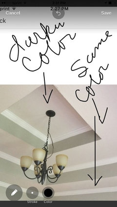
    Christy, you can go lighter or darker on the ceiling but you still have racing stripes! It looks too busy!
  • PRO
    9 years ago

    The real problem is the darn crown molding which gets the trim color so you really have 3 competing colors. Might be good to paint the entire pop up the darker gray. Leaving only the crown in the trim color. Just not a fan of the "stripe" look.

  • 9 years ago
    It's a smallish room with a lot on the ceiling! If you want you can put a much darker color on the very top!
  • 9 years ago
    Guess I wasn't clear earlier:(
  • 9 years ago
    If you paint under the tray it will make your crown moulding pop!
  • PRO
    9 years ago

    I have a client and a friend that have the bronze fandelier with the white shades and just love it! Very happy with the soft flow of air it provides without blowing napkins or paper work around when it is on...circulates the air really well....

  • 9 years ago
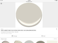
    Lol I gotcha lyn;) So I have SW anew grey and edgecomb on hand. I may just experiment. Do you think anew grey would look good at the very top? I also have balanced beige I could try
  • 9 years ago

    The bronze fandelier is gorgeous!


  • 9 years ago
    I also have balanced beige and edgecomb grey I could experiment with for the ceiling.
  • PRO
    9 years ago

    Anew gray will look pretty much like your Revere Pewter...just a bit darker but may not even be noticeable?

  • PRO
    9 years ago

    Edgecomb grey will be to light...

    balanced biege may be the darkest...?
    maybe mix Anew with Balance Beige and make your own color? If you don't want to buy more paint..... But it won't look like a gray..more a greige color???? Warm

  • 9 years ago
    Of the three you could do balanced beige but it is very warm and can sometimes read pink. Keep in mind colors will read a bit darker on the ceiling also! Now that you have this lovely lighter color on the walls I think it might be nice to see a softer blue/ grey up there to keep this room serene.
  • 9 years ago
    Examples