Software
Houzz Logo Print
robotropolis

Pretty Spring green? (Ben Moore)

9 years ago
last modified: 9 years ago
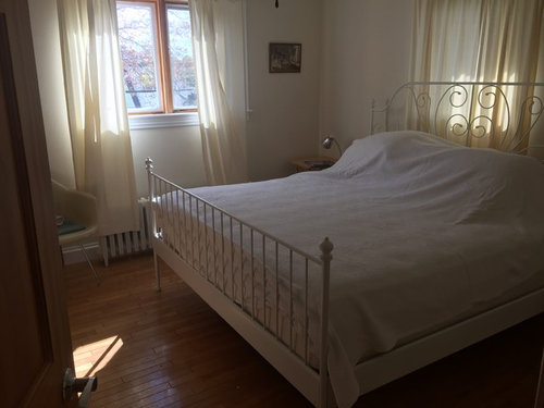
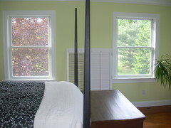
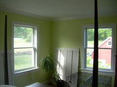
I'm painting this bedroom some time in the next two months. But first I need to do the traditional "spend $150 painting 20 swatches on the wall" dance. Everything in the room is leaving and 100% white furniture is coming in. The only colour I really need to work around is the yellow oak floors and yellow wood doors (which may be painted white at some point).

I'm looking for a pretty, light, yellow (not blue or mint) spring green.

Of the swatches I have to hand:

Pale celery - too light, not green enough

pale avocado – too dark and dull (but right amount of yellow)

glazed green - too blue (but right amount of pretty)

castleton mist - not fresh enough.

Do you have any suggestions for me to try? The room is sunny, southwest facing with two windows.

I will also be in the market for interesting blackout curtains, maybe something in the navy and white family, or whatever. It's pretty open. So if you see any internet-available fun blackout curtains let me know. I'm really into the short curtain look right now so I will be hemming up whatever I find. I don't live near any good home retailers but I do shop on Etsy and Wayfair.


PS I will be painting swatches! I just need some good greens to put on my sample shopping list.

Comments (47)

  • 9 years ago
    last modified: 9 years ago


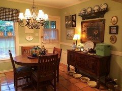
    Are you wed to Ben Moore? We painted our bedroom Sherwin Williams Springtime. It is just as you describe - a yellowy spring green. It's hard to photograph, but I will attach an older photo - it looks grayed out in the photo though - in real life it is much brighter.

    This might be a little closer but it looks yellow here - it's really a nice mix of yellow and green:

    robo (z6a) thanked lkplatow
  • 9 years ago

    Although Castleton Mist has been rejected, in my MBR, it looks very similar to the color above.

    robo (z6a) thanked My3dogs ME zone 5A
  • 9 years ago

    Take a look at BM Hampton Green.

    robo (z6a) thanked User
  • 9 years ago
    last modified: 9 years ago

    I'm not 100% wedded to Benjamin Moore, I just know that deck the best!


    my3dogs I really like castleton mist but am going for a more innocent, fresher look if that makes sense? Without being stridently sweet?

  • PRO
    9 years ago
    last modified: 9 years ago

    pale avocado – too dark and dull (but right amount of yellow)

    Willow Wood A0935 70YY 63/356 (Glidden) is lighter and less dull.

    robo (z6a) thanked Lori A. Sawaya
  • 9 years ago

    Willow wood, Hampton green and pale sea mist are all going on my list!

  • 9 years ago

    I just got some samples to try, and Pale Vista is one of them and might work for you.

    robo (z6a) thanked texanjana
  • 9 years ago
    last modified: 9 years ago

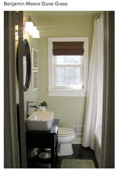
    I Painted a bathroom a while back with Benjamin Moore dune grass . It was fresh and pretty without being too Bright or sweet.


    robo (z6a) thanked Saypoint zone 6 CT
  • robo (z6a) thanked Sueb20
  • 9 years ago

    I happened to check this post on my phone and the pics I posted above of the Sherwin Williams Springtime look totally different - on my laptop it is kind of dulled down but on my phone it is crazy bright. So if you are seeing the bright version and reading me saying "it looks brighter than this" don't be scared! It's not blindingly bright.

    If you have a Sherwin Williams nearby it's worth the $4 for a sample can. (I'd offer to send you all the sample cans I bought when I picked Springtime but I donated them to habitat for humanity....bummer!)

  • 9 years ago
    last modified: 9 years ago

    lkplatow I have to say it looked kinda bright! Haha! I will definitely drop by my local SW.

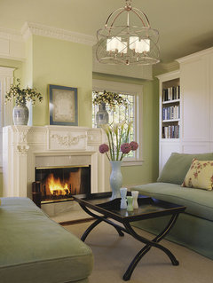
    I love the look of it in this room, if I could get to something that looked like this color in my room/lighting I would be 100% happy.


    I have a paint sample FARM in my basement.

  • 9 years ago
    last modified: 9 years ago

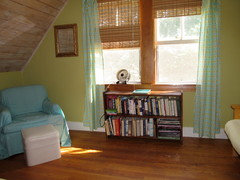
    Here's Dune Grass in my former powder room.

    dune grass

    ETA My room faces southwest.

  • 9 years ago

    Oooh that looks VERY pretty!

  • 9 years ago

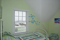
    Now that I see your inspiration pic, I agree with texanjana that you may want to check out Pale Vista. We have it in DD's room in our beach house.

  • 9 years ago

    BM Stem Green is a very yellow-green, but not as pale as you're looking for... but might be good for finding different shades of that color. Potpourri Green is listed as a lighter shade.

  • 9 years ago

    I have BM Dried Parsley in a guest bedroom. It's not pale but you might find something in the shade range you like. I used it to go with some fern colors in bedding. It's definitely not mint green and more 'adult'.

  • 9 years ago

    Maybe guilford green by bm?


  • 9 years ago

    Guilford green is a beautiful color

  • 9 years ago

    BM Hancock Green might also work.

  • 9 years ago

    This is a lovely color from Sherwin Williams called honeydew

    long shore home · More Info


    robo (z6a) thanked amykath
  • 9 years ago

    We had Hancock Green in the bathroom of our previous home, and Guilford Green throughout the rest of the downstairs. I liked both colors. This is Guilford:


    It does appear a little different, depending on lighting.

  • 9 years ago

    akt - that's a luscious color combo!

  • 9 years ago

    Love Guilford Green. I had it in my sunroom in my house I sold 7 years ago. It always looked fresh and springy.

  • 9 years ago

  • 9 years ago

    It is interesting how Dune Grass looks so different in Saypoint' room vs. the bathroom photo above.

  • 9 years ago

    We used SW Independent Gold in this bedroom, with S-SW exposure and oak floors. Trim was SW West Highland White. It was definitely green.

  • 9 years ago

    Lovely room! Aqua and lime is one of my favorite color combos.

  • 9 years ago

    Sherwin Williams Rice Paddy describes what you're looking for

    robo (z6a) thanked decormyhomepls
  • 9 years ago

    Thanks, that looks perfect (in other people's houses ;) I will definitely pick up a sample!

  • 9 years ago

    I used Guilford Green on the walls in my dd's nursery. It was lovely. When we built our new home I used SW Gratifying Green. Similar...but the SW was a tad lighter. Loved them both. I painted her ceiling SW Spinach White in the second room..,perfection

    robo (z6a) thanked nini804
  • 9 years ago
    last modified: 9 years ago

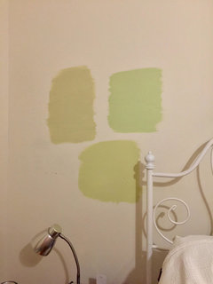
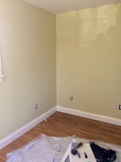
    Last night I tried BM Mellowed Ivory (horrifying, top left), Pale Sea Mist (prettiest but a little neon at night) and Hampton Green (nicest, mayyyybe too yellow). The paint store lady advised me to have a good look at the walls at night since that's when I'll be staring at them. Good advice, I think!

    Gonna pick up rest of my existing green samples this weekend and try a few more.

  • 9 years ago

    It's hard to get it exactly right! I went through a couple of different greens before settling on Guilford. Problem is, I painted entire rooms before being sure that I needed to make a change -- I did the hallway in a green that was much too gray and somber, and I did the bathroom in a shade that was too yellow-green and made a person look vile when they looked in the mirror. You'll get it, though.

  • 9 years ago
    last modified: 9 years ago

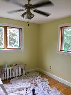
    wanted to check back in for future searchers and say after many many paint samples I came back to Benjamin Moore Rainforest Dew. It's a very pretty, very light calm spring green in my light. It's also impossible to take a picture of, at least with my iPhone, and is more saturated than the photo below.

    I delegated painting to my husband which was a horrifying mistake that has resulted in having to repaint the ceiling and trim. Henceforth he is to be trusted with the roller only. In fact this may be part of his master plan because he hates painting.


    edit....this is a better representation of the color

  • 9 years ago

    That looks really pretty!

  • 9 years ago
    last modified: 9 years ago

    I wish I could share photo evidence of what my husband did to the ceiling and trim but it is so repellent it might as well be classified NSFW.

  • 9 years ago

    Cutting in is a skill that not everyone has or wants to acquire.

  • 9 years ago

    Thanks for checking back in! I love that shade of green.

  • 9 years ago

    Cawaps no kidding! I'm very clumsy but I forced myself to learn how because I despise tape. So now I can do a pretty good job but extremely slowly. Just finished cutting in everything (ceiling, trim, door frames) and it took me about five hours. In my defence I think I was hampered because I was doing it backwards (after the walls were painted).

  • 9 years ago

    I'm pretty good at it now, but it's definitely a job that takes time and focus. I learned from my ex how critical it is to have the right brush. A bad brush, or an old brush, can make cutting in much more difficult and frustrating.

  • 9 years ago

    Beautiful! I have so many rooms of which I simply can't get an accurate photo.

    Looking forward to the rest of the decorating!!!

    So very excited for you!!

  • 9 years ago

    Thanks for showing what you picked. It's always nice to see the final decision. My DH is not allowed to paint the interior. He can slop paint all over the outdoor surfaces all he wants but not indoors.

  • 9 years ago

    I really like it!

  • 9 years ago

    Thanks! I would also like to say that I said sometime in the next two months exactly 2 months ago. I'm slow but I got there in time!

  • 9 years ago

    Love it! Would also love to see the finished room.

  • 9 years ago

    I will post. I've been considering themes and I have an adorable fish end table so I started googling fish mobiles. Think I found a winner? :D

  • 8 years ago

    Glad you chose a colour, Robo. Are you still satisfied with your choice?


    We are planning on using BM Dark Linen, which is on the same card as Pale Sea Mist. In our house neither is neon. In fact, Pale Sea Mist looks dingy/muddy. Interesting how lighting, surrounding colours, and spaces impact a colour.


    Dark Linen looks like the palest colour one might see on a Luna Moth, and plays with shadows beautifully. We have 4 different woods/stains, 2 different types of masonry, plus all kinds of jutting walls/corners & asymmetry in our 1960’s semi-open floorplan, so paint colour has been a hard nut for us to crack.


    Oh, and the lighting. It’s not typical. It’s brighter on the north side than the south side, even though the light itself has a cooling effect. Anything with blue or grey in the undertone turns grey. My hubby is a sun lover, whereas I‘m an overcast gal, but even I can tell how much we need to open up the space with color.


Sponsored
J.Holderby - Renovations
Average rating: 5 out of 5 stars4 Reviews
Franklin County's Leading General Contractors - 2X Best of Houzz!