Software
Houzz Logo Print
tlopez1214

How to pair this countertop. Please help!

9 years ago
last modified: 9 years ago
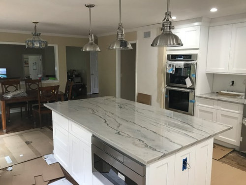
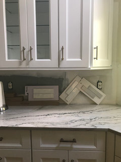
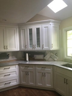
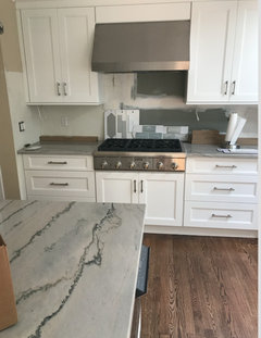
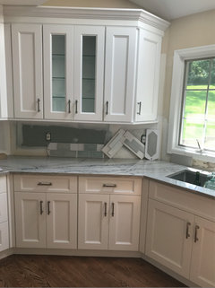
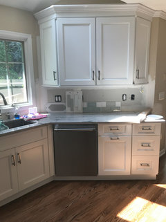
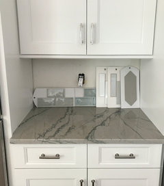
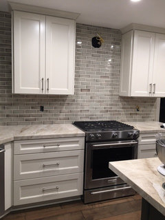
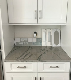
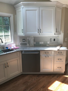
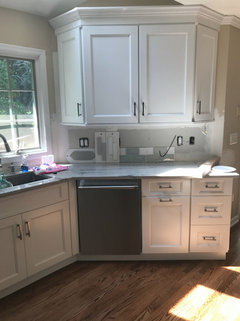
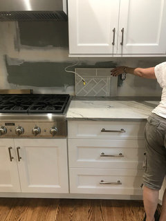
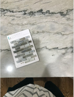
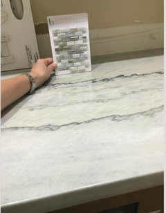
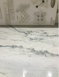
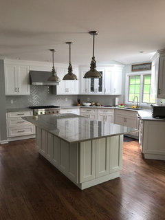
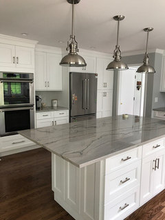
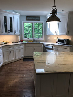
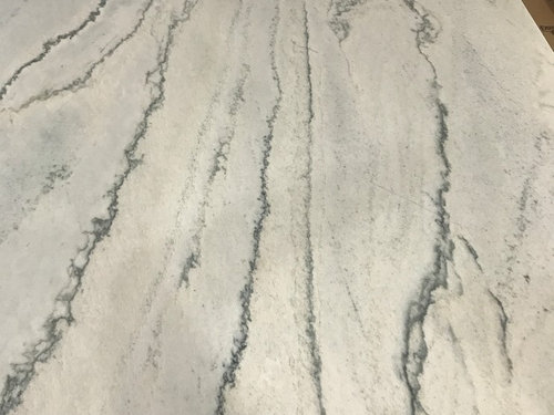
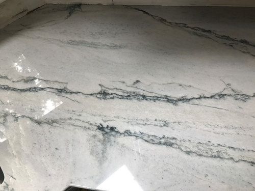
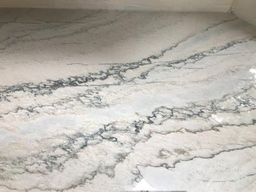
We just had our countertops installed and are totally in love. The overall color is gray with darker veining. Look a little longer and you'll see the gray has blue undertones. Look a little harder and you'll see parts with more cream/beige and tiny bits of green.

I originally wanted to paint the walls a light gray hoping this would bring out the gray but then were considering gray subway tile and now I think it might be too much gray.

What do you guys suggest for backsplash and paint to make this room look cohesive? Due to our open floor plan, the color has to be neutral enough to be used in the living room that is adjacent or there be something that goes well with it.

*Disregard the gaudy chandelier in the background. It's being swapped out next week.

Comments (131)

  • 9 years ago
    last modified: 9 years ago
    the matte gray is also from tilebar. call them and see if they can send you a sample of that along w/your Nabi sample. you should've gotten 5 for 5 bucks, yes?

    they have it in two other colors. I like the shape. you might look around and see if you like any others maybe order a sample of the Nabi in the Glacier White

    http://tilebar.com/aliante-light-gray-4x12-porcelain-tile.html

  • 9 years ago
    I did Beth! They have the best rates for samples. Hope it's a whole tile and not just a chip but we'll see.

    Porter, yes you ARE getting to know me well. I went back to the tile shop and picked up a whiter and a grayer 2x8 ceramic tile samples. I'm just waiting for the other samples to come in now! Bet your bottom dollar that I'll be in HD today.

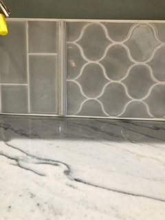
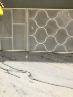
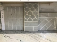
    Here are the tiles from yesterday. I searched high and low for other grays and something like the Nabi but they didn't have it.
  • 9 years ago
    Those pictures were taken this morning around 7:45am. See how it's not very bright in there. The sun is always at the front of the house and briefly comes around the back in the late morning/early afternoon.
  • 9 years ago

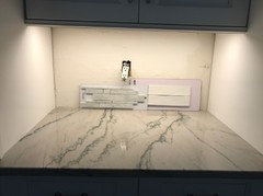
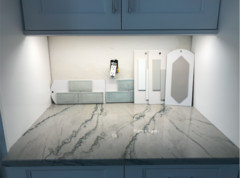
    I'm liking the lighter gray tone.... can you place them in the area you did previously with the under lighting on. Better then to see if the light gray is an option to consider... the ones from tile bar I know you have ordered some have some very light grays... silver fox and the one Beth posted.

    DANG, I wish you could find the light gray Kite from Home Depot!

  • 9 years ago

    this area... it is a warmer light? Just curious..... seems warm, but can't tell.

    I just feel with all the white going on with the uppers and lowers as well as the light counter you need a pinch of contrast... nothing drastic. Stark white is not the best for the counters.

  • 9 years ago

    Tile bar and modwalls are both showing some great options... realize you said Mod is closed due to the holiday!

  • 9 years ago
    I will post the picture of them in the other lighting later today. Yep, it's 3000k undercabinet lighting. We have to switch out the 5000k ceiling light as they're a little too blue.

    Yep, modwalls is closed so I prob won't get the samples until sometime next week. Should have ordered earlier but I thought I'd be able to find something in the tile stores.
  • 9 years ago

    OMG Porter. Shipping for one sample from Modwalls is $16! What the heck!

  • 9 years ago
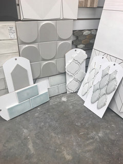
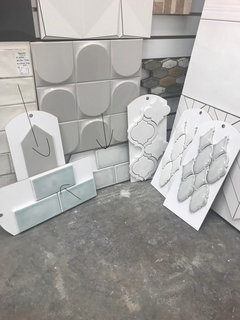
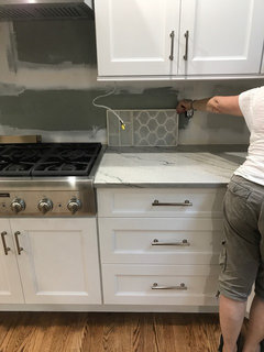
    Look at what I just found at a local tile shop..... the tile bar Nabi and matte gray!
  • 9 years ago
    Whoops...
  • 9 years ago

    GREAT.... what is the one in the bottom center?? looks like brine?

    What is the piece above the blue? The blue shown looks very blue... the one to the right looks more subtle blue/green... maybe that's the Nabi?

    What do they have in matte gray styles?

  • 9 years ago

    bring home the center one under the large gray protruding tile piece that is only a glimpse showing... the more blue may work, I think it's too true blue, but you can try.

    The gray above the blue on the left of the computer... what styles do they have in that?

  • 9 years ago

    OH GEEZ, hope you took home the middle one.....

  • 9 years ago

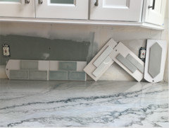
    I took home all of the samples on the floor except the arabesque. The two to the right are ideas for our butler's pantry which is in a separate room.

    The really blue one IS the Nabi arctic ice. I guess it's just bluer in real life. I too thought it was too blue but after so much talk about it, I decided to bring it home and see. The one to the right of it is greener. I like that tile color better as it's more muted but I did not want green backsplash. Brought it home anyway to look. The pointy one is the matte gray Beth pointed out from tile bar, the elongated hexagon. I believe it just came in this shape and several colors. At least at this store. Kind of like the glossy ones better.

    Love these looks but I am exploring all of the recommended color options before making any decisions.


  • 9 years ago
    last modified: 9 years ago
    can we see them next to the countertop and cabs?

    that Nabi really is blue. I still like it tho. I also like the paler one next to it. The arabesques are also interesting. so many choices. earlier you said you didn't want glossy, now you like it? lol

    look at these from encore...

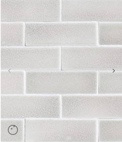
    3x8 silver, and 2x6 cashmere,,,

    http://encoreceramics.com/product/cashmere-crackle-glaze/

    http://encoreceramics.com/product/eliot-textured-field/

  • 9 years ago

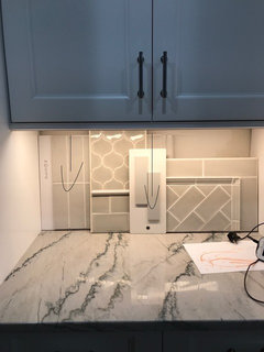
    I know Beth. I have been all over the place. I brought the home and snapped some photos. Here they are. The gray bars, white bars, and lighter nabi are my favorite but worried about the green wall. Ah!

    The gray hexagon was a little taupe, flat, and blah. The blue was just too blue for me.

    What do you think?

  • 9 years ago
    last modified: 9 years ago
    Checkers4 just had those tiles installed w/her Taj countertop. looks beautiful. here is her pic

    Checkers4 kitchen

    same tile, diff color

    tlopez1214 thanked Beth H. :
  • 9 years ago
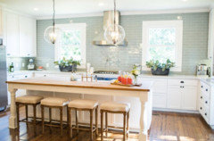
    last modified: 9 years ago
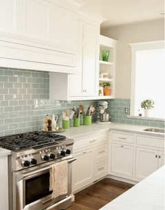
    I like the far left,,,lighter blue/green...I like the size of the bars in white and gray,,,,but no white (too bright) and the gray is blah. you're right about the blue being too blue. sorry bout that. doesn't seem that blue online! But I don't think it's all that bad either. It would just stand out a bit rather than blend into the background.

    of the grays, I like the idea of the crackle glass variation with these encore tiles (they have many other shades to choose)

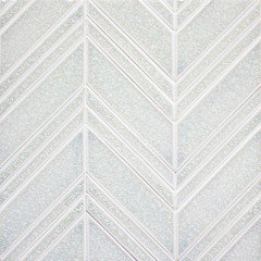
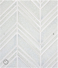
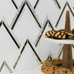
    that encore has beautiful tiles. look at this mixed glass/ceramic chevron

  • 9 years ago
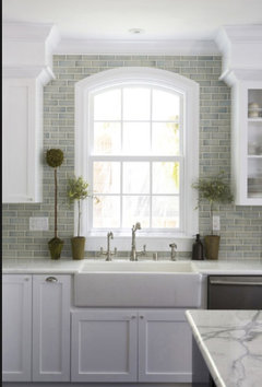
    Looking at all of them I love the two gray ones. Wondering if the one gray you didn't bring home today (linear one) is a tiny bit lighter? I do love them both.

    I also love the one that sent you the message about to MAKE sure you brought it home which was on the center on the floor when you posted much earlier. I think it really looks beautiful in 90% of the photos... Again, it's a computer and you are at home with them.

    love it in both these photos!!!

    Also love the elongated gray... you like the glossy look I believe?

    Wait until early evening before it's dark (dusk) and take a look again with lights on and not. Then look again when it's dark outside...

    What is your though now that you have stared at them for a while?

    I think you have two to three great options here... the gray you brought home today and the lighter tone glossy you brought home today as well as the other gray with is more linear shaped.


  • 9 years ago
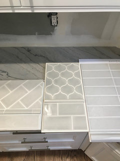
    gets my vote....

    Beth feels the gray is blah and I do like the linear one??? That's the beauty here...

    You can get a lot of opinions and suggestions!

  • 9 years ago
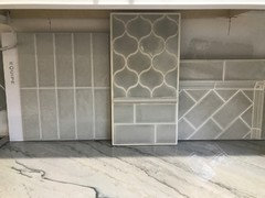
    i like that one checked, above. the gray elongated one is ok in color, and the unique shape, i just feel it's not quite the one for this particular kitchen. to me it's too dull for this space. but i'm more of a 'push the envelope' type of personality and gravitate more towards edgier or out of the box type things. not everyone likes that!

    but as stated, I'm not there and can't see it in person, so it may look totally different to you.

  • 9 years ago
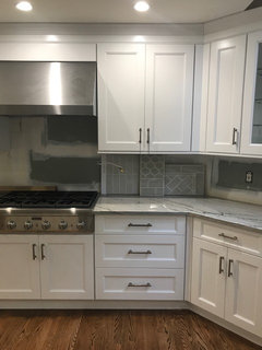
    last modified: 9 years ago
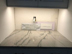
    Thank you, everyone! I agree that the green-gray goes well with the kitchen. Against the countertop, it looks grayer. Alone, in the light, it looks greener. My husband said it looked good against the countertop but that he hated it when it was standing alone. It's like some sort of mood ring tile. Good thing it won't be standing alone. He says to go with white. I'm leaving them all up on the counter and will order the silver from encore ceramics as well as that chevron Beth posted.

    I'm kind of bummed tomorrow is a holiday and I have to wait a whole day to track it down :-/

    If we went with the green-gray (IF) do you think the kitchen backsplash would look an overall green like this?

    This last one looks like it might be from the encore collection.

  • 9 years ago
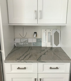
    WHITE... gasp... standing alone is a lot different then being installed between a counter and cupboards... Yet, good luck.....

  • 9 years ago
    last modified: 9 years ago
    check on the website for a local distributor near you (Encore). I'm in love w/that crackle chevron, called the Mixed Mosaic Chevron. you know, you can design it w/different color options. you could do a milky ceramic, mixed w/marble and a soft gray crackle. (that's if you don't want the blue/green shade,,,which I love!)

    http://encoreceramics.com/product/chevron-mixed-mosaic/

    as for the green/gray one, hard to say what the overall appearance would be. It depends on your kitchen lighting, other colors, etc.

    Checkers4 is the one who just used those in her kitchen. maybe contact her to further info on the encore ceramics?

    https://www.houzz.com/discussions/need-help-selecting-backsplash-for-taj-mahal-dsvw-vd~4303045

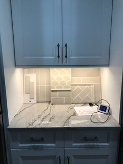
  • 9 years ago
    Alrighty...

    Beth, encore tile takes 6-8 weeks to come in so that's out.
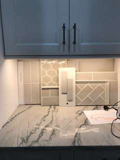
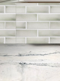
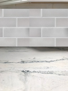
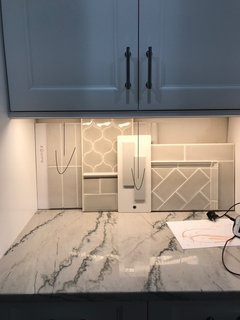
    Went to tile shop and picked these up today. Super light grays two of which are crackle. Love them. The first has a greenish tint much lighter than the last gray green (too green for the husband), the second is more gray green blue, and the last is more of a silver. What do you think?
  • 9 years ago

    You didn't ask me, but you need to put them under the lighting as you did prior.

    and check them from AM to PM to best know... yet, I think I know which I would pick... can't say for sure without the under lighting.

  • 9 years ago

    or the light gray subway... I know you asked Beth, but thought I'd give my penny on this... I think the above is beautiful has enough gray in it... otherwise the subway you brought home today. The others look too green IMO... yet, can't wait for Beth to give her opinion... she has stellar taste too!

  • 9 years ago

  • 9 years ago

    wow...so hard to tell the way you have them shown. they all look nice. I can see where one looks a bit greener. one is very 'silvery'. Is there a way to set them up individually and take a pic w/a flash or something? I do like them!

  • 9 years ago
    last modified: 9 years ago

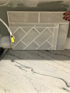
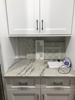
    Thank you for your opinion Porter! I of course wanted your opinion. Just wanted to inform Beth about the wait time on the encore tile. I was not expecting that! I'm surprised you think the two to the right are too green since the previous gray green tile was much greener. Here is a picture of the new tile, along with the original 2x8 gray tile.

  • 9 years ago
    Yes Beth. Will post after dinner.
  • 9 years ago
    Maybe during dinner... hehe
  • 9 years ago

    either of these would be my choice... from the beginning I thought the center would would great... however, the left looks a shade different and I like it as well...

    Not fond of the others... I'd go with the other I posted above before choosing the other two which appear greener or darker? Hard to tell as you can see it better in your home than we can on a computer monitor.

    Good Luck!!!

  • 9 years ago

    doesn't work IMO, it's too cool or?? I can't put my finger on it, but don't like the tone with the counter.

  • 9 years ago

    probably too warm now that I look at it longer...

    anyway, good luck!!

    tlopez1214 thanked Porter Edun
  • 9 years ago
    The third set of photos didn't post from my phone before
  • 9 years ago

    far left is my main pick other than the one you fear is too green from the other day which I do love.

  • 9 years ago

    yep, I think that's it.... far left above... will wait for Beth to give her opinion...

    The others just don't do it for me that you got today... the far left ties in well IMO..

    Ok, well not I have to make dinner!

  • 9 years ago

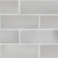
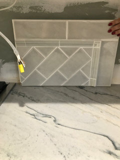
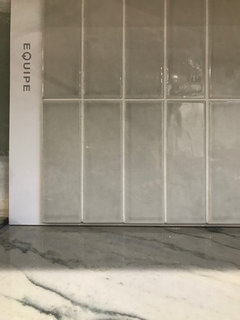
    sheesh,,such pressure! lol. I do think the far left looks best. Equipe, Pic above.

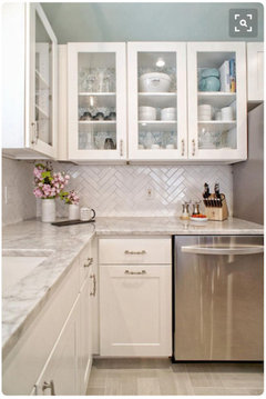
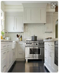
    although, I really like these as well. I do like them in a herringbone, whichever one you choose.

    the one w/the arabesque does seem to have greener tones.

    You're there in person with them and can gauge much better.

    which one do you like???

  • 9 years ago
    last modified: 9 years ago

    I agree with you both. I like the Equipe and the last one Beth posted a picture of, but I think the Equipe goes better. It's slightly grayer and cooler but not too cool. Between you and Porter you have helped me design half my kitchen! Thank you girls. I'm waiting to get the green light from my husband tonight and hope to place an order tomorrow. I will post pictures of the final backsplash!

    For the butler's pantry I'm thinking this:

    My husband says this but I think it's too plain:

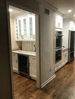
    Here's the room view from the kitchen:

  • 9 years ago
    last modified: 9 years ago

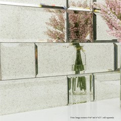
    I actually like that glass one you have. the colors are spot on. and, it's a smaller space so you won't have to worry about it being too busy. You could always splurge on something w/some reflective qualities. it's not a lot to do, so spending a few bucks more wouldn't hurt too badly. (like how I spend your money? )

    this has antique mirror to it

    http://tilebar.com/vzag-antique-mirror.html

    subway mirrors


  • 9 years ago

    Thanks, Beth! Yes, I know. I read these threads and get the same feeling ;-)

    I love the little tiles. I too think the colors are perfect. I am so excited to get this order placed. Glad you ladies pushed me to keep searching but I think the search ends here. I am happy with these choices plus I'm kind of embarrassed to set foot in the nearby tile stores. They all know my face now!


  • 9 years ago

    ok good. I think you've made some very nice choices and will be happy with them. can't wait to see it completed!

  • 9 years ago
    Do you have a sample piece of your counter to take to the paint and tile stores? If not, don't make your choices using a picture....bring color sample chips home and look at them next to your counters in daylight and with your light fixtures on. And don't focus on the gray idea: you may find the other tones in your counter look good on your walls. Painting all the walls in your open-plan space will tie everything together.
    tlopez1214 thanked felizlady
  • 9 years ago

    Hi felizlady. No counter sample but I will def bring paint chips, and eventually samples, home. That's my next step!

  • 9 years ago
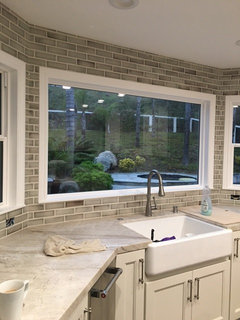
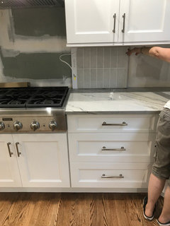
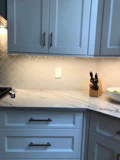
    Thought I would provide an updated photo of the finished kitchen. Thank you, everyone for your advice. I love my new kitchen! You were right about going gray and not white with the backsplash. Love the herringbone too!
  • 9 years ago

    Love this! Counter and backsplash look great with each other and the cupboards!

  • 9 years ago

    Everything looks great! So happy you went with the gray!

  • 9 years ago

    came out really nice!!