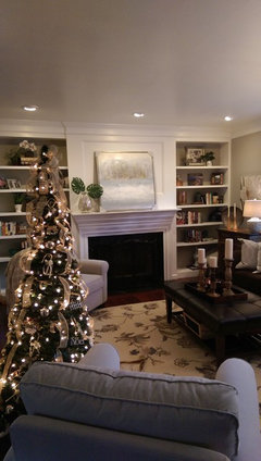
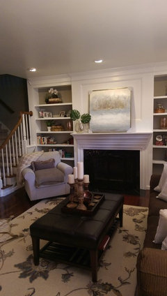
Software
Houzz Logo Print
bbcox57

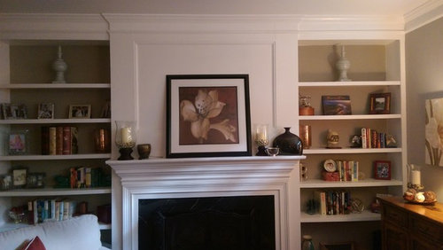
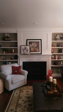
Mantlescape opinion

9 years ago
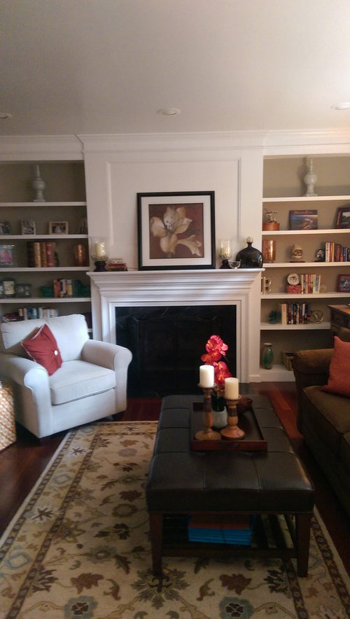
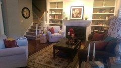
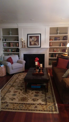
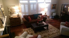
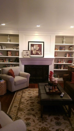
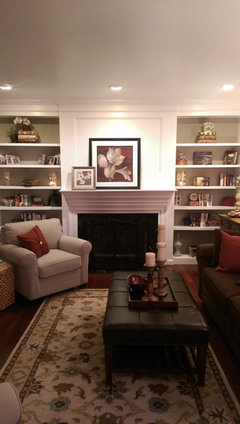
What say ye? Thanks!

Comments (53)

  • PRO
    9 years ago

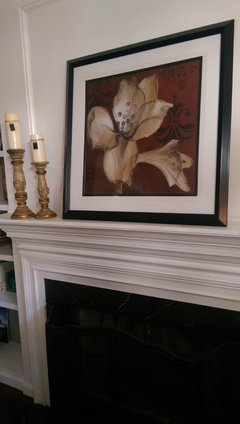
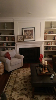
    Looks great! I agree about filling the shelves out with more books, but everything feels balanced and overall pretty great! I wonder what some tall tapered candles on the mantle would look like? It might create some nice vertical contrast.

  • 9 years ago
    Thanks! I tried this.....3 different heights. I am still tweaking the fillers. I have sand and pebbles, to boot!
  • PRO
    9 years ago

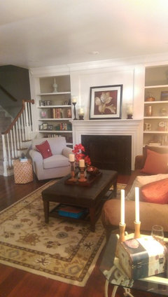
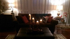
    I spy some tall white candles on the end table beside your sofa. Have you tried placing them on the mantle? They feel a bit more modern, maybe not exactly what you are going for on the mantlescape, but they could be a nice addition. Btw, kudos on the overall layout of the room. It feels very classic and cozy!

  • 9 years ago
    last modified: 9 years ago

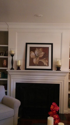
    My preference would be just two of the tall candle holders...one on each side. It's hard to tell for sure, but I like how the dark color of the tall candle holder appears to go with the frame.

  • 9 years ago
    And I like just two candleholders to the left of the picture. Simple and perfect!
  • 9 years ago
    LauraLee, my problem is, when I take something from somewhere else, I then have to redecorate THAT space.
  • 9 years ago

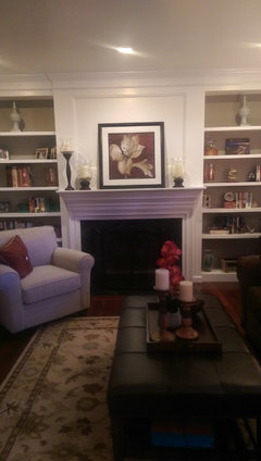
    I think it is lovely, warm and inviting. All that matters is that you love it, then it is perfect.

  • 9 years ago
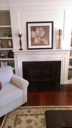
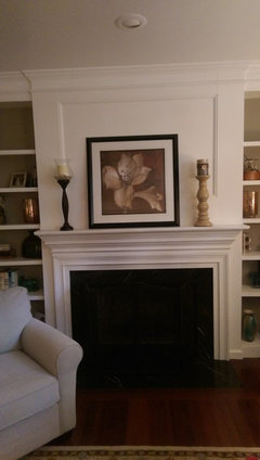
    Tried two on left side only. Can't decide if right side looks too bare. So I added one on the right side. What works?? I can also just do two....one on either side of the pic of the same height. I found another black hurricane as in prior pics and I can get another one of the tall one in the tan color on right side. Thanks!!
  • 9 years ago

    For me it would be one on each side of the frame in this case and equal heights.

  • 9 years ago
    Can you mount the art properly on the mantel?
  • PRO
    9 years ago

    With such a slender mantle....really nothing is working because you can't create any depth so I would only have art and layer a black and white family photo or another art piece in front of it to the left..no accessories...like this without any accessories just the art..

    because of the bookcases on each side it is not necessary to fill the mantle.

  • 9 years ago
    Yes, can do that, also. But that will leave a lot of empty mantle space. Here are the pair options.
  • PRO
    9 years ago

    Leaving space allows the art to be the focal on this wall..no need to fill the mantle and it is to slender in the depth to over accessorize....keep it simple you have all the accessories you need in the bookcases...keep them there:)

  • 9 years ago
    My last comment was in reference to hanging the pic on the wall, thus exposing the entire mantle. Do you prefer it leaning? I like the idea of some black and white art. Thank you.
  • 9 years ago
    The only one I have, will keep my eye out while shopping. I also have a stormy beach photo that I took and may finally enlarge and frame it. Do you think two pics is enough, regardless of what the 2d one is?
  • PRO
    9 years ago

    Yes look for something a bit taller and a bit wider also in a dark frame..preferable slender in nature....it will look simple and sophisticated:)) no candle sticks..try a grouping of the larger candle sticks on your coffee table and remove any smaller accessories...bigger and less rather than smaller and more:)

  • 9 years ago
    love it.....
  • 9 years ago
    last modified: 9 years ago

    I like Home Interior's suggestion of two frames. Also agree the second frame should be dark. Mantels are always...always...best when not overdone.

  • PRO
    9 years ago

    Very nice..looks so pretty....now all you need is a great glass of wine! :))

  • 9 years ago

    Ahhh...the wine will definitely work! Make mine Pinot Grigio. ; -)

  • PRO
    9 years ago


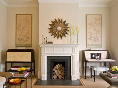
    Noe Valley Residence · More Info
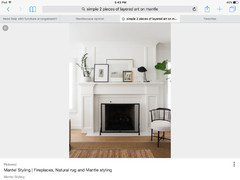
    This is a narrow mantel with thin objects and one central starburst mirror. I would prefer your art mounted on the wall but not more than 5" above the mantel at the bottom. Then some dark thin candle holders rather than the thick ones.
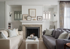
    Washington Street -1 · More Info
    Here is nice example of layering pictures along with one central hung art piece.

  • 9 years ago

    What a nice space.

    For the mantle, I'd do a grouping of three candles (staggering heights) to the left, and move your square picture over more to the right - not centered. You might add the smaller art piece as well on the right. (or a small decorative box to collect small ephemera. When you have candles on both ends of the mantle, it reminds me of an altar. (I guess that's my Catholic school talking. :) It's cozy!!

  • PRO
    9 years ago

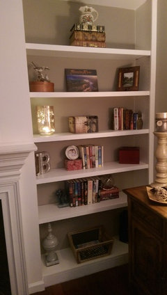
    One other small item. You have a pair of vases on the top shelf of the bookcases but they are light in color and large. Generally, larger pieces are better lower on the shelves. Might try switching those if you can. I also would remove some of the photos or group them more. General rule, is 1/3 books, 1/3 objects and 1/3 open space. A small stack of books on that top shelf with perhaps a small object on top of the stack on each side would be better than the large light vases.

  • 9 years ago
    I have always thought those vases were too light. I'm really not thrilled with the bookcases at all....not good at it!
  • 9 years ago
    It's getting better...I see what you mean. Thanks to everyone for commenting!
  • PRO
    9 years ago

    Better. Put one less book on the top and a smaller item on top of the books. A tiny bowl, or statue, something small. The vases on the bottom look much better. Your little lamps are great too. I like doing that. Bring a bit of interest, especially at night. I think you have done a great job.

  • 9 years ago
    Try pulling the books on the shelves forward a little instead of pushed flat against the back?
  • 9 years ago
    A bit heavy on the knock knacks.

    Bookshelves should be mostly books. Otherwise it looks like display shelving at a gift shop.

    On the mantle shelf, the large piece furthest to the right looks crowded, as if it's going to fall off. And the two candles beg to be displayed symmetrically, so if you're going to use them both (I would) then do so.
  • 9 years ago
    Thanks for your comment. I'm not sure which mantle picture you are referring to, as I've posted several updates.
  • PRO
    9 years ago
    last modified: 9 years ago

    B Cox

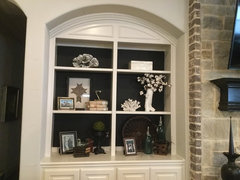
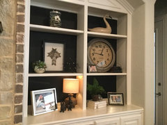
    I love book shelves but they can be so difficul... in a family room you don't want it to look like a library either..so I like to do even amounts of books to objects to photo frames...it doesn't have to be exact but nice to have a formula..so no worries if a little more of one thing..hope this helps.. I have built in bookcases in my family room too....I have another space our den with all our books so my shelves only have a few to stack under objects...take a look maybe my larger objects and placement of items will help you..just remember always enjoy every item you put in the shelves don't just fill it to fill it!:))

    Saddlebrook · More Info

    Saddlebrook · More Info

  • 9 years ago
    Beautiful!
  • 9 years ago
    Following up.....this is the pic I added. I think it looks very nice now.
  • PRO
    9 years ago

    Nice. I like the black frame and the black and white subject matter. Looking good.

  • 9 years ago

    Thank you, Flo!

  • PRO
    9 years ago

    Love the picture and the size..not sure about flower picture on flower picture? But it does look nice..they just seem a bit to similar in subject matter...did you see anything else that wasn't a flower maybe a more architectural subject?

    Oh.....and Hi B Cox...hope you are enjoying your space!

  • PRO
    9 years ago

    Did you try centering the large piece and then layering the other in. It might work a bit better. I would still have that offset look, but feel a tiny bit better. If you have done that already, no worries! It looks really chic and interesting and much better with "less"!

  • 9 years ago

    Hi! I was hoping to find a different subject---every dang picture I have seems to be a flower. Will keep my eye out--at least I know the right size to look for.

  • 9 years ago

    Flo, I will "tweak" the centering. There is some room to work with, I think. Maybe not cover so much of the larger picture with the smaller one?

  • 9 years ago

    If you have time, y'all take a look at my other post about "Wall Mirror Advice for Kitchen." I have tried a gazillon things on that one wall and nothing has said "done!" yet! Thanks!!!

  • PRO
    9 years ago

    Will do. You are very close on the mantel though. I am just a darn perfectionist! :) Off to a client locally. Be back later today!

  • 8 years ago
    last modified: 8 years ago
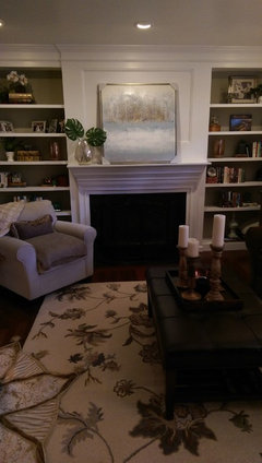
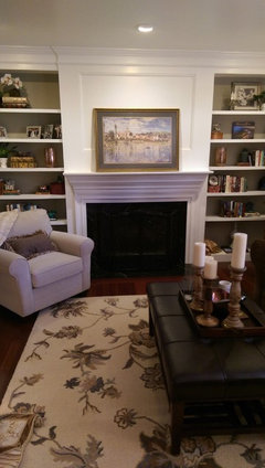
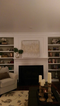
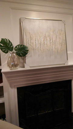
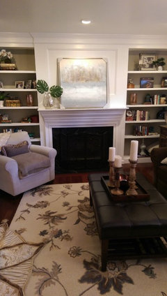
    Hello, again, everyone! This is an old thread, but I changed the rug and sofa pillows so wanted to change the mantle art. Not sure which one to use and what else mantle needs. I think the second one is too bland. Too much white on white. The colors in the first one match the rug the best and the landscape reminds me of my trip to Italy this year. The third one is my choice if I go with a more contemporary look but not sure the blue in it works with my rug. Thoughts?? @homeinteriorswithease

  • 8 years ago
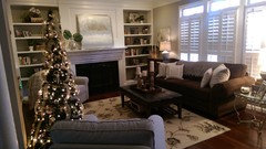
    More pics of the third one.
  • PRO
  • 8 years ago
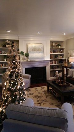
    More pics
  • PRO
    8 years ago

    Hey Becky...actually really like the second one...but they all work in their own way...

    Becky Cox thanked Home Interiors with Ease
  • 8 years ago

    I really love the painting, also, just wasn't sure if I needed more color. I think the size is good (third one is the same size)--bigger than what I had before w/the other rug and pillows.

  • PRO
    8 years ago

    Sorry been so busy with Christmas shopping! What art did you decide on?

  • 8 years ago

    Understand! I haven't decided. Still have all three. This week I've been living with the white (1st) one. It's pretty with my tree.
  • 8 years ago

    Nay, I say! Hang the picture centered in the inset. Add something taller on one side of the mantel.
  • 8 years ago
    Which picture? The only one that fits of the three is the landscape in gold frame.
0