Software
Houzz Logo Print
dbs959

Advice on Dressing Shelves

9 years ago
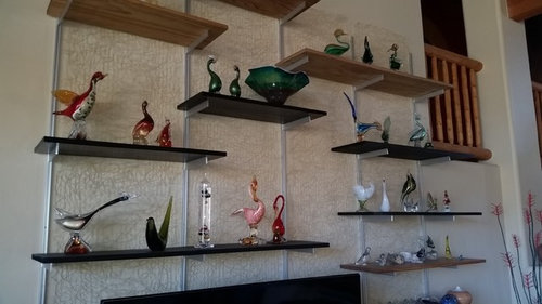
I have never had the knack of dressing a mantel or shelves in a pleasing way. They never look "right".

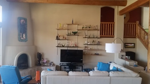
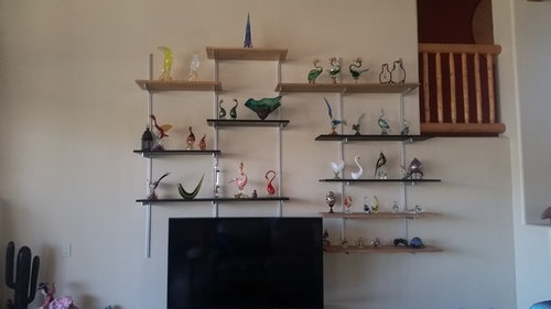
Over the years I have collected lots of Murano glass birds. In my previous home, I had built-in display shelves and they looked great---but I don't know why! They just did. At our "new" home, I had a shelving unit installed that---I hoped---would hit the right tone for the "mid-century southwest" feel I am going for. But once I got the birds up, it didn't look right. I even had a designer come over---he rearranged them and they looked better, but to me, the space still lacks dynamism or interest. We just re-painted so I took everything down to clean and dust, and when I replaced, I added some buts and pieces that we picked up traveling. I thought maybe the birds alone were too "spread out". As you can see, the shelves cover a pretty big space. The display units at my old house were set into the wall and were maybe six foot x 3 foot, with lights, glass shelves,and mirrored backs. And though it veers from the "minimalist mid-century southwest", it seems more interesting. But I don't know what else to add. Plants, photos, books... Any suggestions and thoughts gratefully accepted! TIA! (Oh, one picture is pre-painting as an example of shelves without bits and pieces and with raffia backing I had added---DH hated it and wanted it taken down.)

Comments (14)

  • 9 years ago

    Part of the problem may be that the birds are lined up like soldiers and there doesn't seem to be any "unifying" reason for the groupings. For example, if they are actually identifiable, rather than just fantasy birds, you might group the tropical ones together, or do a grouping of black and white birds. Keeping the groups in 3s, 5s, or 7s is a good way to keep it pleasing to the eye. Looks like you've tried to group colors together, but they're still too spread out. Maybe you've installed too many shelves and now feel compelled to spread out the birds to fill them all. I would remove that top shelf, as I'd prefer all the display to be lower than the handrail on the right side. Another issue seems to be that the shelves are different colors and that is jarring to the eye. The fact that they have a wall mount and brackets is probably what makes them appear so different from the built-in ones you are used to. Have you considered painting the shelves to match your wall color? Then they won't distract us from seeing the birds.

  • 9 years ago

    I would immediately and without question take those shelves down, that does not look good.

  • PRO
    9 years ago

    The shelves aren't centered on anything or anchored by any feature. There's no margin between the end of the shelves and the railing to the right. I'd use lighter color or glass shelves.

    Can you take a lead from their previous display and how they have been formerly arranged?

  • 9 years ago

    2012 New American Home · More Info

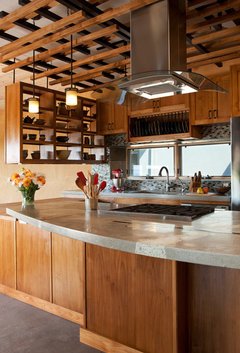
    New glass display cases with underlighting.

  • 9 years ago

    I have to say you should combine Beverly's lighted cabinet suggestion with my grouping idea, and I think you'll be happy.

  • PRO
    9 years ago
    I would completely reinvent this wall. I will post some photos.
  • 9 years ago

    You're getting great ideas here -- and I think everyone is basically saying, "Start over." With glass, as you know, probably the most important part of the display is lighting -- FROM BELOW. apple pie order's picture shows just how dramatic that can be. I'm not sure of your dimensions, but if you did one or two Ikea cabinets a la BeverlyFLADeziner, you could place the "unit" underneath your Juliet balcony and free up the wall space where your collection is now. Then, you could do a fun gallery wall. Lovely room.

  • PRO
    9 years ago

    You have a great collection and I would be scared to death of those shelves being bumped and crashing to the floor. So, I would remove everything and design a wall that incorporates your TV and then has special cubbies for your pieces but I would not display all of them in this space. Too many pieces means none get attention visually.

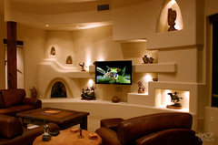
    Southwestern Family Room · More Info
    Now I realize this is a specialty wall and would be expensive to do, however, you could simulate this with various methods as long as you have some good lighting. I think you have a great space to do something like this. I would get a bid from a local stucco place and get with an electrician to produce some shelving and lighting that would change the wall where your current display is into a showplace for your pieces. I would cut the display number probably by about 2/3 and then rotate by color and sizes to create interesting season changes. You could even get a long wood console and then do floating shelving and place directional pot light in the ceiling for illumination. Just remove the terrible metal shelving unit strips and weak shelving. If you can't afford the cost of a great wall, get a couple of the lighted cabinets and do the rotational method so the pieces can truly be enjoyed.

  • PRO
    9 years ago


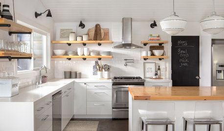
    Contemporary Kitchen · More Info
    Another option would be to put an open shelving unit on the stair step area to the right of the TV (that little half wall that steps down) and place pieces in the shelving unit where the natural light would flow through and create wonderful reflections on the walls around it. That would be a low cost method as well.

  • PRO
    9 years ago


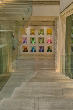
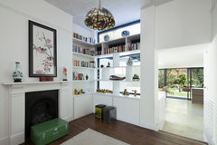
    The Internal Lightwell · More Info
    Something along these lines. Simple shelving from each level of the walkdown wall up to the ceiling and let the natural light be the lighting.

  • 9 years ago

    If the arch opening with the railing in the upper right corner doesn't serve any purpose I would close that off so that you can center the TV better on the wall. That opening also draws the eye upward in not a good way. Then design a wall that incorporates your TV and collection. At the same time, address that tile on the hearth as it would look better with stucco (as shown in Flo's photo).

    If this is a home you plan on being in for some time, do it right even if it means delaying the project if the budget isn't there right now.

  • 9 years ago

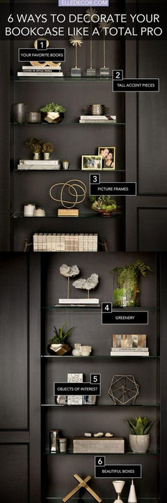
    Just an photo for inspiration

  • 9 years ago
    last modified: 9 years ago

    HI -- The shelves are the problem ... too many lines with the vertical brackets and the thin and different color shelves . With your collection on them it is just too cluttered . You need some nice thick box shelves the same color as the walls with lighting to show off the glass and make it sparkle .