

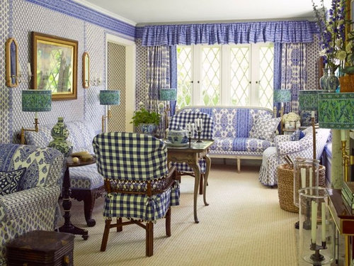
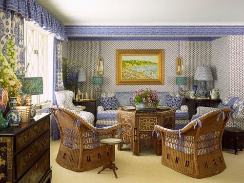
Embracing The Blu & Wht
9 years ago
last modified: 9 years ago
Featured Answer
Sort by:Oldest
Comments (20)
 9 years agolast modified: 9 years ago
Related Professionals
Williamsburg Interior Designers & Decorators · Brainerd Interior Designers & Decorators · Kirksville Interior Designers & Decorators · Sierra Vista Interior Designers & Decorators · Rome Kitchen & Bathroom Designers · Lawrenceburg Kitchen & Bathroom Designers · Omaha Kitchen & Bathroom Designers · Potsdam Kitchen & Bathroom Designers · Albuquerque Kitchen & Bathroom Designers · Westminster Furniture & Accessories · Hartford Furniture & Accessories · Gloucester Furniture & Accessories · Jamestown Furniture & Accessories · Brattleboro Furniture & Accessories · Redding Furniture & Accessories PRO9 years ago
 9 years ago
 9 years ago
 9 years ago
 9 years agolast modified: 9 years ago
 9 years ago
- 9 years ago
 9 years ago
- 9 years ago
- 9 years ago
 PRO9 years ago
 9 years ago
- 9 years ago
- 9 years agolast modified: 9 years ago
 9 years ago
 9 years ago
- PRO9 years ago
- 9 years ago

Related Stories
CONTEMPORARY HOMESHouzz Tour: Family Has Room to Spare in New Rural Home
A builder and his wife design a streamlined house for their family that embraces the land and shows careful planning
Full Story
BATHROOM DESIGNKey Measurements to Make the Most of Your Bathroom
Fit everything comfortably in a small or medium-size bath by knowing standard dimensions for fixtures and clearances
Full Story
PRODUCT PICKSGuest Picks: Snowy, Starry Winter Decor
Let winter's magic reach every room with accessories, furnishings and fixtures done up in nighttime blue and snowdrift white
Full Story
HOME TECHNew Strategies for Hiding the TV
Its easy to be discreet when you've got cabinets, panels and high-tech TV hiders like these
Full Story
LIFEAt-Home Cures for Autumn’s Time Change Blues
The long, dark evenings of late fall and winter can be daunting. Lighten them up with these tips
Full Story
DECORATING GUIDESRoom of the Day: Midcentury Modern Meets the 1840s
Milo Baughman chairs and black lacquer find a home in a traditional setting, making for a cool, eclectic Pennsylvania living room
Full Story
HOME TECHHow Smart TV Will Change Your Living Room
Get ready for the future of TV, in which your living room becomes a movie set, a communication hub and a gaming zone
Full Story
HOME TECHSave Your Decor — Hide Your Media Stuff
When you tuck boxes, wires and speakers into walls and ceilings, all you'll notice is your favorite shows or music
Full Story
DECORATING GUIDESInterior Design Trends Expected to Take Hold in 2018
Get the lowdown on the colors, materials and other design decisions gaining steam now
Full Story
LIVING ROOMSNew This Week: 5 Living Rooms Designed Around the Fireplace
Overcome one of design’s top obstacles with tips and tricks from these living rooms uploaded recently to Houzz
Full Story

UserOriginal Author