

Kitchen Hutch advise
9 years ago
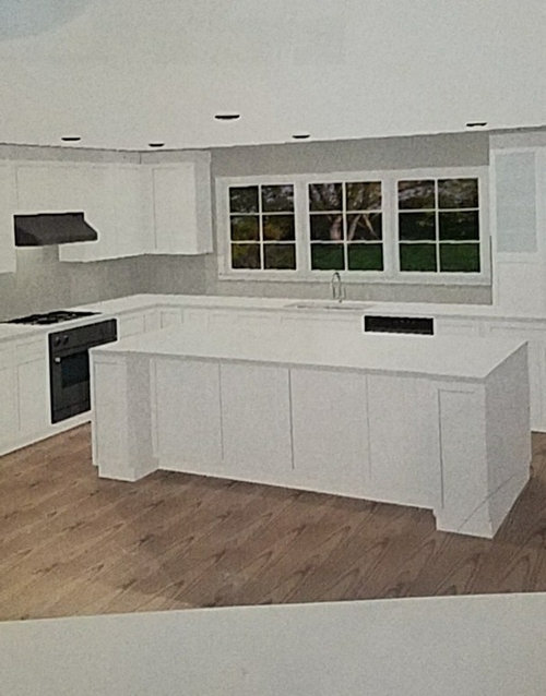
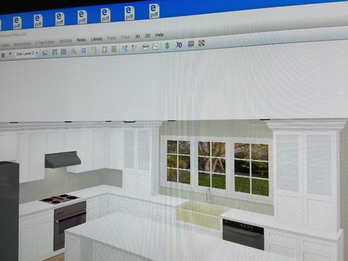
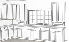
Picture 1
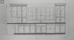
Picture 2
Featured Answer
Sort by:Oldest
Comments (16)
 9 years ago
 9 years ago
Related Professionals
Kalamazoo Architects & Building Designers · Pueblo Kitchen & Bathroom Designers · Albuquerque Kitchen & Bathroom Designers · Kennewick Kitchen & Bathroom Designers · San Marcos Design-Build Firms · Hartford Design-Build Firms · Traverse City Design-Build Firms · Yuma Design-Build Firms · Idaho Falls Design-Build Firms · Jackson General Contractors · Fairbanks General Contractors · St. Louis Kitchen & Bathroom Designers · Napa Kitchen & Bathroom Designers · Muncie Kitchen Remodelers · Portland Custom Countertops 9 years ago
- 9 years ago
- 9 years ago
- 9 years ago
 PRO9 years ago
- PRO9 years ago
- 9 years ago
- 9 years ago
- PRO9 years agolast modified: 9 years ago
- PRO9 years ago
- 9 years ago
- PRO9 years ago
- 9 years ago
Related Stories

BEFORE AND AFTERSKitchen of the Week: Bungalow Kitchen’s Historic Charm Preserved
A new design adds function and modern conveniences and fits right in with the home’s period style
Full Story
KITCHEN DESIGNNeed More Kitchen Storage? Consider Hutch-Style Cabinets
Extend your upper cabinets right down to the countertop for more dish or pantry storage
Full Story
KITCHEN OF THE WEEKKitchen of the Week: New Kitchen Fits an Old Home
A designer does some clever room rearranging rather than adding on to this historic Detroit home
Full Story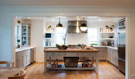
FARMHOUSESKitchen of the Week: Modern Update for a Historic Farmhouse Kitchen
A renovation honors a 19th-century home’s history while giving farmhouse style a fresh twist
Full Story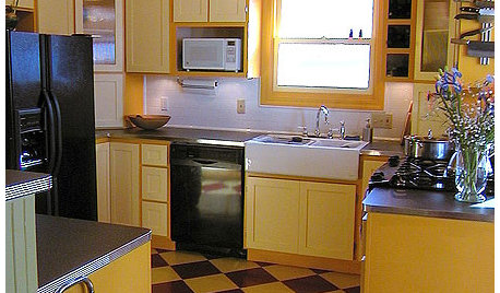
KITCHEN DESIGNKitchen Remodel Costs: 3 Budgets, 3 Kitchens
What you can expect from a kitchen remodel with a budget from $20,000 to $100,000
Full Story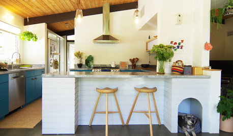
KITCHEN OF THE WEEKKitchen of the Week: A Modern Kitchen With Japanese Style
A chopped-up space becomes a social cook’s dream kitchen
Full Story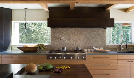
KITCHEN DESIGNKitchen Workbook: 8 Elements of an Asian-Style Kitchen
Craft a kitchen that celebrates the serene, organic simplicity of Asian design
Full Story
KITCHEN DESIGNKitchen of the Week: Past Lives Peek Through a New Kentucky Kitchen
Converted during Prohibition, this Louisville home has a history — and its share of secrets. See how the renovated kitchen makes use of them
Full Story
KITCHEN DESIGNKitchen of the Week: An Entryway Kitchen Opens Up
More square footage and seamless transitions help a historical pied-à-terre's kitchen blend in beautifully
Full Story
KITCHEN DESIGNKitchen of the Week: A Cottage-Chic Kitchen on a Budget
See how a designer transformed her vacation cottage kitchen with salvage materials, vintage accents, paint and a couple of splurges
Full Story
miss lindsey (She/Her)