Software
Houzz Logo Print
amytr

Ceiling and Furniture and Art, Oh My!

9 years ago
last modified: 9 years ago
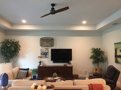
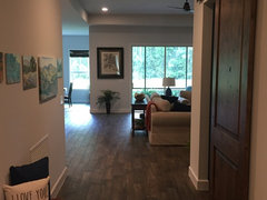
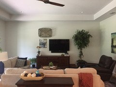
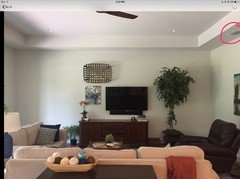
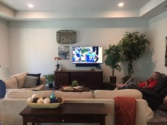
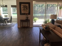
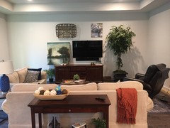
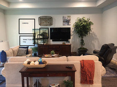
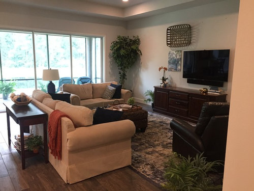
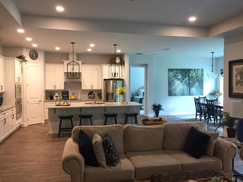
I need some suggestions for our new Florida home great room, especially furniture layout, wall art placement, and ceiling detail. This is currently a work in progress, so please ignore the pieces of wood trim and all of the baskets on the floor that I haven’t found homes for yet. I’m one of the lucky ones whose husband is a contractor and can build, paint, or install anything I need. The things that have to stay in place are the TV, and the TV console. Since we don’t have a fireplace in this house, I’m trying to make this into a TV gallery wall but I’ve only found a couple of elements that I like so far. Any thoughts on additions or placement? The things that have to stay somewhere are (1) my husband’s dark recliner (I would prefer that it stay in that general area because I don’t like it and I don’t want it to block the view of the lanai and pond), (2) the sofa and love seat (3) and the blue and cream rug. Should I get another chair? This ceiling fan is not working for me. I was trying to get an interesting one which is why I got the 2-blade one that you see, but I’m not liking this one and think I’ll be changing it for a 3-blade style. I think I need to do something interesting with the ceiling. Suggestions? Faux beams? Paint? Paneling? Do you think I need some kind of window treatment for the patio door windows? Oh, I forgot to tell you. I like Joanna Gaines’ simple style of decorating, but I’m not so much into the old farmhouse accessories. I like Northern California Napa style, but I’m tired of Tuscan tan walls, which is why these are pale grey. I’m not opposed to painting, or installing accent wall features. Thank you, thank you SO much for all of your help!!!


Comments (38)

  • 9 years ago

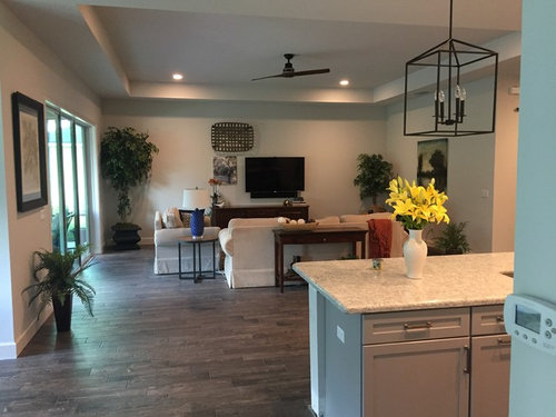
    Here's the view from the entry hall.

  • 9 years ago

    Things already look pretty good-- might not be looking for more, but rather considering less. Like your furniture placement, and like that TV has an asymmetric arrangement. Would take down the flat thing hanging higher to left of TV, the picture, and the plant (too little). One bushy, roundy looking plant in a large white roundy looking pot might look nice with the top of the plant reaching about half the height of the TV. Then something on right of the console - a few colorful books spine out- a colorful box something ( not too big not too small) would give a nice triangle--plant , TV, the something to the right.


    amytr thanked eelh
  • 9 years ago
    last modified: 9 years ago
    I would suggest doing wall-to-wall and floor-to-ceiling white built-ins with a fireplace below the T.V. along with lower cabinets and upper shelving with lights on each side. I agree with removing the ceiling fan since its design is a little too thin and its color makes it too much of a focal feature. If you need or would like a ceiling fan, I would suggest going with a white one that has a more substantial but still stylish design so you have the functionality but it visually disappears and the focus remains on the nice ceiling architecture.

    amytr thanked Elle
  • PRO
    9 years ago

    I suggest enhancing the asymmetric look you have going. Move the taller plant to the right side as well to create a layered effect: and not quite so "in the corner" pull them off the side wall a bit. I like the gallery idea but you need to have a cohesive element for all items. I suggest black frames to reduce the impact of the TV. Do not hang anything higher than the top height of the tallest tree. Balance the left side with pictures that have the same visual weight as the trees.

    amytr thanked SunAlta Design
  • 9 years ago

    Thank you SunAlta Design. Like this?

  • 9 years ago

    By the way, the reason the walls have a green tint now is because we have low-E windows and the sun is shining through them and tinting the pale grey walls now. Would love to lose that effect for sure!

  • 9 years ago
    I love the idea of beams. I think they really enhance a space and bring in lots of character....they would look beautiful in your home.

    I hear you on the green tint from the windows....I hate my low E glass. If they weren't required by code, it would have clear glass.
    amytr thanked User
  • 9 years ago


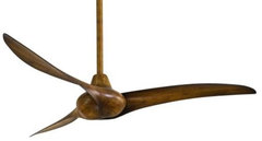
    Wave 52 in. Indoor Ceiling Fan in Distressed Koa · More Info

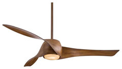
    Artemis 58" LED Ceiling Fan, Distressed Koa · More Info

    amytr thanked groveraxle
  • 9 years ago

    I'm guessing that that ceiling soffit hides ductwork or something. I don't see ceiling beams being an option here.

  • 9 years ago

    groveraxle, I had looked at these before but just picked up something at Lowes. I like the Wave fan. I think that will look really nice.


  • 9 years ago

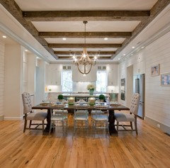
    There is no ductwork going on there. It's just a raised ceiling. But I can use those nice looking faux beams. What do you think? http://www.homedepot.com/p/Superior-Building-Supplies-7-3-4-in-x-6-1-8-in-x-14-ft-9-in-Faux-Wood-Beam-T-17-B/202804944?AID=11210757&PID=7800877&SID=81501X1532937Xe4a7f8baedfad26c5e370a1f26566318&cm_mmc=CJ--7800877--11210757&cj=true


  • 9 years ago
    Beams are still an option.
    amytr thanked User
  • 9 years ago
    Your home looks very pretty. I, too, have my tv over a "console". I centered the tv and put a nice lamp on each side of it (on the console) and then on the right and left of the console (not over it but to each side of it) I put a picture and a pair of smaller scaled chairs to flank it. If you want to keep the asymmetrical arrangement shown in prior post, lower the picture on the left (top of picture no higher than top of tv) and then reposition the basket. Your home looks so nice-just needs tiny, tiny bit of tweaking.
    amytr thanked Donna Cheek
  • 9 years ago
    Are the tall plants near the tv live?
  • 9 years ago
    Looks like you do have some duct work but you can put beams inside tray area.
    amytr thanked User
  • 9 years ago

    I say no on the beams.

  • PRO
    9 years ago

    Not quite. Use both trees shown in the original photo. Tall one closer to the corner, shorter closer to the tv and further forward. Think layers.

    On the left.... less is more larger sized pictures.

    amytr thanked SunAlta Design
  • 9 years ago

    Well, it's a win-win, since you have a beautiful space already. I like the fact that you're using your TV as part of a gallery wall - and I think you have a good start. As you see pieces, add them in -- you can go above the TV, too. One other idea, move your plant and the smaller art piece and in that space, put a low watt tall buffet lamp. (use the smaller art piece to the right of TV). Your idea to add in the basket and other textural pieces is good. Also, what would your sofa table look like on the wall to the left of your sliders -- underneath the picture you have? Then, get another sofa table that's goes the width of your sofa. I like the current rug, I like the current fan, and also the the one groveraxle posted. As for beams? The pictures that nidnay posted are great, but I'm wondering if it would be too heavy a look for where you live?

    amytr thanked coopermcboo
  • 9 years ago
    You have such a lovely start - your "before" pictures look very serene and like the house is just waiting for you to breathe life into it.

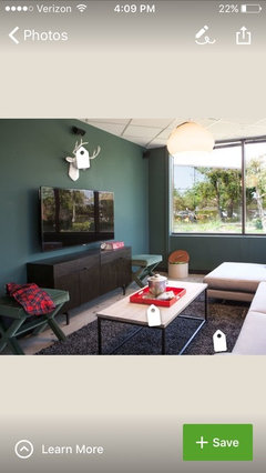
    Because our tvs are so dark (like a black block on the wall) you might want to use a darker paint color on that one wall, which could help make the tv almost disappear; and/or have fun with a gallery that uses lots of dark frames and one or two with "solid" looking content (think moody blank n white photo, framed blue print, or a painting that is well filled with color, not "airy")

    Since you don't have a fireplace, maybe building a great mantel piece and putting the tv low like a firebox would be??? Maybe too quirky?!

    I would avoid making a fireplace and putting the tv _above_ the mantle, though. It's done a lot, but then everyone ends up staring UP at the tv, like sitting down close to the screen in a movie theatre.
    amytr thanked tc_kellygirl
  • 9 years ago
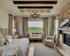
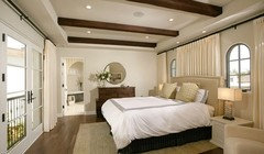
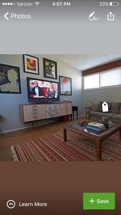
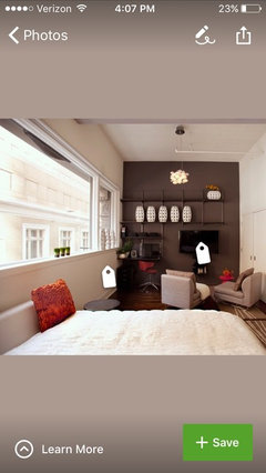
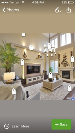
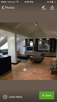
    Some examples
  • 9 years ago

    Thank you everyone. And groveraxel, how did you know I'm looking for a dog, too? ;-) Sunalta Design, I'll move the trees around and post another picture. Coopermcboo, I'll play around with the sofa table.

  • 9 years ago
    last modified: 9 years ago
    I like tc_kellygirl's idea about painting the TV wall a darker color. I don't think I want to go charcoal dark, but what about 3 or 4 shades darker grey than the current color? That might take care of my low E green tinting too. Thoughts?

  • 9 years ago

    SunAlta Design, I don't think layering the trees is going to work, mainly because my husband can't see the TV through the second one.

  • 9 years ago

    Ok, coopermcboo, here is a table to the left of the slider instead of the plant. The sofa table will fit, but since that is a main traffic corner, I think we would bump into the corners all the time. That's why I moved a demi-lune there instead to give you the idea of what it would look like. I do have a taller demi lune also, but this one has more character. Does the 4' sofa table where it is feel too short?

  • 9 years ago
    Meant to include this one before.
    I just searched "dark tv wall" here on Houzz and found loads.
  • 9 years ago
    I think the wall can use a white ship lap look. Tv centered above the console and console go dark gray. 2 bookcases one on each side of console. Metal and wood industrial look. I don't like the trees at all. In the corner by slider two hanging plants staggered lengths for greenery.
    amytr thanked Natasha Sindoni
  • 9 years ago

    Thank you Natasha Sindoni. I think that would be a nice look, though it's not quite what I'm looking for. I've actually considered putting shiplap on the TV wall, but the room is much wider than it is deep and all those horizontal lines would only emphasize that. Good idea though. thank you for the suggestion.


  • 9 years ago
    last modified: 9 years ago
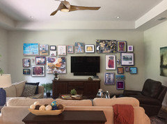
    Ok everyone, what do you think of this? If I move the big canvas to this wall instead of behind the recliner, and move the photograph up. I know it's not finished, but do you think I'm on the right track? And then, what if I put one of those ladders to the left of the TV and art? With blankets on it or something. I'm just trying to figure out how to get some balance on that wall. By the way, the ceilings in the house are all 10', and the tray here is 11'.

  • 9 years ago
    Paint the fan to match the ceiling. Lower the TV to almost the top of the chest. Better still, put it on a swing arm on the wall to the right of the chest. Aim for SEATED eye level or slightly lower.
  • 9 years ago
    NO BEAMS!! Take more advantage of floor and/or table lamps to create flattering lighting.
  • PRO
    9 years ago

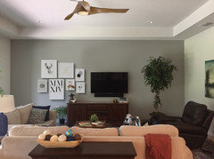
    Try this configuration, don't worry about filling the space above the TV


    amytr thanked SunAlta Design
  • 9 years ago

    If you're going to do a real gallery wall, you can't wimp out. Otherwise, it just looks unfinished.


    amytr thanked groveraxle
  • 9 years ago

    IMO, this is a better look:


    amytr thanked groveraxle
  • 9 years ago

    OMG! You all are the best! Thank you for all of your time and creativity on this! I've got some work to do. :-)

  • 9 years ago

    Yes, take the basket down...rest of pictures look okay around TV.

  • 9 years ago
    The rug is too small for the room and for the furniture. At least half of each seating piece should be upon the rug, and the rug should extend beyond the ends of the sofa at least twelve inches. I like having all my seating pieces fully upon my 11'by18' rug. It holds two sofas and two large chairs, three end tables and a large coffee table plus an upholstered bench, with room for walking. There are a console table, a large armoire-type cabinet, and a buffet-like cabinet on the hardwood flooring, again with room to walk around. The room is 17'by25'. Your room is large, too. A larger rug will define the living room better.
    amytr thanked felizlady
  • 9 years ago

    Up light your tall plant. This is better.