Software
Houzz Logo Print
nikgrl7

Please please help with family room!

9 years ago
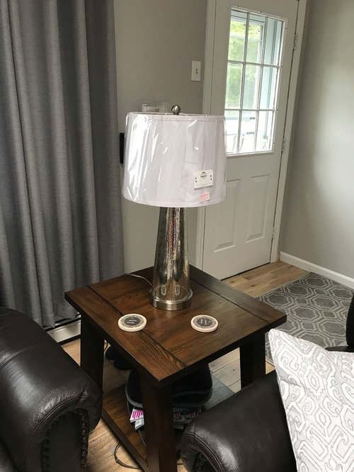
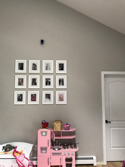
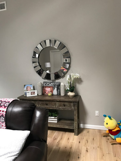
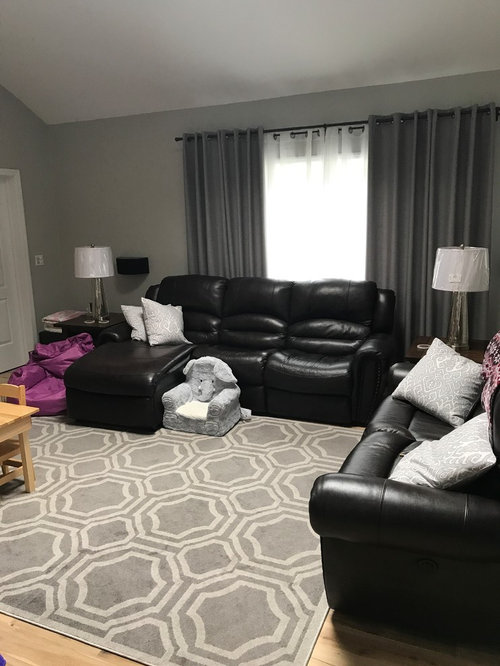
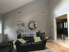
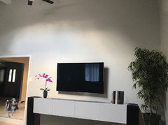
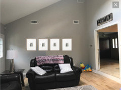
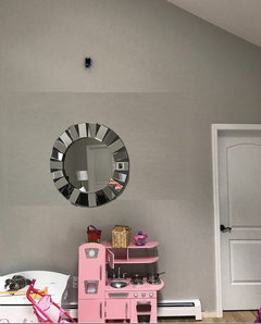
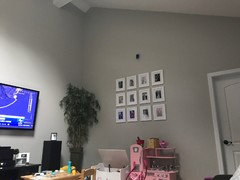
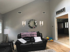
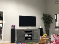
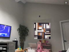
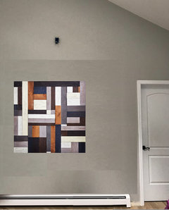
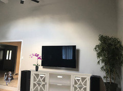
Ok so still in The process of decorating my family room. We just put our hardwood floors in which are a light ashy beige and my walls are gray and I have brown leather furniture. I do not have an accent color yet I'm thinking more on the blue side but I am open and I haven't found any art decor for inspiration and that is the problem. I do have a toddler so I still have a lot of toys in this room so I can't add a accent chair yet but will do after I can move her kitchen set LOL. I have some white frames on the wall and I am not sure what other frames I decide to put on the wall should be can they be black do they have to be white or bronze confused on that. Any advice will greatly be appreciated . And here are some pics of what it looks like now and also debating on the end table lamps still not sure what do you think.

Comments (79)

  • 9 years ago
    last modified: 9 years ago

    I agree with groveraxle and please paint the vents the same as wall they will blend in and be less noticeable . Put the round mirror elsewhere its a nice mirror but too small for that space.

  • 9 years ago
    Love it great idea! Mhmmm could I do white? Or any other color?
  • 9 years ago

    Nikki, the console behind the loveseat is problematic. What is its purpose there? If it's just to fill space, it doesn't work because it limits what else you can put on that wall.


    Perhaps it could move to one side and be balanced by some floating shelves where you could display your family photos. Let me see if I can do that and possibly make the too-small mirror work. Back in a bit.

  • 9 years ago
    I think the drapes are too dark and they should be pushed out past window frame.
  • 9 years ago
    last modified: 9 years ago

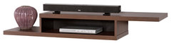
    Not white. It doesn't relate to anything. Either repeat the color of the floor or of the other darker wood furniture. Something like this.

    60 in. Asymmetrical Wall Mounted Console · More Info

  • 9 years ago
    Ahh really bc this furniture is for only right now like another 3 years maybe. Then I would like something lighter. What do you think? That's why I figured white bc it's simple and can re use ?
  • 9 years ago

    I gave you green because it's what I happened to have on hand, though it goes with your sofas and rug. I moved the console a bit to the right and balanced it with floating shelves on the left. This helps to fill the wall in a coordinated way.


    Note that the frames are all alike and the mats are all white or green. The green pillows echo the green mats, the throw on the back of the couch now echoes the color of the rug. (Here's a tip: don't go throwing random colors around like the pink/purple in the throw. If you use a color, use it at least three times in a room and make sure it harmonizes with other colors you've used.)

    Get some fiberfill or extra pillow inserts and plump those things up before you get new pillow covers.

  • 9 years ago

    You could do a white media cabinet if you did white shelves on the back wall. If you're going to use white, use it in more than one place so it looks like it belongs.


  • 9 years ago
    Should it be clean and sleek or can it be like a little rustic? Like shabby chic!? Or to much going on just stay modern
  • 9 years ago
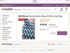
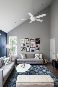
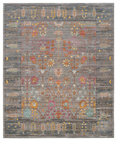
    I don't think you mentioned wanting to get a new rug, and your rug is fine and looks new. But I think you are leaning towards navy and white. This rug is cute and brings in colors you like, and it's kinda artsy, with another, light blue shade.
  • 9 years ago
    last modified: 9 years ago

    The white and shabby chic would take this room in an entirely different direction, compared to the style that you already have going. I assume you are keeping a lot of what you already have, so I wouldn't recommend a change. Your gray color scheme and dark leather upholstery are more sophisticated than shabby, a transitional style.

  • 9 years ago

    I would get bigger frames and possibly move the mirror to where the pictures currently hang.

  • 9 years ago
    I like that! CN you show me the other wall? What should go there instead?! And what shape mirror do you think?!
  • 9 years ago

    I was just thinking you could use your existing mirror. Can you post a picture of that entire corner (from the TV to the kitchen set)?

  • 9 years ago
    Above the picture is a wire box for a light. It previously had a track light so now we have been looking for one. Can't seem to find one that I like. Our fan is matt black so I'm guessing I need a matte black One too? And suggestions for a light too?
  • 9 years ago
    last modified: 9 years ago

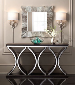
    Your entry console arrangement/idea is very nice and so is your mirror. If you would like to keep the mirror there - you could hang the mirror higher (which would automatically give it more presence on the wall); also, bringing in some sconces is one way to add impact/fill out the space.

  • 9 years ago
    Great so that would go good over my pictures!?
  • 9 years ago

    Help me take 'stock' what you have: is flooring rustic with knots? and the unit looks distressed? Is furniture black or espresso-brown?

    How many of the mercury lamps?

  • 9 years ago
    Yes the floor has knots and ridges in it pretty rustic. Leather furniture is dark brown. I guess u can say it's expresso. And 2 lamps
  • 9 years ago
    And yes the console table is distressed
  • 9 years ago

    The fact that the frames are 'neatly done' helps - how wide is the entire set?

  • 9 years ago

    What if you also distressed, even a bit, all the frames to blend with industrial/rustic?

  • 9 years ago
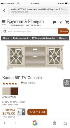
    What about tv center can that be distressed too? And gray , white , or even a color one ?
  • 9 years ago
    Yes I am in between photos didn't know if I wanted to do black and white or stick with color photos
  • 9 years ago
    last modified: 9 years ago

    Still taking stock - are you keeping white dining chairs? at least a couple have thought white frames could look better in other room - what about dining area?

    A clock is there - have you tried it in LR?

  • 9 years ago

    I like your lamps, but they don't go with chrome-ish mirror etc... something has to go in other room.

    Which do you and yours like better: white dining chairs and frames and tv unit??

    or clock and old-world distressed??

  • 9 years ago
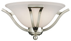
    Where is that light fixture from? Ok so maybe I should just buy the matching piece like my end tables. Wood. For entertainment center. Well kitchen is not to stay that way eventually getting a new dinning room set. So don't mind that room lol. Eventually i will be re doing the kitchen white cabinets and gray and white granite. So not sure what kind of table or chairs yet. Probably wood though.
  • 9 years ago

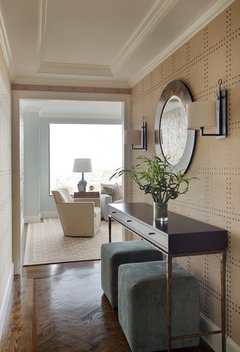
    For anyone interested, here's photo-room you saved:

    Canopy · More Info

  • 9 years ago
    last modified: 9 years ago

    Probably chrome mirror ok... with this but larger of some kind. Stick with your love of white, like you said. But now distressed table/ mercury glass is less than ideal... nice but....

    Z-Lite 1 Light Wall Sconce, Brushed Nickel, 704-1S-BN · More Info

  • 9 years ago
    This would be the matching one! I just hate brown and I don't want a lot of it I like airy white and bright! I will upload other ones that I like.
  • 9 years ago
    This is nice! But does it go? It says it's off white
  • 9 years ago
    last modified: 9 years ago

    ProJody way above posted a textured white lamp shaped like yours - it would 'show' nicely against curtains probably.... echo your white frames etc.?

  • 9 years ago
    last modified: 9 years ago
  • 9 years ago

    Yeh dark furniture -- so I'd go grover's route and buy white cubes/cubbies and place blue/teal/white art above. Behind the loveseat.

  • 9 years ago
    last modified: 9 years ago

    Ok, er's grey-ish unit - is that to you like your curtains? seems ok. And bright art with white....

    not to mention, looks like the ceiling fan. What if you added another rod so it could hang lower? or not good idea?

  • 9 years ago

    93 customers love it - in blue too.

    Safavieh Valencia Collection VAL108 Rug, Grey/Multi, 8' X 10' · More Info

  • 9 years ago

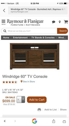
    This console will look good IF it's wide enough. Please make sure it's at least 25% wider than your screen. Nothing worse than a too-short console which makes the TV look top heavy and throws off the look of the whole wall.


  • 9 years ago
    I like this!! Does this go?! Could it work? Ok I decided not to do white I'm liking the gray
  • 9 years ago

    Did you see the one that I posted? It's similar but a little taller. I believe it also had better reviews.

  • PRO
    9 years ago

    I like the gray TV console if measurements are in scale, adds texture and you can build the rest accordingly.

  • 9 years ago
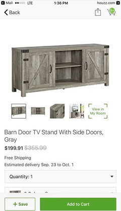
    So it's ok to do barn doors if I wanted to I also like the other pic of the gray console!
  • 9 years ago

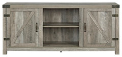
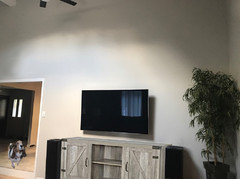
    The gray console is also fine IF it is wide enough. This is only 58" wide. How wide is your TV?

    Walker Edison 58" Farmhouse Barndoor TV Stand in Gray Wash · More Info
    I find the biggest mistake people make with media cabinets is getting them too short. You can almost never go too long; it's easy to go too short.


  • 9 years ago
    I believe it's a 60 inch tv! What about height does that matter?
  • 9 years ago

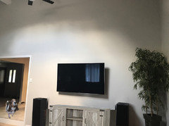
    Ideally the center of your screen is at eye level and the bottom of your TV is a few inches above your console. My best estimate of that 58" gray console is below:

    This console is too short and a bit too low.


    A 60" TV has an actual width of 54 - 55", so your media cabinet should be 72" or so which will give you 8 - 9" on either end. You can go longer, but I wouldn't go shorter.

  • 9 years ago
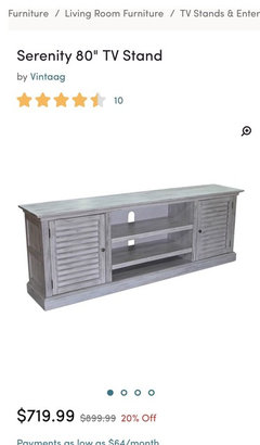
    I love this! What do you think?!
  • 9 years ago

    80" should do it. Now, before you go spending $719, measure it out on the wall--both width and height--to see how it fits. Better yet, tape it out with blue painters tape, stand back, and look.

  • 9 years ago

    Seems those medium tones are better than white or very dark.

  • 9 years ago

    Glad you're not going with the matching tv console of your side tables, that would definitely be too much brown. I like the 80" console.

  • 8 years ago
    Please take a look at your inspiration photo someone posted above. It has an awesome rug. I see you have little ones in the house. So, put a little color, pattern in an artsy rug. I’m sorry, but I,m not getting a sophisticated feeling from black and grey. I think you need to up the fun in this room! Do it for the kids! You can do sophisticated when they are older.