Software
Houzz Logo Print
hzdeleted_20021230

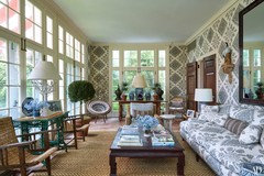
Tory Burch's Mbdrm

9 years ago
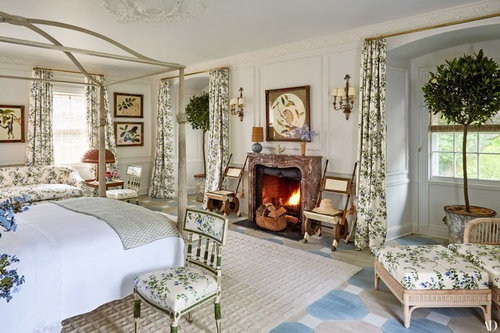
Notice the stenciled floor


Comments (66)

  • 9 years ago

    The dull room looks more soothing and relaxing. With the new version I find the art boring as being part of the "theme", dislike the structure over the bed, and the room seems overthought. The English do this better.

  • 9 years ago
    last modified: 9 years ago
    Agree with palimpsest...

    I TRY to fit in here...but I don't. My taste seems...too different.

    Oh well.

  • 9 years ago
    last modified: 9 years ago

    palimpsest

    The
    plain beige room isn't terrible, either, but honestly it looks
    partially cleared out and the pillows on the bed look completely random.

    Honestly with a lot of the comments I read in the various picture
    threads you post chijim, I really can't figure out what it is that
    people want or expect any more.

    But it seems like what a lot of people seem to want is a lot closer
    to the dull as dishwater room, only with a prefinished wood floor, than
    anything that has any sort of specific viewpoint or specific expression
    of taste outside a really narrow boundary.

    ******************************************************

    Sigh - I wonder too at times...

    It seems like so many just want safe

    BTW, I'm sure the 'before' bdrm had a bit more personality before the staging

    As in the pic of the TB's LR in the other thread, I really didn't mind the before--the decor was old $$ good taste, but I appreciate the new fresh take on the room and how TB went all in on the look.

    ETA: My friend has a large $$ grand house that is decorated nicely but loves the layered look--but doesn't indulge, because she doesn't want to hear what the negative in-laws/relatives would say about it because they like things much, much plainer/simpler

    I wish their opinions didn't hold so much power over her, but...

  • 9 years ago
    last modified: 9 years ago

    I like the restraint of using the florals with the white walls. On the back (window) wall it looks like a combo of white and bone paint which I think I would love even more. For me the particular floral used is maybe a little safe to use exclusively - although it contributes to the soothing look I could picture some other prints being mixed in just because this particular floral isn't overwhelming/commanding. I really love the botanicals on the walls. I think the room would look really pretty with vintage powder blue walls.

  • 9 years ago

    But it seems like what a lot of people seem to want is a lot closer
    to the dull as dishwater room, only with a prefinished wood floor

    Isn't that the truth? I guess RH isn't so stupid when they market on the idea that people think they will die if they see a color somewhere.

  • PRO
    9 years ago

    I don't like the drapery rods (they clash with the arches), and I have a hard time imagining it with all the drapes closed. Other than that, I like it, including the art on the walls, although I think I would get bored with it fairly quickly. It would be good for a bed & breakfast hotel.

  • PRO
    9 years ago
    last modified: 9 years ago

    There are blinds at the windows and this house is on a large estate; I doubt the curtains are ever drawn - no need to do so.

    The fabric is a Colefax & Fowler classic - "Fuchsia" in the blue color way. It's a gorgeous fabric. I had it in my DR for curtains for over 30 years until I replaced them with C & F "Bowood", which is the fabric Tori Burch has on her sofas in the LR. Clearly, we are attracted to the same fabrics! No, I NEVER got tired of my DR curtains - I was sorely tempted to use the same fabric again. The only reason I didn't is that C&F is no longer printed in the UK and is now printed in Asia. The quality is just not the same and I would have noticed the difference, having previously had the fabric.

    When a company continues a pattern for decades, it's because it is timeless and people still love it. Bowood and Fuchsia are two of these classics. Waverly's "Ivy" looks dated as it is just not the quality of design that "Fuchsia" is, to say nothing of the quality of the fabric on which it is printed.

    Tori Burch grew up in a lovely, large Georgian house and that is what she thinks of when she thinks of "home". Westerly, the Hamptons house, is a fabulous, old Georgian house built in 1929. She chose (thank God!) to decorate it in the style that becomes it most, not show how "hip" she is by turning it into something "tres moderne" the way so any stately homes in England are being decorated by rock stars and footballers these days. It's a sacrilege.

    The only think I would change in this bedroom are the topiaries in the windows. They will never get enough light to thrive, and they will constantly be dropping leaves on the carpet - just messy. Other than that, I could move in and sleep there tonight.

  • 9 years ago

    I am always thrilled to see a traditionally decorated room, even if I would not choose to do it up in the exact same way as shown. TB's bedroom is overall lovely to my taste. I do not care for the topiaries in the windows, not because of how they would fail to thrive (I didn't know- I am not much of a gardener,) but because I just don't like them there and they do have quite a presence in the room. I don't think I would hand the curtains the way she did either- but that is no matter. On the whole- brava, well done, from my perspective.

    The room as it was in the listing, the endless beige monotony would stupefy me. It looks like a place to recover from a nervous breakdown to me (and frankly that would send me into one instead.)

    With respect to not knowing what people want in their house, I am continually puzzled by comments about how serene and calming rooms are. I do not understand those words as interior decorating terms. There seems to be an aversion to having objects in a room. Any room with decorative pieces is at risk of being called anything from granny-ish to a dust collection to un-serene. Patterns seem to be suspect too.

  • 9 years ago

    Don't like topiaries where placed and I am a gardener. I like the room, girlie, not for a husband and wife, IMO

  • 9 years ago
    last modified: 9 years ago

    I am continually puzzled by comments about how serene and calming rooms are.

    And I am puzzled by which rooms are apparently not.

    This room is a white room with one color and one real pattern. It varies, and it's a strong pattern but it's leaves on white. On more white.

    Yes the floor is a pattern and it's not green, but to me this is less "pattern" than the typical porcelain "stone look" tile and much less pattern than the prefinished floors or wood look tiles that are so popular.

    I don't know how there could be less going on unless the entire room was patternless and white. And I don't think it's necessary to match a marble fireplace to anything, particularly when that means you would have to work in a palette of an antipasto or salumi appetizer plate.

    It's not completely my taste and it's heavy on the chairs but honestly if somebody gave it to me, I wouldn't change it much.

  • 9 years ago

    Why does she need so many chairs?

  • PRO
    9 years ago

    I like the fabric also - thanks for that history on it! I don't think I would get tired of that fabric - it's the art that I might get bored with after a while, although if I saw it in person, I might have a different opinion. It's difficult to tell how much depth it has in that photo.

    If it were my mother's room, those topiaries would be artificial - and they would still drop leaves.

  • 9 years ago
    last modified: 9 years ago

    I wrote a post before and I don't know what happened to it, I may have deleted it when I edited.

    I am continually puzzled by comments about how serene and calming rooms are.

    And I am continually puzzled by comments about what rooms are apparently not.

    This is a white room with One pattern. Sure the pattern varies on the prints, but it's green leaves (one color) on white. On more white.

    Okay the floor is a separate pattern and isn't green. But to me it's much more visually subdued than the stone look or wood look porcelain that's so popular or the intensely colored and variegated prefinished floors.

    I don't understand how this room could be any more subdued palette wise unless it was completely patternless and completely white.

    And the fireplace doesn't have to "match" anything, and nothing has to "match" the fireplace. That would mean you were stuck with the pinkish color palette of an antipasto or salumi appetizer plate. And we know how popular that would be.

    It's awful heavy on the chairs and it's not completely my taste, but if someone gave it to me, I wouldnt feel compelled to change it, much.

  • 9 years ago

    I like the trees! But they're probably fake and in person I would hate them. Besides, I'd want at least MY chair in one of those windows.

    The rug is boring and the floor looks...not to my taste. :)

    But it's not bad. I prefer the curtain style in the listing photo, but the new fabric is much nicer.

  • 9 years ago

    Not to please pal or chijim because I'm not that kind of person but -.I love, love, love that room. Seriously, all of it. And I wouldn't mind a chandelier with crystals to finish it off, or perhaps a table lamp with crystals by the chair/ottoman.

    Thanks chijim.

  • 9 years ago

    The chair has been placed by the bed in order to provide a surface to place one's dressing gown and slippers.

    Either way, it's a nice room with lovely architectural details. I think it needs more tables and lamps. And, the topiaries obscure the view. I find them to be unnecessary visual clutter.

  • 9 years ago

    The plain beige listing photo is boring. Granted, they probably removed a lot of stuff before the photos were taken but that is the definition of boring.

    In the new room, I wish that the wall trim was defined rather than all one color. The fabric is great. The rug bothers me. Why hide the stenciled floor? Perhaps because it doesn't work so well with the fabric? And the texture of it against the floor just doesn't work for me. I'm not a fan of the topiaries either. But only because, if it were my room, I would want to sit in a chair next to one of those windows, reading and letting my eyes wander to the outdoors.

  • 9 years ago
    last modified: 9 years ago

    This is a favorite fabric of mine. I don't know if I'd ever have a chance to use it. I don't consider it overly feminine... Rose Cumming Chestnut Leaves through Dessin Fournir

  • 9 years ago

    The chairs on either side of the fireplace look like insects from a Japanese monster movie. Why so many chairs? I find the entire room unsettling for some reason, and I love green, but not this time.

  • 9 years ago

    Those chairs are somewhat in the style of Carlo Bugatti:

  • 9 years ago

    Annette, you need to play more video games. Those chairs are clearly made from double axes!

  • 9 years ago

    I don't understand how that room looks feminine either. I asked my husband too and he doesn't see it as girlish either.

  • 9 years ago
    last modified: 9 years ago

    Re: The topiaries

    I suspect ever week or so, like cut flower arrangements,, her pair of topiaries are swapped out with another pair growing in the estate greenhouse - as are probably other houseplants/orchids used for decorative display in the house

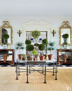
    This display is in her foyer:

    One of Martha Stewart's greenhouses:

    Carolyn Rohem's estate greenhouse

  • 9 years ago

    Now that's what I need to live well, an estate greenhouse!

  • 9 years ago

    I could see visiting and enjoying that room for a week. Not my style for home, but hey.

    Scrolling down to the topiary/greenhouse photos... Now THESE I'd like to bring home!!!

  • PRO
    9 years ago

    It's a very grand house and is decorated to suit that grandness.

  • 9 years ago

    Floral (or foliage) curtains are a hard sell for me. If I'm going to have that much going on at eye level, I'd better like it as much as I like art, and it's a very rare floral textile that I like that much.

    This is a white room with One pattern. Sure the pattern varies on the prints, but it's green leaves (one color) on white. On more white.

    Pal's not wrong, but because the room is pared down to just a few repeated elements, if you don't like those elements, you aren't going to like the room. And I don't like that fabric. I could live with it in smaller quantities, or in an application that isn't quite so in-your-face. Or maybe even if it were in a room with more going on so that the drapes weren't the only thing capturing my attention.

    If you took the same room and let me pick the fabric? I could do a 1-for-1 replacement of all the fabric in the room and get a room I would like, maybe a lot.

  • 9 years ago

    What I find lacking is any sense of the owner's personality, passions or interests. Without that it's just a decorated space and seems cold and empty to me. Everything seems chosen by the decorator and it's pretty (although the floor seems out of place) but I have no idea of who the owner of this room is. That really bothers me.

  • 9 years ago

    "What I find lacking is any sense of the owner's personality, passions or interests."

    I've heard you say this before, If I recall correctly, about other, otherwise well-decorated rooms, and I've never quite gotten what you meant by it...

    What do you think is missing, exactly? What is is about your own bedroom, for example, that tells people who don't know you personally, who you are that these other rooms don't?

    I don't know Tory Burch personally, but I dunno, I get the impression that she is somebody who likes formal houses, tries to de-formalize them a little bit, and she obviously likes green plants and topiary. What else do I need to know?

  • 9 years ago

    Books, drawings and paintings that I love and have personally selected or have been drawn/painted by my husband. Chinese antique porcelain that I've studied and collected over a period of years. The paintings reflect my love of animals and nature, and my love of color. I have summer and winter quilts, shams and curtains that keep the room more interesting for me.

  • 9 years ago

    But how do we know that this doesn't reflect what Tory Burch likes? None of the furniture is off a showroom floor, none of the art is generic decorator art...she's a (clothing) designer, so how do we know that she didn't play a big part in all the selections? Or are you just calling it "impersonal" because you don't respond to it personally? That's what I don't get about the assumption. It's clearly not impersonal like a hotel room (which is more than I can say for a lot of rooms I see), so I really still don't get it...

  • 9 years ago
    last modified: 9 years ago

    Here's a extensive blog post full of eye-candy about Tory Burch's Westerly

    http://niagaranovice.blogspot.com/2017/09/tory-burchs-westerly.html

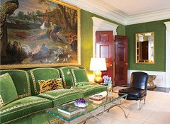
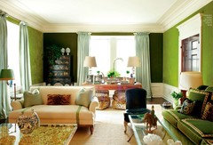
    This is her NYC apartment LR

    This sofa has become iconic


  • 9 years ago

    Dammit....now I want a greenhouse!!!

  • 9 years ago

    Here are some blog pics of the rest of the house. I would say that the bedroom Jim posted is my least favorite. The rest of the rooms have a bit of whimsy, I don't see it as much in the bedroom. Although, I wish we could see the head of the bed, I suspect there are some wonderful pillows there. I think the house is gorgeous.


    Southampton


  • 9 years ago

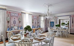
    I think the wallcovering in the dining room is Martyn Lawrence Bullard.

  • 9 years ago

    I've been thinking about Ingrid's comment and Pal's response. I wonder if it could be the size of the bedroom takes away from some of the warmth. The personal touches maybe are harder to see in that space- aside from the fact that TB likes botanicals and chairs? I know in the pictures we have seen of Ingrid's house we see her porcelain collection and art clearly. Whereas the picture of this bedroom is more of a landscape.

  • 9 years ago

    I love the green walls in the living room- of course most anything in a room of those proportions and finishes would look pretty spectacular to me.

  • 9 years ago

    Perhaps a pair of big brown pleather sofas and a game boy with wires hanging from it for a more lived-in look?

  • 9 years ago
    last modified: 9 years ago

    I was just about to ask about that dining room wall covering. How does that kind of super custom looking treatment work? Like do you think he sized it custom for her, or do you think they sized the picture mouldings to accommodate the print? I have to say I like every other room chjim posted better than the bedroom, although I like the bedroom. But the others seem a bit more daring and "decorated" somehow. Although I can respect wanting a serene bedroom.


    Based on that one beige listing photo, the house must have already come a loooong way with added architectural detail which in itself would take a ton of work and vision. I'm wondering if additional layering may come with time.

  • 9 years ago

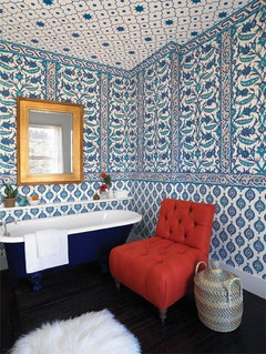
    Robo, there is an older Vogue article about the dining room that said "The dining room was transformed by the Paris-based wallpaper designers Iksel, who created custom panels based on Persian Iznik tiles, an exotic complement to Burch’s collection of Imari porcelain." I think this a closer view of the panels. The colors don't look quite the same but it may be a lighting issue.

    I rarely wish for more money or things but decorating like a billionaire looks like it would be a lot of fun.


  • 9 years ago
    last modified: 9 years ago

    The floral pattern is pure 1980s. So Laura Ashley. I can't like it for a modern room. I find the useless chair next to the bed pretentious and actively loathe the topiaries.

    I do really like the treatment of the fireplace and the layered carpet, though.

    I love her NYC apartment though!

  • 9 years ago
    last modified: 9 years ago

    The MLB for Schumacher wallpaper is a pale imitation of the paper in Burch's house. It's still nice, but not in the same league...

  • 9 years ago

    Here's a closeup of the DR walls. I would have sworn it was tile and not wallpaper, as the quote from Vogue that d_gw posted states. But I guess that was the point?

    http://niagaranovice.blogspot.com/2017/09/tory-burchs-westerly.html


    Yeah, decorating like a billionaire would be fun.

  • 9 years ago

    I could spend all day looking at that wallpaper. What a fantastic complement to her porcelain.

  • 9 years ago
    last modified: 9 years ago

    OMG yes I love it so much! I love that tile look.

    One of my favorite places in the world is the jardin botanique de montréal and they have a gorgeous garden of peace with Iznik tile installations. It really was my first introduction to Iznik tile and I fell in love with the rich colours and designs.

    http://espacepourlavie.ca/en/gardens-and-greenhouses/peace-garden

  • 9 years ago

    I love all of it! I could move right in and not change a thing.

  • 9 years ago

    I agree, decorating as a Billionaire with a sense of design would be fun! I really like (to love) the rest of the house. (The BR is the only place where I felt a disconnect between the floor and the rest of the room). Her personal favorites are very clear, to me.

    (the cover shot of her on a ladder trimming a bush is a bit difficult to believe)

  • 9 years ago
    last modified: 9 years ago

    It's interesting that even the "cheap" version of the wallpaper that Pal posted requires a precision of installation that would not be inexpensive. It boggles my middle class mind to think of how much $ is in that gorgeous dining room.

  • 9 years ago
    last modified: 9 years ago

    :) Very true, and most of us would need a professional to design it in the first place.

    Regarding, "Sigh - I wonder too at times... It seems like so many just want safe."

    Yes. But a feeling of safety (as opposed to "safe," timid decorating choices) is a good thing. It's not just very important to most of us but, very on point, for many includes being conforming.

    This isn't a putdown. Homes have to fit their owners' emotional needs, and bunch of people get great comfort from homes that conform to tastes prevailing around them. Just as for all of us, it's about the particular style that makes one feel glad to be home.

    I've learned to remember that when someone asks for help for a room with gray walls and brown, beige, gray furniture, both upholstered and casegoods, from a chain furniture store. Those posts aren't really seeking advice from someone whose home is filled with auction and yard sale "finds" gathered in various states over some decades. :) They want input from people who share, or at least can enter into, their vision of what a lovely home looks like.

    I'm among those who like this bedroom, but it'd be much better for me if it were no more than about 14x14 so no need to fill empty space with unused furniture. We're empty nesters with plenty of room, no need to seek privacy in the bedroom, and one attractive, comfy chair just in case would be plenty. Ours is 16x16 now, just too big for the coziness that feels most inviting to us at night.