Software
Houzz Logo Print
beverett1

Need help with Kitchen Tile and Splash Back

13 years ago
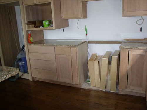
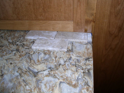
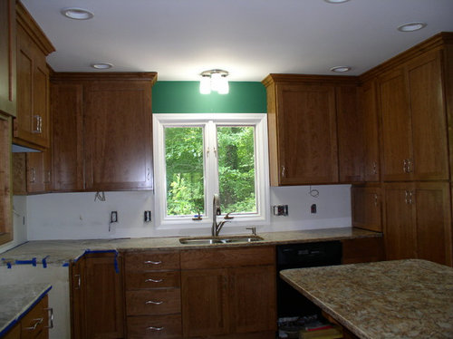
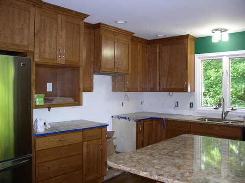
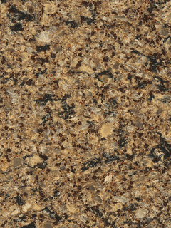
Help! I have never remodeled a kitchen, but I am in the final stages of redoing my 1979 kitchen. I am stuck when it comes to picking the tile and kitchen splash back. My house is modern/contemporary with lots of wood. My counter tops are Cambria--Canterbury http://cambriausa.com/en/designs/design-palette/?gclid=CPDgiKWMr7cCFUee4AodpgUATQ. The countertop is a busy one, so I want something to complement it rather than compete with it. My shaker cabinets are a mid-brown with stainless cabinet pulls. Originally I thought about 3x6 travertine stone tiles with a band of glass tile between the countertop and cabinet bottom. But in looking at where the outlets are, the glass band would be off center if I go above or below the outlets. Then I thought about 4x4 square tiles just above the countertops with the remaining tile in diamond shapes going to the bottom of the cabinets. But I was told that squares were outdated. I also thought about alternatives to tile, such as glass, but it was out of my budget. My 30" range will be a black glass top induction one and the area behind the stove may need an accent.

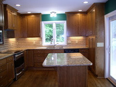
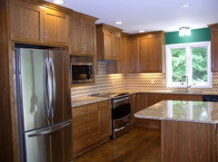
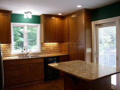
I am attaching pictures of the current state of my kitchen which may be a little dark. My recessed lighting has not been completely installed. The tile in the pictures is a light walnut color.

Comments (183)

  • 13 years ago
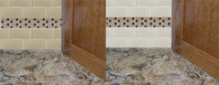
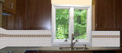
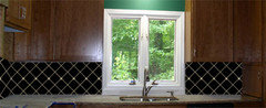
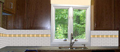
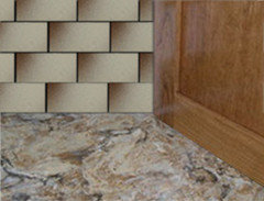
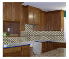
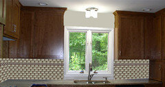
    beverett1, here are some mockups I did for you.
  • 13 years ago
    the images are cropped but if you click on them you'll see the whole thing.
  • 13 years ago
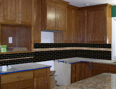
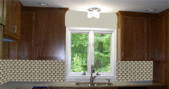
    Two more
  • 13 years ago
    you are so kind to do the mockups, but I still favor the two-tone brown subway. Can you do a mock-up?
  • 13 years ago
    wow! Great work rosebud3! From these pictures, I really like the black diamonds with the contrasting grout.
  • PRO
    13 years ago
    Beverett1,

    I am a kitchen designer who is obsessed with Cambria. Your countertop is photographing like Buckingham not Canterbury, just want to confirm the color. If it is Buckingham than Florida Tile has a elongated glass tile in a toupe color that picks up on that countertop perfectly!!

    Cambria now has a tool on its website where you can look at the countertop color and it will suggest 3-4 paint colors that coordinate, might be helpful if you are going to go monotone in the backsplash.

    I am a huge fan of back painted glass and it is not terribly difficult to do yourself, it looks like you might have eliminated that as an option about 1/3 of the way through this thread but you might want to consider it again.

    Good luck!
  • 13 years ago
    I love good kitchen design and one truism that I think really prevails is "Keep it Simple"! When I look at all of my tearsheets of good kitchens what they all have in common is that the find some great harmony in all of those elements of floor, cabinets, counter and backsplash. I think your counter is really busy and whatever backsplash you get it should be one color and as seamless as possible. If there is too much going on you will get tired of it. Kitchens are busy places with people, food and emotion! Set your stage with simple elegance.
  • 13 years ago
    Kohl, I was going to suggest to beverett1 that she get the paint chips from BenMoore and take with to tile store. Joan I can do more this weekend.

    Beverett1, I must say I changed my mind about hating the black once I did the mockups.
  • 13 years ago
    Glad to hear some folks are changing their mind about black in the backsplash. I would avoid solid glass because it shows spots. In other words, you have to clean it before company, even before serving a big meal, or it looks sloppy. That's why I like my black granite with flecks. I have to go looking for splashes, so guests are never the wiser about any slips while I'm making dinner. Splashes slide right in with the flecks in the granite and I can wipe them off later. Glass tiles are better than solid glass because they aren't a mirror smooth span.
  • 13 years ago
    Spots were also my thought about nixing black glass tiles.
  • 13 years ago
    Beverett1:have u made a decision yet?
  • 13 years ago
    You might consider larger rectangle glass tiles. Or do as I did and use porcelain tiles.
  • 13 years ago
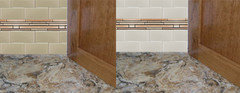
    jbv - as promised
  • 13 years ago
    Close up is good - overall - too busy. Thanks!
  • 13 years ago
    Jbv the color of the tile is nice. Is there a chance you could fine a larger rectangle? That would eliminate that 'business'. Similar to my backsplash.
  • 13 years ago
    How large are the rectangle porcelain tiles? Who is the maker and what is the color?
  • 13 years ago
    If your asking about mine they're 8 x 20 and made by Daltile
  • 13 years ago
    I'm sorry I forgot, the color is Cashmere Grey
  • 13 years ago
    rosebud3, Thanks so much for the visuals. I followed up on the great suggestion of taking the Cambria recommended BM paint colors for my Buckingham counter tops (not Canterbury as originally typed) to the tile store. Man, this process has really made me see what "undertones" are in colors!

    We are narrowing choices down. My husband is not keen on the accent strip for our kitchen. If the outlets were directly under the cabinets and did not show as much, it might be a different story.

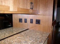
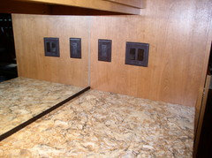
    Attached are pictures of my dining room counter top which is the same as the kitchen. My new dining room cabinets are similar in color, but they have more of a reddish tint to match the wooden wall on the opposite side of the cabinets. I did go with a mirror since when sitting at the table, a window view of the garden fountain is reflected. Moreover, my husband enjoys the reflection of food on the counter top! I have LED under cabinet lights which has 2 levels of brightness which I love as which was a great suggestion.

    My dear husband says not to worry so much about the tile. He is more concerned about what is cooking! Thanks dear Houzziers for your patience and guidance. Regardless of the decision, I will post the final pictures and let you know whether the decision is the right one for my family.
  • 13 years ago
    I think you should look into Heath ceramics (diamond tile shape) color, "chalk"
  • PRO
    13 years ago
    last modified: 13 years ago
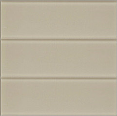
    I've read right through this thread, and think the two-tone subway tile would get old quite quickly. A single, paler colour such as this oversized (4 x 12") subway tile which comes in a lovely colour called Lush Driftwood would look a bit less frantic.

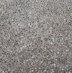
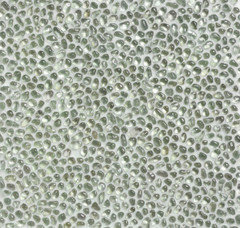
    Another, slightly more unusual option is this recycled glass tile called ModRocks which catches the light beautifully. It can be made to look quite different depending on which colour grout you chose.
  • 13 years ago
    The counter/cabinets in your dinning room look beautiful! And I can picture the kitchen cabinets bringing out the red in the browns in the countertop. Patience is definitely required in remodeling a kitchen! LOL But trust me, when it comes together right you find yourself 'hanging around' in it doing nothing but admiring your accomplishment. :)
  • 13 years ago
    Beverett1, when you find the "right" thing you will know it!!! Good luck!
  • 13 years ago
    Love those recycled glass tiles Ginger. Rosebud3-could you do a mockup just for fun with those in them please?
  • 13 years ago
    gingerclaire, love the recycled glass. I have not seen it before. I have a master bath and powder room which will be my next projects after I recover from the kitchen and dining room work. I can imagine the ModRocks in a pretty powder room especially!

    You are right about the two-tone. I looked at it for a couple of days and it started looking country and it lost its appeal to me.
  • PRO
    13 years ago
    Have you made a choice?
  • 13 years ago
    Breadboard painted glossy dark brown to tie in the floor.
  • 13 years ago
    joann1965 "Breadboard..................floor" ? Please clarify!
  • 13 years ago
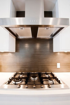
    Came across this and thought it was unusual, but simple and elegant, without looking too trendy. Maybe it's possible to find something along these lines?
    Piano Kitchen · More Info
  • 13 years ago
    Love the Piano Kitchen backsplash! I think it would complement your granite beautifully!
  • 13 years ago
    What is the Piano Kitchen back splash made of? It looks like back painted glass. It is a very interesting look.
  • 13 years ago
    If you click on the link below the picture it goes into some more detail - it's actually a concrete product. However, I have seen tile that incorporates that wavy pattern, which may be more easily available. My thought was that it had more interest than a flat tile, and was neutral enough to balance out your countertop. Plus, I want to keep it mind for the day I finally redo MY kitchen!
  • PRO
    13 years ago
    Hi! i'm walking out the door nearly to place my order for new Cambria countertops and I'm planning on putting Cambria Canterbury on my island. I'm positive that what you have is not Canterbury; it looks more like Buckingham, Lincolnshire or Bradshaw. Here's Canterbury:
    Kitchen Countertops · More Info
    Can you confirm? Thank you!
  • PRO
    13 years ago
    jgoodmon She has Buckingham...she confirmed about 1/2 way through the comments. Good luck with Canterbury!! It is my favorite color!!
  • 13 years ago
    Use the travertine, with glass long strips in the middle. Keep glass in granite tones.
  • PRO
    13 years ago
    last modified: 13 years ago
    Thank you "Kohl"! I must have missed that, although I thought I read every post. I, too, am looking for backsplash ideas!
  • PRO
    13 years ago
    jgoodmon a good 1st step is to go on Cambria's website and download the paint suggestions that they have for Canterbury, take those into the tile shop...they will help you see the base colors that are in the stone!

    Good luck :)
  • 13 years ago
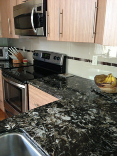
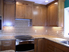
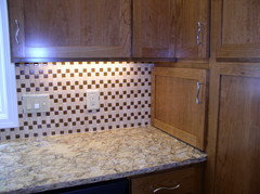
    Here are the pictures of my kitchen which is 95% finished. I still have to put the decorative touches for the items to go on the counter tops. We have received positive feedback for the splash back. Thanks Houzzers so much for your input. My kitchen is better because of your willingness to share your knowledge.
  • 13 years ago
    what is the backsplash
  • 13 years ago
    The tile is from the Tesoro Listello Collection. The color is No0ce travertine with butterscotch glass.
  • 13 years ago
    Thank you for your help and wishes. To me, it looks better in person than in the pictures. The glass tiles are a perfect match to the cabinets. The great room with a large ivory section is open to the kitchen. The light tile color blends with the sectional. The glass tiles are very pretty at night from the great room, especially when the under counter lights are on.
  • PRO
    13 years ago
    Looks great! Thanks for sharing the after pictures, it's always nice to see how projects turn out!
    Barbara thanked Walker Woodworking
  • 13 years ago
    It is very pretty!
    Barbara thanked bearus2
  • 13 years ago
    Turned out very nice! Glad you are happy with it beverett1.
    Barbara thanked hollywaterfall
  • 13 years ago
    I just finished reading this entire thread for the second time in the past 10 days. It is just SO helpful to me -- such wonderful advice and reasoning and tips -- as my new cabinets and countertop will be similar in color and I am trying to figure out a simple, inexpensive, timeless backsplash before selecting wall color. Thanks to all for all the comments!
    Barbara thanked J Milner
  • 13 years ago
    And now that its done, you can sit back and enjoy its beauty! :) Congrats on your new kitchen.
    Barbara thanked greymom
  • 11 years ago
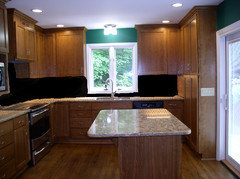
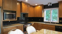
    The sample tile looked more like marble surface than what was actually received. Therefore, the tile was replaced with black glass tile. What a difference it made. Before when folks came into the kitchen, all they saw was the backsplash. Now they see the cabinets and then the counter top surfaces. Since I like my counters without clutter, there was nothing to "tone down" the busy backsplash.

    I learned alot about choices for kitchens. Even though everything perfectly matched with the first tile choice, it was not a good selection for me. I learned that you really need to pick what you feel is the focus of the kitchen that you want to highlight. For me, it was the cabinets. Horizontal surfaces are not noticed as much as vertical ones. The solid black tiles in my opinion make the cabinets "pop." Then the counters become the supporting element to tie the cabinets, counters and blackspash together for a calm cohesive look. The absence of "stuff" on the counters allow a good look at the glass tiles. I have lived with this remodel for about a year and I still love the look. I really appreciate all who commented and helped me work through the process. I have shown this thread to many others who are going through kitchen remodel and they have found this thread to be very enlightening. Houzzers are the best!
  • 11 years ago
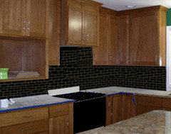
    Sorry! Wrong pictures attached and I could not delete them.
  • 11 years ago
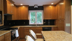
    I like the black much better than the busy pattern shown before! Your granite and cabinets are the stars now...and they are lovely.