Software
Houzz Logo Print
qz0g40

What is Wrong With this Picture? (HBFF)

8 years ago

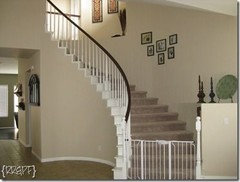
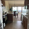
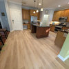
I removed an antique victrola from the wall on the left, which has left a large gap. Anyone have any idea what I can put there? How can I hide the thermostat? The fish will come down;


Comments (227)

  • 8 years ago

    That is the word I’ve been looking for is saturated. I as well don’t want the interior walls to look too dark but the saturated colors to me looks bright ppg suggest one of their colors, which is inverted and from Sherwin-Williams these are the colors that are close to inverted taupe tone and tony taupe basically the shame shade. Here it is with let it rain.

  • 8 years ago

    Let It Rain is pretty.

  • 8 years ago

    My fear is the Taupe tones. For what ever reason I feel the living room will be very dark.

    Wonder if Mary is having a bottle of wine :(...... I know she feels like one right now....


  • 8 years ago

    Here is SW Solitude and Tony Taupe in background

  • 8 years ago

    That's a pretty blue with a hint of gray!

  • 8 years ago
    It is pretty blue it’s a little darker than let it rain
  • 8 years ago

    Yes, I like it.... I have Paint Harmony on my phone. Don't need it for my job, but have used it for home. I need to use my husband's I pad to use it though as I have a tremor in my right hand and my phone is tough to do it on. I love the app though!

    The SW paint visualizer tool is junk. No way any color transposes to the right color!

  • 8 years ago
    I’m sorry to hear about the tremor is it a spontaneous one or constant. Yeah the SW doesn’t allow you to paint the room just picks up the colors
  • 8 years ago

    it's constant, started when I was in my very late teens. Not a big deal. I worked for many years as an OR nurse and was able to take a beta blocker to stop it as I worked cardiac surgery so steady hands needed. I can no longer take the meds. It's not debilitating, but don't drink coffee and so on as it will get worse from that. So, fine movement such as trying to use Harmony on my I phone is not possible as it's too small of a screen :).

    My brother has the same, so it's a familial thing. He manages to be an ER physician in a trauma center so? His is a bit worse and stress activates it, but he is the head of the ER so he figures it out too. Thank you Claire... so many things I'm sharing on Mary's site.

    I wonder where Mary went. I'm sure she is so frustrated I wish I could better help. Feel I should go up to SW it's so close to me and look at some colors. Yet, she gravitated toward some colors I fear are dark?

    I went through this with my master bath remodel and had literally 15 or more sample cans and poster board all over the room last year. Never know from one room to the next. The ceiling for what ever reason is 15' tall in a portion and it's not a giant room and it has two windows and from AM to PM paint would turn blue or green or pink. I finally dreamed up my own color and had them mix it. My husband thought I should just, "pick any one it will be fine". LOL, not.

    Again, hijacking Mary's thread.... enough about me.....

    Don't think we'll hear from her tonight.

    Have a nice evening Claire and Mary.

    Mary, if you want me to go to SW tomorrow let me know. You said you sampled the colors, but didn't say what you thought.


  • 8 years ago

    Hi everyone, I just got back from a wild goose chase.

    I'll address all remarks tomorrow. Have to make dinner.

    Porter, I did like Denim and it looks darker on my sample than it does in yours.

    I like Cool Beige, but it might be a little dark. The only reason I'm staying away from anything with gray is because of the sofa color. If I could find a beige with some gray in it, I guess that would work.

    Decisions, decisions, decisions!

    Have a good evening HBFF and Claire.

  • 8 years ago

    Poor geese Mary :)

    Yes, the Denim IMO was to vivid.... Loved Claire's Solitude color. Yet, feel you want a more Blue vs. Gray blue.

    As for Cool Beige or the other you chose they IMO are going to be too dark. I'll look for beige with a hint of gray.

  • 8 years ago

    Porter,

    I agree with you that Cool Beige and Practical Beige will be too dark. So maybe Touch of Sand or Sand Dollar. ?????

    Solitude is pretty, but too much lavender.

    If I go with a blue gray, do you think I should also go with a beige gray?

    Da-- geese!

  • 8 years ago

    I think Touch of sand has a lot of orange, but Sand Dollar might be ok.

    I think they are very similar to the ones you just got, but maybe a pinch lighter?

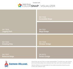
    The only paint color that may work with a gray tone is accessible beige.

    I wish you would try some tones a tad lighter than what you are leaning and away avoid orange or orange brown tones. Yet, I have not gone up to look at samples. The most important place to test them is in the kitchen with your counters/backsplash and in the darkest room (naturally, all rooms)


    Still like Rice Grain too!!

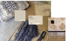
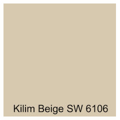
    Kilim is going to be lighter than above on the card. I've seen it up.

    I think/hope you are finding things are going too dark. If you aren't then you

    should ignore me :)-------


    Watch this below:

    https://www.youtube.com/watch?v=PfOkZM4PoPs


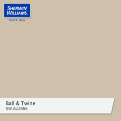
    You might look at Ball and Twine when you are up there. May be too dark may pull a pinch pink or orange?

  • 8 years ago

    Windsor Greige?

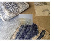
    See the color above and below look purple.... accessible may work it's on the fabric swatches I posted last. Not sure about the kitchen, but I would try it. It's very commonly used for a neutral nice color in models. Not that I would buy it due to that!

    If you kind of like one you got take the can back and have them cut it lighter. At 25% it's only a pinch lighter. I'd go 50% IF there is no orange tone in it :)

    Remember, floors are red tone, kitchen cabs are warm..... you don't need a color with a lot of orange or red tone.

  • 8 years ago

    It's hard to believe that I can't find a color in the whole wheel that I like for the living space. But I do agree with you that I need to look at lighter shades of beige with a hint of gray.

  • 8 years ago

    When you get the paint for the other areas then you might look for the blue tone. I do love Granite Peak then Storm Cloud then Distance for blue tones from what I see with your fabrics.

    Another favorite I posted WAY up.

    Nice, clean look, appears neutral and dark enough as well as it's warm.

    PLEASE take a look

  • 8 years ago

    Porter

    Show Mary Shoji White by SW

  • 8 years ago

    I tried it and thought she think it was too light. I do like it too.....

    Please hold :)

  • 8 years ago

    And pearly White

    probably light for you Marie.

    Can't find a swatch that makes it look as it really is.

    On the same card is: Natural Choice, Oyster, then Shoji. I love Natural Choice and Oyster so maybe if she's still home she can pull that card and see the three. Natural Choice is the darkest, then Oyster then Shoji I BELIEVE they are on the same card.

  • 8 years ago

    I know Mary, it's really tough from house to house and room to room to find a correct color.

    You may like Accessible Beige if it's not too cool for the house?


    "Accessible Beige is a gorgeous beige that has a soft and subtle taupe base to it. It really is a lovely blend between beige and gray, leaning more to the beige end of things. (Accessible Beige is the lighter version of Balanced Beige)".

  • 8 years ago

    Ok, well I need to go to the pet store to get my fur babies their food before I travel on Thursday. Hope my husband feeds them :)

    Mary, no Goose hunting, get home and show us some colors :)

  • 8 years ago

    Regarding the lamp by the thermostat: Use an LED bulb which does not emit heat and that will not affect your thermostat like an incandescent bulb.

  • 8 years ago

    Good luck with choosing your colors. When I painted our foyer, it was a nightmare getting the color right. With a skylight facing west and not much other natural light, the paint color changes from morning to afternoon and then into the evening and night. It took several samples to get one we liked. You need to look at it in all parts of the day to make sure it works in all lighting. I finally chose a medium gray with green undertones and it works perfectly!

  • 8 years ago

    laurie0714,

    Great idea using an LED bulb.

    It is amazing how much light affects a color. My problem is trying to figure out how undertones affect a color. Such as, I don't like a green undertone, but depending on the light in my room, it may look fine.

  • 8 years ago

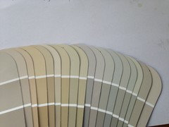
    Ok, I pulled all the strips from the color wheel that have beiges and here it is. I did not go into the pastel section.

    The colors are the lightest ones at the top of each strip. From left to right:

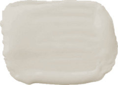
    Realist Beige, Touchy Sand, Playa Arenosa, Tres Naturale, Kilim Beige, Natural Linen, Softer Tan, Wool Skein, Rice Grain, Alpaca, Popular Gray, Agreeable Gray, Repose Gray, Worldly Gay, Useful Gray, Grecian Ivory, Shiitake, Accessible Beige.

    I am going to begin eliminating one by one. And would love help;)


    The background is supposed to be white. It looks gray on my monitor.

  • 8 years ago

    Oh man Mary, Playa Arenosa has too much orange.... many to green or blue and I'm surprised as any I suggested I looked them up in dim room and in light bright rooms.

    Realist Beige, Touchy Sand (maybe), Kilim, Natural Linen, Accessible Beige

    I personally feel that colors look darker when you get them on the wall vs. the swatch. That has been my experience personally. I ended up with Agreeable Gray for my master bath and IT WAS SO DARK and I have two decent sized windows. I was so tired of it all I cut it 75% and that was that.

    I do think you can eliminate a lot of colors here, but I do feel there are options out there. I looked at Natural Linen in some rooms on line and appeared a bit peachy/orange or?

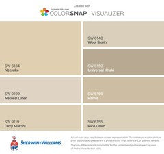
    So, I looked further and still wonder about wool Skein due to the chart below???

    Why it looks green in your deck and Natural Linen looks good in your deck, but not above. Rice Grain also has no green here then it does in the deck.

    So, all you can do is go with a neutral and try 3 different colors you lean toward. Just deciding on 1 then going home and painting the poster board to find, "woof" is going to be very frustrating.

    Knowing there isn't a lot of natural light in one of the rooms (living I believe it is) I'd lean lighter in tone and not with a light blue gray or it will look like a baby's room or a light tone battleship.


    From YOUR color chart I'd try:


  • 8 years ago

    Kilim looks green????? Maybe not Kilim.


    But why not Kilim


  • 8 years ago

    I don't trust the computer, but this says warm neutral and looking at undertones there is no green or minimal as I don't see it.

    Accessible Beige is a gorgeous beige that has a soft and subtle taupe base to it. It really is a lovely blend between beige and gray, leaning more to the beige end of things. (Accessible Beige is the lighter version of Balanced Beige).Accessible Beige is a gorgeous beige that has a soft and subtle taupe base to it. It really is a lovely blend between beige and gray, leaning more to the beige end of things. (Accessible Beige is the lighter version of Balanced Beige).

    Food for thought…

    • Accessible Beige is really happy with most wood tones (it told me so)
    • Accessible Beige is a great tone for a North or South facing room without the risk of it looking heavy or drab

    In this video colour review you will learn ALL about Sherwin Williams Accessible Beige! You might think you're getting a plain ole beige, but you're not, as this neutral paint colour has some fabulous undertones!


    Sherwin Williams Wool Skein SW 6148

    Wool Skein is one of the nicest beige paint colours on this page (and my fave – because really, it’s all about me…). It is light and fresh without becoming tooo light. It is a warm neutral, and leans more to the yellow side than any of the colours above WITHOUT being obnoxious about it – in fact, compare it to Canvas Tan to see the shift from a beige that is neutral (Canvas) and a beige that is similar, but slightly warmer (Wool Skein). It can also pick up a vague (really vague) green undertone, but nothing to worry about at all.


    ????


  • 8 years ago

    I took this from a color experts comments.... I'm not taking credit for the above thoughts on the two paints :)

    I'd try Accessible and ? Very hard to tell on the computer with the deck.

  • 8 years ago

    I'm leaning toward Accessible....

  • 8 years ago

    I lean that way as well.... Yet, so you don't go crazy going back and forth I'd pick 3 different colors to sample cans.


    https://www.houzz.com/discussions/accessible-beige-and-balanced-beige-dsvw-vd~3980222

  • 8 years ago

    At the very end of the thread a person shows it in several rooms. I think it may work very well. It may be a bit dark, but you can reduce only 25% which is only a pinch if you think it is and you can go back and do another 25% if need be. One person on the thread shows it on the wall and it's very dark, but the last photos in the thread it's very pretty.

  • 8 years ago

    What would be your second choice if there was no accessible?


  • 8 years ago

    Husband is driving me to the asylum so don't have to make paint decisions anymore. - :) I have never been so confused. I have the sample of Assessible and it seems dark. I guess I could ask painter to lighten it a bit. What about Modern Gray?

  • 8 years ago

    MODERN GRAY, SHERWIN WILLIAMS

    Megan Tatem

    "This is the ideal background color: warm, soft, and plays well with everyone. It's like the consummate party hostess who brings out the best in every guest. It's the perfect backdrop for blues (denim, chambray, navy) in a living room, and makes olive green look fantastic. It can handle fuchsia and orange in a bunk room, but also goes beautifully soft with creams and grays when used in a master bedroom or kitchen." -


    Appears like it could turn pink? You might try it HBFF. All I can say is been in your shoes and no home or color will look the same in different lighting and or lack there of. You might take the Accessible Beige up and ask they lighten it 50% if you think it's very dark. I just got back in to town a few hours ago so.... I'd try that route if you are not committed and in the asylum yet :)

  • 8 years ago

    I love gray... but I think my downstairs is too "warm" for gray) and the OVERWHELMING response was "Accessible Beige" by Sherwin Williams. Lots of people sent me pictures of it in their own homes, I found whole Pinterest boards dedicated to it, there are YouTube reviews of the color (who knew!) and I still need to get some sample boards painted and up, but that's the color I'm leaning toward (in a more durable finish and possibly lightened 50%).


    The above is a quote.... not me. I'd try it. There were several that went this route due to lighting and warm tones within the home.

  • 8 years ago

    Well, it would have been so nice to find what you came up with??? Maybe you are still in the, "asylum"? :)

    Anyway, Happy Holidays Mary

  • 8 years ago

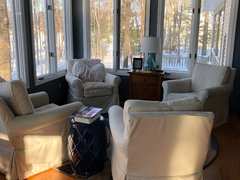
    Porter, my friend, they did let me out for the holidays! The painter is scheduled for the second week of January. I think that I will go with Accessible Beige for the major space and I'm getting real close to the blue/gray for the sun room.

    Have a wonderful Holiday season and we'll touch base in the New Year.

  • 8 years ago

    Thank you for the laugh Mary

  • 8 years ago

    Did you like the results? Could you post pictures?

  • 8 years ago

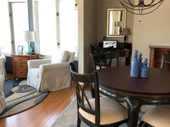
    Mark, I finally decided on Storm Cloud for the sunroom and Accessible Beige for the living/dining area. I am very happy with both.

  • 8 years ago

    HBFF, looks lovely....... I waited and waited for you to share then decided you didn't want to. I do love it! I was working here on the computer and saw your post pop up! Happy to see you...

  • 8 years ago

    Very lovely...happy to hear that with your choice

  • 8 years ago

    Porter,

    No one takes as long to make a decision as I do:) A psychiatrist would probably have a field day with me.

    How is your redecorating coming?

  • 8 years ago

    Claire,

    Thank you! I'm so glad to finally have this behind me. It's fun at the beginning, but gets old quick:)

  • 8 years ago

    You’re Welcome

  • 8 years ago

    Too funny Mary...... I just finished painting the eat in kitchen and kitchen.... it's a long space and I went with Aesthetic White by SW. I thought of you belaboring my samples and so on. I did it myself, but drove my husband nuts with all my samples. I just used it in a medical office and loved the way it was a true beige white with no creamy/yellow or other tones... it does lean toward a true extremely muted lighter gray toward night which is fine as I have a lot of very dark gray around the space.

    I love the way it all turned out and I guess it was worth putting off the painters and making a good choice. I love how it's turned out for you! Well, happy you didn't have to be, "committed". I would have sent you a cake with a saw though!

  • 8 years ago

    Would love to see your kitchen when it’s done Porter

  • 8 years ago

    Porter, I agree with Claire. Please post pictures!

    And in the future, can I count on that saw if I still need it?

  • 8 years ago

    Yes, you can count on it!!!

    I have to hang the linen curtain panels as I purchased 4 more (they aren't used for function, but are in the corners of the eat in kitchen of mostly all window area) and ran in to a snafu due to the rings with the hooks and clips and needing more and they don't make the clips in the nice larger and longer size like I have had and now they are TINY so my curtains are closer to the ring and not long enough. Trying to work with that and I'll post... it's just the eat in kitchen very informal, but it's so frustrating the the clips are so TINY so bringing the panels up a good 3". Hard to explain....

    WOOF.... my wheels keep turning! I got all new rings today in the mail and tiny clips... I may need to get all new longer panels and relocate my linen panels to another room which is fine as I can put them in a bedroom. It's just a major mental task... for me at least :)