Software
Houzz Logo Print
building2017

Plan Critique Please: SL West Bay Landing

8 years ago
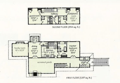
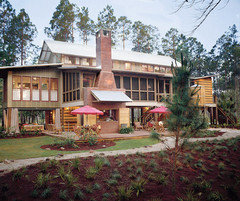
There are aspects of this 2004 SL Florida Idea House that we really like (long, one room-deep, raised for flooding without being ugly), but there are some quirks I was hoping this group could help me iron out.

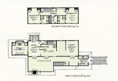
- We don't like the current kitchen configuration - specifically people having to walk through kitchen to get anywhere while someone is cooking. Would it make any sense to move the kitchen to the "family room" space & reconfigure? We don't need a dining room (will use screened porch for dining), so we could then have the current kitchen/dining become the family room? Also thinking of moving fireplace closer to house so that it could be indoor and outdoor. Perhaps where the kitchen sink wall abuts the porch as-is now.

- Any way to modify master area for w/d to be downstairs?

Open to other critiques and suggestions too.

Thanks!


Link to exterior photos: http://houseplans.southernliving.com/plans/SL076?index=2&search%5Bvendor%5D=179

Comments (18)

  • 8 years ago

    It makes little sense to me that one would want an indoor/outdoor fireplace, presumably for warmth, and simultaneously be content to have the only dining space located in a screened in porch.

    Washer/dryer can be located in a closet in the mudroom, but that means losing more of the limited storage in this plan.

  • PRO
    8 years ago

    What is your site?

  • 8 years ago

    What happened to needing a home that was ADA compliant?

  • 8 years ago

    ARG... long story. Will explain down the road in a future build thread, it’ll be “lessons learned” once it’s not so fresh.

    RR, it’s what works for us.

    Mark, ideal for a long and skinny plan running long on the north and south sides. It’s an acre with only about .25 buildable, lot overlooks water, in AE floodplain so will build up.

    Cp, didn’t “need” it beyond the lift to entry, which we will incorporate and then a stair chair on the larger run. Wanted it for a variety of reasons, but challenging with our former square footage requirements so it was already dropped. This will not be our “forever” house.


  • PRO
    8 years ago

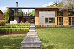
    One good conceptual approach to organizing a longer, linear house is to have main spaces and circulation is a single large rectangle, with ancillary spaces hung off the sides like saddle bags. the small office is an example, which could be expanded to include other needed functions in separate spaces.

    I'd make the Family Room to be the same vertical dimension as the dining room so that it formed the major rectangle.

    Porch and enlarge area for office, etc. could be the "saddle bags".

    Doing so would free up space in the major rectangle to be reallocated as desired.

    Good luck!

    building2017 thanked Virgil Carter Fine Art
  • 8 years ago
    last modified: 8 years ago

    I don't like this house's exterior. Too much going on for my taste.


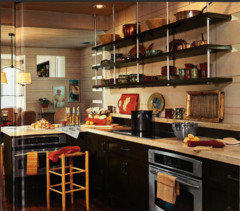
    On the first floor, you've identified the biggest issue: The kitchen work aisle is also the only circulation path through the house. In a 2051 sf house, you should have space for a hallway. Additionally, the kitchen has too little storage:

    Speaking of the square footage, I just don't see where it's going. All of the rooms are adequate, but none are large.

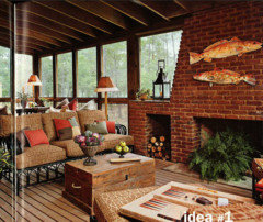
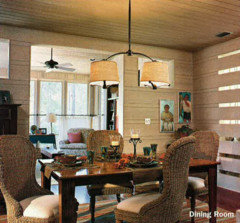
    I hear you when you say you don't need a full-fledged dining room, but I don't think saying you'll eat ALL meals out on the screened porch is realistic -- at some point you're going to want to eat in a climate controlled room. Even if you don't, you say this isn't your forever house, and foregoing an indoor eating space altogether would be resale suicide. The porch, as shown in the magazine, is absolutely lovely, but it ought to be a supplement for indoor spaces, not a replacement:


    The master bath is not well designed at all. The tub and the shower are both crammed in by the door, and you'd have to stand on the toilet to use the sink on the left. No wonder the magazine didn't include a picture of it.

    The half bath downstairs also looks disfunctional ... a staircase is probably 3 1/2' wide, meaning the half bath is also 3 1/2' wide ... so imagine turning sideways to squeeze past that sink. The sink they put into the idea house looks fun but not 'specially functional:


    Yet upstairs you have two full baths (poorly designed -- your knees would touch the shower wall while you sit on the toilet) ... I'd rather see them combined into one good-sized jack-and-jill bath.

    I'm no clotheshorse, but those tiny closets look more appropriate for a vacation home than for full-time living. Beyond clothing, where will you store your vacuum cleaner and other cleaning supplies? And so many other things that need storing?

    I like that little bumpity-bump office off the dining room, which is barely visible at the back of the picture. Looks like a lot of function for a tiny bump-out. However, you said in your other thread that this is a full-time 50-hours-a-week office ... is it enough? Do you need space for files, reference books? Do you need quiet and privacy for phone calls? I'm thinking I'd like it as a reading nook off the master bedroom.


    On the plus side, the windows throughout the house will make these rooms lovely and light filled:

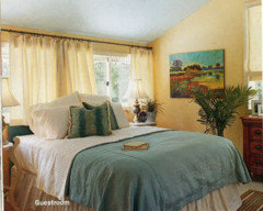
    Ditto for the upstairs bedrooms -- love those windows:


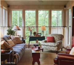
    I enjoyed the pictures. This is a house that was designed and staged before we hit our current all-white-everything phase -- lots of pretty spaces -- but I don't believe this space would actually be a comfortable place to live.

    building2017 thanked Mrs Pete
  • 8 years ago
    last modified: 8 years ago

    We drove out to Rivercamps today and toured a version of this plan that is currently available for sale, it's about ten years old and has worn well. Then we drove through the neighborhood and took exterior shots of four or so other versions that have been built. By searching addresses, found old pics of some of them online and put everything into a folder for reference (https://www.smugmug.com/gallery/n-H357KD/). It's amazing how much window selection and sizing can transform an exterior elevation given the different versions we saw of the same house.

    Re: the version we went through... It has a Master bedroom/closet addition. Former Master is a sitting room/piano room. We saw other versions while driving that did exactly what Virgil recommended, there were various saddlebags off the main rectangle... some to excess from an exterior elevation perspective, but interesting to see.

    Few thoughts having been in the house...

    - Bathrooms all felt larger and more functional in person. Showers still small... in the upstairs baths, there is at least a foot that could be borrowed to make the showers bigger. Though I'd do what someone else mentioned and move the laundry to make larger and more functional baths.

    - Kitchen still a BIG problem in regard to flow. Saw a version elsewhere (photos in link) with family room larger to match the width of the rest of the house... with the increased width, I'm thinking a kitchen could work in that space with some modification to windows.

    - fyi from earlier question... Downstairs "office" wouldn't be our 50-hour-a-week office. One of the upstairs bedrooms would be reconfigured for that role. It'd be a downstairs satellite for me as I usually juggle between office and kitchen.

    - I actually liked the location of the outdoor fireplace. I would have thought it blocked the "view" too much and would have thought I'd move it to the side like another house in the linked file did, but in it's current location, the fireplace actually made the space feel sheltered and cozy in person.

    - Having the doors open to the outside in the house "felt" great (I mean internal feeling, not temperature related), as did all the natural light from windows... it was a very open feeling house, bringing the outdoors in - even with the doors closed, which is a strength to us.

    - Perhaps because it was a Lake/Flato design, but the structural details (piers into concrete, bolts/screws, etc.) all had a clean, sleek, proportional look compared to the details and structural trim in other raised houses we've seen that seem to disregard scale and proportion. Really like that aspect of it

    Has potential, but still plenty for us to think about for tweaks.

  • PRO
    8 years ago

    Lake/Flato and a special Texas Hill Country vernacular which they do so well...


  • 8 years ago

    It's very interesting - they have taken some more pedestrian materials and elevated them, but there are some things that look like they forgot / ran out of energy / money. I despise seeing PVC drains exposed under the sinks. If you are going to expose them - get the chrome.

    The railing out of 2x6's I don't like.

    It's too camp like for me - and that one half bath reminded me of walking down an airplane aisle.

    It is, however, decorated to the nines!

    Is there a reason that everything needs to be elevated? or is it just wanting to feel like you are in a camp / treehouse?

  • 8 years ago
    last modified: 8 years ago

    Virgil, I've always loved that first house in your post. If money were no object, they'd convert me to such a modern aesthetic!

    Janni, Great points - and completely agree re: chrome and others. The railing upstairs looked like pallets to me; would definitely change that up. For us, the elevation is necessary. We have to go up about 4-5 feet (depending on final survey) for lower insurance costs, and if we have to go up that much, we are going to up 8 ft to use the space underneath for usable parking/storage/workshop space. It is quite common where we are, some houses up halfway and some up the full height. Our neighbor is elevated the full floor height as well. Also, given all the unexpected flooding levels across the country in 2017, going up the full amount makes me feel better about any potential storms.

    It's definitely Florida fish camp in feel, which is common where we are, bayside near fishing.

    I'm playing around in Photoshop tonight, but can't seem to get things "fixed" enough without butchering the whole house.

  • 8 years ago

    It feels like a great weekend house. And I felt that even before seeing the photos.

  • 8 years ago
    last modified: 8 years ago

    CP, you must have great intuition. That neighborhood is designed to be vacation rentals, and that would be the bulk of our resale market as well. I've been told in our area only 30% of housing is occupied by full-time residents.

    Just exploring it as an option, but might not be the house for us given the strange kitchen configuration. I spend a LOT of time in the kitchen, so if it's not right for function, it won't work. But the number of plans with a long porch and one-room deep rooms for plenty of natural light is sparse, so worth the time to explore for now...

  • 8 years ago
    last modified: 8 years ago

    Absolutely. Does it have to be one room deep or would 2 rooms deep work too? (asks the woman who's house has all rooms with the exception of the kitchen/dining area as one room deep. And the kitchen/dining could be considered a single room too.)

    If you're looking to live there full time, I think you need to explore other options to make it work for you.

  • 8 years ago
    last modified: 8 years ago

    Prefer one deep, mostly because I love light on at least two sides of every room and the lot works well for it. But one plan we have actually lived in before as a rental that was 2+ rooms deep but still very functional and light on two sides (except for upstairs) was a modification of this plan, which we have thought about too: http://www.allisonramseyarchitect.com/plan-details.cfm?planNumber=143129 (kitchen layout was different, laundry was not in kitchen, had a fireplace in great room, some of the wasted master bath space was different).

    Taking a stab at the fish camp house first floor below... moving kitchen to family room so it is out of the traffic flow (though it creates longer plumbing runs). However, I'm not sure how to reconfigure the dining/oldkitchen space into a family room (perhaps including a 4-top table in a corner for dining if island isn't big enough for dining). Layout seems strange with powder room placement (fyi - 1/2 bath did seem MUCH bigger in person - 200lb male can walk straight in without turning sideways to get past sink). Wondering if because of available loft space upstairs, if the staircase/halfbath could be scooted back/rearranged into the current master bath space (which I just erased out as a blank slate). Also perhaps change/move west the oldkitchen wall that bordered the master bath to "borrow" from old kitchen square footage in order to make master bath and closet better laid out. Welcome any insights... not quite ready to scratch it.

  • last year

    What about using the office as an entry point, the mudroom as an office an using the screened in porch as a sunroom for an all season dining room?

  • PRO
    last year

    This is a seven year old post.