Software
Houzz Logo Print
beckberta

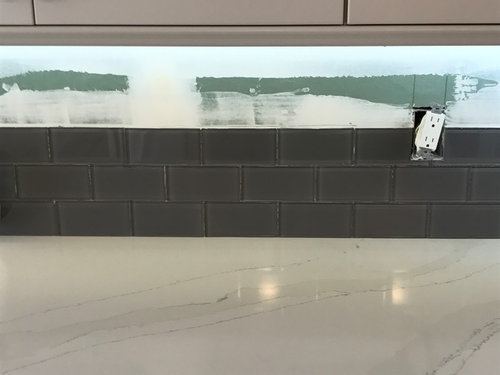
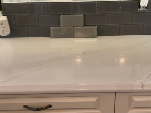
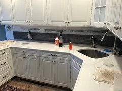
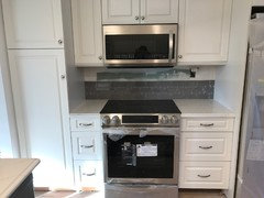
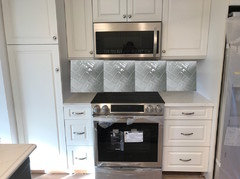
Is this subway tile backsplash too dark, or does it POP?

8 years ago
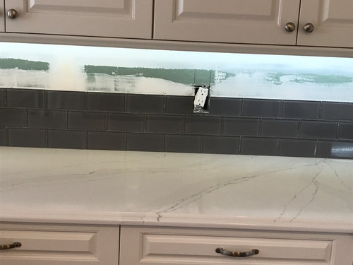
So unsure about the backsplash, and don't want to make the wrong decision!


Is the dark grey glass subway tile too dark, or does it "POP?"


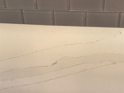
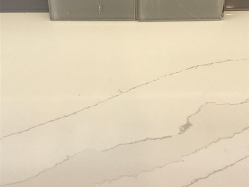
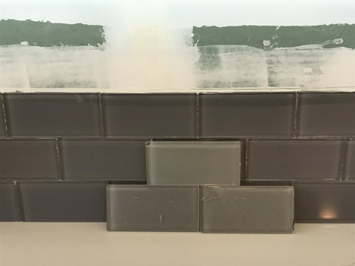
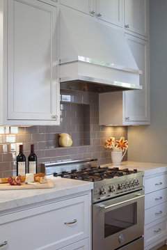
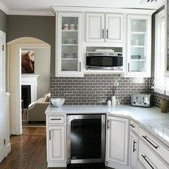
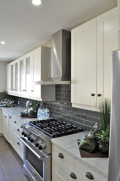
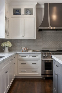
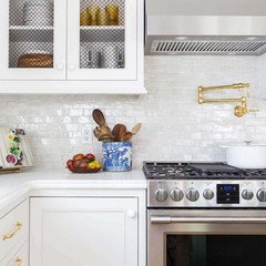
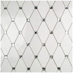
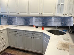
The last 3 pictures show a lighter grey subway tile.


The countertop is Silestone Calacutta Gold, and is granite.


Thoughts? Suggestions? Other tile material or shape ideas?


I would appreciate any help!


Lighter tiles in these pictures


Comments (39)

  • PRO
    8 years ago
    I also think it’s to dark I would most definitely go with the lighter shade my opinion
    Becky B thanked Quality Home Interior Renovations
  • 8 years ago
    Too dark
    Becky B thanked deshaun dumas
  • 8 years ago

    I agree - the lighter one for sure. It will have more life to it than the dark one does too. BTW - the Silestone is quartz (a man-made product composed of about 95% stone and 5% resin) - not granite. ;)

    Becky B thanked Paddy
  • 8 years ago

    Paddy-you are absolutely right about the Silestone being quartz! My error!!! Thanks for the correction.

  • 8 years ago

    Can you post more photos of the entire room as a whole? At first I thought too dark, but I want to see it in context with the rest of the room

    Becky B thanked K I
  • 8 years ago

    Thanks to all of you (above) for your comments. If anyone else is interested in commenting, I would still like to hear what you have to say!

  • 8 years ago

    Thank you, Kelly. I will post more photos.

  • 8 years ago

    I think everyone has his/her preference for contrasts. I do not care for backsplashes that contrast a great deal. I think a much lighter gray would be better.

    Becky B thanked Rita / Bring Back Sophie 4 Real
  • 8 years ago

    I do think it's too dark. At least it is for me.

    Becky B thanked Kris Mays
  • PRO
    8 years ago

    We did a glass tile in my daughter's kitchen. She loves the reflective quality it adds to the kitchen & doesn't absorb stains. Since your cabinets look more traditional, a subway pattern is very attractive and timeless. Since you chose brushed nickel knobs and pulls, you should really stay with the softer gray tile. If you had chosen dark knobs, then the darker gray tile could have been a good choice when using a light grout. Hope this helps. Please send pictures of the finished product.


    Becky B thanked Design by Christina Marie
  • 8 years ago
    Agree with the others that the original is too dark. Are your cabinets white? It's a little difficult to see the exact color in the photos. If they are white you might consider going even lighter than the gray in the second set of pictures. Personally I like less contrast but that's your call, of course.
    Becky B thanked golfer32
  • 8 years ago

    Yes, my cabinets are white.


    I appreciate all of your help! Thank you so much!


    I will post the pics of the entire kitchen a little later today. Thank you!

  • 8 years ago
    Yes
  • 8 years ago
    I’m going to be the dissenter and say I preferred the dark. Keep in mind what we see on our screens is widely variable due to settings. On mine, the lighter grey seems too mute and makes the entire kitchen 50 shades of drab. There doesn’t seem to be a “star” - the counter is nothing special. The darker color makes the counter special not by drawing attention to it, but by receding and thrusting the cabinets/ counter forward. It seems deeper.
    Becky B thanked seregiel
  • 8 years ago
    The lighter grey also has a somewhat green cast on my screen that clashes with the warmer tones elsewhere.
  • 8 years ago
    I love the dark tile!
    Becky B thanked Annette Vusich
  • 8 years ago

    I like the dark too! On my monitor, at least, the lighter tile doesn't go as well with the cabinets. Plus, I like a little drama.

  • 8 years ago

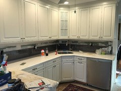
    Here are whole room photos that Kelly requested.


  • 8 years ago
    Too dark, sorry.
    Becky B thanked Banjo Hughes
  • 8 years ago

    Becky, those pix help a lot. I would definitely go with a lighter gray backsplash.

    Becky B thanked chloebud
  • 8 years ago

    What color grout will you use?

    Becky B thanked cluelessincolorado
  • 8 years ago

    Another vote for way lighter, whether glass or ceramic.


    but jeez, @seregiel, she probably paid $$$ for those "nothing special" marble-look quartz counters! I think that's where she wants the focus.


    Becky B thanked acm
  • 8 years ago
    @acm - I said that the lighter grey makes the counters bland and the darker gray pops out the counters and puts attention on them rather than the backsplash. The backsplash just turns to a negative space. Neither backsplash seems to steal the show but one seems to say “the counters are here!” More.
  • 8 years ago
    The second set of photos shows the pop if you want that - but the lighter gray would make the kitchen feel lighter. Once again, I like the dark as the contrast seems to put the focus on the counters and also the lighter gray reads more green on my screen. I like green- greys, but I’m not sure that was what you are going for and that’s why I don’t think it goes as well with your cabinet paint. That could totally be the pictures and if it is warmer/ more neutral than I would say either call is a good one and will look good based on what your goal is - pop or airy.
  • PRO
    8 years ago
    last modified: 8 years ago

    Hello, I have been reading about your tile decisions but would like to ask the origin of your cabinets. They are a very nice Shaker style. I will upload a sample back splash that might work for you. Thank you for the information.

  • 8 years ago

    Thank you so much! I like my cabinets very much, although they are still empty. They are Brookhaven Recessed something (?)-in Nordic White. Brookhaven is made by the Wood-Mode company. They are sturdy and it's easy to move the shelves.


    I would love to have your help on selecting a backsplash!! Thank you.

  • 8 years ago

    Hi acm and seregiel-Yes, I did want the focus on the counters. You are right, I thought they were beautiful and I paid $$$, but I am disappointed in them in this kitchen. It is way too white and I am trying to make it better. (I would hate to spend more $$$ to have to get a new countertop.) I really do appreciate all of the thought that ALL of you are putting into this! Kitchen design is definitely not my forte' and I am overwhelmed by ALL of the decisions to be made. Soon it will be over. Thank you all for the information that you provided.

  • 8 years ago

    Jane Owen-I think it's Brookhaven Recessed Fairmont.

  • 8 years ago
    last modified: 8 years ago

    Becky B, what color grout do you plan to use?

    I was going to say that I preferred the lighter tile, until I saw that very last photo. That looks perfect. Will you have under cabinet lighting? If so, I think the darker tile will be just fine.

    Becky B thanked Chessie
  • 8 years ago

    I like the dark. It looks very modern and makes the cabinets look like they are floating. Pick a verify dark grout and get black receptacles, and it's perfect.

    Becky B thanked Milly Rey
  • 8 years ago

    Find a picture of a kitchen with white cabinets and your countertops. See what they have used as backsplashes. See what takes your breath away.

    Becky B thanked Kathi Steele
  • 8 years ago
    last modified: 8 years ago

    you don't have to do plain white subway tile. your counter isn't busy enough to warrant plain 3x6 tiles. you have a very short, small backsplash. doing something a little busy, or something with color, won't be overwhelming. doing a plain, white 3x6 subway tile will put this kitchen in yawnsville.

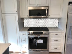
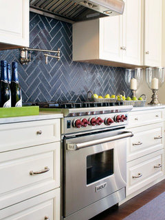
    Here is a white kitchen w/your dark glass you picked

    If you really want gray, what I would suggest is a different gray tile. one w/a little variation due to a handmade appearance, or even a glazed brick.

    heres a 3x6 in a glossy gray,,,

    http://www.discountglasstilestore.com/yorkshire-3-x-6-gray-glossy-finish-handmade-effect-wall-tile-on-sale-4-98-sq-ft/

    I like an iridescent white glass if you want to do white (the gold really sets this off!)

    do a white thassos marble w/a little bling! you have the perfect space for it.

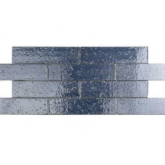
    This nocturne blue, glazed brick, would look 10X better than that dark gray glass!

    here it is installed. these are the Cadenza line from tilebar.com and come in about 10 colors.

    very rough,,,but you get the idea. I would do it in the herringbone like above:

    I have a dozen other options if you're interested, but please don't settle for a plain white unless you really want a plain, sterile looking white kitchen that everyone else has!

    Becky B thanked Beth H. :
  • 8 years ago

    Beth-Thank you so much for sending all of these examples and for putting the tiles into my kitchen-especially because I have a difficult time visualizing! I love a lot of the tile choices that you made!

    I DO like the dark grey tile in the first picture, so maybe I just need a different tile. I also like the blue glazed brick, but since I am planning to sell in the next 2 years, I would like to keep it more neutral, with the grey. Two other beauties are both the iridescent glass and the thassos marble, but I really don't want to do white and marble scares me anyway.

    If I could find something like that blue glazed brick in a slightly lighter grey than the dark grey that I have, it might be a solution for me. Thanks to you, I plan to visit the tile store today with some new ideas and possibilities in mind. If you feel like sending others I am definitely interested in seeing your ideas. (I know this takes a lot of time, so if you don't I fully understand!)

    Thank you so, so much!

  • 8 years ago

    Thank you all so, so much! I really am listening to every one of you-whether you like the light or dark grey! All of the comments (and the choices in the tile store) will help me to decide, and I greatly appreciate your input!!!

  • 8 years ago
    I would select a light gray subway or light gray glass subway tile with matching grout. Contrasting grout can look too busy, especially if you use smaller size tiles.
    Becky B thanked felizlady
  • 8 years ago

    To cluelessincolorado I am thinking that the grout color should be similar to the tile color, so it doesn't look very busy. I feel very clueless, too. These decisions never end!

  • 8 years ago
    @beckyb how do you like your calacutta gold counters? How are they holding up. We are thinking of choosing the same
  • 8 years ago
    I ❤️❤️❤️your countertop!! Good luck with whatever u decide!