Software
Houzz Logo Print
raymondranch

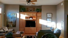
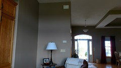
Could this work or does it look chaotic?

8 years ago
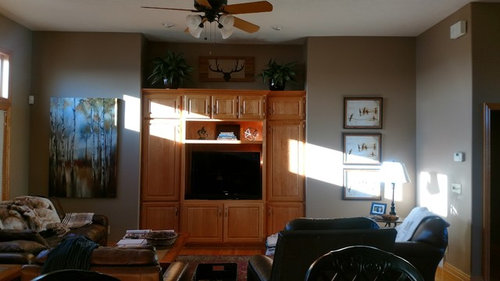
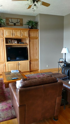
I haven't been able to get this wall right! Just recently purchased the three frames from Michaels because I like the yellow and black color of the frames. The goal was to try to balance out the tree art on the left side without being too symmetrical. I started with two but it looked skimpy so I got another. Now it may be too much? Was planning to try to find art to put in the frames, they look too white because it is just the store insert in them now. So my questions are: Does this work? If it does, would I want to stay with landscape/tree type art or could I go with anything that coordinates color wise? Start over? Get a duplicate of the tree pic for a cleaner look? Any advice on this wall is welcome!

Comments (24)

  • 8 years ago
    last modified: 8 years ago

    I think it looks fine. You could even put some pottery with more color above the TV unit.

    raymondranch thanked just_terrilynn
  • 8 years ago

    Thanks for your reply justterrilynn. I have had advice to use a large plant or two larger pictures to balance the large art. Also to paint the wall unit to help it blend in better. I do like your idea of pottery above the tv. What are your thoughts about two tree pictures? If I use the three frames does the art all need to relate in subject matter? Thanks for your time.

  • 8 years ago

    I am starting to see the necessity of painting it. Just scared to mess it up! I keep thinking if I get the art right I will make it all work somehow lol! Does the balance of the the two side walls seem right?


  • 8 years ago
    last modified: 8 years ago

    I don't care for the wall paint color--at least on my computer, with the built-ins, or the stain/finish of the built-ins in general

    I think you'd have more options with making the built-ins darker

    BTW, no problems with art

    raymondranch thanked User
  • 8 years ago

    I think the art looks great! I vote to paint or stain the built-ins.

    raymondranch thanked hooked123
  • 8 years ago

    Hmmm. I wonder how I could test this out. Would a darker stain make it even darker in here with all of the dark furniture? My daughter says I need to lighten everything up! Not exactly sure I love the paint color either. Just don't know what color I would do instead. Being open concept we are talking alot of paint! Kinda makes it harder to experiment.

  • 8 years ago

    You have a lovely room; you've done really well with your wall art!

    I also am not a fan of the wall color, though. If you paint the wall unit that color, you'll have a large area of that gray-greige unbroken by art, since you can't hang anything on the cabinets, and imo it might look rather drab.

    I agree with your daughter!

    raymondranch thanked sableincal
  • 8 years ago

    The built-ins appear to match the hardwood flooring, so I would not paint the built-ins. The wall color may not be ideal for the room, but may not be bad enough to cause you to paint right now.

    The frames look OK. Wider frames would have worked as well. The three framed pictures should blend together somehow, but they don't have to have anything to do with the tree pic.

    No to two tree pictures.

    raymondranch thanked graywings123
  • 8 years ago

    So are there any suggestions for wall color?

  • 8 years ago
    last modified: 8 years ago

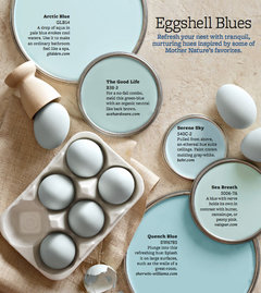
    Hi Raymondranch, you mentioned you have an open plan. We can't suggest a color without seeing the rest. For some reason I have a very light off white Eggshell Blue in my head. However, not knowing what the rest looks like I have no idea if that would work. I can't even see your rug.

    Something like the Serene Sky

    Or Behr Serene Journey

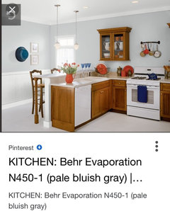
    Or Evaporation

    I like your wall color you have. It just depends on what sort of look you want.

    raymondranch thanked just_terrilynn
  • 8 years ago

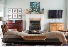
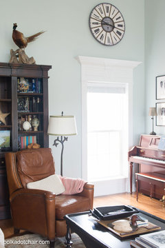
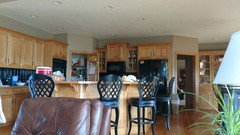
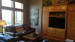
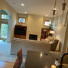
    Here are some more pics....

  • 8 years ago

    I don’t mind your wall color. I think your home is very nice. I do think painting the tv cabinets would be nice as there is a lot of wood and it would be nice to have a different element to add visual interest.

    raymondranch thanked hooked123
  • PRO
    8 years ago

    I like your wall color very much. It's a very nice neutral. Painting that cabinet will make the room looks SO much larger and so much better. You already have kitchen cabinets that color, nearby. You don't need anymore of that wood.

    We usually tell people that their art is hung way too high. In this case, it's too low. I would make the tops of the picture frames even with the top of the cabinet.

    Not crazy about that ceiling fan/light. If you truly need a ceiling fan, get one without a light and then add some cans if you need more light than your lamps provide.

    It's a very attractive house!

    raymondranch thanked Anglophilia
  • 8 years ago

    Would painting the built in a creamy white make sense? Like the front door?

  • 8 years ago
    last modified: 8 years ago

    I would be more inclined to paint the kitchen island to eliminate a bit of the overall wood. The thing is is that with the wood you have throughout you are going to have contrast. Painting the wall unit will only swing the eye to the kitchen in your open plan. If you have a bit of the same wood everywhere the eye will move around the rooms freely. I think contrast is beautiful. Sometimes though it works better by spreading it thinner. What color is your countertop?

  • 8 years ago

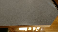
    It is a sort of blue/gray with red speckles in the background

  • 8 years ago

    I like your art but how about trading places with them....the bigger one on the right of the TV and the three smaller ones on the left of the TV. Also hang them all just a tad higher. The sun will shine on the bigger picture and look very good, I think. How about taking the side doors off the built-in.... and have shelves in there. and maybe put some pretty colorful pottery in there. The top of your built-in looks nice. Would be less wood with the doors off.

    raymondranch thanked erinsean
  • 8 years ago
    I agree that the art should be a bit higher, and I would increase the spacing slightly between the 3 frames for more pleasing spacing, less crowded. Benjamin Moore Dunmore Cream would be lovely with the golden tones of the wood and the counter top. I might also rearrange the space above the entertainment unit, using an asymmetrical layout... maybe combine both plants into one planter for bigger impact and balance it with something substantial opposite, or a grouping of objects, or maybe try a low easel to move the little picture to the front. The items now are too symmetrical and a little lost amidst the larger art and furniture.
    raymondranch thanked quedeedee
  • 8 years ago
    Also, maybe introduce something that is not rectangular. The entire wall is repeating rectangles, which may be why it feels off.
    raymondranch thanked quedeedee
  • 8 years ago

    I love your paint! Can you share with me the name and brand?

    raymondranch thanked amykath
  • 8 years ago

    Love house, love art work, love paint color. Art s/b taller, same height as top of cabinet. I think I would also paint kitchen island base instead of tv cabinet for purposes of reducing “woodiness”. Again, great house and nothing is chaotic about it

    raymondranch thanked bossyvossy
  • 8 years ago

    Keep in mind that you don't want the sun shining on any of your pictures. It will fade them!

    raymondranch thanked sableincal
  • 8 years ago

    Atkillery9 the paint color is Valspar Lyndhurst Timber which is now called Woodland Stone I believe. I like it except in bright light is seems to bring out a pink undertone. Thanks everyone for your thoughts about my space! I have moved that poor tree art so many times I feel like my walls are swiss cheese behind it! This whole wall has really been a challenge for me. I am really bad at asymmetrical arranging, it never seems to look right. i think it is a skill that skipped a generation in my family lol! If I took off the doors to the built in I would have even more deep shelves to arrange! If anyone has any ideas for that shelf above the tv I am all ears! I think I am finally happy with the space up high even though it is symmetrical. I am kinda leaning towards getting two larger pictures instead of the three becasue it will be hard to find three pieces of art that work together in that size....