Software
Houzz Logo Print
dazureus

Requesting opinions: Backsplash tile horizontal or vertical?

8 years ago
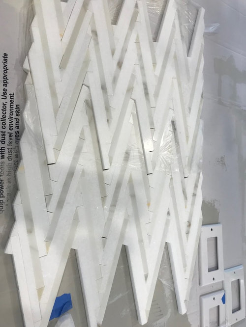
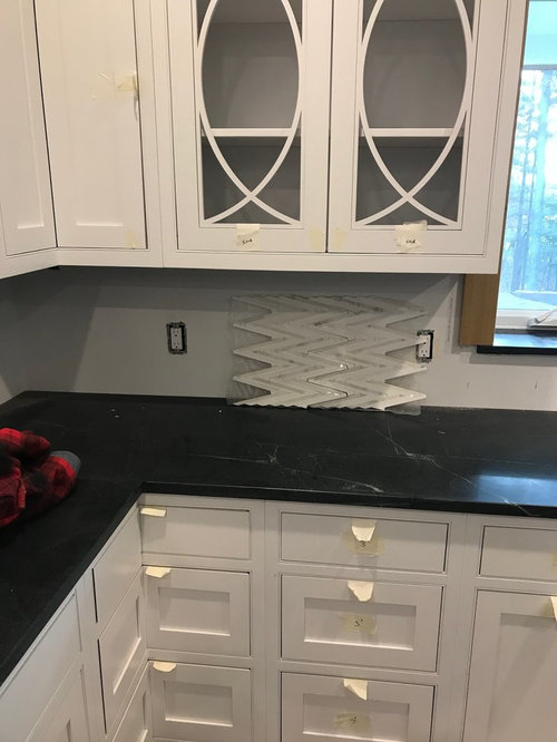
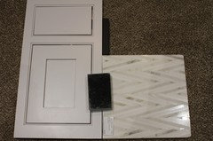
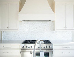
In our new build, we're installing a chevron shaped backsplash tile in the kitchen, shown below. The tile will be installed along the entire backsplash, including behind the cooktop. Our awesome interior designer thinks it should be installed vertically so the chevrons go up and down. My wife always liked the look of the chevrons going horizontally. I've always deferred aesthetic design decisions to them. Any thoughts?

Comments (59)

  • 8 years ago

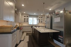
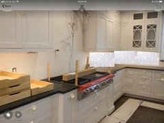
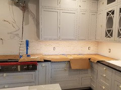
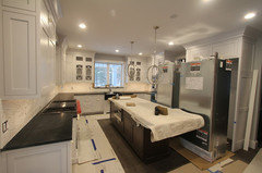
    Did a post go missing? I got notification that someone posted stating they didn't prefer the tile design, which is perfectly fine. The general design of the interior is transitional, but there are some more modern elements in it. The shaker cabinets and soapstone counters are more traditional, but the lighting and backsplash was meant to be more modern (flashy). Here's what the whole kitchen looks like currently if it helps. The fridge and freezer still need to be pushed back into their location.

    I'm not on site so I can't take a picture of it vertical. I've seen lots of pictures online of vertical chevron tiles and I think that's how it's "supposed" to be installed. A more traditional tile installation would be subway tiles, which runs horizontally, which might be why we're skewed towards horizontal. I'm glad I'm so design blind because I won't object either way.

  • 8 years ago

    Are those commercial freezer & fridge?

  • 8 years ago

    Subzero 24" freezer and 30" fridge. They don't have the panels installed yet.

  • 8 years ago

    Nice kitchen! I prefer the first pic (is that one horizontal?) but I am wondering if the peaks are too exaggerated on this chevron tile? The second pic looks like an accordion.

  • 8 years ago

    At first I thought horizontal. Then I noticed the design in your open cabinets and I think vertical would go better.

  • PRO
    8 years ago
    last modified: 8 years ago

    Vertical...less busy...imagine the horizontal in a whole 18" worth of it..It looks like it will create a wave optical illusions and too busy for the space. wondering if you just use it on the stove area ....show us a picture of that side please.

  • 8 years ago
    last modified: 8 years ago

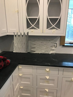
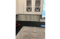
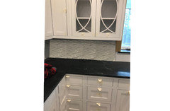
    Done in a rush, but maybe this will help a little. ETA, I didn't alter tile size.

    ETA, Also, not sure why I think this, but I still like it horizontal, but if your appliances were to be SS (and they aren't, I assume, since you are doing cabinetry on the SZ's) and your pulls something along the line of brushed nickel, I'd then say vertical. I think vertical looks more 'modern', perhaps. I don't see your kitchen as being full-on contemporary, but rather more traditional. IMO.

    dazureus thanked 2ManyDiversions
  • 8 years ago

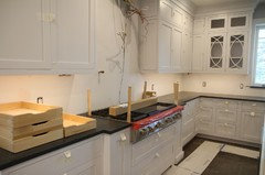
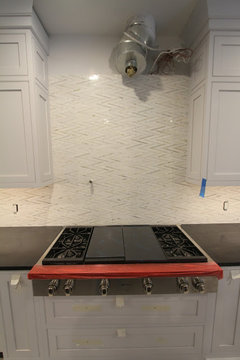
    Looks like most people are leaning towards vertical so far. Here's the best picture I have of the cooktop side right now. The hood is a Wolf chimney style so tile will be visible higher up near the ceiling where the hood tapers.

  • 8 years ago

    It's a very nice tile, but I would get tired of looking at it. I think it would start to make me dizzy...

  • 8 years ago

    Maybe this will help.

    I thought I’d pick vertical, but I actually like the horizontal better.

  • 8 years ago

    My vote is for horizontal ;-)

  • 8 years ago

    vertical. and i like the idea from Filipe of only using it behind cooktop. sometimes u can have too much of a good thing and i think that applies here.

  • 8 years ago

    I think the scale may be a bit large for the space under the cabinets, and for some reason, to me, that means vertical with a well placed main zigzag may work better than horizontal.

  • 8 years ago

    I don't think there's a wrong answer here, just different preferences. Let the designer make her best pitch for vertical to your wife. If you have opinion, weigh in. If not, let your wife decide.

  • 8 years ago
    last modified: 8 years ago

    I agree with pal, the scale of the tile is wrong for the space, and vertical will mitigate that best. I also think that using the mosaic tile behind the range and either a Thassos or Carrara marble tile in the periphery might be a better idea than using thie mosaic everywhere.

    If you’re not 100% sure this is the tile for you, keep in mind there are many, many versions of marble mosaic tiles out there.

  • PRO
    8 years ago
    I am concerned about that tile working well in either direction. The size seems off. Are you set on the style? I have an idea to consider that might work for you. Bbl
  • 8 years ago

    I agree with Pal also. The tile seems too big and too busy. The rest of your kitchen is so beautiful. I’m afraid the tile will detract from that.

  • PRO
    8 years ago
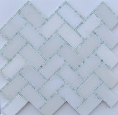
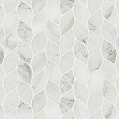
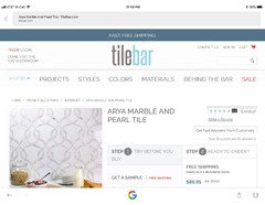
    Here is an alternative look I think would repeat the beautiful glass cabinet mullions. This is from www.tilebar.com.
  • PRO
    8 years ago
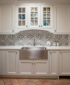
    Little mock up. Colors aren’t right on internet but just to give you better idea of the curved shapes working better than the chevron. We can “like” a lot of looks, but some don’t work as well as others. Good luck.
  • PRO
    8 years ago

    Your kitchen is lovely and I adore your glass front cabinets. I truly believe this tile will detract from them. I'd use something far simpler. Anything busy will distract the eye from what a beautiful kitchen it is.

  • 8 years ago

    Thanks for everyone's comments and opinions as they're all truly appreciated. Changing the tile selection now isn't possible since it's literally set in stone (tile). Way back during the first revision of tile selections, we considered creating a "display" area behind the cooktop and using more traditional tile everywhere else, but couldn't see that "tuscan look" fitting in with the modern Victorian/transitional look. We also looked at the waterjet-cut curvy tiles. While it looks great, we wanted to go with something with more impact since the shaker cabinets are devoid of detail feature. I guess that's how we landed on the chevron tiles. We've had other tiles come and go in other places, but remained consistent with the selection of this one from the very beginning. I think the white grout will calm the tile down a bit.

    The rest of the house is pretty vanilla with most of the flash coming from light fixtures.

    As for the initial request, it looks like the thread is split pretty evenly between horizontal and vertical, which is probably appropriate for a diagonal tile. Right now, the plan is to go horizontal but we'll discuss it more with our interior designer, who hasn't steered us wrong so far and presented choices we wouldn't have thought about and now love.

  • 8 years ago

    I'm with the others that this is the wrong tile. That one is terribly gaudy. It introduces a random shape just for the sake of being different and it conflicts with the signature shape of the overlapping circles of the doors and the lighting. You need a softer shape like eam's second tile.

  • 8 years ago
    last modified: 8 years ago

    Have you seen a kitchen or pic with that backsplash? I'm in agreement with others that it may not be the right tile for your beautiful kitchen. I'd add the "flash" with kitchen hardware and light fixtures. Or a statement hood. Or brass toekick.

    Or a different tile.

  • 8 years ago

    I agree that a matching grout subdues this quite a bit. I think the pattern is not inconsistent with a Victorian reference because they did herringbone or chevron topnailed flooring.

  • 8 years ago

    This is the only (over exposed) picture I could find online of the tile installed and it's a vertical installation. The tile selection is out of my hands and my wife likes it, but I can appreciate the alternative tile comments. I can appreciate that a different tile would definitely be "safer" but this is our final house and every aspect of it is custom. My wife's eyes fell on this tile and hasn't wavered since. She's quick and tenacious in her decision making which is good when you're designing a whole house, but has the unfortunate ability to blindly pick the most expensive item from the group. Disconnected from this ability, this is her favorite. I'll update this thread when it's installed.

  • 8 years ago

    It sounds like this is the way to go, then.

    Unless you're absolutely sure to go with a horizontal layout, you could print out the pattern and "wallpaper" it to your backsplash as a test. Alternatively, try to stack some tiles and take pictures.

  • 8 years ago
    I still think it's a pretty tile, and I don't usually like chevron patterns. And my hubby has always been aghast that I have some superpower to almost always pick the most expensive selection available. I am also quick and decisive in my choices. We both about had a heart attack that my granite counter top selection was actually one of the cheapest ones available, my hubby decided it was a miracle.
    Looking forward to pictures of your finished kitchen, it looks lovely so far!
  • 8 years ago

    Given your glass door fretting I'd go vertical with matching grout.

  • 8 years ago

    It is gorgeous. I'm a modernist and like very few GW kitchens. Once up as a full field, it should read quite subtle.

    No opinion on direction really. I like to print full scale, large format, and apply via sandblast paper, (low tack sticky like a wallpaper), and really live with it for a few days/week. Leaning toward vertical seeing the last pic.

    Getting so many varied opinions makes one realize how different we all are.

  • PRO
    8 years ago
    Looking forward to seeing final kitchen. The cabinetry is beautiful. As long as you are both happy, that’s all that matters. I would give you one tip. Arrange an on site meeting with the person doing the install and specifically layout the design and figure out how you will terminate the ends and finish edges. If the ends terminate into wall that is good. But if not, you will need either matching pencil edging or a Schluter system that gets installed before tile goes up. Layout so key focal points look right will be important. It is the install that will be critical. Hope that is helpful and do post results.
  • 8 years ago
    last modified: 8 years ago

    There will be one side that doesn't terminate into something. Our interior designer was on site a few times this week coordinating all the back splash tile installs so I'm sure she has this covered but I'll ask what she came up with. Thanks for the reminder.

    Edit: Quick reply from ID states that a stone pencil molding that coordinates with the backsplash will be used.

  • PRO
    8 years ago

    Perfect, glad that has been thought through. Too many posts here where the tile is up and then the edges are a problem. Great. Going to be stunning! Your wife has very good taste. We have a common trait, I can select the best of the best, without knowing price or anything! Then I have to either pop for it, or find a really good reasonable facsimile!! Good luck! Thanks for the update.

  • 8 years ago
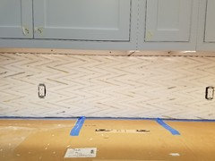
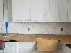
    We got a chance to swing by the house today and take a peek at the progress. They started installing from an inside corner of the longest wall. Seeing that section reconfirmed my wife's convictions about the tile direction. The patter is much more subtle than I first imagined and will probably disappear more when grouted.
  • PRO
    8 years ago

    Looking good!

  • 8 years ago

    Very nice! I honestly think either direction would have looked good... but this is my preferred, too! Can't wait to see it grouted - please update us!

    I love that you are going with something you love, and it's unique. As this is your 'final house', bravo!

    ...but has the unfortunate ability to blindly pick the most expensive item from the group Ha ha! DH has that same unique trait! Gotta love them for it, though!

  • 8 years ago

    I like it.

  • 8 years ago

    Last update to this thread now that *nearly* all the tile is installed and grouted. I say nearly because there's still one more strip at the top of the cooktop area that needs some tile.

    The fridge and freezer still needs to be set in but that didn't stop the tile installers from working. The tile isn't glaringly obvious in general.

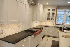
    Here's the cooktop side. Even at this distance, I think the tile is pretty subtle. There's an obvious pattern, but it doesn't smack you in the face.

    Cooktop. I'm almost sad that the large space will be bisected by a chimney hood. It always seems like the installers run out of tile.

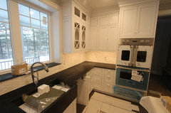
    Oven side. I think the grout really lessened the impact the design of the provided. If we used a darker grout, the diagonal effect would have been much more obvious and dramatic. I know the tile isn't everyone's cup of tea, but it's the little bit of dazzle we were looking for in an otherwise traditional kitchen.

  • 8 years ago

    Looks really great!

  • 8 years ago

    It looks great!! Thanks for sharing! Hope you’ll do a full kitchen reveal when it’s done :)

  • 8 years ago

    It's beautiful - your wife must be proud and rightfully smug. Thanks for coming back with the photos! It's a great lesson about the impact of your grout choice.

  • 8 years ago

    It looks nice. You should have never shown us that close-up in the first pic!

  • 8 years ago

    Very attractive - good job!

  • 8 years ago

    That tile looks amazing! Glad you stuck with it.

  • 8 years ago

    I love it. Always nice to see a kitchen stepping away from that white subway look.

  • 8 years ago
    VERY pretty!!! I'm glad you went with a light grout, the subtleness is so soft and lovely.
  • 8 years ago

    Nice contrast with your countertop and window sill. Is it granite?

  • 8 years ago
    The counter top is soapstone with Caesar stone Alpine mist on the island.
  • 8 years ago

    Enjoy your new kitchen in the best of health!

  • PRO
    8 years ago

    Turned out great. Well done! Thanks for sharing.