Software
Houzz Logo Print
nrivera139

What should I use as a backsplash?

13 years ago
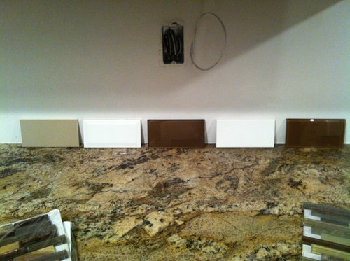
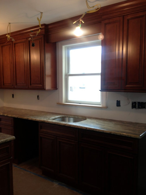
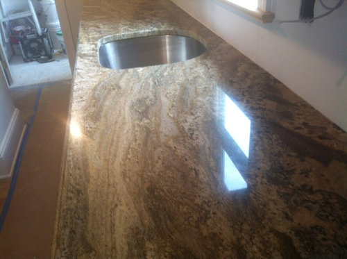
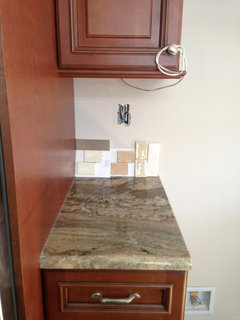
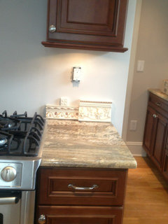
I am unsure as to what type of backsplash to use. My granite is very busy so I was think glass tiles in a solid color. Do you think subway tiles in 3x6 or linear solid pattern or smaller/longer subway? What color? Thanks. I am so unsure.

Comments (97)

  • 13 years ago
    We are also looking into backsplash. I like the light tan subway tile. I agree the glass tile with your countertop is too busy. We are working with almost the same countertop. Good luck!
  • 13 years ago
    The granite is Neptuno Bourdeux
  • 13 years ago
    @onthefence-that is what I was thinking of using. Going to try to get a sample this week.
  • 13 years ago
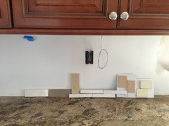
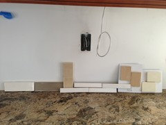
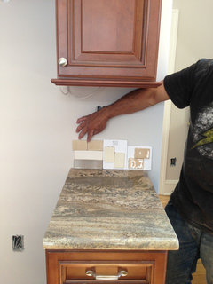
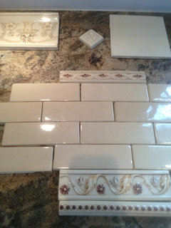
    So what do you think? Sizes, style and color? Which one? Thanks.
  • 13 years ago
    I like far left and far right. What is your floor, maybe you've already said, but I've forgotten?
  • 13 years ago
    More views
  • 13 years ago
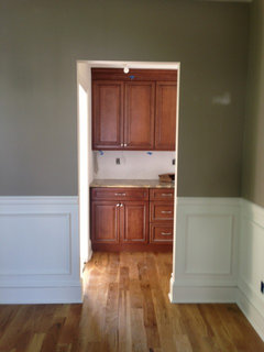
    Here is the only floor pic I have.
  • 13 years ago
    Oh never mind, I see from a post above that it's oak. I think far right is my favorite.
  • 13 years ago
    Sorry we overlapped posts. Yes I still like what was far right in your first picture today (but if you like shiny, far left in that same first picture works quite well too). The darker one (2nd from left, first picture) is nice with the counter but I don't like it with the cabinets. The pinkish ones also work with the counter, but will make the kitchen unnecessarily pink toned. The long, skinny one is just too white.
  • 13 years ago
    BTW, your finished kitchen will be beautiful! Good job with your choices!
  • 13 years ago
    Thank you Ann. The long, skinny, white one was used to see if I like the style. I could order it in another color but they did not have the sample. Thanks for the complement.
  • 13 years ago
    I like the darker one (more gray I think; second in the first and second photo). I think it will look great with the counter and with the Revere Pewter.
  • PRO
    13 years ago
    Picking a color from the granite is brilliant. If you want to "calm down the granite" goin with a solid color backsplash will do that. The gray is chic, the white is casual. The off white is safe and will disappear. The mottled is tropical or rustic. Choose your "mood" and you will know your color. Subway stacking is fine. Other pattern can be done, too.
  • PRO
    13 years ago
    PS, Your style seems to be organic and traditional. Lovely and timeless.
  • 13 years ago
    Thank you.
  • 13 years ago
    I agree with Printesa. I like the darker one in the two photos above. I'm presuming they are the same tile at different angles. If not, I like the dark one in the photo you posted, on the left.
  • PRO
    13 years ago
    last modified: 13 years ago
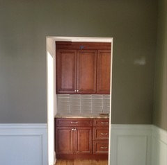
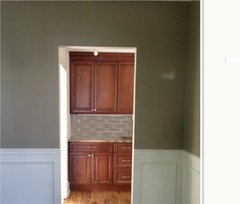
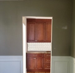
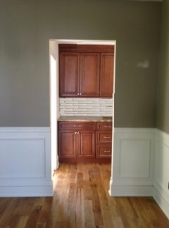
    Maybe this will help. The first and second are the darker tile samples you showed, second to left. The third picture is the smaller bone sample on the far right that you showed.

    In my opinion, the pencil tile doesn't fit. The third from left and second from right is too pink. The white subway is too much of a contrast and will only make the movement in the granite more conspicuous.
  • 13 years ago
    Wow! Thanks for doing that.it is a huge help. If possible, is there a way to do that with the thin, white ones? I think the second photo looks really nice. I also like the third.
  • 13 years ago
    I really love the second pic and think I should & will most likely choose that. Thank you so much.
    I have to pick tile for a powder room and bathroom. Is that program easy to use? It would be a huge help in choosing bathroom?
  • 13 years ago
    Wow, I sure missed a lot!!! Well, sorry for no input, but I love the one you're choosing!! Looks like it will be great, nice continuity and flow from other room into kitchen. Thumbs up :)
  • 13 years ago
    Have you thought about a stone tile? I used this one in 3x10 in shadow with a busy granite and it looks great. It has some movement but not enough to be distracting.

    http://www.jeffreycourt.com/chpt11_natural_stone_field_tiles.asp
  • 13 years ago
    I love your countertops! They are so classy and rich. The photoshopped backsplash certainly make it easier to choose, but given the countertop and cabinet colors, I do not like the white. Boring and clashes with everything. The gray-ish stone is better, but given the color scheme, have you tried the warmer tones? I don't see a dark backsplash working, but the gray and tan look "dead."

    Consider a glass tile in squares, all the same color with a darker grout. I recommend a color from the countertop, and so far, none of the backsplash colors seem to pick that up. It's a dilemma; I have a similar problem so I understand the frustration.
  • PRO
    13 years ago
    last modified: 13 years ago
    You're welcome! I just use Microsoft Paint and did some cut and paste. I'll post the long thin ones for you as well.
  • PRO
    13 years ago
    last modified: 13 years ago
    Long thin tile. It would probably look somewhat thinner than what is shown but hopefully that will give you an idea anyway.
  • 13 years ago
    Ooh, too busy
  • 13 years ago
    Well, maybe it's just the color that's off. What size are the actual tiles?
  • PRO
    13 years ago
    Copy and paste the link to the bathroom here in this post and I'll pick it up and try to give you a visual on that too.
  • PRO
    13 years ago
    last modified: 13 years ago
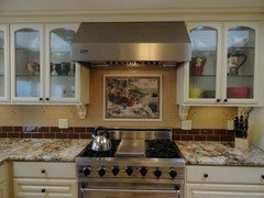
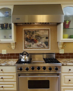
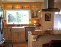
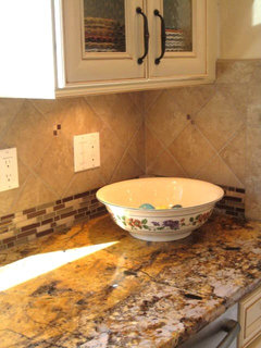
    Here are some project photos with examples of back splashes ideas for you that I have done. Notice that the granite is busy and somewhat similar to yours. As a kitchen designer, I specialize in distinctive kitchen and baths. One of my signatures is to create interesting back splash designs to go with my kitchen designs. I rather like to make a statement and have my clients homes look more unique. I prefer to do mixtures of tiles rather than the typical plain subway look which I feel is starting to date itself and looks like every other kitchen. This is still okay if you want to achieve a safe look. Another option is to think out of the box and have more fun! One trick to pulling it off is to have plain color tile area to rest your eyes and a darker area to anchor it.

    In the first two photos, the dark glass 3x6 tile (like the darker ones in your first photo) anchors the tile design while the lighter 1x1 lighter glass tile rest your eyes. The last two photo, I have a 4" high strip of random glass and stone mosaic that is busy like the granite, but the lighter 6x6 tiles above it allow it to work.

    Even though your cabinets are a darker wood, you still could do something similar to these ideas. You could do one or two rows of the darker brown 3x6 glass at the bottom to anchor it and then find lighter tile above it. Just make sure all tiles match the colors in the granite and don't clash with the cabinet color.
  • 13 years ago
    Here's my humble two cents...go with a lighter subway tile...something bisque or creamy or a light taupe. The dark would make the kichen feel dark and you already have dark cabinets and dark wood floors. I think the contrast of the lighter tile would look great as it would break it up a bit. FYI...I have used stone subway tile in a kitchen and it does NOT clean well, especially if you have it near the stove. The smooth surface of ceramic tile makes it easier to clean. Happy decision-making! :)
  • 13 years ago
    I think the white and off white and lighter tan look dirty with the white woodwork as I look through the door. Like the grey or the light cocoa kind of colors if I'm seeing it with the other room. If paint on trim is different in kitchen, like an ivory I guess that's fine, but I doubt you're changing trim color from one room to the next.
  • 13 years ago
    Now that I see Eagledzines renditions (very useful!), I was wrong about the darker one not working with the cabinets. I like Eagledzines second picture - looks great!
  • 13 years ago
    @eagle, I will post pics of bathroom as soon as i take them. I am not there now. Thanks again.
    0 seconds ago
  • 13 years ago
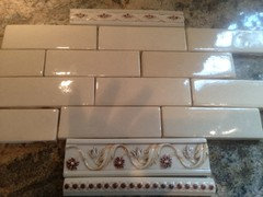
    So I chose the Walker Zanger Gramercy Park 2x6 field tile in Hampton beige which wasn't one of the original samples.
    I may use the same tile in the bathroom. My question is should I use some or any of these borders? If so which ones & where?

    I am thinking of just using the plain subway in both kitchen and bathroom. I think it may be too traditional with the borders or dated?
    What do you think?
  • PRO
    13 years ago
    Something less patterned :)
  • 13 years ago
    Stay with the solid subway in black or pale gold.
  • 13 years ago
    I'd say no borders.
  • 13 years ago
    No borders. Keep simple.
  • 13 years ago
    I will just use subway in the kitchen. What do you think about the powder room off the kitchen? Should I use the borders? Thanks for the input.
  • 13 years ago
    I'd still say no to borders. I have them in my house in the kitchen and two bathrooms. I have a third bathroom where I didn't put borders and now that 8 yrs has passed, that's by far become my favorite look. I wish there was an easy way to remove my borders. It's a dated look.
  • 13 years ago
    No border. Too busy and will be dated in a hurry.
  • PRO
    13 years ago
    last modified: 13 years ago
    I hate it when pretty designs tend to become as what some say 'dated'. I would go with what you like! I still like borders. I know, I'm different!
  • PRO
    13 years ago
    last modified: 13 years ago
    I think that in 5+ years, all the design choices made in today's world will be dated too :)
  • 13 years ago
    They really aren't my taste but I knew someone selling them on Craigslist and considered using them. Thank you for the feedback.
  • 13 years ago
    Good point LB. I was recently thinking about names and how my kids are giving their kids such unique names. I wonder how everyone will feel about that in 20 years.
  • 13 years ago
    Maybe "dated" isn't the best word to use as it does sound negative, but I agree with the posters saying keep it simple. Simple = timeless, in my opinion. :)
  • 13 years ago
    I am late to the party too- love your kitchen! No borders I do think it gets you stuck in a rut for decorating after the love wears off- simple = longevity= money saved with no need to renovate!
  • PRO
    13 years ago
    last modified: 13 years ago
    I agree with simple and timeless means longevity. What if everyone made simple and 'safe' decisions? We wouldn't have any diversity or interesting rooms and forget about different and unusual designing. New products would not be purchased. Industry keeps us wanting what's new! Spend is the word for the manufacturers.

    Many of us get bored or tired of our things or design choices after about the 6-8 year mark. Things get worn out or broken. Maybe a time for change. If income is ok, some can make the changes, unfortunately, some can not.
  • 13 years ago
    Decor, paint, furnishings are easier changed then tile- It is a personal decision for sure but personally I like to make decisions that allow for these minor changes to provide a whole new look rather then the need to demo a room every time my taste changes.

    My vote is still plain subway tile no border for either room.
  • PRO
    13 years ago
    I agree 'Amy' that is a good option.
  • PRO
    13 years ago
    Is the backsplash done yet? Would like to see what you went with!
Sponsored
CHC & Family Developments
Average rating: 5 out of 5 stars6 Reviews
Industry Leading General Contractors in Franklin County, Ohio