

Swiss chalet mish mash
13 years ago
My brain is now fried - we're trying to modernise the living area of our new home but still keep a chalet feel. We appreciate that pine T&G can look cheap and dated. However we're adverse to white rendered white plaster walls, which is in fairness the clinical look that many homes have in our region of Swissy.
Sigh. We've come to kind of like the timber - its warm and full of character, although the ceilings with the fake(!) beams can feel quite low. The pillar in the end third of the living room is structural and will be costly to remove. However we are looking to remove the structural half wall that currently holds a small formal dining setting.
The floors are cheap laminate and we will want to replace at some point.
The windows look out over a valley and lake - we're exploring the cost currently of having a balcony run the length of that wall with French style doors opening out to that. I doubt we can extend the house or room in anyway - building costs here are horrendous.
At the end of long living room is the kitchen. Sigh again.
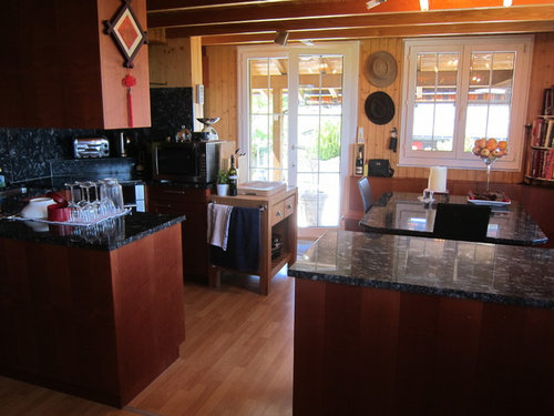
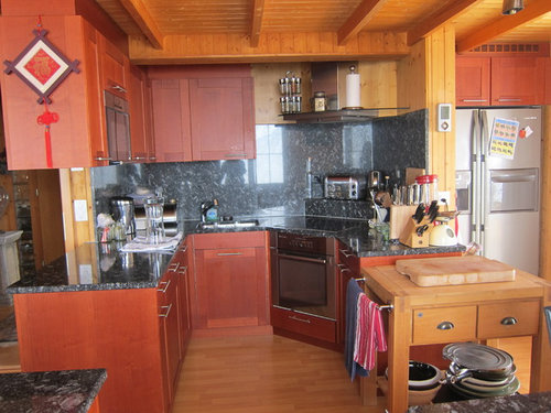
Its dark, has an odd layout, and I worry that its pokiness is one of the reasons the house has struggled to be sold historically - my husband loves it though as only he can fit in it so no-one else can interfere with his cooking! The door leads onto a suntrap terrace which in winter holds 5 feet of snow. The stone table and built in benches are effectively the entertaining hub as people gravitate here to chat whilst my husband cooks. The laminate cabinets in my mind are completely at odds with the rest of the pine house and any chalet style? The cost of kitchens and tradesmen here is prohibitive, so ripping it all out for a larger feel layout is not feasible.
I've scoured the Houzz website and found loads of ideas. However I don't have the creativity to envision the end result. I've spoken with Swiss architects and interior designers - they keep referring me back to white walls.....aaargh!
Any help/suggestions/ideas would be massively appreciated.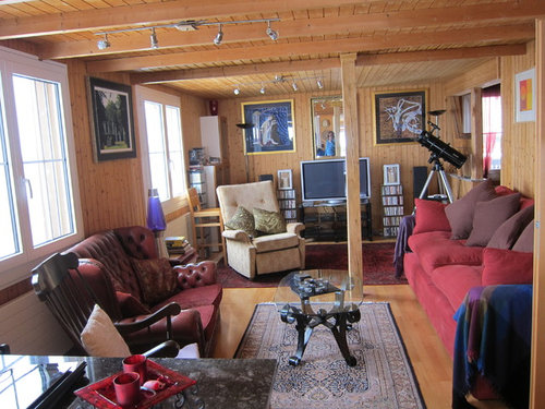
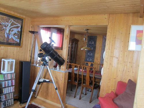
Sigh. We've come to kind of like the timber - its warm and full of character, although the ceilings with the fake(!) beams can feel quite low. The pillar in the end third of the living room is structural and will be costly to remove. However we are looking to remove the structural half wall that currently holds a small formal dining setting.
The floors are cheap laminate and we will want to replace at some point.
The windows look out over a valley and lake - we're exploring the cost currently of having a balcony run the length of that wall with French style doors opening out to that. I doubt we can extend the house or room in anyway - building costs here are horrendous.
At the end of long living room is the kitchen. Sigh again.
Its dark, has an odd layout, and I worry that its pokiness is one of the reasons the house has struggled to be sold historically - my husband loves it though as only he can fit in it so no-one else can interfere with his cooking! The door leads onto a suntrap terrace which in winter holds 5 feet of snow. The stone table and built in benches are effectively the entertaining hub as people gravitate here to chat whilst my husband cooks. The laminate cabinets in my mind are completely at odds with the rest of the pine house and any chalet style? The cost of kitchens and tradesmen here is prohibitive, so ripping it all out for a larger feel layout is not feasible.
I've scoured the Houzz website and found loads of ideas. However I don't have the creativity to envision the end result. I've spoken with Swiss architects and interior designers - they keep referring me back to white walls.....aaargh!
Any help/suggestions/ideas would be massively appreciated.
Featured Answer
Sort by:Oldest
Comments (27)
 13 years agoI woul recommend a swedish or danish style. Try www.skonahem.se loads and loads of verions on pine. Paint, not plaster. White on roof and beams will help lift it. A whitewashed pine floor, grey furniture, sheep skin, some dark brown wood, white painted chandeliers. Natural materials like linen and wool. Something shiny or a bright blue accent.
- 13 years agoHow about painting just the ceilings and beams white, as there is so much wood in your house it is, to me, a bit overwhelming. If the kitchen in dark how about painting the cupboards white? Your furniture is not helping to give the room a light, airy feel, as it appears large and chunky. I would opt for finer lines in the furniture and couches and armchairs that are raised up off the ground so you can see floorspace underneath, as it will make the room appear larger. The glass topped coffee table is a step in the right direction re having a more open feel( but I don't like the legs. You could get a totally clear coffee table. made of Perspex, which would give even a greater feeling of space. I think you need to cull the clutter and consolidate the colors, it is just too busy. Do you need the rockingchair ? Do you need that single ( what appears to be a wooden bar chair)? Do you need the telescope in the room?
Related Professionals
Victoria Interior Designers & Decorators · Wichita Falls Interior Designers & Decorators · New Haven Interior Designers & Decorators · Spanish Fork Interior Designers & Decorators · Quincy Architects & Building Designers · Lafayette Architects & Building Designers · Monroe Architects & Building Designers · Morgantown Architects & Building Designers · Kankakee Architects & Building Designers · Rutland Architects & Building Designers · Ashland Kitchen & Bathroom Designers · Grand Rapids Kitchen & Bathroom Designers · Farmington Kitchen & Bathroom Designers · Roswell Kitchen & Bathroom Designers · Rapid City Kitchen & Bathroom DesignersLea Mo
Original Author13 years agoHeavens above. Thank you for observation on clutter - just cannot see the wood for the trees. Have fixed this immediately - removed the TV, bar chair, the colourful throws, the CD cases, the odd cabinets in the far end, and the rocking chair. Will remove the lava lamp and tidy the stereo electrics when hubby not looking! Like the idea of painting the ceiling and beams white. Worry about painting kitchen cabinets - they're a stained effect laminate and get a lot of use so I worry about them chipping? (yay for a man who loves to cook!)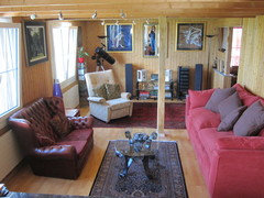
 PRO13 years agoHi there, just saw you really are in Swissyland (like me!). Having looked at lots and lots of places in the alps and design, it seems that the moment you mention painting wood here they swoon and mutter "ah non, impossible!!!" and look at you like a philistine. The trend in the alps at the moment is to stain wood or to work with reclaimed old wood (which costs $$$). and as you say the costs of labour here are pretty steep.However, I seriously think your dark kitchen could be made over or changed just by changing your counter top for something less dark that really sucks up the light. I would also remove the red furniture if you can. I have learned the reason why red goes so well is that on cosy cold nights it brings a room closer together. Now the trend is to go for pale greys with the pine or cream which open up a room (a trend that has been allowed to happen with the introduction of floor heating and better heating systems)I think that is a start -
Lea Mo
Original Author13 years agoAll of our Swiss neighbours, along with the designers we've approached to date have advised us to rip out the wood and put up white spackled plasterboard walls. I cannot bring myself to do that - we don't want an uber modern house. We're up in Kanton Schwyz - let me know if you're open to taking on new work in that region - we have a whole house to be made over!! I will explore the costs of new counter tops. I can easily replace the chesterfield style sofa and get something lighter over the reclining chair. Parting with the super comfy 3 seater sofa is going to be a hard ask though.... 13 years agolast modified: 13 years agoI love your little chalet. I dont think there is a problem with your walls,and what I would do is visualize the space as a blank slate. Im going to be analytical, so please dont be offended by my suggestions!
For me, the feeling given in your living room, is more a mish mash of conflicting furniture styles, and no coordinated colour theme. If you look at the kitchen area, where things are simplified, the walls are not even an issue. I would create a storage wall, possibly by the TV area, to store all of you media equip,cds, etc, basically removing the clutter of books,etc.Something very simple, white frame (ikea?) with doors, and a bit of glass for display of a few favorite items.Imagine how stunning your large telescope will look, with a clean backdrop of a wall unit filled with books and treasures... your tv could be incorporated into it at the centre. I would think about where the telescope is used, do you need to move it from that spot to use it each time? Can you position it closer to where it is used(near the window?)Removing the knee wall might open the space a bit for you. The higher chair in the corner needs to be tucked away. Is this workable for use as a coffee barstool near the kitchen counter?
You have some lovely artwork and framed pieces, but they seem a bit too high up on the walls, and the frames are all different looking. The gold is really hard to make work because of the yellowness of the pine.I didnt even notice there is also a mirror on that back wall above the tv, now I now your eyes must not relax there is just too much stuff going on over there! If you want to us mirror to open the space, you could look at it as part of the wall unit? door(s), but not all. Can you paint out your frames or replace them to coordinate, and possibly put some bigger art pieces over the sofa, about 12" above the back? If you leave your big sofa there ,of course!...Can you see how your small light bordered frame there is way too high and lost on the wall? You could tuck that over the shorter shelving unit and make it a focal point to discover..
If you cant afford to replace the flooring, then switch out the rugs so that they dont compete. Looks like you attempted to go with red, is it because you love the old sofa (leather?)..tufted sofa is great, but it is too busy with the rocker, and the scale of every chair and sofa is off. I actually like the classic lounge chair and tufted sofa scale, your big red modern couch just swallows that room.If you cant replace that, try changing the cushion covers for the 4 lined up across the back with a fabric that also has the deep red of the leather, a little off white from the lounger, and a bit of green found in you throw pillows on the lounger. You might even consider the wall unit, minus the tv, with the large sofa placed in front of the unit(sorry I cant tell if there is even room for this suggestion), which would free up that sitting area for your leather sofa, and two opposing classic chairs on the other side of the room. Measure to see if you red leather couch would work on the 'big sofa' wall, and move your lounge chair to the window sideThink scale and proportion for the design. the rug under the coffee table is too small for the space and does not grond the furniture, and I would spray paint the base of the coffee table to a more earthy toned blackblue or brownblack, or change it up to a few side tables to hold you book and a good coffee! if you are not in love with it.
Your kitchen is not screaming fix me! if you just cant stand the darkness, you could change your backsplash, but that is expensive stone, so why ??Storage space seems to be the bigger issue. I cant tell from the photo, but can you create a' bar' over the stone counter on the other side of the room, and hang your glasses, put in your coffee machine and mugs, etc? pull your high bar stoo(s)l up for more guests to sit on the backside? Is there wall space over near the fridge area for a pantry, to help you create storage?- 13 years agolast modified: 13 years agoPS- I reread your question, odd layout?? If you get rid of your knee wall , can you re configure the rooms, change the dining- plus telescope-,and back wall area into a library /sitting area, (fireplace on the wall where the hangings are now), with your entertainment and media storage, which would switch up your couch and seating areas,and have your dining area closer to your kitchen?Replace or refinish in white you dining furniture??
If you whitewash the ceiling consider the possibility of pot lights to clean up and modernize the ceiling space. - 13 years agoI would hang the tv on the wall between the windows. Purchase a cream microfiber sofa or sectional with 2 small leather club chairs. Move all other furniture and nick nacks. Telescope is too big for room. Lower paintings and mirror to where top of painting is at height of top of opening on other wall
 13 years agoI recommend to stay with the wooden walls and floor (real wood if possible) and go with less different types of wood around it (dining table, chairs, kitchen etc.) which all have different wood colors and less different types of furniture (3 different types of chairs/sofa in your living room are too much, better are two of the same kind.) Instead of changing the kitchen cabinets why not paint the ceiling white and change the countertop (as recommended above).
Lea Mo
Original Author13 years agoNancy - thanks hugely - we actually have a monster sized pantry just outside of the kitchen where we keep everything that isn't day to day, so storage is no issue at all. Think everyone has made some really valid comments. Was hanging pictures high (right around the house) to try and give illusion of higher ceilings, but clearly I've mucked it up - will fix later today! Have booked for a painter to come quote for lightening the ceiling! Will be working to sort the furniture and flooring asap. HUGE THANKS to you all for the ideas.- 13 years agoI wouldn't touch walls. They look charming and cozy. Agree with earlier comments re furniture. Cheaper and easier to buy new furniture than to do construction. If you streamline couch and chairs with a straight line style (can be comfortable) it will make the room look more open and modern. That being said...the kitchen cabinets are too modern for the house. Sounds like I'm contradicting myself! Would (professionally) paint the cabinets white or a soft gray. Do you plan to remove wall which separates DR? Think that would work well to open up the look of the room.. I raise a glass to you and toast your good fortune to have found a man who likes to cook. Much more important than the wooden vs plaster walls debate.
- 13 years agolast modified: 13 years agoI love your chalet! If I were in the same dilemma, I'd make a list of what I didn't like about the space, prioritize that list, and then decide a budget, and just go down the line as time/budget permitted.
I think knocking that half wall out between the dining/former TV area is a great idea. If you don't really use your dining area a whole lot, I would leave it there. I don't know that I'd move it closer to the kitchen. In time, you might find that you don't use it at all, and then you could convert that area into a home office? We have a dining room tucked away as well, which is fine for us, since folks usually gather in the kitchen and then filter out to our lanai (we live in Florida).
I might swap out the rugs in the seating and former TV area, as the rug in the seating area is too small for the space. Once you take that half wall out, I think a white wall unit at the end of the room (where the TV was) with a lot of storage would be perfect. IKEA always has great ideas for something that can be customized to your home. You could also paint the ceiling white or ivory (but for me, I'd leave the beams as is).
Once those things were done, I'd start looking at the scale of your furniture. The sofas are two different styles/sizes, not to criticize, but with all the different sizes, styles, and colors of furniture, there's no unifying theme. Decide what type you like, then replace the others. I'd choose a neutral color. It's the same with the tables. Different woods, styles, etc... I think glass is better in this instance, and throw in a couple of garden stools that would double as side tables for pops of color. You seem to have a lot of reds... I have reds in my home as well and love it! Go with one color, and then for variety, different hues of the same color. If you enjoy a tomato red vs. a cranberry red, pick one, then use different hues (or shades) of that same color. Then accent with pops of a complementary color in your pillows on the sofa and accents, etc..
As for the kitchen, I love it, but if it's too dark for you, what about under counter lighting? It's relatively easy to install yourself. I also noticed a table/seating area in the back of the 3rd picture... is that a breakfast bar? What ever it is, it looks like it has the same black top as the rest of the kitchen. If it's too expensive to do the entire kitchen, maybe paint the base of that piece (since it's in the middle of the kitchen) white, or just replace that top with a white carrera marble? Lastly, the butchers block table that is in the kitchen is blocking the flow from the living area to your deck. Possibly think of relocating that piece for a week or two and see if you can live without it in that spot. It'll open up the kitchen a bit more...
I think if you just made some cosmetic changes like those, the whole area would come together much better and get rid of the 'mish mash' completely!  13 years agoPainting the ceiling white is going to really brighten up the space and make it easier to live with the wood panelling. Won't you have a problem with the removal of the TV? As you are stuck with the support pillar, using that alcove for the TV makes a lot of sense. You need storage, so replace the tv stand and the tall cabinets in that area with one long cabinet or bureau (with drawers to hold all the the dvds, etc). One that is as wide as possible. If money is really tight maybe a series of Malm dressers, side by side with a countertop? Hey, you have to pay for the French doors somehow! This would really clean up that area. If you must keep the large speakers, they could go into the corners. Remove the tall lamps. You could have table lamps on the new tv cabinet, but keep it simple. As the leather couch is going, replace it with lighter chairs. Ones with long legs, no skirts. They will work with the new French doors too. If you enjoy the telescope, keep it in front of the windows. Move the recliner or the replacement chair to the space between the windows, or the corner in front of the kitchen to pull the seating area closer to the couch. The small rug in front of the couch is very nice, but too small for the space. Does the larger rug clash or complement the couch? It is hard to tell on a computer monitor. Could you try the larger rug in front of the couch? Get a larger glass coffee table or just change the base for a simpler one for now. I think your art work is too high. They make the ceiling seem even lower. The couch needs new accent pillows, and you can have some fun with those. Bigger, down filled ones, maybe with the blues that are in the throw. If the couch could be slipcovered a nice neutral like the recliner, that would be great, and then the larger rug would work for sure. There are fantastic paints for laminate now, but maybe you could just paint the bottoms that face into the living room a nice creamy white for now. If your husband cooks and he likes the kitchen, you are a lucky lady. Once the kitchen ceiling is painted, it will look a lot brighter. Introduce white accessories into the dark corner above the stove with a large white platter holding several white pitchers and bottles. Try to take the stuff down from the vent hood if possible. Otherwise, let function and the cook's preference rule in there. Are the counters laminate or granite? Granite is too expensive to replace (French doors!) but if they are laminate, a lighter colour would really help. If they are granite, maybe you could just change the backsplash? Your decluttering efforts have already paid off.
- 13 years agoHi ... I love your house and I love natural wood ... My thought is that the kitchen is a bit awkward but the only problem I see is the horribly dark backsplash and countertops ......I would not paint the gorgeous light wood at all and the cabinets would be fine if the countertops and backsplash were light . I love wood so I'd go with light maple or birch countertops and a simple off-white plain tile backsplash and call it good . The backsplash would reflect light like a mirror and be clean and simple to look at ... This would be a simple fix , not too much money and you'd have a clean , light Scandinavian-modern, but homey , kitchen
 13 years agolast modified: 13 years agoHow many of the beams are fake? Would you consider removing them?
The room would look more attractive with the mishmash of many small objects and many large art pieces put away. One at a time for large art in a small space: just rotate them seasonally. Put the small things in a floor to ceiling closed door bookcase from Ikea.
Then buy coordinating furniture once you have figured out a better floor plan. There are folding chairs that can be stored for guests if you do not need seating for 10 every day in your living room.
I think asvinteriors on houzz is in Switzerland. You might want to look at her page. http://www.houzz.com/pro/thereluctantdesigner/asvinteriors- PRO13 years agoBoy, that is surprising for the rosti divide. Zurich has cutting edge modern design and Zermatt one of the leading modernist alpine designers (look up Heinz Julen). This sounds a very 1980s approach to chalets. Please don't. Take your time. How urgent is this, I have a friend up in Cham so could pop by and visit you one time?
Lea Mo
Original Author13 years agoMore great comments. Have decided that I clearly have the decorating style of a....snail.
ASV - we're on the top of a mountain, 80 minutes from Zurich and 35 minutes from Luzern. Not a big enough project for the Zurich folks and the local folks think our chalet (built in 1977) is too old and needs a complete modernisation. Sigh. We're both originally from the UK so 1977 is a "new house" compared to our old Victorians! Stop by for a cuppa anytime.
I have sorted the clutter and fixed the busyness of art, I think. Red rug cannot be moved to incorporate furniture - the pillar is right in the way. Huge red sofa cannot move to any other wall - its just too big and whilst it could go to the back wall (currently with stereo), I think it would prove impractical - once we sort out the half wall, we'll have the option to extend the formal dining table if needed to 20 seats, and that cannot happen if squashy red sofa is in the way!!
Stereo setup can certainly be moved from the back wall, but the stereo guru (also known as the man who cooks so must be obeyed) has advised that the sound would be compromised if the unit & speakers were in any other location....hmmm.
We're off to the furniture shop this weekend....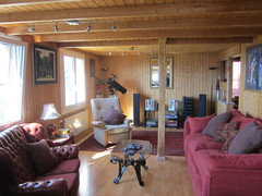
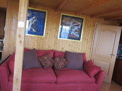
- 13 years agoOkay that's better but... How tall are you??! Centre the frames over the couch, I wouldn't go more than 4-6" apart, and about two 2" lower than that door frame... They are too high!! :)
- 13 years agoPicture one is much better already, I love your telescope! Yeah the chair and rug are gone, already better! I still think you would be amazed how awesome your space is with some ikea wall unit storage on that back wall!
 PRO13 years agoGlad ASV is on your case ! She's one very talented lady !! You have struck gold there !!!
 13 years agoI like what you did with kitchen. Very updated and modern. The look you want. You have to get rid of all the wood. Ceiling and walls. I would go slate on floors instead of wood. You could heat it. The walls do not need to be white. A pewter gray, is modern and big right now. You could just dry wall all walls and ceiling then paint. If removing pine would be too hard.remove beams too. Your furn is to big and dated for look you are going for. Think low and sleek. Use prints with bold colors on chairs only. Adding area rug to define a area is very good. Window covers help make it seem finish. Remover to keep furn to scale, you have a long narrow room, difficult but not impossible to arrange. Start by removing wood, put dn flooring. Then decide on furn.
- 13 years agoWow, the lady is not interested in too modern. Let her have the home she wants without starch white plaster! i think you kitchen is very nice but i would go for gray cabinrts. The red is contrasting too much with the pine. Goodwork with decluttering. I think you should skip the paintings. Does not look right on wood panel.
- 13 years agoI like the wood you have, it brings in loads of texture and warmth. I would suggest that you should keep the rest simple, fresh and cohesive so it looks restful. Painting the ceiling is great
In the living area. Go for cooler fresh colors ... Whites, and creams or pale greys. If you can't get rid of the large red couch, slip cover it. For the seating pick a color and stick with it. Stick with solid colors, stay away from pattern in the furniture and rugs. You already have quite a bit of black in the electronics and the telescope. So don't bring in any more black furniture. You also seem to have white trimmed windows that have a little bit of wood under them and then something else painted white under them that has horizantal panels. Get rid of the white painted stuff under the windows. If thats not possible maybe floor length white sheers or curtains on the windows to unify it and stay with the vertical lines on the walls.
As for the art on the walls. Take out the piece that is hung between the windows there is a lot going on in that wall with the white windows. If you want something there go for a tall piece.
I agree with you on the kitchen, It's very functional but the backsplash and counter are eating up all the light and are too oppressive or the space. Painted cabinets will chip :)
The dining Refinish the chairs in white or cream ... And go for brighter art work.  13 years agoThe first thing I noticed, apart from the former clutter and lack of a color theme, was the art hanging "from the ceiling." Several have commented and I will try to give you some guidelines, since I see you've made changes with art but it is still hung too high. Hanging near the ceiling has had the opposite effect from what you desired. It makes the space appear lower. If you place pieces above furniture, leave 5" between the furniture and bottom of the art. There should always be more space between the top of the art and the ceiling than there is between it and the item it hangs above. Another clue to the problem is the fact that art is above window and door frames in some cases. Your mirror is doubling one of the problematic issues of the room - the support post. It is also increasing the visual length of your room. Mirrors need to reflect something beautiful or interesting. They can also be used to pull light into a dark space. Do you have one in the dining room? It looks dark and the window is small, so maybe the mirror could work to brighten that space. Otherwise, hang it behind the sofa to reflect the mountain view. As for all the laminate surfaces, there is no excuse to bemoan them. Proper priming, as mentioned before, makes paint stick. Many people are installing cheap laminate floors to get the wood look and then are painting them with specialty or even marine floor paint. Black has been one of the more popular colors, and I noticed your ideabook contained several pix with dark floors. This would tie your dark countertops in to the overall look. If you can get it, www.rustoleum.com has a product to refinish your kitchen cabinets if you're interested. Interested to hear and see the results of the shopping trip.
Lea Mo
Original Author13 years agoHuge thanks for these extra comments. Decoenthusiaste and Nancy - I hugely appreciate your clarification on art height. All the articles I've read on low ceilings recommend art be hung high, but with no detail on how high so as an amateur (with no style sense) I have clearly mucked it up. I will get busy this afternoon and repost photos.

Related Stories
HOUZZ TOURSMy Houzz: Relaxed Glamour in a Downtown Row House
See how this Maryland couple put their own creative stamp on their 1890 home
Full Story
ROOTS OF STYLEClues to Your Home's Architectural History
Use this quick guide to design themes to identify the era and style of your house's details
Full StorySponsored

Bella Casa LLC
Average rating: 5 out of 5 stars17 Reviews
The Leading Interior Design Studio in Franklin County


michigammemom