Software
Houzz Logo Print
madavecarz

need a paint color suggestion for my master bedroom

13 years ago
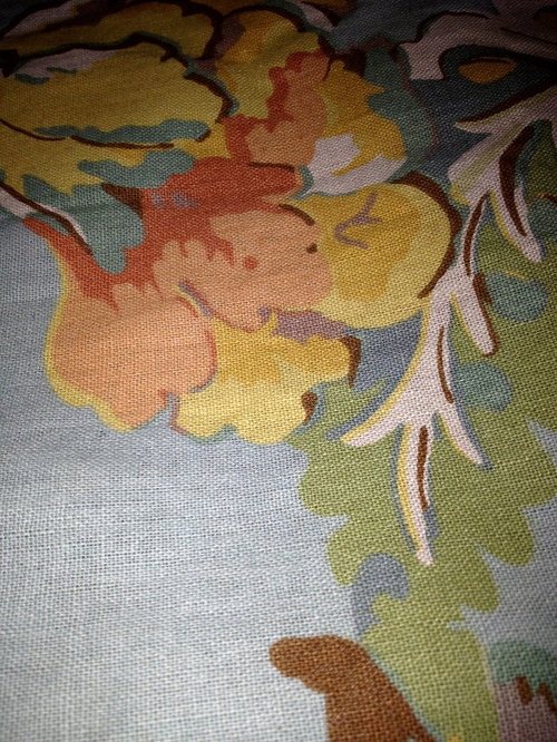
attached is the colors in my comforter all other colors are in same family with off white bedskirt, blanket, and shams. the comforter is at the foot of the bed.

Comments (25)

  • 13 years ago
    I suggest a cozy yellow from the deeper yellow on the print- tone it down a bit (go to sherwin williams' site - color visualizer). Using a light bright color on the walls will pop the prints, but a more tonal look will give the room a unified look.
  • 13 years ago
    last modified: 13 years ago
    For me, I would choose a lighter hue of one of the blues on your comforter. Bedrooms should be calming, and blues/greens/purples are calmer colors vs. reds/yellows/oranges. Any of the blues would do, just a lighter hue. You could even do one accent wall with the same color, only a little darker hue. I would save the 'hot' colors for the pops of accent color around the room. That way you could change them out if you get tired of them down the road.
  • 13 years ago
    Ben Moore " Marilyn's Dress " the perfect soft blue grey for your bedroom. Don't be deterred by the swatch looking grey for it reads a soft blue on the wall but won't dull the blues in your fabrics.
  • 13 years ago
    Hi. I dissagree with the idea of yellow as the shade in the fabric doesn' go very well with the grey back ground in and of itself.

    If you look at each colour option in the fabric you will notice that the only colour that goes with all of the other colours is the dark coral colour.

    It would be fabulous and as rich as the fabric deserves! Do not be afraid of the colour, there's no glory in safe!

    I would choose the trim colour carefully too. White would create too crisp a contrast to the fabric as it is linen and therefore very textured. Paint colours should reflect that. I suggest starting by matching the gray to see if that will work. I can't be sure without actually seeing the fabric but there really isn't another choice.

    A lighter shade of that colour should be on the ceiling.

    The coral should have a muddy undertone as should the trim.

    You haven't said what your furniture colour is. However, the coral would go with anything whereas the other colours would only go with dark would furniture.

    I would also suggest a co-ordinated stripe for the bed skirt and side panels on the window with a valance in the print and a combination of those fabrics and solid coral throw pillows will pull it all together. If you don't want a valance then you could use the print added only at the top of the striped side panels. Your fabric likely has a 27 in pattern match and you should utilize most of that for the length.

    Sew the print, wrong side to right side after lining the stripe. Then sew a rod pocket for a fancy rod. Leave a ruffle at the top of about 4 inches or use pleats and clips. If you don't know what that means your drapery store will.

    I am a designer so if you are afraid, don't be!!

    You'll never get tired of it.

    Barbara van Pelt - Vinifera, The Inn on Winery Row and It's All Technical Interior Design and Decor, Grimsby, Ontario, Canada. Note: That 'is' how we special colour.
  • 13 years ago
    last modified: 13 years ago
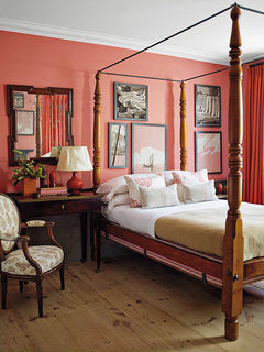
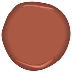
    I don't know if that colour in the comforter is rust or not , I would choose the darker shade out of it ,by doing so the comforter will not only be part of the bedroom but will also give you a nice piece of art and bring a warm glow into the room as well
    Steven Gambrel Time and Place · More Info
    ]
    Egyptian Clay CSP-1140 Paint · More Info
    ]
  • 13 years ago
    sorry all, I disagree with all those suggestions and with those options the colour of the dressers etc. would be very important!!!! I could teach a class here on "First colour, second colour" only one superior colour in a room, which in this case, is the coral as it is the strongest colour in the fabric.

    If the back ground of the fabric really is blue, which I doubt, then you're in trouble but every fabric as a neutral and, in this case, from what I can see, is grey. Not the best neutral for the otherwise warm colours in this beautiful fabric.

    I could prove all of this if I had all of you here with the fabric. It's not because I said so, it's because the fabric says so. Promise.

    Cheers, Barb
  • 13 years ago
    I think if you choose a color from the comforter, you can't go wrong. What I am hearing here is a lot of personal preferences... If you like blues, or greens or yellows, pick one from the comforter and go with it.
  • 13 years ago
    Another comment has been posted showing the best colour which is great because then you can see how great it could be.
  • 13 years ago
    The paint sample colour, not the wall shade, it's too bright in this photo. Sorry Handyman, I don't agree with you either. Just because you think you like a colour doesn't mean it's going to go with the fabric.
  • 13 years ago
    When choosing colours you have to look at the room itself and what you want to achieve. Is your room warm or cold, does it get a lot of light, what colour do you like best, what colour is your bed. You have off white in other bedding - do you want to continue this and have the only colour in the comforter. Can you post more photos of your room, it does help a lot.
  • 13 years ago
    Whatever color you decide to go with....make sure you check it against the lighting in the room. Lighting has a huge impact on what the color will actually look like on the wall.
  • 13 years ago
    I like the yellow idea. But that's my personal choice. I love a bedroom with lots of outside light, and sunny! Of the colors on the comforter, pick the one u like, that will create the mood u want in your bedroom. :-) really doesn't matter what others think.
  • 13 years ago
    The problem is we need to see the fabric from a distance (more of it) as well as the close up, to get a true feel for it....in order to make a wise choice
  • 13 years ago
    yes i agree.........YOU must like it
  • 13 years ago
    Like the yellow idea!
  • 13 years ago
    I would opt for that taupe between the yellow parts of the flower and have them mix it at 50% strength.
  • 13 years ago
    Behrs Paint - cottage white.....great cream colour or Sherwin Williams - Moonstruck with light gold hue
  • 13 years ago
    Clam chowder- Behr Paint and 50% lighter on ceiling
  • 13 years ago
    Madavecarz - I just looked at your idea book and you have some great photos there of colours that would go well with your comforter. It will just depend on how they will look in your room.
  • 13 years ago
    I'm not a designer, but I can tell you, I painted my walls both the green and yellow in your comforter and they were really depressing. Pick the blue or a shade or two lighter from your comforter. Blues and blue based greens are really calming in the bedroom. I recently painted over the green with a soft pale blue with a bit of grey in it as a base and its much more inviting and cheerful
  • 13 years ago
    I would go with a grey that has a subtle blue undertone, because coral and yellow will be dated in about two days.
  • 13 years ago
    You are really open. That's a beautiful comforter but it's hard to tell if the background is blue or gray? It all depends on which colors you want to bring forward. You could go with off white like your bedskirt. If you choose one of the colors in the comforter then I'd suggest going with a lighter, softer version of the color instead of trying to match the color exactly. Sometimes the finish on your furniture can influence color choice. Strong cherry finish for instance.
  • 13 years ago
    last modified: 13 years ago
    Your bed is 80% off white and this comforter is folded at the bottom of the bed? My suggestion is get the predominate color of the comforter up on the walls. From the picture, it looks as if blue is it. But, it can be any level of that blue.

    When I am stuck on a color choice often I get a strip of BM that has exactly the color of the fabric. More often than not any color on that strip will be fine.

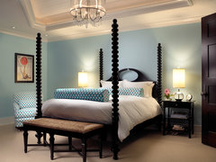
    The effect would be something like this picture.

    Sophisticated Key West Style · More Info

    From my monitor I am seeing strip 827 to 833. My monitor is fickle, though, but comparing here looks good.
  • 13 years ago
    Good call judyg, I totally agree. :)