Software
Houzz Logo Print
bwulf

Help me pick a backsplash - round 3

8 years ago

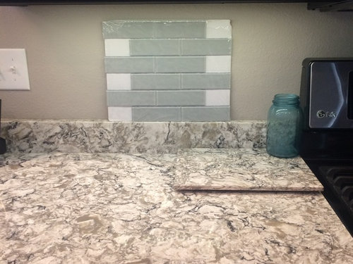
After heeding everyone's advise, I went shopping for simpler tile samples. Am I getting closer???


#1 - This one shows 4 tile samples -2 glass and 2 ceramic. If you like one of these, let me know which one.


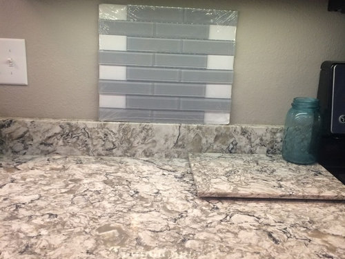
#2 - glass


#3 - glass


#4 - glass


#5 - glass


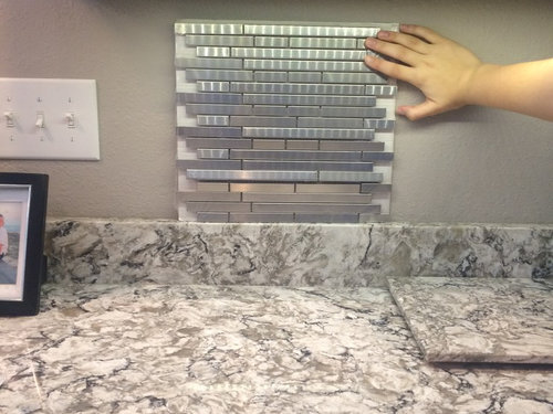
#6 - stainless steel (there is some glare from my undermount lights on the plastic covering.)


Let me know now what you think!

Comments (32)

  • 8 years ago

    #3 is my favorite of those, but I'm not a big fan of glass in general. I would look for that same tone in a ceramic or porcelain tile. You stone is so busy & beautiful that you don't want the backsplash to complete. Keep it simple & pull a light color from your stone. Don't add a new color. Those blueish grays are a definite no.

  • 8 years ago

    I like the one on the far right in the first photo - the cream.

  • 8 years ago

    Either the far right in photo #1 or photo #3 - both look lovely with your cabinets, countertops, and wall color. The others all look either the wrong color or too busy (tile size/pattern).

  • 8 years ago

    I like the first photo and fourth from the right tile. I think it is the cream color.

  • 8 years ago

    The far right tile in the first photo.

  • PRO
    8 years ago

    Option #4 Far Right. Simple. Brings out the color and beauty of the Quartz.

  • 8 years ago

    I would choose the right-most tile, from the #1 photo.

  • 8 years ago
    last modified: 8 years ago

    First photo, far right.

    But, I can see you're attracted to cool tones for this BS :).

    I looked at the third from the left in photo one, which is pretty with the counters, but I think it's not good with your cabinets.

    #3 is too drab green. I stopped at #2 and #4. They're not as safe as the cream but... I'd need somebody to photoshop them into a pulled back photo of your kitchen. I think you had one on your other thread?

    I think the first mosaic is too green and too busy. Those red cabinets are going to pull that undertone if it's there. That might be an issue with #2. At least, I thought so at first glance.

    I think the last stainless steel tone 'works' but 1) those narrow lines are going to cause seizures against your quartz and 2) the material itself feels too cool and manmade and undercuts the obvious warm feeling of your quartz.

  • 8 years ago
    last modified: 8 years ago

    I appreciate everyone's feedback so far. Cabinets are black.

  • 8 years ago

    First photo, far right.

  • 8 years ago
    last modified: 8 years ago

    bwulf, I apologize. I came back in from putting my horses to bed, turned on artificial lights, and ... dopey me, black!

    So, now I also like #1 , third from right. Do you have a lot of light in your kitchen? I remember one post from awhile back where she used a darker tone with black cabinets and regretted the overall dark effect during the day.

    There is no doubt the cream you picked is very pretty, and it's what I suggested on your last thread. What are you thinking?


    bwulf thanked barncatz
  • 8 years ago

    Barncatz, yes there is quite a bit of light so I don't think that will be a problem. While everyone is liking the cream one on the far right of #1, I don't really like it. Lol Husband hates it! I'm liking third from left of #1 and #3. I like the look of the glass tile. Again, wishing we would have done this when we built the house!!!

  • 8 years ago
    last modified: 8 years ago

    Just saw your comment. You cannot use it if your husband hates it. I don't want to hear 'Happy Wife, happy life .' especially because it doesn't make you happy either! Happy couple, no more trouple.

    Well, I hope the photo I just posted provides some encouragement for one of those two. I still prefer the grey glass in #1 of your two finalists.

  • 8 years ago

    From the 1st pic, I think the 1st and 4th tiles would work. And I like pic #3.

    Most of the cooler grays (and white) don't look very good with the counter.

    I liked the color of the tiles in pics 4 and 5, but I find that shape too busy in general, and too busy with your counter in particular. I didn't expect to like the stainless, since the other gray options left me cold, but I kind of did, possibly because of what it is reflecting.

  • 8 years ago

    1st one (far left) in first pic, color but not in glass

    3rd one, color but not in glass

    i think they are more of a gray/brown which i like and won't be too stark like the cream/white ones. i do like the ceramic over the glass though. i feel glass is modern, while your space is not. so i would do ceramic/porcelain matte finish over a glass/shiny finish.

    while i like the the 4th one first pic., its just ok...and now that u guys don't like it at all, its off the table anyway.

    5th and 6th pic are WAY to busy and out of place with your cabs and counters.

    2nd & 4th pic, colors are a no go for me. i would not want to introduce another color with your colorful counter.

  • 8 years ago

    I would avoid all the mosaics...too buzy and fights your counter. Since you do not like the cream ceramic tile eventough most posters do, try finding a glass tile in that tone. Are you planning to DIY with the tile? Glass tile presents definite challenges that ceramic tile does not. Make sure you or your installer use mortar that the tile manufacturer recommends if you pick a glass tile...there have been issues posted on here.

  • 8 years ago

    Another vote for the cream ceramic, far right in first photo. It seems you prefer the look of glass, though, so I'd agree with the suggestion to look for a glass in that same cream shade.

  • 8 years ago

    It is not DIY. We're to scared to do tile! Lol

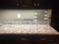
    Despite everyone's like for the cream tile, we just aren't fond of it. Which do you like out of the three in the bottom pic? They are all glass. Thank you!!

  • 8 years ago

    I like the glass tile. The first one is my fav, followed by the middle one. I think the one on the right is too dark.

  • 8 years ago

    From your first pic I like the one beside the cream tile that everyone liked.

    From the ones that you just posted I like either of the singles. Can you back up and show us the floor with the final ones? Or lean them against the lower cabinets and on the floor.

    Although the more I look at them, the more I like the one on the left. It seems to pick up the softer tones of the counter.

  • 8 years ago

    I like your paint color best. I’d do no tile, the granite splash is fine, or find a tile to match the paint.

  • 8 years ago

    first one on the left, then last one. not liking the middle at all..too cool, does nothing to enhance your counters.

    question is, do u want a lighter or darker B/S??

  • 8 years ago

    WOW,, this is a hard choice! When I cover two options to look at each one individually, they all look like great possibilities. Seriously they all look good. My question is which one is what you like? I know, you don't know hence the post with images...

    The hard part is the each one of us has a different monitor with variations on lighting. When I look at all three together the right one looks too dark. But then I cover the other two and right one could really work. Then I go back to the middle one saying with the right lighting and maybe their is more gray veining in the counter that could bring that color out. I go back to the first and say it has a slight green hint to the gray color and looks gorgeous...I always lean toward green so this could just be me.

    Which one? Which one?

    If I were making the choice right now based on the colors I see before me, I would choose the far right. It does appear darker than the others but it feels like it works with the counters. And something about the far right doesn't have green and while dark it seems to really match the counter. And if you have lots of light coming into the space it is not going to look to dark.

    And just seeing all your options is giving me lots to think about in my own space ahead.

  • 8 years ago

    I like 3 & 4.

    5 & 6 too busy. I don't like the cream in pic 1.

    I do like the patterns in barnkatz's sample photo.


  • 8 years ago

    Of your most recent pic, I prefer the one on the far right (darkest one) b/c it does seem to harmonize best with the colors of your counters. The one on the left seems to have a little green in it that does not highlight your lovely counters (unless they are somewhat greenish?).

  • 8 years ago

    Whatever tile you go with make sure you get a matching grout color so it doesn't make the backsplash busy. It's hard to tell exact colors on a computer, so really only you can match up the colors of the tiles. Since you cabinets are so dark I would go light.

  • 8 years ago

    You have dark cabinets and a busy medium-toned counter. To me, the darker colors are going to make for a really dark kitchen.

  • 8 years ago

    What's your stone called?


  • 8 years ago

    If I can read between the lines.... sounds like you and your husband don't like the cream ones and the non-glass ones because they are all too "boring". You are gravitating towards the mosaics, the rippled glass, and stainless, and the green/blue, because they are all "interesting". But as people said in your previous post, you have too much going on in your kitchen to add a busy backsplash. You *should* be seeking out a boring, forgettable backsplash. Your goal should be choosing a backsplash that is utterly unnoticeable. I think my previous advice to you was to skip the BS altogether, since you already have a 4 inch lip -- thus negating any need for one. If you get a BS with any *interest* whatsoever (small shape, grout, ripple, shine, new color added to the room), it is going to look chaotic.

  • PRO
    8 years ago

    Agree with H202. The back splash should be the balance to connect the counter and the cabinetry. Should not compete. Yes they are solid colors but they IMO have too much grey. Do you want the thousands of dollars to shine or the few hundred?? While you are at it remove the 4" whichever way you go.

    Based on your latest pics of the 3 glass back splashes. I would go for the first, BARELY, the others are too grey.


  • 8 years ago

    From the 3 choices in your last picture post, I would choose the far right one because it appears to match the grey in your countertop. The far left one looks too green and the middle one looks too blue.