

Need help with BM Classic Gray color scheme...
8 years ago
last modified: 8 years ago
Sort by:Oldest
Comments (3)

Related Stories
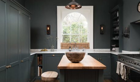
KITCHEN OF THE WEEKDark Gray Sophistication in a Shaker-Style Kitchen
Rich paint used throughout this compact London space helps create a kitchen that’s contemporary and inviting
Full Story
BEFORE AND AFTERSBefore and After: Gray and Marble in a Serene Master Suite
A designer helps a California couple create an efficient and stylish space where they can relax, rest and rejuvenate
Full Story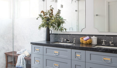
GRAYDesigners Share Their Favorite Light Gray Paints
These versatile neutrals can help create a range of moods in any room
Full Story
KITCHEN DESIGNNew This Week: 3 Stunning White-and-Gray Kitchens
See how the classic color palette works wonders in spaces in a variety of styles
Full Story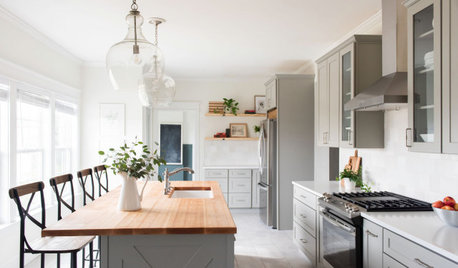
KITCHEN MAKEOVERSKitchen of the Week: White, Gray and Peaceful in Tennessee
A designer helps a young family increase storage and flow while creating soothing transitional style
Full Story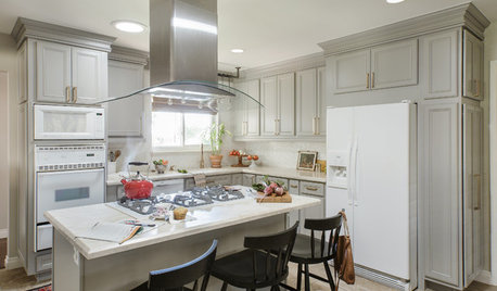
BEFORE AND AFTERSA Casual Gray Kitchen Effortlessly Blends Looks and Functionality
Durable, family-friendly finishes and cool tones help this San Diego kitchen keep a laid-back profile
Full Story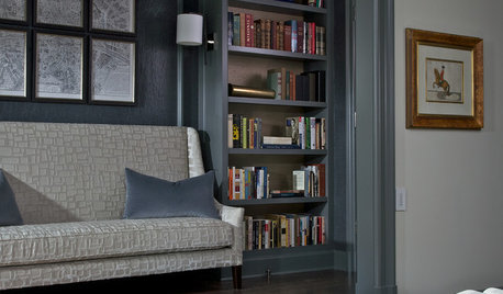
COLORHow to Layer Tones of Gray for Depth and Harmony
Use texture, pattern, contrast and more to create a subtle, sophisticated look with this popular color
Full Story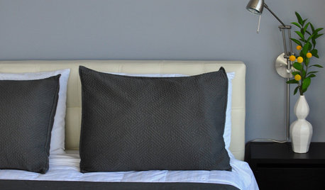
MOST POPULAR50 Shades of Gray
Gray is hotter than ever, thanks to a hit novel full of risks and dark secrets. Tell us: Which paint shade possesses you?
Full Story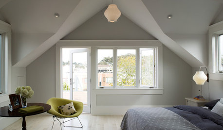
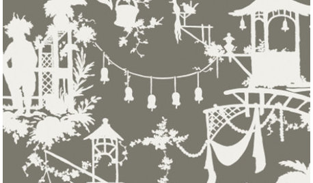
PRODUCT PICKSGuest Picks: Go Gray for Modern Elegance
Done up in chinoiserie, Greek key patterns and sculptural accessories, gray has all the sophistication with none of the somber
Full StorySponsored

Customized Award-Winning Interior Design Solutions in Franklin Cnty OH
Chroma Design
J AdamsOriginal Author
Related Professionals
Vicksburg Interior Designers & Decorators · Morgantown Interior Designers & Decorators · Huron Interior Designers & Decorators · Mission Viejo Interior Designers & Decorators · Ontario Interior Designers & Decorators · Natchitoches Bathroom Remodelers · Concord Bathroom Remodelers · Medford Kitchen & Bathroom Designers · South Bend Interior Designers & Decorators · Lawrence Interior Designers & Decorators · Webster Interior Designers & Decorators · Elmira Architects & Building Designers · Wichita Kitchen & Bathroom Designers · Danbury Kitchen & Bathroom Designers · Detroit Kitchen & Bathroom DesignersChroma Design