Software
Houzz Logo Print

Comments (23)

  • 8 years ago
    last modified: 8 years ago

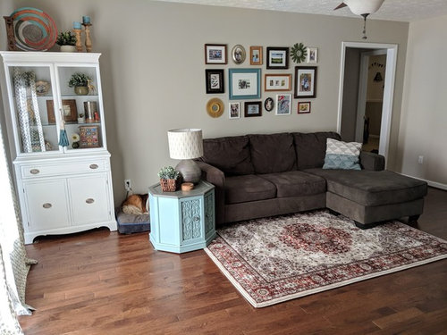
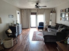
    The only thing I think off a bit is the size of your rug. There is too much wood surrounding it. A room that size needs a much larger rug. Does the dog like to hide? If not I would pull out his bed and push in the side table a bit. Pretty room!

    rushing_wind thanked roarah
  • 8 years ago

    Pretty room. And I agree -- bigger rug and the end table needs to be closer to the wall.

    rushing_wind thanked User
  • 8 years ago

    In addition to a larger rug and moving the end table closer to the wall, I would add several larger framed pieces to your salon/gallery wall. It will keep the current arrangement from looking overwhelmed by too many tiny items.

    rushing_wind thanked beckysharp Reinstate SW Unconditionally
  • 8 years ago
    I agree with the previous posters and would just like to add that I really like your room. It looks like a real person lives there and is not too “matchy” or overstyled.
    rushing_wind thanked zabba23
  • 8 years ago
    Add more pics with your back standing in the middle of each wall/space. Looking at this photo, the dog bed needs to be elsewhere because it’s pushing the end table too far forward and the china cabinet looks to close to the window wall.
    rushing_wind thanked Bette P
  • 8 years ago

    Your things are fine but don't seem to be arranged in the best way. If you can post pix of all walls and furniture, we can get this sorted out for you. And yes, the rug is too small. It should be big enough to slip under the front 1/3 of the seats and all the way under the chaise, leaving a foot or more of rug extending past the two sides of the sofa. Pleas comment and use the photo button here to add more pix of all of it.

    rushing_wind thanked decoenthusiaste
  • 8 years ago

    There's not too much-- There's not enough going on, but this is a very good start! I agree with the previous suggestions. Push the end table against the wall and add a large piece of art in the center of the blank wall space to balance out the gallery wall. It also looks like you have room for another piece of furniture, but first you should get a bigger rug.

    rushing_wind thanked songbird07
  • 8 years ago

    Not too much going on. Great job making this all look cohesive. The only issue is it looks cramped just because the white shelves are pushed into the corner and the turquoise end table is sticking out strangely. Sadly, I think you just don't have enough room on that wall for the sofa, turquoise table and white cabinet.

    Do you have another space for the side table in your home? If so, I would pull the white cabinet out from the corner just 8" and find a much smaller end table to put next to the sofa with that lamp on it. Perhaps you could find a smaller end table and paint it the same color turquoise and find a smaller lamp for it?

    rushing_wind thanked Kendrah
  • 8 years ago

    I like your style! Imo (grain of salt, not a pro) if you’re buying a different rug— I think going a little simpler, slightly more modern, maybe incorporating a bold color for the rug? could really make the space even more cohesive.

    rushing_wind thanked rebecca_adia
  • 8 years ago
    last modified: 8 years ago

    your decor is fine, but the arrangement is weird. i don't like how you have anything placed. I can't see the entire room, so I don't know where else it could go, but there has to be a better layout. Can the sofa go against the window?

    rushing_wind thanked Beth H. :
  • 8 years ago
    last modified: 8 years ago

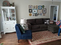
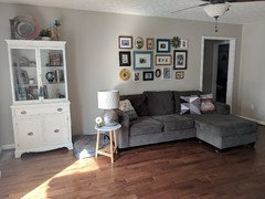
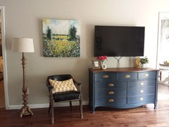
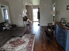
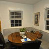
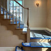
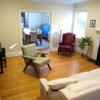
    Thank you all for the feedback! I'm going to attach some pictures of the opposite wall, a previous rug and chair, and a possible future chair.

    The dog bed is where it is because she likes to have a den-like place to go, I guess it's her inner wolf haha. Before I moved the china cabinet in, the wall looked very empty with only the decor above the sofa and I didn't know how to fill the space. So it was either the china cabinet or a secretary desk. It's a very long wall and the wall opposite is short and kind of broken up with doors.

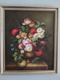
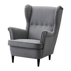
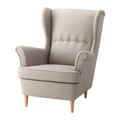
    In the pictures where you see the blue chair, I was thinking about putting one of the wingback chairs from Ikea there, either gray or beige. Also, where you see the canvas above the black chair, there is now the floral painting (which is being reframed).

    After adding all the pictures, I'm thinking I'm starring at everything too much, lol.


  • 8 years ago

    The teeny tiny Captain America is perfect : )

    rushing_wind thanked beckysharp Reinstate SW Unconditionally
  • 8 years ago

    Wow, in your recent series of pictures, the first one you posted is fantastic. Why did you take away that legged little side table, the red background rug and the blue chair? I thought they all looked really great together and a charming complement to the great TV set up you have. I'd move it all back together like that and if you want a new chair get the grey wing back. I think the teeny Captain America goes really well with the blue chair though!

    My dog digs a cave too. In one house we had next to the sofa a drop leaf table that we put his bed under. We called it his condo. He adored it.


    rushing_wind thanked Kendrah
  • PRO
    8 years ago

    Salon style picture hanging really doesn't work with itty bitty pictures unless in a somewhat controlled small space. Wrong pictures, wrong place.

  • 8 years ago
    last modified: 8 years ago
    To me, the biggest problem with the room as in the OP is that there is nothing to tie the disparate elements together, so that each thing is a separate entity. That's what gives you the sense of too much stuff, even though there's not much there; none of it relates to anything else in the room.

    Just moving the side table back to the wall and adding a taller lamp, then hanging the artwork lower so it relates better to the couch would be a big step forward, although I do agree with those who say that very small paintings like that are better where you can get closer to study them better.

    rushing_wind thanked writersblock (9b/10a)
  • 8 years ago

    That blue octagon cabinet table is lovely, but it is too much next to the white cabinet. The other open table looked better, particularly away from the wall. Could it possibly go behind the sectional along the wall next to the entryway? Or in a bedroom next to a bed. I really love the table but it must have a better spot in your home.

    rushing_wind thanked l pinkmountain
  • 8 years ago

    The blue side table has been removed and the other put back in it's place. I've taken down some of the smaller frames on the wall and sat larger ones against the wall above the sofa and I see it looking better already. I really like the look of gallery walls and would like to keep one there if I can pull it off.

    Kendrah - I changed the original layout because it started looking red, white, and blue to me.. I guess that goes back to starring at it too much lol.

    Beverly - Thank you so much for the picture you posted, it's puts in perspective what this room could look like.. and I love that ottoman!

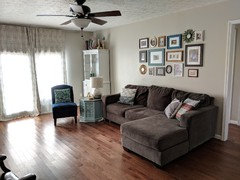
    I would move the sofa over and put a table on the other side of it, but then it would be disconnected to the opposite wall. This living room's layout has proven a challenge to me. I will attach another picture of the while area so you can see how it looks as a while.. don't mind the missing tv and frame above the chair!

  • 8 years ago

    Well, we still haven't seen the wall where you took that last pic, opposite the sliders. And we don't know what that piece of furniture is in the lower right hand foreground. But I'm going to suggest that the wall opposite the sliders it is the spot for the white china cabinet. Then you can center your sofa and art on the wall where they are now and add a floor lamp to the chaise side of the sofa. Lower the grouping and level the bottom row of frames at 5" above the sofa back, remembering that "less is more" as you reorganize them.

    rushing_wind thanked decoenthusiaste
  • 8 years ago

    Oops, here's the last view in the room!


  • 8 years ago
    I like your hutch. And the accommodation for the dog is heart melt sweet. But, I would have moved the sofa along towards the window wall to give it some breathing room by the doorway and to add a small sleek floor lamp on the right for layered lighting. The dresser/tv looks like it would still be in line. The design on the rug is partly hidden, an all over pattern or the other rug might be a better option. Can you add two more curtain panels for fullness, or a pair of plain panels in the middle. Hem or maybe iron tape to 1/2 above the floor. Curious to see the 4th wall though. What’s the furniture piece showing in your last photo?
    rushing_wind thanked Bette P
  • 8 years ago
    last modified: 8 years ago

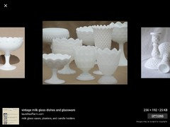
    Ok, the 4th wall! You could wrap mdf thin boards with natural flax coloured linen or natural grass cloth looking wallpaper to sit snug against the backboard of the shelves. Or paint the backboard. Try clearing the top of decor. Wonder how all white vintage milk glass pieces would look in there against a darker backboard.

  • 8 years ago

    I see that the hutch would block the side exits out of the room if placed at the entrance end, but try turning it to stand right of the sliders. That will allow the sofa to slide down the wall some and be more aligned with the TV. Use large art 5" above the sofa and stack the two blue framed photos centered 5' above the floor just left of the slider to give a visual counter balance to the hutch. I would do away with your drapes and install some UV film on the sliders. Top them with a faux roman shade that picks up the blue, and a larger rug and pillows that pull the blue around the room.

    rushing_wind thanked decoenthusiaste