Software
Houzz Logo Print
arexa_radrian

Green kitchen gone very wrong. HELP!

8 years ago
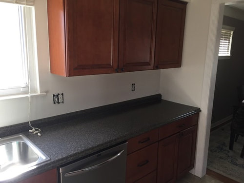
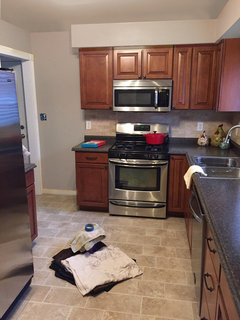
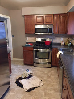
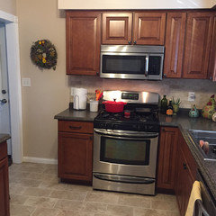
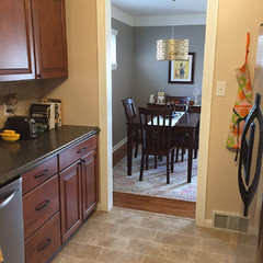
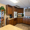
Hi everyone, I’ve gotten myself in a mess and need help fast! I just had beautiful travertine sandalwood backsplash put in my kitchen with cherry cabinets and black/ gray laminate countertops (not originally my choice, came in the home updated) I choose the sandalwood tiles to keep things neutral, but the Swiss Coffee Behr paint on my walls was leaving everything washed out. After some googling and studying of the color wheel, I decided to go with a green. From what I’d read green was a popular choice to pair with cherry cabinets. So in an effort to have some fun and add a pop of color and to not think to hard about this, I choose Beth’s Anjou Pear. My goodness, what a mistake I have made. I HATE the color in my kitchen. In a kitchen with white cabinets and very muted decor, sure, but against my kitchen, it’s doing nothing at all! Painting over is not exactly how I want to spend my weekend, but I can deal. What I can’t seem to figure out is what color to use instead! I don’t want a yucky beige and I think I’ve scared myself off from color. Just want something that will make my backsplash pop. Any advice would be wonderful!

Comments (42)

  • PRO
    8 years ago

    So many things , the backsplash does not work with the counter and looks likr you tried to matche the floor but just missed , you should have removed the little piece of backspash in the counter material before doing the backspalsh . As for the wall color now I would choose a color from either the floor or the backspalsh and repaint. The green you chose is not IMO complimentary to the color of the cabinets, since the space is small keep the walls neytral and add some accessories to bring in some fun

  • 8 years ago
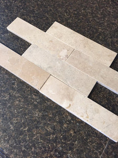
    Should have posted an up close of the backsplash. I did match the tile samples before picking out, here is a picture. I call the counters back but there are actually a lot of flecks of gray and yellow in there too!
  • 8 years ago

    So I'm reading pink undertones in your floor and back splash...however the cabinets and current paint colour might be fooling my eye. I like this blogger and you may find some tips. http://www.mariakillam.com/?s=pink+beige

  • 8 years ago
    Thanks for the link! I agree. Getting lots of pink as well, especially with the cherry cabinets having red under tones.
  • 8 years ago
    I think the back splash should have been close to the black counter color...because I feel like it’s doing a striped thing right now..beige, cherry, black, beige, cherry, green...
    And o also don’t think the green looks good against that shade of cherry...I would go to white, off white.
  • 8 years ago

    Cream or light backsplash is fine with dark counters. I have pics but not at home to post. There are some in my "wood kitchens" idea book. Your short dark splash is probably connected to the counter - all one piece which is why you did not remove it. Agree to take a color from the backsplash for the wall and add color with accessories.

  • 8 years ago
    last modified: 8 years ago

    Yknow OP, your backsplash is fine and IMHO "coulda /shoulda" is not terribly useful at this point. A browner/beigier or more olive green would relate better to your woods/tiles- its that particular shade acid green that is throwing everything off Or as others have suggested take a gray/greige from your tile and put it up on the wall -but make it a midtone - not super-dark but not some wimpy light gray either. Needs to stand up to the intensity of the cherry cabs.

    Which btw are beautiful.

  • 8 years ago
    last modified: 8 years ago

    I have cherry cabinets, with an orangey stain, a travertine floor and backsplash (with a lot of pink in it ). Not my choice, it was here when I moved in. With the help of a color consultant, I settled on Sherwin Williams “Zeus”. I think it tones down the pink and compliments the cabinets. It’s definitely in the green family and something different than the ubiquitous tan/beige.

  • PRO
    8 years ago

    I am not sure what the rest of your color scheme is in your home. But for a warm rich look a dark mustard is very nice or for a cooler but rich look grey-


    blue is nice!

  • 8 years ago

    I'm currently working on painting my kitchen and bathroom and got some great advice on houzz. While surfing the internet, I found that Glidden has a visualizer for painting rooms! Upload a photo of your room and paint the walls. Glidden Visualizer . I ordered some paint based on what I saw on the site.

    Good luck! I am challenged when it comes to colors!

  • PRO
    8 years ago

    I'm thinking a blue/gray paint color (not too dark) would help a lot. You're right, the green you've chosen has too much yellow in it. I don't have a problem with your backsplash choice--it's nothing fancy, but it's fine. Some Benjamin Moore options, but PLEASE do some brushouts before you go whole hog. Computer colors never look the same as they do IRL.

  • 8 years ago
    Your counter has greys and blues pick a blue gray for wall color. I agree the backsplash could have be a different color. But I say try the blue grey color and see how it goes try the wall to the left of the range.
  • 8 years ago

    A light soft taupe should do the trick.

  • 8 years ago

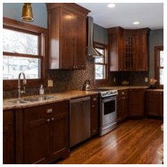
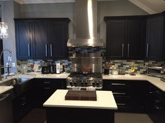
    Like this?


    Space to Expand · More Info

  • 8 years ago

    It's a very nice kitchen and IMO your backsplash works well. Look at it this way: if painting the wrong color is the worst thing that happens to you, be thankful, laugh, and move on.


    I'm gonna paint your kitchen for you (virtually; you'll have to do the real thing yourself) in hopes it will help you choose a better color next time. Stay tuned.

  • PRO
    8 years ago
    last modified: 8 years ago

    Don't reinvent a wheel. Take a tile to the paint store and get the palest ,palest tone of it you can. No blue, no green, no gray . You're fighting the entire thing. Also making the cabinets appear redder than they are. Gray? It will go "blue" against the cabinets.......

    Warm up your lighting, it reads icy cold against the rest : ) You need more of it too.

  • 8 years ago

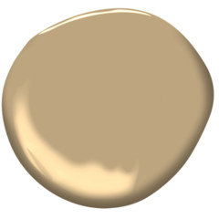
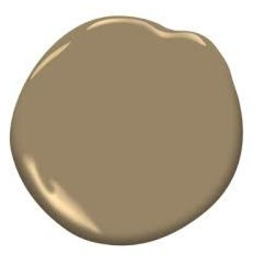
    @groveraxle Thanks so much for your work putting together the edits. I like the first two much more than the blues and greens, they are just competing for attention and its drawing from the kitchen. The second picture reminds me another color that I have in my house, Mole Skin by Behr. I am loving it against the cabinets!

  • 8 years ago

    Sometimes spaces are better with no color. In your case I think this kitchen is one of them. I would do a warm creamy white.

  • 8 years ago

    When you repaint, I'd repaint the ceiling the same color as the walls.


  • 8 years ago
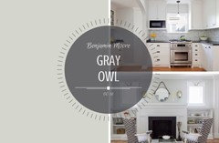
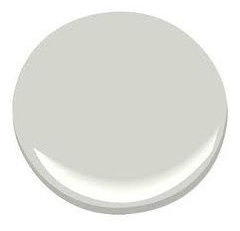
    I would do Navajo white- crisp beige that isn’t blah. But if you want green... I think a lot of people go for a “color” they like on this chip and that’s a mistake because it’s always way way bolder on the wall. Instead I try to choose a base color (beige, white, or grey) and then get a bunch of chips. Then I line them up and determine undertones, and pick the chip with the undertone that is the color you want (in this case green). That way you end up with a muted subtle color. A good example of a green undertoned neutral is gray owl.
  • PRO
    8 years ago

    Hello

    I really am drawn to the last 2 color options from groveraxle. I think a cooler shaded green or blue is the way to go. The color should have enough grey to keep it from being too youthful. If you go with a neutral color as some are suggesting your kitchen will look like its straight out of the early 2000's. A fresh relevant color will go a long way.

    Karen

  • 8 years ago
    @groveraxle agree on the ceilings. What a difference. Do you have the brands/ titles of the colors you used so I can match them? I have a swatch for Behr Natural Almond, but hard to tell how much lighter it is than you’re lightest pic. It seems to match the tones in my tile the best.
  • 8 years ago

    Grover, that second beige is awesome! It pulls everything together quite well. I am not sold on the ceiling. What about if it was a shade lighter?

    And, where is the dog? Colors would match perfectly!

    Not a fan of the countertop with the floor and backsplash, but it is not the worst I've seen!!

    Prime the walls first so the green does not bleed thru.

  • PRO
    8 years ago

    Go with a very pale grey aqua blue, honestly I would think of the blue as almost tropical but very subtle it will match both your floor your backsplash and the counter as well as your cupboards I would paint the ceiling white.

  • 8 years ago

    I had the same counters and a very similar travertine tile in my home previously with cherry cabinets, and we had Ben Moore Spice Gold and Jamesboro Gold. Might be worth a peek. Both nicely saturated...

  • 8 years ago

    My 7 yr old son told me to tell you that he likes the green the best and that’s what you should paint it ; ). I actually like the green and the blue and also the 1st one on the second set of options. I like that they cool down the warm cabinets. I think a beige or tan is just too blah. Do they go? Yes. But they are boring.

  • 8 years ago
    last modified: 8 years ago

    Arexa, I can't give you any color names because I simply manipulate the color that's already there till I get something I like (or something I don't like that I want to demonstrate). It wouldn't matter in any case because you still have to get samples and bring them into your room. I cannot adjust for your lighting and a color may look completely different in the space than it does on the swatch.

    You said you have Behr moleskin somewhere. If you have some paint left over, paint a sample and see what you think. It may help you narrow it down.

  • PRO
    8 years ago

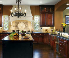
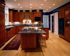
    I'm going to agree with the 7-year old and say green, but not the same green. Just because that green doesn't work doesn't mean that all greens are out. The problem is that you need a deeper color. Any light pastel color is going to look blah against your dark cherry and counter top. I'd try one of the dark greens in the Ben Moore Historical palette, like Kennebunkport Green, Providence Olive, or Weathersfield Moss.

    Although the walls in this kitchen are not green, they are very dark and look wonderful with the cherry cabinets.

    All American · More Info

  • 8 years ago

    What she said! That kitchen has a lot of power and presence and needs a counterweight. Have fun!

  • 8 years ago

    I find buying those 8 ounce samples of various paint colors invaluable to help you make your selection. It's amazing how different the color looks in your space. I'm on my third sample and I was absolutely convinced that my first paint choice was the winner -- until I painted a patch on the wall. Get a few samples and you will quickly see which colors you prefer. Good luck!

  • PRO
    8 years ago

    Getting samples is a great idea, but paint them on a large piece of poster board, not directly on the wall. The original color can show through and change the color. In addition, the surrounding original color can change how you perceive color.


  • 8 years ago

    You picked a pretty color, it is just off for your room. That green in groveraxile's sample (3rd one down) is really pretty. Keep trying, it will be beautiful.

  • 8 years ago
    I was going to suggest Owl Gray by Benjamin Moore as well. It has a green undertone while still being very neutral. I think it will make the cabinets pop the way you want, and compliment your beautiful backsplash as well! That’s the exact backsplash I’m looking into purchasing so I’m a fan. Neutral and classy!
  • 8 years ago
    last modified: 8 years ago

    I liked Grover's suggestions, but then I saw Diana Bier's suggested photo, and I was impressed. I love that dark, dramatic color! Also, notice how the runner has both colors to tie it all together. On another note, one of the people felt the beiges would be too blah, but my suggestion would be to find a piece of art with some color on it for the walls - no more blah, if you go for the beige! BTW, I thought your backsplash plays nicely with your floor.

  • 8 years ago


    OP UPDATE: Decided to go the neutral route and chose Behr Natural Almond. Also, took one the suggestion of painting my ceiling the same color. Very happy with the results and can DEFINITELY say this color is sooo much better than the green. Will add my pop of color that I was after with wall hangings, items on my counters, and a rug.

  • 8 years ago

    Looks great. I don't think you need any additional color pops. You have the pear shaped canisters on the counter, the red pot and utensils. It's all good.

  • 8 years ago

    Thanks @groveraxle, I agree, I have my pops. Only other thing I'm after now is a rug.

  • 8 years ago

    looks great

  • 8 years ago

    Looks great!

  • PRO
    8 years ago
    last modified: 8 years ago

    Pint the walls the same color as the backsplash. Why? So the tile doesn’t hit a dead end.

    Put the green on the ceiling.


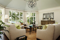
    Family Room · More Info

  • 8 years ago

    Did you read the whole thread, Judy? She updated with pics of her newly re-painted kitchen and it looks great.