Software
Houzz Logo Print
janalyn_owens

BM Darken Classic Gray paint

8 years ago

I put a sample of Benjamin Moore's classic gray on the wall & thought it was the perfect color. It is lovely, but I found it to be lighter than I expected (almost an off-white) when I painted it in a room. I am hoping to use it in most of my rooms if I can darken it a little. Has anyone had success using this paint & darkening it by percentage? If so, what percentage worked? I realize that I will be changing the actual color by darkening it. I want the color to be enough of a change that it would have some contrast with white trim and pull out colors in the home, but I am still OK with a light gray.

Comments (33)

  • 8 years ago

    Janalyn, can I ask what you decided about the Classic Gray? I'm having the same issue in choosing an exterior paint color with it. I've sampled several colors including Classic Gray at 100% and 200%. I really like the 200% better because, like you, the 100% was way to white. I still feel like it needs a little more umph to it. I may get another sample at 300% and 400% but I've read somewhere that adding black will actually make it go a shade darker. Not sure which to try but I have to make a decision by Sunday.

  • 8 years ago

    if you need to darken the paint take it to the store and have them do it this way it will be properly mixed.

  • 8 years ago
    last modified: 8 years ago

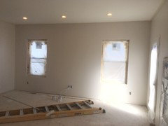
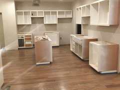
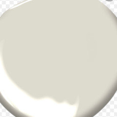
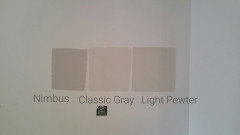
    Shead, I ended up going with 150. I did get that professionally mixed. To my eye, any darker and the color moved more brown than gray. I am happy with the results but it is pretty light still. The color feels airy and peaceful. In the morning the color leans gray, in the afternoon/evening it leans a little more taupe on some walls. I think the color will be a classic as the name says, and I can see liking it for years to come. I apologize that these pictures don’t read as true to the color as I would like.

  • 8 years ago

    Thanks! Unfortunately, I had to rule Classic Gray out as a color because at 400% (the right intensity for my house exterior), the color definitely was more brown than gray :(

  • 8 years ago

    Hope you find that perfect color

  • 8 years ago
    Janalyn wow great timing on this post! I was just about to ask about darkening Classic Gray. I also like the color but found it looks almost white in a light room. Thanks for the updates. Would you say the rooms you are painting are very bright, dark or in between? We are painting a living room and kitchen, which get a lot of light. Also does the color read purple anywhere? I’m trying to avoid that!
  • 8 years ago

    I am sorry to get back late on this post. The rooms I used the classic gray all have large windows. The natural light makes the color seem pretty light during the day. No purple undertones at all! I see just a subtle taupe undertone with the gray.

  • PRO
    8 years ago

    There's really no need to mess around with adjusting formulas. It's a shame paint stores don't have color experts on staff because these are not hard color conundrums to solve. Colors that are very, very similar to Classic Gray just darker are:

    Bone Black Ben Moore CW-715

    Mindful Gray SW 7016

    You can tell how much darker by comparing Light Reflectance Values.

  • 8 years ago

    Lori, is there a color that is just a little darker but still very, very similar to Classic Gray? I am looking for an lvr around 65-70.

  • PRO
    8 years ago
    last modified: 8 years ago

    DE6226 FOGGY DAY by Dunn Edwards would be the best option. LRV is 71.

    1464 LIGHT PEWTER by Benjamin Moore. LRV is 71

    90YY 63/044 OYSTER BAY by Glidden, get it at The Home Depot. LRV is 63.

    SW 7015 REPOSE GRAY by Sherwin Williams. LRV is 58 but may be worth a look.

    All of these fit the criteria of just like Classic Gray but with an LRV around 60 to 70 ish.

  • 8 years ago

    Thanks, Lori! I have Repose Gray in there now, I am hoping to go a lighter and a tad more greige so I'll check out the others.

  • PRO
    8 years ago

    Light Pewter is probably the best option then.

  • 8 years ago

    Lori, I have a question for you. I was trying to decide between Classic Gray and Balboa Mist. I plan on using it on the bottom floor of a duplex that is on a hillside and east facing. I am putting in white oak floors that will be stained Dark Walnut with Dura Seal. The rooms have 8 foot long windows, but there is just 1 wall in each room that has a window so the rooms never get too much natural light. I was leaning toward Balboa Mist, but am worried it might be too dark and make the rooms feel gloomy. However, I am also concerned Classic Gray is too light and won't make the white baseboards pop. I can look at Light Pewter or would you stick with Classic Gray in this situation. I have a lot of large dark Asian furniture. Also for a large kitchen/dining room which gets a fair amount of natural light would you add another color such as Gray Owl if I will use modern 24 x36 gray tiles with Walnut kitchen cabinets or just stick with one color for the whole unit. You seem to have a good understanding of Benjamin Moore colors so I thought I would ask.

  • PRO
    8 years ago

    I will use modern 24 x36 gray tiles

    You need to base the wall color on the colors in the tile. In other words, the color of paint you choose for the walls needs to match a color in the tile.

    Balboa, Gray Owl and Classic Gray are all pretty colors but if they don't relate to anything in the space then they're not going to look so great.

  • 7 years ago
    last modified: 7 years ago

    Just painted my whole downstairs with classic gray. Love the color but as other people said it looks almost white. Just want a drop more depth. I have alot of white moldings. Thank you !!

  • PRO
    7 years ago

    Take a look at BenM's Rodeo 1534.

  • 7 years ago

    I used Balboa Mist recently on my kitchen walls with Chantilly Lace on cupboards, trim and fireplace. Floors have gray, matte wood finish. The room is a sunny, SW-facing kitchen and color combination looks gorgeous! Although I do love this pale taupe wall color and will soon repeat it in my sunny living room, I am considering going with the lighter Classic Gray in the darker, north-facing parts of my house. Has anyone tried this?

  • 7 years ago
    I just remodeled my kitchen and had trim, doors and cabinets painted Chantilly Lace and walls Classic Gray. It turned out beautiful! The room faces northeast. The crispness of the Chantilly Lace contrasts nicely with Classic Gray.
  • 6 years ago

    I'm looking for a lighter version of classic gray...my new rental only has a couple east facing windows and the living room doesn't get much light. So classic gray although beautiful will look like a much darker color than I want. Any suggestions?

  • 6 years ago

    Similar only lighter by almost 5 points, but close in Chroma (colourfulness) is Benjamin Moore Int. Rm White Dove.


    Similar but lighter & slightly more neutral than Classic Gray = Dulux 98YY 92/022 and Benjamin Moore AF-15 Steam.

  • 6 years ago

    Thank you Marylee

  • PRO
    6 years ago

    BM Pale Oak is light neutral.

  • 6 years ago

    Thanks Flo, Pale Oak is a bite darker than Classic Gray and I'm looking for something that reads like classic gray but slightly lighter...not darker....appreciate the input.

  • PRO
    6 years ago

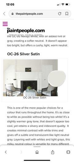
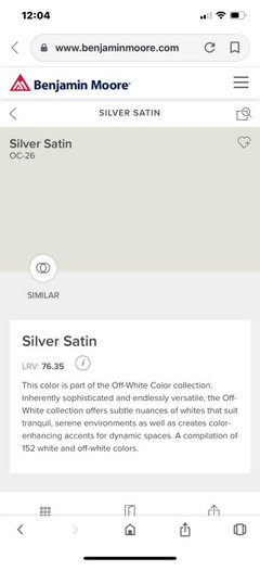
    Lighter I suggest Silver Satin LRV 76.

  • PRO
    6 years ago

    Pics

  • 6 years ago

    Oh that silver satin is so pretty!

  • 6 years ago

    I have a post and beam renovation getting ready for paint... in my open concept kitchen/dining/living I have Chantilly Lace on the ceiling, walls and trim in different finishes. I am using Classic Gray down the hall and in the bedrooms. The ceiling throughout is tongue and groove with support beams running through. I need a slightly darker version of Classic Gray that can be used consistently on the ceiling beams, to provide contrast. It needs to be dark enough to contrast from the Classic Gray on the bedroom walls, but not so dark that it overwhelms the open concept area. The color tone of Classic Grey is perfect, but I think I need more depth. Advice?

  • 6 years ago

    Hi Marie - there are suggestions further up this thread to fit your request. 🌈

  • 6 years ago

    Old post but I wanted to share since this post was extremely helpful in helping me narrow down my search to 6 chip samples and a short list of 2 sample pots.


    Lori recommended other colors on another thread: https://www.houzz.com/discussions/4595806/gray-greige-or-something-else#19799391


  • 4 years ago

    what would be a touch more gray than classic grey which shows as a griege.. Problem is if it is more gray it sometimes turns into a light blueish color....need a real neutral gray without a blue or blue green tint such as gray owl...HELP losing sleep over this one. Want a true very light grey with little blue undertones for my kitchen cabinets.with a white backsplash and smoke ember walls. thanks help asap please

  • 4 years ago


  • last year

    For anyone out there looking for a darker version of classic gray. You can look at Sherwin-Williams egret white. It’s very similar but darker. Purple pink undertones.